


CSS 导航栏
垂直
水平
导航栏
熟练使用导航栏,对于任何网站都非常重要。
使用CSS你可以转换成好看的导航栏而不是枯燥的HTML菜单。
导航栏=链接列表
作为标准的HTML基础一个导航栏是必须的
。在我们的例子中我们将建立一个标准的HTML列表导航栏。
导航条基本上是一个链接列表,所以使用 <ul> 和 <li>元素非常有意义:
<!DOCTYPE html>
<html>
<head>
<meta charset="utf-8">
<title>菜鸟教程(runoob.com)</title>
</head>
<body>
<ul>
<li><a href="#home">主页</a></li>
<li><a href="#news">新闻</a></li>
<li><a href="#contact">联系</a></li>
<li><a href="#about">关于</a></li>
</ul>

<p>注意:这里我们用 href="#"作为测试连接。但在一个真正的 web 站点上需要真实的 url。</p>

</body>
</html>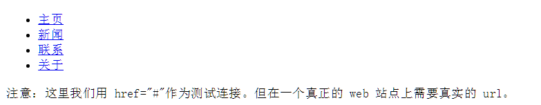
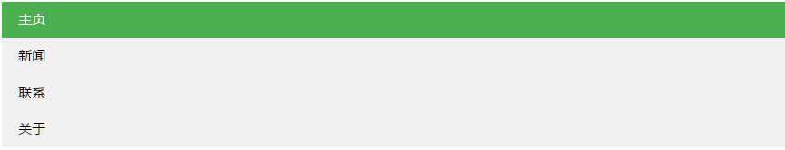
现在,让我们从列表中删除边距和填充:
<!DOCTYPE html>
<html>
<head>
<meta charset="utf-8">
<title>菜鸟教程(runoob.com)</title>
<style>
ul
{
	list-style-type:none;
	margin:0;
	padding:0;
}
</style>
</head>
<body>
<ul>
<li><a href="#home">主页</a></li>
<li><a href="#news">新闻</a></li>
<li><a href="#contact">联系</a></li>
<li><a href="#about">关于</a></li>
</ul>
</body>
</html>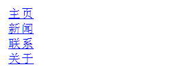
例子解析:
- list-style-type:none - 移除列表前小标志。一个导航栏并不需要列表标记
- 移除浏览器的默认设置将边距和填充设置为0
上面的例子中的代码是垂直和水平导航栏使用的标准代码。
垂直导航栏
上面的代码,我们只需要 <a>元素的样式,建立一个垂直的导航栏:
<!DOCTYPE html>
<html>
<head>
<meta charset="utf-8">
<title>菜鸟教程(runoob.com)</title>
<style>
ul {
    list-style-type: none;
    margin: 0;
    padding: 0;
    width: 200px;
    background-color: #f1f1f1;
}

li a {
    display: block;
    color: #000;
    padding: 8px 16px;
    text-decoration: none;
}

/* 鼠标移动到选项上修改背景颜色 */
li a:hover {
    background-color: #555;
    color: white;
}
</style>
</head>

<body>
<ul>
<li><a href="#home">主页</a></li>
<li><a href="#news">新闻</a></li>
<li><a href="#contact">联系</a></li>
<li><a href="#about">关于</a></li>
</ul>

<p>背景颜色添加到链接中显示链接的区域</p>
<p>注意,整个区域是可点击的链接,而不仅仅是文本。</p>
</body>
</html>
示例说明:
- display:block - 显示块元素的链接,让整体变为可点击链接区域(不只是文本),它允许我们指定宽度
- width:60px - 块元素默认情况下是最大宽度。我们要指定一个60像素的宽度
<!DOCTYPE html>
<html>
<head>
<meta charset="utf-8">
<title>菜鸟教程(runoob.com)</title>
<style>
ul
{
	list-style-type:none;
	margin:0;
	padding:0;
}
a:link,a:visited
{
	display:block;
	font-weight:bold;
	color:#FFFFFF;
	background-color:#98bf21;
	width:120px;
	text-align:center;
	padding:4px;
	text-decoration:none;
	text-transform:uppercase;
}
a:hover,a:active
{
	background-color:#7A991A;
}
</style>
</head>

<body>
<ul>
<li><a href="#home">主页</a></li>
<li><a href="#news">新闻</a></li>
<li><a href="#contact">联系</a></li>
<li><a href="#about">关于</a></li>
</ul>
</body>
</html>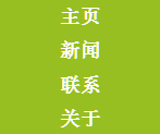
注意: 请务必指定 <a>元素在垂直导航栏的的宽度。如果省略宽度,IE6可能产生意想不到的效果。
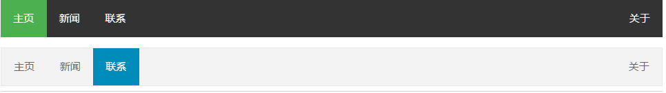
激活/当前导航条实例
在点击了选项后,我们可以添加 "active" 类来标准哪个选项被选中:
<!DOCTYPE html>
<html>
<head>
<meta charset="utf-8">
<title>菜鸟教程(runoob.com)</title>
<style>
ul {
    list-style-type: none;
    margin: 0;
    padding: 0;
    width: 200px;
    background-color: #f1f1f1;
}

li a {
    display: block;
    color: #000;
    padding: 8px 16px;
    text-decoration: none;
}

li a.active {
    background-color: #4CAF50;
    color: white;
}

li a:hover:not(.active) {
    background-color: #555;
    color: white;
}
</style>
</head>
<body>

<h2>垂直导航条</h2>
<p>在点击了选项后,我们可以添加 "active" 类来标准哪个选项被选中。</p>

<ul>
  <li><a class="active" href="#home">主页</a></li>
  <li><a href="#news">新闻</a></li>
  <li><a href="#contact">联系</a></li>
  <li><a href="#about">关于</a></li>
</ul>

</body>
</html>
创建链接并添加边框
可以在 <li> or <a> 上添加text-align:center 样式来让链接居中。
可以在 border <ul> 上添加 border 属性来让导航栏有边框。如果要在每个选项上添加边框,可以在每个 <li> 元素上添加border-bottom :
<!DOCTYPE html>
<html>
<head>
<meta charset="utf-8">
<title>菜鸟教程(runoob.com)</title>
<style>
ul {
    list-style-type: none;
    margin: 0;
    padding: 0;
    width: 200px;
    background-color: #f1f1f1;
    border: 1px solid #555;
}

li a {
    display: block;
    color: #000;
    padding: 8px 16px;
    text-decoration: none;
}

li {
    text-align: center;
    border-bottom: 1px solid #555;
}

li:last-child {
    border-bottom: none;
}

li a.active {
    background-color: #4CAF50;
    color: white;
}

li a:hover:not(.active) {
    background-color: #555;
    color: white;
}
</style>
</head>
<body>

<h2>垂直导航条</h2>
<p>以下实例让每个链接居中,并给每个列表选项添加边框。</p>

<ul>
  <li><a class="active" href="#home">主页</a></li>
  <li><a href="#news">新闻</a></li>
  <li><a href="#contact">联系</a></li>
  <li><a href="#about">关于</a></li>
</ul>

</body>
</html>
全屏高度的固定导航条
接下来我们创建一个左边是全屏高度的固定导航条,右边是可滚动的内容。
<!DOCTYPE html>
<html>
<head>
<meta charset="utf-8">
<title>菜鸟教程(runoob.com)</title>
<style>
body {
    margin: 0;
}

ul {
    list-style-type: none;
    margin: 0;
    padding: 0;
    width: 25%;
    background-color: #f1f1f1;
    position: fixed;
    height: 100%;
    overflow: auto;
}

li a {
    display: block;
    color: #000;
    padding: 8px 16px;
    text-decoration: none;
}

li a.active {
    background-color: #4CAF50;
    color: white;
}

li a:hover:not(.active) {
    background-color: #555;
    color: white;
}
</style>
</head>
<body>

<ul>
  <li><a class="active" href="#home">主页</a></li>
  <li><a href="#news">新闻</a></li>
  <li><a href="#contact">联系</a></li>
  <li><a href="#about">关于</a></li>
</ul>

<div style="margin-left:25%;padding:1px 16px;height:1000px;">
  <h2>Fixed Full-height Side Nav</h2>
  <h3>Try to scroll this area, and see how the sidenav sticks to the page</h3>
  <p>Notice that this div element has a left margin of 25%. This is because the side navigation is set to 25% width. If you remove the margin, the sidenav will overlay/sit on top of this div.</p>
  <p>Also notice that we have set overflow:auto to sidenav. This will add a scrollbar when the sidenav is too long (for example if it has over 50 links inside of it).</p>
  <p>Some text..</p>
  <p>Some text..</p>
  <p>Some text..</p>
  <p>Some text..</p>
  <p>Some text..</p>
  <p>Some text..</p>
  <p>Some text..</p>
</div>

</body>
</html>
注意: 该实例可以在移动设备上使用。
水平导航栏
有两种方法创建横向导航栏。使用内联(inline)或浮动(float)的列表项。
这两种方法都很好,但如果你想链接到具有相同的大小,你必须使用浮动的方法。
内联列表项
建立一个横向导航栏的方法之一是指定元素, 上述代码是标准的内联:
<!DOCTYPE html>
<html>
<head>
<meta charset="utf-8">
<title>菜鸟教程(runoob.com)</title>
<style>
ul
{
	list-style-type:none;
	margin:0;
	padding:0;
}
li
{
display:inline;
}
</style>
</head>

<body>
<ul>
<li><a href="#home">主页</a></li>
<li><a href="#news">新闻</a></li>
<li><a href="#contact">联系</a></li>
<li><a href="#about">关于</a></li>
</ul>

</body>
</html>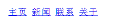
实例解析:
- display:inline; -默认情况下,<li>元素是块元素。在这里,我们删除换行符之前和之后每个列表项,以显示一行。
<!DOCTYPE html>
<html>
<head>
<meta charset="utf-8">
<title>菜鸟教程(runoob.com)</title>
<style>
ul
{
	list-style-type:none;
	margin:0;
	padding:0;
	padding-top:6px;
	padding-bottom:6px;
}
li
{
	display:inline;
}
a:link,a:visited
{
	font-weight:bold;
	color:#FFFFFF;
	background-color:#98bf21;
	text-align:center;
	padding:6px;
	text-decoration:none;
	text-transform:uppercase;
}
a:hover,a:active
{
	background-color:#7A991A;
}

</style>
</head>

<body>
<ul>
<li><a href="#home">主页</a></li>
<li><a href="#news">新闻</a></li>
<li><a href="#contact">联系</a></li>
<li><a href="#about">关于</a></li>
</ul>

<p><b>注意:</b>如果您只为 a 元素设置内边距(而不设置 ul 元素),那么链接会出现在 ul 元素之外。所以,我们为 ul 元素添加了 top 和 bottom 内边距。 </p>
</body>
</html>
浮动列表项
在上面的例子中链接有不同的宽度。
对于所有的链接宽度相等,浮动 <li>元素,并指定为 <a>元素的宽度:
<!DOCTYPE html>
<html>
<head>
<meta charset="utf-8">
<title>菜鸟教程(runoob.com)</title>
<style>
ul
{
	list-style-type:none;
	margin:0;
	padding:0;
	overflow:hidden;
}
li
{
	float:left;
	text-align:center;
}
a
{
	display:block;
	width:100px;
	background-color:#98bf21;
}
</style>
</head>

<body>
<ul>
<li><a href="#home">Home</a></li>
<li><a href="#news">News</a></li>
<li><a href="#contact">Contact</a></li>
<li><a href="#about">About</a></li>
</ul>

<p><b>注意:</b> 如果 !DOCTYPE 没有定义, floating 可以产生意想不到的结果.</p>

<p>背景颜色添加到链接中显示链接的区域。整个链接区域是可点击的,不仅仅是文本。</p>

<p><b>注意:</b> overflow:hidden 添加到 ul 元素,以防止 li 元素列表的外出。.</p>

</body>
</html>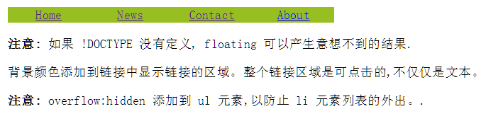
<!DOCTYPE html>
<html>
<head>
<meta charset="utf-8">
<title>菜鸟教程(runoob.com)</title>
<style>
ul
{
	list-style-type:none;
	margin:0;
	padding:0;
	overflow:hidden;
}
li
{
	float:left;
}
a:link,a:visited
{
	display:block;
	width:120px;
	font-weight:bold;
	color:#FFFFFF;
	background-color:#98bf21;
	text-align:center;
	padding:4px;
	text-decoration:none;
	text-transform:uppercase;
}
a:hover,a:active
{
	background-color:#7A991A;
}

</style>
</head>

<body>
<ul>
<li><a href="#home">主页</a></li>
<li><a href="#news">新闻</a></li>
<li><a href="#contact">联系</a></li>
<li><a href="#about">关于</a></li>
</ul>
</body>
</html>
激活/当前导航条实例
在点击了选项后,我们可以添加 "active" 类来标准哪个选项被选中:
<!DOCTYPE html>
<html>
<head>
<meta charset="utf-8">
<title>菜鸟教程(runoob.com)</title>
<style>
ul {
    list-style-type: none;
    margin: 0;
    padding: 0;
    overflow: hidden;
    background-color: #333;
}

li {
    float: left;
}

li a {
    display: block;
    color: white;
    text-align: center;
    padding: 14px 16px;
    text-decoration: none;
}

li a:hover:not(.active) {
    background-color: #111;
}

.active {
    background-color: #4CAF50;
}
</style>
</head>
<body>

<ul>
  <li><a class="active" href="#home">主页</a></li>
  <li><a href="#news">新闻</a></li>
  <li><a href="#contact">联系</a></li>
  <li><a href="#about">关于</a></li>
</ul>

</body>
</html>
链接右对齐
将导航条最右边的选项设置右对齐 (float:right;):
<!DOCTYPE html>
<html>
<head>
<meta charset="utf-8">
<title>菜鸟教程(runoob.com)</title>
<style>
ul {
    list-style-type: none;
    margin: 0;
    padding: 0;
    overflow: hidden;
    background-color: #333;
}

li {
    float: left;
}

li a {
    display: block;
    color: white;
    text-align: center;
    padding: 14px 16px;
    text-decoration: none;
}

li a:hover:not(.active) {
    background-color: #111;
}

.active {
    background-color: #4CAF50;
}
</style>
</head>
<body>

<ul>
  <li><a href="#home">主页</a></li>
  <li><a href="#news">新闻</a></li>
  <li><a href="#contact">联系</a></li>
  <li style="float:right"><a class="active" href="#about">关于</a></li>
</ul>

</body>
</html>
添加分割线
<li> 通过 border-right 样式来添加分割线:
<!DOCTYPE html>
<html>
<head>
<meta charset="utf-8">
<title>菜鸟教程(runoob.com)</title>
<style>
ul {
    list-style-type: none;
    margin: 0;
    padding: 0;
    overflow: hidden;
    background-color: #333;
}

li {
    float: left;
    border-right:2px solid #bbb;
}

li:last-child {
    border-right: none;
}

li a {
    display: block;
    color: white;
    text-align: center;
    padding: 14px 16px;
    text-decoration: none;
}

li a:hover:not(.active) {
    background-color: #111;
}

.active {
    background-color: #4CAF50;
}
</style>
</head>
<body>

<ul>
  <li><a class="active" href="#home">主页</a></li>
  <li><a href="#news">新闻</a></li>
  <li><a href="#contact">联系</a></li>
  <li style="float:right"><a href="#about">关于</a></li>
</ul>

</body>
</html>
固定导航条
可以设置页面的导航条固定在头部或者底部:
<!DOCTYPE html>
<html>
<head>
<meta charset="utf-8">
<title>菜鸟教程(runoob.com)</title>
<style>
body {margin:0;}

ul {
    list-style-type: none;
    margin: 0;
    padding: 0;
    overflow: hidden;
    background-color: #333;
    position: fixed;
    top: 0;
    width: 100%;
}

li {
    float: left;
}

li a {
    display: block;
    color: white;
    text-align: center;
    padding: 14px 16px;
    text-decoration: none;
}

li a:hover:not(.active) {
    background-color: #111;
}

.active {
    background-color: #4CAF50;
}
</style>
</head>
<body>

<ul>
  <li><a class="active" href="#home">主页</a></li>
  <li><a href="#news">新闻</a></li>
  <li><a href="#contact">联系</a></li>
  <li><a href="#about">关于</a></li>
</ul>

<div style="padding:20px;margin-top:30px;background-color:#1abc9c;height:1500px;">
<h1>Fixed Top Navigation Bar</h1>
<h2>Scroll this page to see the effect</h2>
<h2>The navigation bar will stay at the top of the page while scrolling</h2>

<p>Some text some text some text some text..</p>
<p>Some text some text some text some text..</p>
<p>Some text some text some text some text..</p>
<p>Some text some text some text some text..</p>
<p>Some text some text some text some text..</p>
<p>Some text some text some text some text..</p>
<p>Some text some text some text some text..</p>
<p>Some text some text some text some text..</p>
<p>Some text some text some text some text..</p>
<p>Some text some text some text some text..</p>
<p>Some text some text some text some text..</p>
<p>Some text some text some text some text..</p>
<p>Some text some text some text some text..</p>
<p>Some text some text some text some text..</p>
<p>Some text some text some text some text..</p>
<p>Some text some text some text some text..</p>
<p>Some text some text some text some text..</p>
<p>Some text some text some text some text..</p>
<p>Some text some text some text some text..</p>
<p>Some text some text some text some text..</p>
</div>

</body>
</html>
<!DOCTYPE html>
<html>
<head>
<meta charset="utf-8">
<title>菜鸟教程(runoob.com)</title>
<style>
body {margin:0;}

ul {
    list-style-type: none;
    margin: 0;
    padding: 0;
    overflow: hidden;
    background-color: #333;
    position: fixed;
    bottom: 0;
    width: 100%;
}

li {
    float: left;
}

li a {
    display: block;
    color: white;
    text-align: center;
    padding: 14px 16px;
    text-decoration: none;
}

li a:hover:not(.active) {
    background-color: #111;
}

.active {
    background-color: #4CAF50;
}
</style>
</head>
<body>

<ul>
  <li><a class="active" href="#home">主页</a></li>
  <li><a href="#news">新闻</a></li>
  <li><a href="#contact">联系</a></li>
  <li><a href="#about">关于</a></li>
</ul>

<div style="padding:20px;background-color:#1abc9c;height:1500px;">
<h1>Fixed Bottom Navigation Bar</h1>
<h2>Scroll this page to see the effect</h2>
<h2>The navigation bar will stay at the bottom of the page while scrolling</h2>

<p>Some text some text some text some text..</p>
<p>Some text some text some text some text..</p>
<p>Some text some text some text some text..</p>
<p>Some text some text some text some text..</p>
<p>Some text some text some text some text..</p>
<p>Some text some text some text some text..</p>
<p>Some text some text some text some text..</p>
<p>Some text some text some text some text..</p>
<p>Some text some text some text some text..</p>
<p>Some text some text some text some text..</p>
<p>Some text some text some text some text..</p>
<p>Some text some text some text some text..</p>
<p>Some text some text some text some text..</p>
<p>Some text some text some text some text..</p>
<p>Some text some text some text some text..</p>
<p>Some text some text some text some text..</p>
<p>Some text some text some text some text..</p>
<p>Some text some text some text some text..</p>
<p>Some text some text some text some text..</p>
<p>Some text some text some text some text..</p>
</div>

</body>
</html>
注意: 该实例可以在移动设备上使用。
导航条内部设置下拉菜单
<!DOCTYPE html>
<html>
<head>
<title>下拉菜单实例|菜鸟教程(runoob.com)</title>
<meta charset="utf-8">
<style>
  ul{
    list-style-type:none;
    margin:0;
    padding:0;
    overflow:hidden;
    background-color:#333;
  }

  li{
    float:left;
  }

  li a, .dropbtn
  {
    display:inline-block;
    color:white;
    text-align:center;
    padding:14px 16px;
    text-decoration:none;
  }

  li a:hover, .dropdown:hover, .dropbtn
  {
    background-color:#111;
  }

  .dropdown
  {
    display:inline-block;
  }

  .dropdown-content
  {
    display:none;
    position:absolute;
    background-color:#f9f9f9;
    min-width:160px;
    box-shadow:0px 8px 16px 0px rgba(0,0,0,0.2);
  }

  .dropdown-content a
  {
    color:black;
    padding:12px 16px;
    text-decoration:none;
    display:block;
  }

  .dropdown-content a:hover {background-color: #f1f1f1}

  .dropdown:hover .dropdown-content
  {
    display:block;
  }

  </style>
</head>
<body>

<ul>
  <li><a class="active" href="#home">主页</a></li>
  <li><a href="#news">新闻</a></li>
  <div class="dropdown">
    <a href="#" class="dropbtn">下拉菜单</a>
    <div class="dropdown-content">
      <a href="#">链接 1</a>
      <a href="#">链接 2</a>
      <a href="#">链接 3</a>
    </div>
  </div>
</ul>

<h3>导航栏上的下拉菜单</h3>
<p>鼠标移动到 "下拉菜单" 链接先显示下拉菜单。</p>

</body>
</html>


 2361
2361


 被折叠的 条评论
为什么被折叠?
被折叠的 条评论
为什么被折叠?
 到【灌水乐园】发言


