


概要
总结
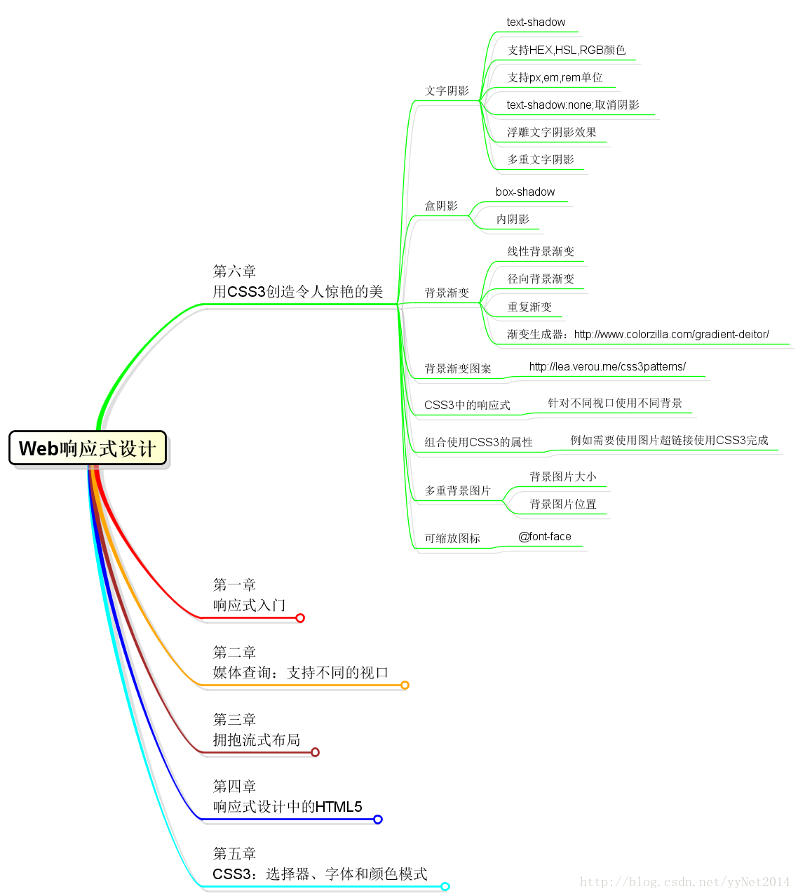
文字阴影 text-shadow
/*文字阴影*/
.textshadow p:first-child {
    /*右侧阴影 下方阴影 模糊距离 阴影颜色*/
    text-shadow: 1px 1px 1px #cccccc;
}
支持HEX,HSL,RGB颜色
/*支持HEX,HSL,RGB颜色*/
.textshadow :nth-child(2) {
    text-shadow: 4px 4px 4px hsla(140, 3%, 26%, 0.4);
}
支持px,em,rem单位
.textshadow :nth-child(3) {
    text-shadow: 0.1em 0.1em 0 #d7d7d7;
}
取消阴影
.textshadow em {
    text-shadow: none;
}
浮雕文字阴影效果
.textshadow :nth-child(4) {
    text-shadow: 0 1px 0 hsla(0, 0%, 100%, 0.75);
}
多重文字阴影
.textshadow :nth-child(5) {
    text-shadow: 0 1px 0 hsla(0, 0%, 100%, 0.75), 4px 4px 4px hsla(140, 3%, 26%, 0.4);
}
盒阴影
.boxshadow div:first-child {
    /*右侧阴影 下方阴影 模糊距离 阴影颜色*/
    -ms-box-shadow: 4px 4px 2px #ccc;
    -webkit-box-shadow: 4px 4px 2px #ccc;
    box-shadow: 4px 4px 2px #ccc;
}
内阴影
.boxshadow :nth-child(2) {
    -ms-box-shadow: inset 0 0 10px #000;
    -webkit-box-shadow: inset 0 0 10px #000;
    box-shadow: inset 0 0 10px #000;
}
多重阴影
.boxshadow :nth-child(3) {
    -ms-box-shadow: inset 0 0 10px hsl(0, 0%, 0%),
    inset 0 0 15px hsla(0, 97%, 53%, 1);
    -webkit-box-shadow: inset 0 0 10px hsl(0, 0%, 0%),
    inset 0 0 15px hsla(0, 97%, 53%, 1);
    box-shadow: inset 0 0 10px hsl(0, 0%, 0%),
    inset 0 0 15px hsla(0, 97%, 53%, 1);
}背景渐变(渐变生成器:http://www.colorzilla.com/gradient-deitor/)
线性背景渐变
.bggradient :nth-child(1) {
    /*渐变方向,渐变起始颜色 渐变起始位置,过渡颜色 过渡颜色位置,渐变结束颜色 渐变结束位置 */
    background: linear-gradient(90deg, #fff 0%, #e4e4e4 50%, #fff 100%);
}
径向渐变
.bggradient :nth-child(2) {
    /* 渐变形状 ,渐变起始颜色 起始渐变位置,过渡颜色 过渡渐变位置,渐变结束颜色 结束渐变位置*/
    background: radial-gradient(circle, #fff 40%, #e4e4e4 60%, #000 100%);
}
重复渐变
.bggradient :nth-child(3) {
    background: -webkit-repeating-radial-gradient(circle, white, lightblue 10%);
    background: -ms-repeating-radial-gradient(circle, white, lightblue 10%);
    background: repeating-radial-gradient(circle, white, lightblue 10%);
}背景渐变图案(http://lea.verou.me/css3patterns/)
.bggradient :nth-child(4) {
    background: linear-gradient(45deg, #92baac 45px, transparent 45px) 64px 64px,
    linear-gradient(45deg, #92baac 45px, transparent 45px, transparent 91px, #e1ebbd 91px, #e1ebbd 135px, transparent 135px),
    linear-gradient(-45deg, #92baac 23px, transparent 23px, transparent 68px, #92baac 68px, #92baac 113px, transparent 113px, transparent 158px, #92baac 158px);
    background-color: #e1ebbd;
    background-size: 128px 128px;
}
多重背景图片
body {
    background: url(../../images/oscar.png) top right no-repeat,
    url(../../images/bg.jpg) bottom left no-repeat;
    /*
    auto使用图片的原始大小;cover按照原始图片的长宽等比缩放以填充整个区域;contain按照原始图片的长宽等比缩放使其较长的一边适应元素大小;
    顺序对应图片顺序
    */
    background-size: auto, contain;
}
可缩放图标
使用@font-face制作可缩放图标
@font-face {
font-family: fontawesome;
font-weight: normal;
font-style: normal;
src: url('../../images/fontawesome.eot');
/* IE9*/
src: url('../../images/fontawesome.eot#iefix') format("eot"),
url('../../images/fontawesome.woff') format("woff"),
url('../../images/fontawesome.ttf') format("truetype"),
url('../../images/fontawesome.svg#fontawesome') format("svg");
/* iOS 4.1- */
}
.icon {
font-family: fontawesome;
-webkit-font-smoothing: antialiased;
}
.icon :nth-child(1):before {
content: "";
color: red;
font-size:12px;
}
.icon :nth-child(2):before {
content: "";
color: blue;
font-size:24px;
}


 255
255


 被折叠的 条评论
为什么被折叠?
被折叠的 条评论
为什么被折叠?
 到【灌水乐园】发言


