


RadioButton自定义样式
准备两张图片
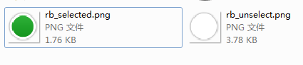
第一步:在drawable目录下,添加rb_normal_bg.xml
<?xml version="1.0" encoding="utf-8"?>
<selector xmlns:android="http://schemas.android.com/apk/res/android" >
     <item android:state_checked="true" android:drawable="@drawable/rb_selected" />
    <item android:state_checked="false" android:drawable="@drawable/rb_unselect" />
</selector>
第二步:
在values/styles.xml中添加
    <style name="rb_normal_style" parent="@android:style/Widget.CompoundButton.RadioButton">
        <item name="android:button">@drawable/rb_normal_bg</item>
    </style>
样式自定义完成。
使用自定义样式:
    <RadioGroup
        android:id="@+id/needpwd"
        android:layout_width="fill_parent"
        android:layout_height="wrap_content" >

        <RadioButton
            android:id="@+id/male"
            style="@style/rb_normal_style"
            android:text="男"
            />


        <RadioButton
            android:id="@+id/female"
            style="@style/rb_normal_style"
            android:checked="true"
            android:text="女"  />
    </RadioGroup>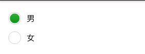
=========================================================================================
CheckBox自定义样式,方法和步骤与RadioButton一样
准备两个图片

第一步:在drawable目录下,添加my_checkbox_style.xml
<?xml version="1.0" encoding="utf-8"?>
<selector xmlns:android="http://schemas.android.com/apk/res/android">

  <item android:drawable="@drawable/cb_checked" android:state_checked="true"/>
 <!-- 选中时效果 -->
    <item android:drawable="@drawable/cb_normal" android:state_checked="false"/>
 <!-- 未选中时效果 -->

</selector>
第二步:在values/styles.xml中添加
    <style name="MyCheckBox" parent="@android:style/Widget.CompoundButton.CheckBox">
        <item name="android:button">@drawable/my_checkbox_style</item>
    </style>
自定义完成。
使用方式:
                <CheckBox
                    android:id="@+id/cb_needphonecode_step2_noNeedPwdAll"
                    style="@style/MyCheckBox"
                    android:layout_width="wrap_content"
                    android:layout_height="wrap_content"
                    android:layout_marginLeft="12dip"
                    android:checked="true" />
<CheckBox
android:id="@+id/cb_needphonecode_step2_noNeedPwd"
style="@style/MyCheckBox"
android:layout_width="wrap_content"
android:layout_height="wrap_content"
android:layout_marginLeft="12dip" />


 6416
6416


 被折叠的 条评论
为什么被折叠?
被折叠的 条评论
为什么被折叠?
 到【灌水乐园】发言


