


Asp.net Ajax Control Toolkit设计编程备忘录(色眼窥观版)——第5回(错不了专辑)

 色即设——设计,从网页设计师的角度出发。因为自己的的特殊性(本身是软件工程师,但是对网页设计却有浓厚的兴趣),所以我的此系列文章不仅仅从编程角度出发,还将从设计的角度出发来细数AjaxControlToolkit系列控件,告诉你这些控件最终的结构表现形式、样式,还有如何修改他们的样式使之适合于你的网页整体规划。
窥,小视也——《说文》,此小视非必小视呀。此小视的意思是:水平有限,不能望其全貌,仅能管中窥豹。所以很多地方还请高人指点则个。
相关链接:
Asp.net Ajax Control Toolkit设计编程备忘录(色眼窥观版)——第1回(柿子专辑)
Asp.net Ajax Control Toolkit设计编程备忘录(色眼窥观版)——第2回(F4专辑)
Asp.net Ajax Control Toolkit设计编程备忘录(色眼窥观版)——第3回(UE专辑)
Asp.net Ajax Control Toolkit设计编程备忘录(色眼窥观版)——第4回(忍者专辑)
Asp.net Ajax Control Toolkit设计编程备忘录(色眼窥观版)——第5回(错不了专辑)
Asp.net Ajax Control Toolkit设计编程备忘录(色眼窥观版)——第6回(习惯专辑)
正文:
闲话:
抱歉,因为最近项目有点紧张,所以这么长时间才放出如此质量的文章,是在是过意不去。最近项目弥漫着不利的因素,连续几个PG跳槽,还有几个主力甚至一个项目经理要去日本,让项目的人力资源严重吃紧,而公司却又迟迟找不到能满足要求的新员工。多嘴一句:现在的本科毕业生是不是真的都是被网游毒害的一代?为什么来公司面试的10多个本科生我们部门的技术老大于何竟然连一个都没有要。本科毕业生真的不堪至此吗?哦,对了,昨天还写了一篇“哗众取宠”的文章《 web标准不标准》,有兴趣的朋友可以去看一下 :-)
keyword:ajax FilteredTextBox,ajax MaskedEdit,ajax ValidatorCallout,asp.net ajax,ajax教程,ajax基础教程,ajax技术,ajax.net,asp ajax,ajax设计,ajax网页设计,ajax表现
相关链接:
Asp.net Ajax Control Toolkit设计编程备忘录(色眼窥观版)——第1回(柿子专辑)
Asp.net Ajax Control Toolkit设计编程备忘录(色眼窥观版)——第2回(F4专辑)
Asp.net Ajax Control Toolkit设计编程备忘录(色眼窥观版)——第3回(UE专辑)
Asp.net Ajax Control Toolkit设计编程备忘录(色眼窥观版)——第4回(忍者专辑)
Asp.net Ajax Control Toolkit设计编程备忘录(色眼窥观版)——第5回(错不了专辑)
Asp.net Ajax Control Toolkit设计编程备忘录(色眼窥观版)——第6回(习惯专辑)
正文:
15.ValidatorCallout
事后提示的代表,但是它和传统的验证控件却有着很大的不同,它对于错误位置的定位以及错误信息的定制比传统验证控件更强大。控件定制的强大再加上你的智慧它就能有更好的表现。
先说控件属性,控件属性比较简单如下:
先说控件属性,控件属性比较简单如下:
- TargetControlID - The ID of the Validator to extend【目标验证控件,注:是验证控件,不是文本框】
- Width - The width of the callout【错误提示框宽度】
- HighlightCssClass - A CssClass to apply to the invalid field【验证失败时,验证目标控件样式】
- WarningIconImageUrl - The path to a custom warning icon image【警告图标】
- CloseImageUrl - The path to a custom close image【关闭图标】
传统的验证方法都是采用事后提示这种方法,而ValidatorCallout控件也是,这就是形成了它的一种优势——符合用户使用习惯。但是我们不能否认的是“事中引导”的方式比“事后提示”有更好的用户体验度。如果能将“用户使用习惯”和“用户体验”结合起来,那将是“鱼和熊掌兼得”的美事。小弟才疏,在此仅能给个思路:验证仍然是事后验证,但是在提示错误的同时给出可能正确的选项供用户选择来引导用户。这样就能有效的帮助用户回避一件最讨厌做的事情——打字!从而提高用户的网站体验度。具体效果参看下图:

posted on 2007-07-22 22:22
杨正祎
不要在意玩笑本身,请留意图片要表现的思想 :-)
顺便说一下,这个控件的DOM结构很让人失望(如下图),完全是采用table在布局,看来web标准设计的路真的还有很长的路要走。
顺便说一下,这个控件的DOM结构很让人失望(如下图),完全是采用table在布局,看来web标准设计的路真的还有很长的路要走。

闲话:
抱歉,因为最近项目有点紧张,所以这么长时间才放出如此质量的文章,是在是过意不去。最近项目弥漫着不利的因素,连续几个PG跳槽,还有几个主力甚至一个项目经理要去日本,让项目的人力资源严重吃紧,而公司却又迟迟找不到能满足要求的新员工。多嘴一句:现在的本科毕业生是不是真的都是被网游毒害的一代?为什么来公司面试的10多个本科生我们部门的技术老大于何竟然连一个都没有要。本科毕业生真的不堪至此吗?哦,对了,昨天还写了一篇“哗众取宠”的文章《 web标准不标准》,有兴趣的朋友可以去看一下 :-)
keyword:ajax FilteredTextBox,ajax MaskedEdit,ajax ValidatorCallout,asp.net ajax,ajax教程,ajax基础教程,ajax技术,ajax.net,asp ajax,ajax设计,ajax网页设计,ajax表现
“如何确保用户输入数据的有效性?”
 ——几乎所有的网站都无法回避这个问题。回答方法很简单——验证!但是怎么去验证却有很多的讲究。现在已经不能像几年前粗暴的“砰”“砰”地弹Alert对话框了。因为现在的所谓的web2.0网站已经不是多年前网站提供内容供浏览者浏览的运营方式,而是用户提供内容来充实网站。所以任何粗暴的对待用户的做法都是网站在自寻死路。那么如何才能更友好、更有效的验证用户输入数据的有效性呢?微软Asp.net Ajax Control Toolkit中的几个控件提供了我们一些思路。
——几乎所有的网站都无法回避这个问题。回答方法很简单——验证!但是怎么去验证却有很多的讲究。现在已经不能像几年前粗暴的“砰”“砰”地弹Alert对话框了。因为现在的所谓的web2.0网站已经不是多年前网站提供内容供浏览者浏览的运营方式,而是用户提供内容来充实网站。所以任何粗暴的对待用户的做法都是网站在自寻死路。那么如何才能更友好、更有效的验证用户输入数据的有效性呢?微软Asp.net Ajax Control Toolkit中的几个控件提供了我们一些思路。
如何验证用户输入数据的有效性的方法按过程分大致有以下三种:
l 事前限制:对无效数据进行屏蔽,使得用户无法输入无效数据。如:FilteredTextBox控件。它不会提示你任何错误信息,因为它不会让你输入错误数据。这种控件对“用户输入的无效数据”处理方法是“
堵”。
l 事中引导:当用户在输入数据时,给予用户有效数据格式的提示,以引导用户输入有效的数据。如:MaskedEdit控件。这种控件对“用户输入的无效数据”处理方法是“
导”。
l 事后提示:当用户点击提交按钮的时候,验证数据有效性,并对无效数据提示错误。如:传统的验证控件和ValidatorCallout控件。传统的网页验证都是采用这种方法。只是事后提示的方法不一样罢了。最糟糕的当然是“砰”“砰”地弹Alert对话框。好一些的就是在页面上用鲜艳的颜色或者图标提示错误信息,并标注出错误的地方。但是ValidatorCallout控件给予了这种验证方式一种新的表现形式。这种控件对“用户输入的无效数据”处理方法是“
查”。
好了,我们就进入今天的主题——“错不了”的主题吧。
1 3 . FilteredTextBox
1 3 . FilteredTextBox
“事前验证”验证类型的代表,我个人感觉这种“堵”的方法给予用户体验是很差的,因为你用比较粗暴的方式告诉我“不准做”!“不准”这个词是很粗暴和不敬的,这让我想到现实生活中的一个例子:那天我陪女朋友在苏州观前街逛街时,进入一家饰品店,在头花区,可能是店家怕试戴的用户太多商品不好卖了,所以就在墙上贴了个纸条,上面写着“不准戴”后面还加上了强调作用的感叹号。我不知道其它的顾客看到这个纸条会有什么想法,但是我却是立刻想到了网站中用词的重要性。顺便举个网站用词的例子,关于百度的。在百度主题推广申请通过的回复邮件中,百度一开始使用的是“百度主题推广已经批准了你的申请”而后来却改为了“恭喜您加入百度主题推广”,哪句能给用户更好的体验一目了然。
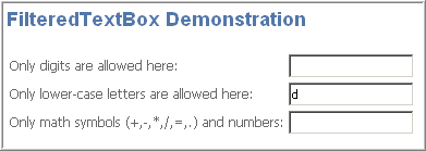
FilteredTextBox控件只有“神”没有“形”, 对于此控件没有什么好说的。所以就直接给张官方Ajax实例网站中的截图吧。
FilteredTextBox控件只有“神”没有“形”, 对于此控件没有什么好说的。所以就直接给张官方Ajax实例网站中的截图吧。
属性也比较简单,如下:
- TargetControlID - The ID of the text box for this extender to operate on【目标文本框控件】
- FilterType - A the type of filter to apply, as a comma-separated combination of Numbers, LowercaseLetters, UppercaseLetters, and Custom. If Custom is specified, the ValidChars field will be used in addition to other settings such as Numbers.【过滤类型】
- ValidChars - A string consisting of all characters considered valid for the text field, if "Custom" is specified as the field type. Otherwise this parameter is ignored.【有效字符】
1
4
.
MaskedEdit
事中引导验证的代表。我个人觉得这种方法验证是极好的一种确保数据有效性方式,友好而有效。
Mask这个词,直译是面具,但是我更倾向于PhotoShop对这个词的翻译——“蒙板”。这个控件看上去稍微有点复杂,有着多的让人窒息的属性。但是值得庆幸的是:这些东西都是有规律的,虽然数量不少,但是没有什么难以理解的属性。
说它稍微有点复杂还因为它和其他的控件不同,它其实是有两个部分组成的。它们分别是: MaskedEditExtender和 MaskedEditValidator 。它们各自拥有的属性。
事中引导验证的代表。我个人觉得这种方法验证是极好的一种确保数据有效性方式,友好而有效。
Mask这个词,直译是面具,但是我更倾向于PhotoShop对这个词的翻译——“蒙板”。这个控件看上去稍微有点复杂,有着多的让人窒息的属性。但是值得庆幸的是:这些东西都是有规律的,虽然数量不少,但是没有什么难以理解的属性。
说它稍微有点复杂还因为它和其他的控件不同,它其实是有两个部分组成的。它们分别是: MaskedEditExtender和 MaskedEditValidator 。它们各自拥有的属性。
MaskedEditExtender
的属性:
- Mask Characters 【蒙板字符】
9 - Only a numeric character
L - Only a letter
$ - Only a letter or a space
C - Only a custom character (case sensitive)
A - Only a letter or a custom character
N - Only a numeric or custom character
? - Any character - Mask Delimiters【蒙板分隔符】
/ - Date separator
: - Time separator
. - Decimal separator
, - Thousand separator
/ - Escape character
{ - Initial delimiter for repetition of masks
} - Final delimiter for repetition of masks - Examples:【蒙板示例】
9999999 - Seven numeric characters (equivalent to 9{7})
99//99 - Four numeric characters separated in the middle by a "/" - AcceptAMPM - Whether an AM/PM symbol is displayed.【是否显示AM/PM】
You can change between AM/PM by pressing 'A' or 'P'.【你可以通过按A或者P按钮切换】
The default value is false. - AcceptNegative - Accepts the negative sign (-).【显示符号的方式】
The default value is None.
None - do not show the negative sign
Left - show the negative sign on the left of the mask
Right - show the negative sign on the right of the mask - AutoComplete - Whether to automatically complete any empty mask characters not filled in by the user. AutoComplete can be used when ValidType is Date, Time, or Number.
The default value is true.【是否允许自动完成】
If ValidType="Number" or ValidType="Time", empty mask characters will be filled with zeros.
If ValidType="Date", empty mask characters will be filled with the current date if they are all empty; otherwise remaining characters will filled in with zeros. - AutoCompleteValue - Default value to be used when AutoComplete is enabled. It is only used when ValidType="Date" or ValidType="Time".【自动完成的值】
Overwrite Current Date or Time. - Century - Default century used when a date mask only has two digits for the year (so setting Century="2000" will interpret 01/01/07 as January 1st, 2007).【年份显示方式】
- DisplayMoney - How the currency symbol is displayed. The default value is None.【金额的显示方式】
None - do not show the currency symbol
Left - show the currency symbol on the left of the mask
Right - show the currency symbol on the right of the mask - InputDirection - Text input direction【输入文本流向】
LeftToRight - Left to Right (Default)
RightToLeft - Right to left. - MaskType - Type of validation to perform:【蒙板类型(重要的属性)】
None - No validation (default)
Number - Number validation
Date - Date validation
Time - Time validation - MessageValidatorTip - Message to display when editing in textbox.【开始输入时,显示的提示文言】
- OnFocusCssClass - Name of CSS class to use when the control receives focus【目标控件获得焦点时样式】
- OnFocusCssNegative - Name of CSS class to use when the control with a negative value gets focus【如果允许负号,目标控件获得焦点时的样式】
- OnBlurCssNegative - Name of CSS class to use when the control with a negative value loses focus【如果允许负号,目标控件失去焦点时的样式】
- OnInvalidCssClass - Name of CSS class to use when the control is not valid【验证不通过时目标控件的样式】
- PromptChararacter - Prompt character to indicate masked characters not yet entered. The default value is "_".【未输入时显示的提示字符】
MaskedEditValidator
的属性:
- ControlToValidate - ID of the textbox to validate.【需要验证的目标控件】
- ControlExtender - ID of the MaskedEditExtender attached to the textbox【配合使用的MaskedEditExtender】
- ClientValidationFunction - Client script used for custom validation【客户端验证函数】
- InitialValue - Initial value of the field to be validated. The default value is empty.【初始值】
- AcceptAMPM - Whether or not AM/PM is accepted on times.【是否显示AM/PM】
The default value is false. - IsValidEmpty - Whether the textbox can be empty. The default value is true. If false, the RequiredValidator is executed.【是否验证空值】
- MaximumValue - The maximum value of the input. If set, CompareValidator is executed【最大值】
- MinimumValue - The minimum value of the input. If set, CompareValidator is executed【最小值】
- MessageEmpty - Text message when RequiredValidator is executed【空值错误提示】
- MaximumValueMessage - Text message displayed when MaximumValue CompareValidator fails【最大值错误提示】
- MinimumValueMessage - Text message displayed when MinimumValue CompareValidator fails【最小值错误提示】
- InvalidValueMessage - Text message displayed when DataTypeValidator fails. The DatatypeValidator gets its type from the ControlExtender and is always executed.【无效值错误提示】
- TooltipMessage - Message displayed when the textbox has focus and an empty value.【验证目标控件获得焦点时提示信息】
- ValidationExpression - Regular expression used to validate the input.【验证表达式】
为了验证不同的数据类型,这个控件引入了MaskType的概念,也正是这个概念,让这个控件显的稍微有点复杂,因为不同的蒙板类型对应了不同的属性,导致了这个控件的属性很多。鉴于这个控件稍微有点复杂,所以就提供一个比较完整的例子,是用来验证时间的。

代码片段如下:

 <
style
type
="text/css"
>
<
style
type
="text/css"
>


 body{}{
 font-size:9pt;
 } .MaskedEditFocus{}{ background-color:pink; } .MaskedEditError{}{ background-color:deeppink; } #MaskedEditValidator1{}{ font-size:120%; padding:2px 20px; background:url('images/warningico.png') no-repeat; }
 </
style
>
</
style
>
 <
cc1:ToolkitScriptManager
ID
="ToolkitScriptManager1"
runat
="server"
>
</
cc1:ToolkitScriptManager
>
<
asp:TextBox
ID
="TextBox1"
runat
="server"
ValidationGroup
="Demo1"
Width
="80px"
></
asp:TextBox
>
<
cc1:MaskedEditExtender
ID
="MaskedEditExtender1"
runat
="server"
TargetControlID
="TextBox1"
Mask
="99:99:99"
MessageValidatorTip
="true"
MaskType
="Time"
AcceptAMPM
="True"
OnFocusCssClass
="MaskedEditFocus"
OnInvalidCssClass
="MaskedEditError"
>
</
cc1:MaskedEditExtender
>
<
cc1:MaskedEditValidator
ID
="MaskedEditValidator1"
runat
="server"
ControlToValidate
="TextBox1"
ControlExtender
="MaskedEditExtender1"
IsValidEmpty
="False"
EmptyValueMessage
="Time is required"
InvalidValueMessage
="Time is invalid"
ValidationGroup
="Demo1"
TooltipMessage
="Input a time"
>
<
cc1:ToolkitScriptManager
ID
="ToolkitScriptManager1"
runat
="server"
>
</
cc1:ToolkitScriptManager
>
<
asp:TextBox
ID
="TextBox1"
runat
="server"
ValidationGroup
="Demo1"
Width
="80px"
></
asp:TextBox
>
<
cc1:MaskedEditExtender
ID
="MaskedEditExtender1"
runat
="server"
TargetControlID
="TextBox1"
Mask
="99:99:99"
MessageValidatorTip
="true"
MaskType
="Time"
AcceptAMPM
="True"
OnFocusCssClass
="MaskedEditFocus"
OnInvalidCssClass
="MaskedEditError"
>
</
cc1:MaskedEditExtender
>
<
cc1:MaskedEditValidator
ID
="MaskedEditValidator1"
runat
="server"
ControlToValidate
="TextBox1"
ControlExtender
="MaskedEditExtender1"
IsValidEmpty
="False"
EmptyValueMessage
="Time is required"
InvalidValueMessage
="Time is invalid"
ValidationGroup
="Demo1"
TooltipMessage
="Input a time"
>


 236
236


 被折叠的 条评论
为什么被折叠?
被折叠的 条评论
为什么被折叠?
 到【灌水乐园】发言


