


画图能够使我们直观的分析数据的特点,图形画的清晰易懂能使我们更好的找到数据的特征,发现其中的规律。
参考链接
https://matplotlib.org/users/pyplot_tutorial.html plot()函数的官方文档
https://www.zealseeker.com/archives/matplotlib-legend-and-text-label/ 讲解了图例和标注
http://note4code.com/2015/03/30/%E4%BD%BF%E7%94%A8matplotlib%E7%BB%98%E5%88%B6%E6%95%A3%E7%82%B9%E5%9B%BE/ 散点图样例
https://github.com/Phlya/adjustText/blob/master/examples/Examples.ipynb 关于标注的详细例子,非常非常好
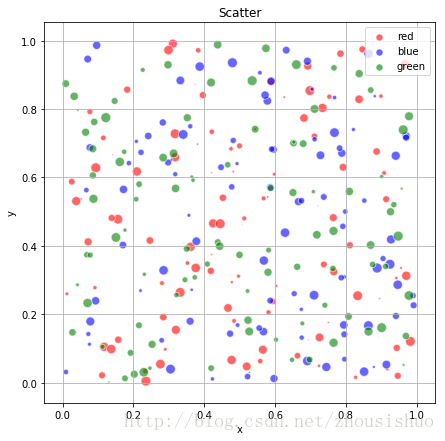
1.使用scatter()画散点图
import matplotlib.pyplot as plt
import numpy as np

n = 100
plt.figure(figsize=(7,7))
for color in ['red','blue','green']:
    x, y = np.random.rand(2, n)
    scale = 100*np.random.rand(n)
    #s 表示散点的大小,形如 shape (n, )
    #label 表示显示在图例中的标注
    #alpha 是 RGBA 颜色的透明分量
    #edgecolors 指定三点圆周的颜色
    plt.scatter(x,y,c=color,s=scale,label=color,alpha=0.6,edgecolors='white')
plt.title('Scatter')
plt.xlabel('x')
plt.ylabel('y')
plt.legend(loc='best')
plt.grid(True)
plt.show()
结果如图
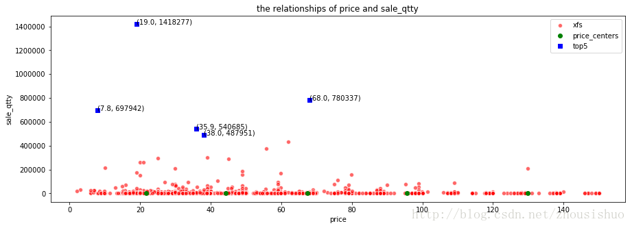
2.使用plot()函数实现
数据资源请访问链接http://download.csdn.net/download/zhousishuo/9973961
import pandas as pd
import numpy as np
from sklearn.cluster import KMeans
import matplotlib.pyplot as plt

data = pd.read_csv("xfs.csv")
df_xfs = data.sort_values(['brand_code', 'red_price']).drop("brand_code",axis=1)
#只选取价格不大于150的
df_xfs = df_xfs[df_xfs.red_price<=150]

#这段代码是为了找出聚类价格的中心点,通过查看有几个销量峰值来确定
#销量前十五
top15_qtty = df_xfs.drop("red_price",axis=1).sort_values("sale_qtty",ascending=False).head(n=15)
#前十五销量的均值
avg_qtty = top15_qtty["sale_qtty"].mean()
#找到大于前15销量均值的个数
center_num = top15_qtty[top15_qtty.sale_qtty>avg_qtty].count()["sale_qtty"]

fig = plt.figure(figsize=(15,5))
ax1 = fig.add_subplot(1,1,1)
#参数ms是markersize的缩写,来控制圆的大小。alpha是RGBA 颜色的透明分量。mec是markeredgecolor缩写,指定圆周颜色。
ax1.plot(df_xfs["red_price"], df_xfs["sale_qtty"],'ro',label='xfs',alpha=0.6,ms=6,mec='white')
#画k-means找到的聚类中心点
xfsMatrix = df_xfs.drop("sale_qtty",axis=1).as_matrix()
xfs_kmeans = KMeans(n_clusters=center_num, random_state=0).fit(xfsMatrix)
# print(xfs_kmeans.cluster_centers_)
xfs_pd = pd.DataFrame(xfs_kmeans.cluster_centers_, columns = ['red_price'])
#这是一个二维的坐标轴,如果不加"sale_qtty"这一列,会在同一坐标轴x上重建坐标,达不到效果
xfs_pd["sale_qtty"] = 0
# print(xfs_pd)
ax1.plot(xfs_pd["red_price"],xfs_pd["sale_qtty"],'go',label='price_centers')

#画出前center_num的销量点
df_topn = df_xfs.sort_values("sale_qtty",ascending=False).head(n=center_num)
topname = 'top' + str(center_num)
ax1.plot(df_topn["red_price"],df_topn["sale_qtty"],'bs',label=topname)
ax1.legend(loc='best')
#为X轴设置一个名称
ax1.set_xlabel("price")
#为Y轴设置一个名称
ax1.set_ylabel("sale_qtty")
#设置一个标题
ax1.set_title('the relationships of price and sale_qtty')

#构造销量前centers_num的坐标
x_price = df_topn["red_price"].as_matrix()
y_qtty = df_topn["sale_qtty"].as_matrix()
text = []
texts = []
for i in range(len(x_price)):
    text.append("("+str(x_price[i])+", "+str(y_qtty[i])+")")

for x, y, s in zip(x_price, y_qtty, text):
    texts.append(plt.text(x, y, s))
plt.show()
结果如图


 5343
5343


 被折叠的 条评论
为什么被折叠?
被折叠的 条评论
为什么被折叠?
 到【灌水乐园】发言


