


首先,说说实现的效果:
1、图片的展示与翻页;
2、点击图片放大图片。
实现的效果如下所示:
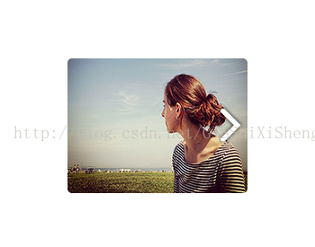
初始化和第一张
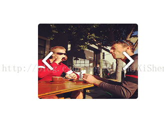
中间的图片

最后一张图片
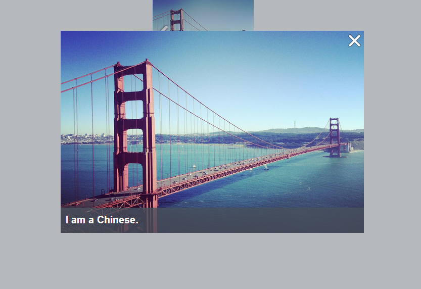
单击放大显示图片详细与信息
实现的内容很简单,是常规图片的展示方式,下面说说我的实现思路。
1、图片的展示与翻页
a、图片展示
图片展示是通过<img />标签实现的:
<div class="container">
    <div class="image-list">
        <div id="prev" οnclick="updateImage('prev')"></div>
        <a id="img1" class="thumb-a" οnclick="showImg(1)">
            <img class="thumb-img" width="200" height="150" src="img/demopage/thumb-1.jpg" alt="" />
        </a>
        <a  id="img2" class="thumb-a thumb-a-hide" οnclick="showImg(2)">
            <img class="thumb-img" width="200" height="150" src="img/demopage/thumb-2.jpg" alt="" />
        </a>
        <a  id="img3" class="thumb-a thumb-a-hide" οnclick="showImg(3)">
            <img class="thumb-img" width="200" height="150" src="img/demopage/thumb-3.jpg" alt="" />
        </a>
        <div id="next"  οnclick="updateImage('next')"></div>
    </div>
</div>翻页是通过updateImage这个函数实现的,传递参数为type,判断操作时“上一张”还是“下一张”,updateImage函数如下:
        function updateImage(type){
            if(type==="prev"){
                if(imgIndex>1){
                    imgIndex=imgIndex-1;
                }
            }
            else{
                if(imgIndex<3){
                    imgIndex=imgIndex+1;
                }
            }
            for(var i=0;i<3;i++){
                $("#img"+(i+1)).addClass("thumb-a-hide");
            }
            $("#img"+imgIndex).removeClass("thumb-a-hide");

            if(imgIndex===3){
                $("#next").hide();
            }
            else{
                $("#next").show();
            }
            if(imgIndex===1){
                $("#prev").hide();
            }
            else{
                $("#prev").show();
            }
};①、判断操作类型,并设置操作后的图片的编号。
②、循环添加thumb-a-hide样式,隐藏所有的图片,并移除图片编号为imgIndex的thumb-a-hide样式,显示图片;
③、根据imgIndex判断操作按钮的显示与隐藏。
2、点击显示图片详情与信息
该效果通过函数showImg实现,showImg的具体内容如下:
        function showImg(index){
            var width=600,height=400;
            var winWidth = $(window).width(),winHeight = $(window).height();
            var modalBg = $("<div></div>");
            modalBg.addClass("modal-bg");
            modalBg.appendTo($('body'));
            var modal = $("<div></div>");
            modal.addClass("modal");
            modal.css("position","absolute")
                 .css("top",(winHeight-height)/2+"px")
                 .css("left",(winWidth-width)/2+"px");
            var titleTipsBg = $("<div></div>").addClass("tips-bg");
            var titleTips = $("<a></a>").addClass("tips").html("I am a Chinese.");
            var titleClose =  $("<a></a>").addClass("close");
            var title = $("<div></div>");
            title.addClass("title");
            title.append(titleTipsBg)
                 .append(titleTips)
                 .append(titleClose);
            titleClose.on("click",function(){
                modalBg.hide();
                modal.hide();
            });
            title.appendTo(modal);
            var img = $("<img>").attr("width",width)
                                 .attr("height",height)
                                 .attr("src","img/demopage/image-"+index+".jpg");
            var imgDiv = $("<div></div>").append(img);
            imgDiv.appendTo(modal);
            modal.appendTo($('body'));
        }
上述代码生成Html代码之后如下:
<div class="modal-bg"></div>
<div class="modal" style="position: absolute; top: 270px; left: 540px;">
	<div class="title">
		<div class="tips-bg"></div>
		<a class="tips">I am a Chinese.</a>
		<a class="close"></a>
	</div>
	<div>
		<img width="600" height="400" src="img/demopage/image-1.jpg">
	</div>
</div>
其实是创建了一个模态层来显示放大图片。
上面,涉及到的CSS样式内容如下:
    <style type="text/css">
        html, body, .modal-bg {
            height: 100%;
            margin: 0;
            padding: 0;
            font-size: 13px;
            font-weight: bold;
            color: #fff;
        }
        .modal-bg{
            position: absolute;
            left: 0px;
            top: 0px;
            width: 100%;
            background: #48525e;
            opacity: 0.4;
            z-index: 10;
        }
        .modal{
            position: relative;
            z-index: 99;
            opacity: 1;
            top: 15%;
            left: 40%;
            width: 600px;
            height: 400px;
        }
        .modal .title .tips-bg{
            position: absolute;
            bottom: 0px;
            left: 0px;
            background: #48525e;
            width: 100%;
            height: 50px;
            opacity: 0.8;
        }
        .modal .title .tips{
            position: absolute;
            bottom: 13px;
            left: 10px;
            font-family: "Arial";
            font-weight: bold;
            font-size: 20px;
        }
        .modal .title .close{
            background: url(img/close.png) no-repeat;
            width: 27px;
            height: 27px;
            position: absolute;
            top: 5px;
            right: 5px;
        }
        .modal .title .close:hover{
            cursor: pointer;
        }
        .container{
            position: absolute;
            top: 200px;
            text-align: center;
            width: 100%;
            z-index: 5;
        }
        .image-list{
            width:300px;
            margin-left: 40%;
            position: relative;
        }
        #prev{
            display: none;
            position: absolute;
            top: 55px;
            left: 35px;
            float: left;
            width: 45px;
            height: 50px;
            background: url(img/prev.png);
        }
        #next{
            position: absolute;
            top: 55px;
            right: 40px;
            width: 45px;
            height: 50px;
            background: url(img/next.png);
        }
        #prev:hover,#next:hover{
            cursor: pointer;
        }
        .thumb-a{
            display:inline-block;
            padding:4px;
            margin:0 0.5rem 1rem 0.5rem 1rem;
            line-height:0;
            -webkit-transition:background-color 0.1s ease-out;
            -moz-transition:background-color 0.1s ease-out;
            -o-transition:background-color 0.1s ease-out;
            transition:background-color 0.1s ease-out;
            -webkit-border-radius:6px;
            -moz-border-radius:6px;
            -ms-border-radius:6px;
            -o-border-radius:6px;
            border-radius:6px
        }
        .thumb-a:hover{
            background-color:#4ae;
            cursor: pointer;
        }
        .thumb-a-hide{
            display: none;
        }
        .thumb-img{
            -webkit-border-radius:5px;
            -moz-border-radius:5px;
            -ms-border-radius:5px;
            -o-border-radius:5px;
            border-radius:5px
        }
    </style>
至此,图片集显示就完成了,完整html代码如下:
<!DOCTYPE html>
<html>
<head>
    <meta charset="utf-8">
    <title>Image List</title>
    <style type="text/css">
        html, body, .modal-bg {
            height: 100%;
            margin: 0;
            padding: 0;
            font-size: 13px;
            font-weight: bold;
            color: #fff;
        }
        .modal-bg{
            position: absolute;
            left: 0px;
            top: 0px;
            width: 100%;
            background: #48525e;
            opacity: 0.4;
            z-index: 10;
        }
        .modal{
            position: relative;
            z-index: 99;
            opacity: 1;
            top: 15%;
            left: 40%;
            width: 600px;
            height: 400px;
        }
        .modal .title .tips-bg{
            position: absolute;
            bottom: 0px;
            left: 0px;
            background: #48525e;
            width: 100%;
            height: 50px;
            opacity: 0.8;
        }
        .modal .title .tips{
            position: absolute;
            bottom: 13px;
            left: 10px;
            font-family: "Arial";
            font-weight: bold;
            font-size: 20px;
        }
        .modal .title .close{
            background: url(img/close.png) no-repeat;
            width: 27px;
            height: 27px;
            position: absolute;
            top: 5px;
            right: 5px;
        }
        .modal .title .close:hover{
            cursor: pointer;
        }
        .container{
            position: absolute;
            top: 200px;
            text-align: center;
            width: 100%;
            z-index: 5;
        }
        .image-list{
            width:300px;
            margin-left: 40%;
            position: relative;
        }
        #prev{
            display: none;
            position: absolute;
            top: 55px;
            left: 35px;
            float: left;
            width: 45px;
            height: 50px;
            background: url(img/prev.png);
        }
        #next{
            position: absolute;
            top: 55px;
            right: 40px;
            width: 45px;
            height: 50px;
            background: url(img/next.png);
        }
        #prev:hover,#next:hover{
            cursor: pointer;
        }
        .thumb-a{
            display:inline-block;
            padding:4px;
            margin:0 0.5rem 1rem 0.5rem 1rem;
            line-height:0;
            -webkit-transition:background-color 0.1s ease-out;
            -moz-transition:background-color 0.1s ease-out;
            -o-transition:background-color 0.1s ease-out;
            transition:background-color 0.1s ease-out;
            -webkit-border-radius:6px;
            -moz-border-radius:6px;
            -ms-border-radius:6px;
            -o-border-radius:6px;
            border-radius:6px
        }
        .thumb-a:hover{
            background-color:#4ae;
            cursor: pointer;
        }
        .thumb-a-hide{
            display: none;
        }
        .thumb-img{
            -webkit-border-radius:5px;
            -moz-border-radius:5px;
            -ms-border-radius:5px;
            -o-border-radius:5px;
            border-radius:5px
        }
    </style>
    <script src="js/jquery-1.8.3.js"></script>
    <script>
        var imgIndex = 1;
        function showImg(index){
            var width=600,height=400;
            var winWidth = $(window).width(),winHeight = $(window).height();
            var modalBg = $("<div></div>");
            modalBg.addClass("modal-bg");
            modalBg.appendTo($('body'));
            var modal = $("<div></div>");
            modal.addClass("modal");
            modal.css("position","absolute")
                 .css("top",(winHeight-height)/2+"px")
                 .css("left",(winWidth-width)/2+"px");
            var titleTipsBg = $("<div></div>").addClass("tips-bg");
            var titleTips = $("<a></a>").addClass("tips").html("I am a Chinese.");
            var titleClose =  $("<a></a>").addClass("close");
            var title = $("<div></div>");
            title.addClass("title");
            title.append(titleTipsBg)
                 .append(titleTips)
                 .append(titleClose);
            titleClose.on("click",function(){
                modalBg.hide();
                modal.hide();
            });
            title.appendTo(modal);
            var img = $("<img>").attr("width",width)
                                 .attr("height",height)
                                 .attr("src","img/demopage/image-"+index+".jpg");
            var imgDiv = $("<div></div>").append(img);
            imgDiv.appendTo(modal);
            modal.appendTo($('body'));
        }
        function updateImage(type){
            if(type==="prev"){
                if(imgIndex>1){
                    imgIndex=imgIndex-1;
                }
            }
            else{
                if(imgIndex<3){
                    imgIndex=imgIndex+1;
                }
            }
            for(var i=0;i<3;i++){
                $("#img"+(i+1)).addClass("thumb-a-hide");
            }
            $("#img"+imgIndex).removeClass("thumb-a-hide");

            if(imgIndex===3){
                $("#next").hide();
            }
            else{
                $("#next").show();
            }
            if(imgIndex===1){
                $("#prev").hide();
            }
            else{
                $("#prev").show();
            }
        };
    </script>
</head>
<body>
<div class="container">
    <div class="image-list">
        <div id="prev" οnclick="updateImage('prev')"></div>
        <a id="img1" class="thumb-a" οnclick="showImg(1)">
            <img class="thumb-img" width="200" height="150" src="img/demopage/thumb-1.jpg" alt="" />
        </a>
        <a  id="img2" class="thumb-a thumb-a-hide" οnclick="showImg(2)">
            <img class="thumb-img" width="200" height="150" src="img/demopage/thumb-2.jpg" alt="" />
        </a>
        <a  id="img3" class="thumb-a thumb-a-hide" οnclick="showImg(3)">
            <img class="thumb-img" width="200" height="150" src="img/demopage/thumb-3.jpg" alt="" />
        </a>
        <div id="next"  οnclick="updateImage('next')"></div>
    </div>
</div>
</body>
</html>
如有疑问请联系:
QQ:1004740957
Emai:niujp08@qq.com


 454
454


 被折叠的 条评论
为什么被折叠?
被折叠的 条评论
为什么被折叠?
 到【灌水乐园】发言


