


- shape图形 –如何画?
- shape图形 –参数详细解析
- shape图形 –如何用?
- shape图形 –实际开发应用场景
-
shape图形简单介绍
用xml实现一些形状图形, 或则颜色渐变效果, 相比PNG图片, 占用空间更小; 相比自定义View, 实现起来更加简单
怎么画?
在res/drawable/目录下建一个XML资源文件
Shape图片语法相对复杂, 下面是一个总结性的注释, 涵盖了大部分的参数,属性, 建议先跳过这段, 回头再看- <?xml version="1.0" encoding="utf-8"?>
- <!--rectangle 长方形 /默认-->
- <!--oval 椭圆-->
- <!--line 线-->
- <!--ring 环形-->
- <shape
- xmlns:android="http://schemas.android.com/apk/res/android"
- android:shape="rectangle">
- <!--corners标签: 圆角-->
- <!--bottomLeftRadius 左下角-->
- <!--bottomRightRadius 右下角-->
- <!--topLeftRadius 左上角-->
- <!--topRightRadius 右上角-->
- <!--radius 是四个角, 设置了这个就不需要设置上面的四个了, PS:它的优先级比较低, 会被其他参数覆盖-->
- <corners
- android:bottomLeftRadius="5dip"
- android:bottomRightRadius="5dip"
- android:radius="5dip"
- android:topLeftRadius="5dip"
- android:topRightRadius="5dip"/>
- <!--gradient标签: 简单的说: 让图形变成一个有颜色梯度的-->
- <!--angle 是颜色变换的角度, 默认是0, 取值必须是45的 倍数. 0: 是颜色从左边到右边, 90: 是颜色从底部到顶部, -->
- <!--startColor centerColor endColor 一起使用: 开始的颜色, 中间的颜色, 结束的颜色-->
- <!--centerX centerY是指定位置坐标, 取值是0.0f ~ 1.0f 之间, 例如: android:centerX="0.5f" 表示X方向的中间位置-->
- <!--type 颜色渐变的类型, 取值类型有三种: linear/radial/sweep -->
- <!--linear 线性变化, 就是颜色从左往右, 从下往上-->
- <!--radial 放射变化, 例如: 从一个圆中心到圆的边缘变化-->
- <!--sweep 扫描式渐变, 类似雷达扫描的那种图形-->
- <!--gradientRadius 和android:type="radial"一起连用, 半径-->
- <gradient
- android:angle="0"
- android:centerColor="#000"
- android:centerX="0.5"
- android:centerY="0.5"
- android:endColor="#FFF"
- android:gradientRadius="20dip"
- android:startColor="#000"
- android:type="linear"
- android:useLevel="true"/>
- <!--padding标签: 这里的padding是控件中间内容与shape图形图片的距离-->
- <padding
- android:bottom="5dip"
- android:left="5dip"
- android:right="5dip"
- android:top="15dip"/>
- <!--size标签 shape图形的宽度和高度 这里一般不用设置, 它的优先级没有控件的优先级大, 他指定控件的宽高就好, shape图形会随控件拉伸-->
- <size
- android:width="50dip"
- android:height="10dip"/>
- <!--solid标签: shape图形背景色-->
- <!--PS: 这个和上面的gradient标签会互斥, 一个是设置背景色, 一个是设置渐变色, 你懂得-->
- <solid
- android:color="@android:color/white"/>
- <!--stroke标签: 边框-->
- <!--width 边框的宽度-->
- <!--color 边框的颜色-->
- <!--下面两个参数是 把边框变成虚线用-->
- <!--dashGap 虚线中空格的长度-->
- <!--dashWidth 虚线中实线的长度-->
- <stroke
- android:width="5dip"
- android:color="#0000FF"
- android:dashGap="2dip"
- android:dashWidth="1dip"/>
- </shape>
shape图形参数详细解析
- shape 图形形状
- corners 圆角标签
- gradient 阶梯渐变标签
- padding 边距标签
- size 大小标签
- solid 背景标签
- stroke 边框标签
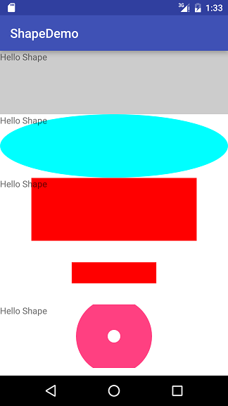
shape图形的形状, 一共四种形状.
- 1.rectangle 长方形/默认是长方形
- 2.oval 椭圆
- 3.line 线
- 4.ring 环形
布局代码如下:
-
shape_rectangle.xml
- <?xml version="1.0" encoding="utf-8"?>
- <LinearLayout xmlns:android="http://schemas.android.com/apk/res/android"
- android:layout_width="match_parent"
- android:layout_height="match_parent"
- android:background="@android:color/white"
- android:orientation="vertical">
- <!--rectangle长方形-->
- <TextView
- android:layout_width="match_parent"
- android:layout_height="100dip"
- android:background="@drawable/shape_rectangle"
- android:text="Hello Shape"/>
- <!--oval椭圆形-->
- <TextView
- android:layout_width="match_parent"
- android:layout_height="100dip"
- android:background="@drawable/shape_oval"
- android:text="Hello Shape"/>
- <!--line线性 background-->
- <TextView
- android:layout_width="match_parent"
- android:layout_height="100dip"
- android:background="@drawable/shape_line"
- android:text="Hello Shape"/>
- <!--line线性 src-->
- <ImageView
- android:layout_width="match_parent"
- android:layout_height="100dip"
- android:src="@drawable/shape_line"/>
- <!--ring环形-->
- <TextView
- android:layout_width="match_parent"
- android:layout_height="100dip"
- android:background="@drawable/shape_ring"
- android:text="Hello Shape"/>
- </LinearLayout>
-
- <span style="color:#666666;"><?xml version="1.0" encoding="utf-8"?>
- <shape xmlns:android="http://schemas.android.com/apk/res/android"
- android:shape="rectangle">
- <!--这里shape如果不指定是那种类型, 就会是默认的rectangle长方形.-->
- <solid android:color="#33000000"/>
- <!--solid标签:指定背景色-->
- </shape></span>
shape_oval.xml -
- <span style="color:#666666;"><?xml version="1.0" encoding="utf-8"?>
- <shape xmlns:android="http://schemas.android.com/apk/res/android"
- android:shape="oval">
- <solid android:color="#00ffff"/>
- </shape></span>
shape_line.xml
line形状下, solid标签下的color会无效,- <span style="color:#666666;"><?xml version="1.0" encoding="utf-8"?>
- <shape xmlns:android="http://schemas.android.com/apk/res/android"
- android:shape="line">
- <!--line模式下solid标签无效-->
- <solid android:color="#33000000"/>
- <stroke
- android:width="99dip"
- android:color="#ff0000"/>
- <size
- android:width="500dip"
- android:height="300dip"/>
- </shape></span>
需要为它设置stroke标签, stroke标签中: stroke标签中如果不指定color的颜色, 则默认是黑色,
需要指定width, 如果width如果大于控件的layout_height还无法显示? 背景也无法拉伸值整个控件?
用在background的时候, shape图片会被拉伸,
用在src的时候会按你指定的size大小去显示, 如果为指定size, 会和background一样效果.
还有上述几个疑问, 但没打算深究, 如果你知道, 请告诉我。 -
shape_ring.xml
- <span style="color:#666666;"><?xml version="1.0" encoding="utf-8"?>
- <shape xmlns:android="http://schemas.android.com/apk/res/android"
- android:innerRadius="10dip"
- android:innerRadiusRatio="2"
- android:shape="ring"
- android:thickness="50dip"
- android:thicknessRatio="3"
- android:useLevel="false">
- <solid android:color="#FF4081"/>
- </shape></span>
ring形状下, 有几个特殊的属性:
- innerRadius 中间圆圈的半径;
- innerRadiusRatio 如果和innerRadius同时存在是, innerRadiusRatio无效, 是一个比率: shape图片宽度/内半径, 默认是9;
- thickness 圆环的厚度, 整的shape图片的半径减去内圆的半径;
- thicknessRatio 同样如果和thickness同时存在是, thicknessRatio无效, 也是一个比率: shape图片宽度/圆环厚度, 默认值是3;
- useLevel 一般使用false, 否则无法显示之类
可能看到这里还是不会用, 下面就用最常用的rectangle长方形做详细的讲解:
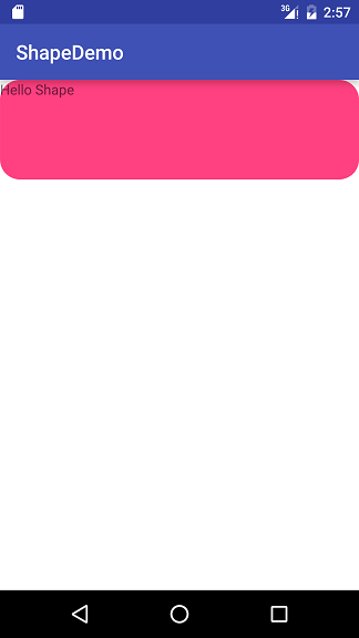
corners标签:
作用: 指定长方形四角的圆滑度, 圆角矩形就是用这个corners标签办到
- bottomLeftRadius 左下角
- bottomRightRadius 右下角
- topLeftRadius 左上角
- topRightRadius 右上角
- radius 是四个角, 设置了这个就不需要设置上面的四个了, 但是它的优先级比较低, 会被上面的设置所覆盖
shape_rectangle.xml文件
- <span style="color:#666666;"><?xml version="1.0" encoding="utf-8"?>
- <shape xmlns:android="http://schemas.android.com/apk/res/android"
- android:shape="rectangle">
- <corners
- android:bottomLeftRadius="20dip"
- android:bottomRightRadius="20dip"
- android:radius="20dip"
- android:topLeftRadius="20dip"
- android:topRightRadius="20dip"/>
- <solid android:color="#FF4081"/>
- </shape></span>
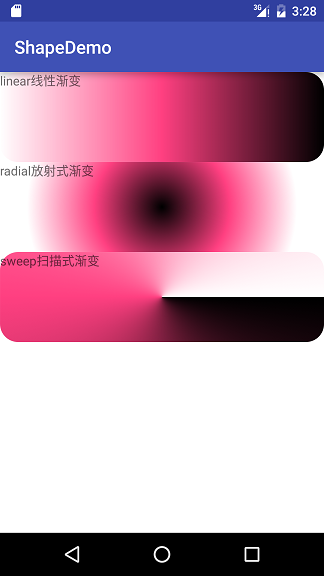
gradient标签:
作用: 让图形有颜色的渐变效果
- angle 是颜色变换的角度, 默认是0, 取值必须是45的倍数. 0: 是颜色从左边到右边, 90: 是颜色从底部到顶部,
- startColor centerColor endColor : 开始的颜色, 中间的颜色, 结束的颜色
- centerX centerY是指定位置坐标, 取值是0.0f ~ 1.0f 之间, 例如: android:centerX=”0.5f” 表示X方向的中间位置
- type 颜色渐变的类型, 取值类型有三种: linear/radial/sweep
- linear 线性渐变, 就是颜色从左往右, 从下往上
- radial 放射渐变, 例如: 从一个圆中心到圆的边缘变化
- sweep 扫描式渐变, 类似雷达扫描的那种图形
- gradientRadius 和android:type=”radial”一起连用, shape图片的半径
XML布局代码
- <span style="color:#666666;"><?xml version="1.0" encoding="utf-8"?>
- <LinearLayout xmlns:android="http://schemas.android.com/apk/res/android"
- android:layout_width="match_parent"
- android:layout_height="match_parent"
- android:background="@android:color/white"
- android:orientation="vertical">
- <!--rectangle长方形 linear 线性渐变-->
- <TextView
- android:layout_width="match_parent"
- android:layout_height="100dip"
- android:background="@drawable/shape_rectangle_linear"
- android:text="linear"/>
- <!--rectangle长方形 radial 放射式渐变-->
- <TextView
- android:layout_width="match_parent"
- android:layout_height="100dip"
- android:background="@drawable/shape_rectangle_radial"
- android:text="radial"/>
- <!--rectangle长方形 sweep 扫描式渐变-->
- <TextView
- android:layout_width="match_parent"
- android:layout_height="100dip"
- android:background="@drawable/shape_rectangle_sweep"
- android:text="sweep"/>
- </LinearLayout></span>
shape_rectangle_linear.xml文件- <span style="color:#666666;"><?xml version="1.0" encoding="utf-8"?>
- <shape xmlns:android="http://schemas.android.com/apk/res/android"
- android:shape="rectangle">
- <corners android:radius="20dip"/>
- <gradient
- android:angle="0"
- android:centerColor="#FF4081"
- android:centerX="0.5"
- android:centerY="0.5"
- android:endColor="#000000"
- android:startColor="#FFFFFF"
- android:type="linear"
- android:useLevel="false"/>
- <!-- <solid android:color="#FF4081"/>-->
- <!--android:gradientRadius="150dip"-->
- </shape></span>
shape_rectangle_radial.xml文件- <span style="color:#666666;"><?xml version="1.0" encoding="utf-8"?>
- <shape xmlns:android="http://schemas.android.com/apk/res/android"
- android:shape="rectangle">
- <corners android:radius="20dip"/>
- <gradient
- android:angle="0"
- android:centerColor="#FF4081"
- android:centerX="0.5"
- android:centerY="0.5"
- android:endColor="#FFFFFF"
- android:gradientRadius="150dip"
- android:startColor="#000000"
- android:type="radial"
- android:useLevel="false"/>
- <!-- <solid android:color="#FF4081"/>-->
- </shape></span>
shape_rectangle_sweep.xml文件
- <span style="color:#666666;"><?xml version="1.0" encoding="utf-8"?>
- <shape xmlns:android="http://schemas.android.com/apk/res/android"
- android:shape="rectangle">
- <corners android:radius="20dip"/>
- <gradient
- android:angle="0"
- android:centerColor="#FF4081"
- android:centerX="0.5"
- android:centerY="0.5"
- android:endColor="#FFFFFF"
- android:startColor="#000000"
- android:type="sweep"
- android:useLevel="false"/>
- <!--<solid android:color="#FF4081"/>-->
- <!--android:gradientRadius="150dip"-->
- </shape></span>
PS:
- solid标签会和gradient标签冲突, 会覆盖gradient配置的颜色;
- gradient标签中的android:gradientRadius属性和android:type=”radial”一起连用, 配置shape图片的半径
- centerX centerY是指定位置坐标, 取值是0.0f ~ 1.0f 之间, 例如: android:centerX=”0.5f” 表示X方向的中间位置, 这里就不做演示了padding标签
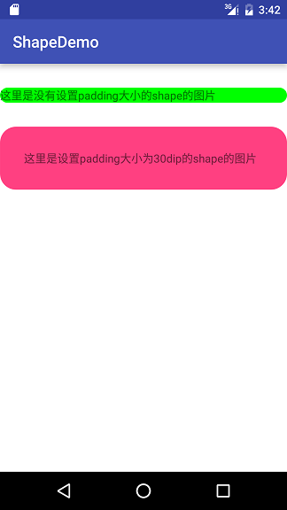
作用: 设置控件中(文字)内容与shape图片边框的距离
- bottom 底部距离
- left 左边距离
- right 右边距离
- top 听不距离
XML布局代码:- <?xml version="1.0" encoding="utf-8"?>
- <LinearLayout xmlns:android="http://schemas.android.com/apk/res/android"
- android:layout_width="match_parent"
- android:layout_height="match_parent"
- android:background="@android:color/white"
- android:orientation="vertical">
- <!--这里是没有设置padding大小的shape的图片-->
- <TextView
- android:layout_width="match_parent"
- android:layout_height="wrap_content"
- android:layout_marginTop="30dip"
- android:background="@drawable/shape_rectangle"
- android:text="这里是没有设置padding大小的shape的图片"/>
- <!--这里是设置padding大小为30dip的shape的图片-->
- <TextView
- android:layout_width="match_parent"
- android:layout_height="wrap_content"
- android:layout_marginTop="30dip"
- android:background="@drawable/shape_rectangle_padding"
- android:text="这里是设置padding大小为30dip的shape的图片"/>
- </LinearLayout>
- shape_rectangle.xml文件
- <?xml version="1.0" encoding="utf-8"?>
- <shape xmlns:android="http://schemas.android.com/apk/res/android"
- android:shape="rectangle">
- <corners android:radius="20dip"/>
- <solid android:color="#00ff00"/>
- </shape>
- shape_rectangle_padding.xml文件
- <?xml version="1.0" encoding="utf-8"?>
- <shape xmlns:android="http://schemas.android.com/apk/res/android"
- android:shape="rectangle">
- <corners android:radius="20dip"/>
- <solid android:color="#FF4081"/>
- <padding
- android:bottom="30dip"
- android:left="30dip"
- android:right="30dip"
- android:top="30dip"/>
- </shape>
- size标签
- 作用: 指定图片的大小
- 使用drawable有两种方式, 一种是控件的background属性; 一种是控件的src属性;
- 两种方式在使用size方式的时候出现了不同的结果
- 当用background属性去使用drawable的时候, size标签无效, shape图片大小会随着控件的大小去放大或缩小
- 当用src属性去使用drawable的时候. 有两种情况:
- 一, 如果shape图片大小比控件指定大小小, shape图片会显示在控件的中间;
- 二, 如果shape图片大小比控件的大小大时, shape图片的宽高会等比例缩放, 一直压缩到宽或者高能放进控件内, 并放置在控件的中间, 如下图所示:
- 这里写图片描述
- XML布局代码:
- <?xml version="1.0" encoding="utf-8"?>
- <LinearLayout xmlns:android="http://schemas.android.com/apk/res/android"
- android:layout_width="match_parent"
- android:layout_height="match_parent"
- android:background="@android:color/white"
- android:orientation="vertical">
- <!--这里是用background属性去设置图片-->
- <TextView
- android:layout_width="match_parent"
- android:layout_height="100dip"
- android:background="@drawable/shape_rectangle_size"
- android:text="这里是用background属性去设置图片"/>
- <TextView
- android:layout_width="match_parent"
- android:layout_height="wrap_content"
- android:layout_marginTop="30dip"
- android:text="这里是用src属性去设置图片 宽度是200dip 高度是100dip"/>
- <!--这里是用src属性去设置shape图片 宽度是200dip-->
- <ImageView
- android:layout_width="match_parent"
- android:layout_height="100dip"
- android:background="#33000000"
- android:src="@drawable/shape_rectangle_size"/>
- <TextView
- android:layout_width="match_parent"
- android:layout_height="wrap_content"
- android:layout_marginTop="30dip"
- android:text="这里是用src属性去设置图片 宽度是500dip 高度是100dip"/>
- <!--这里是用src属性去设置shape图片 宽度是500dip-->
- <ImageView
- android:layout_width="match_parent"
- android:layout_height="100dip"
- android:background="#33000000"
- android:src="@drawable/shape_rectangle_size_long"/>
- </LinearLayout>
- shape_rectangle_size.xml文件
- <?xml version="1.0" encoding="utf-8"?>
- <shape xmlns:android="http://schemas.android.com/apk/res/android"
- android:shape="rectangle">
- <corners android:radius="20dip"/>
- <solid android:color="#00ff00"/>
- <size
- android:width="200dip"
- android:height="100dp"/>
- </shape>
- shape_rectangle_size_long.xml文件
- <?xml version="1.0" encoding="utf-8"?>
- <shape xmlns:android="http://schemas.android.com/apk/res/android"
- android:shape="rectangle">
- <corners android:radius="20dip"/>
- <solid android:color="#00ff00"/>
- <size
- android:width="500dip"
- android:height="100dp"/>
- </shape>
PS: 用src去设置drawable处理起来会比较麻烦, 实际开发中其实也很少有人这么用
solid标签
给图片设置背景色. 上面已经用到了, 就不多说了,
PS: 它和gradient标签是冲突的, solid标签会覆盖gradient标签配置的颜色
我常用的用法, 在solid标签中的color属性配置颜色选择器selector.xml, 实现点击换色的点击效果stroke标签
作用: 给shape图形设置边框, 设置边框的宽度, 颜色, 实现还是虚线, 以及虚线的间隔大小
- width 边框线的宽度
- color 边框线的颜色
- 下面两个参数是设置虚线是需要用到的
- dashGap 虚线间隔的长度
- dashWidth 虚线中实线的长度
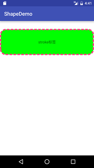
XML布局代码- <?xml version="1.0" encoding="utf-8"?>
- <LinearLayout xmlns:android="http://schemas.android.com/apk/res/android"
- android:layout_width="match_parent"
- android:layout_height="match_parent"
- android:background="@android:color/white"
- android:orientation="vertical">
- <TextView
- android:layout_width="match_parent"
- android:layout_height="100dip"
- android:layout_marginTop="30dip"
- android:background="@drawable/shape_rectangle_stroke"
- android:gravity="center"
- android:text="stroke标签"/>
- </LinearLayout>
shape_rectangle_stroke.xml布局文件- <?xml version="1.0" encoding="utf-8"?>
- <shape xmlns:android="http://schemas.android.com/apk/res/android"
- android:shape="rectangle">
- <corners android:radius="20dip"/>
- <solid android:color="#00ff00"/>
- <stroke
- android:width="5dip"
- android:color="#FF4081"
- android:dashGap="5dip"
- android:dashWidth="10dip"/>
- </shape>
现在在去看那个总结图是不是不一样呢?
shape图形实际开发应用场景
我想说, shape图形真的非常非常常见
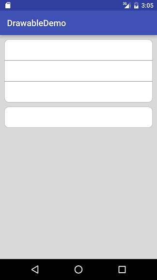
场景一: 显示圆角的图形
用shape图片设置background实现起来非常简单
只需要设置形状,背景色,四个角的圆角度数,边框的宽度, 以及边框的颜色布局XML文件
- <pre name="code" class="java"><?xml version="1.0" encoding="utf-8"?>
- <LinearLayout xmlns:android="http://schemas.android.com/apk/res/android"
- android:layout_width="match_parent"
- android:layout_height="match_parent"
- android:background="#22000000"
- android:orientation="vertical">
- <View
- android:layout_width="match_parent"
- android:layout_height="48dip"
- android:layout_marginLeft="10dip"
- android:layout_marginRight="10dip"
- android:layout_marginTop="10dip"
- android:background="@drawable/shape_test_top"/>
- <View
- android:layout_width="match_parent"
- android:layout_height="48dip"
- android:layout_marginLeft="10dip"
- android:layout_marginRight="10dip"
- android:background="@drawable/shape_test_middle"/>
- <View
- android:layout_width="match_parent"
- android:layout_height="48dip"
- android:layout_marginLeft="10dip"
- android:layout_marginRight="10dip"
- android:background="@drawable/shape_test_bottom"/>
- <View
- android:layout_width="match_parent"
- android:layout_height="48dip"
- android:layout_marginLeft="10dip"
- android:layout_marginRight="10dip"
- android:layout_marginTop="10dip"
- android:background="@drawable/shape_test_single"/>
- </LinearLayout>
shape_test_top.xml
- <?xml version="1.0" encoding="utf-8"?>
- <shape
- xmlns:android="http://schemas.android.com/apk/res/android"
- android:shape="rectangle">
- <corners
- android:topLeftRadius="10dip"
- android:topRightRadius="10dip"/>
- <!--背景色-->
- <solid android:color="@android:color/white"/>
- <!--边框的宽度以及颜色-->
- <stroke
- android:width="0.5dip"
- android:color="#44000000"/>
- </shape>
shape_test_middle.xml
- <?xml version="1.0" encoding="utf-8"?>
- <shape
- xmlns:android="http://schemas.android.com/apk/res/android"
- android:shape="rectangle">
- <!--背景色-->
- <solid android:color="@android:color/white"/>
- <!--边框的宽度以及颜色-->
- <stroke
- android:width="0.5dip"
- android:color="#44000000"/>
- </shape>
shape_test_bottom.xml- <?xml version="1.0" encoding="utf-8"?>
- <shape
- xmlns:android="http://schemas.android.com/apk/res/android"
- android:shape="rectangle">
- <corners
- android:bottomLeftRadius="10dip"
- android:bottomRightRadius="10dip"/>
- <!--背景色-->
- <solid android:color="@android:color/white"/>
- <!--边框的宽度以及颜色-->
- <stroke
- android:width="0.5dip"
- android:color="#44000000"/>
- </shape>
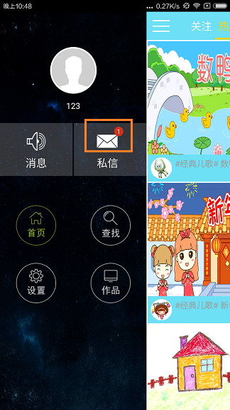
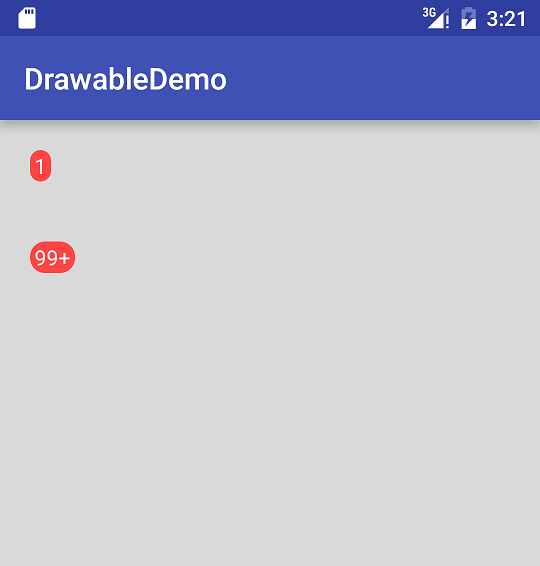
场景二:显示消息的数目
直接上图:
布局XML代码
- <?xml version="1.0" encoding="utf-8"?>
- <LinearLayout xmlns:android="http://schemas.android.com/apk/res/android"
- android:layout_width="match_parent"
- android:layout_height="match_parent"
- android:background="#22000000"
- android:orientation="vertical">
- <TextView
- android:layout_width="wrap_content"
- android:layout_height="wrap_content"
- android:layout_margin="20dip"
- android:background="@drawable/shape_test_circle"
- android:text="1"
- android:textColor="@android:color/white"/>
- <TextView
- android:layout_width="wrap_content"
- android:layout_height="wrap_content"
- android:layout_margin="20dip"
- android:background="@drawable/shape_test_circle"
- android:text="99+"
- android:textColor="@android:color/white"/>
- </LinearLayout>
shape_test_circle.xml- <?xml version="1.0" encoding="utf-8"?>
- <shape xmlns:android="http://schemas.android.com/apk/res/android"
- android:shape="rectangle">
- <!--圆角大小-->
- <corners android:radius="10dip"/>
- <!--文字到shape图片边缘的距离-->
- <padding
- android:bottom="1dip"
- android:left="3dip"
- android:right="3dip"
- android:top="1dip"/>
- <!--背景色-->
- <solid android:color="@android:color/holo_red_light"/>
- </shape>
最后这种样式是开发中用到比较多的情况,就是给按钮设置背景
下面是样式代码:
- <?xml version="1.0" encoding="utf-8"?>
- <shape xmlns:android="http://schemas.android.com/apk/res/android"
- android:shape="rectangle">
- <corners
- android:bottomLeftRadius="15dip"
- android:bottomRightRadius="15dip"
- android:topLeftRadius="15dip"
- android:topRightRadius="15dip"/>
- <solid
- android:color="#01BAFD"/> //这个是底色颜色<span style="white-space:pre"> </span>
- <stroke android:color="@color/white"
- android:width="1dip"
- />
- </shape>
shape图形 –简单介绍


 3718
3718


 被折叠的 条评论
为什么被折叠?
被折叠的 条评论
为什么被折叠?
 到【灌水乐园】发言


