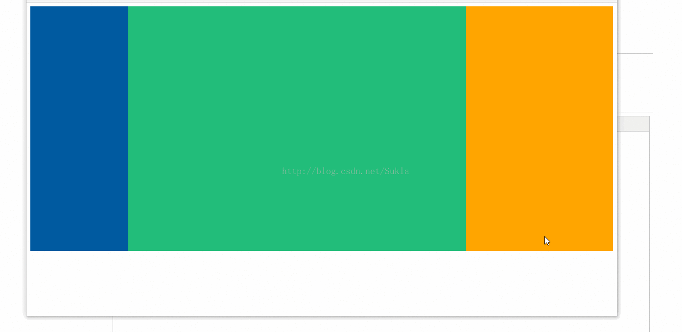
div+css 三栏式布局

1,效果图


2,方法一

<!doctype html>
<html>
<head>
    <meta charset="utf-8"/>
    <title>三栏式布局</title>
</head>
<style>
    .main{
        background-color: #22bd7a;
        margin:0 300px 0 200px;
        height: 500px;
    }
    .left{
        width: 200px;
        height: 100%;
        float:left;
        background-color: #005aa0;
    }
    .right{
        width: 300px;
        height: 100%;
        float:right;
        background: orange;
    }
    .clean{
        clear: both;
    }
    .container{
        width: 100%;
        min-width: 600px;
        height: 500px;
    }
</style>
<body>
<div class="container">
    <div class="left"></div>
    <div class="right"></div>
    <div class="main"></div>
    <div class="clear"></div>
</div>
</body>
</html>

3,方法二

<!doctype html>
<html>
<head>
    <meta charset="utf-8"/>
    <title>三栏式布局</title>
</head>
<style>
    .container{
        min-width: 500px;
        padding:0 300px 0 200px;
        height: 100%;
    }
    .clear{
        clear: both;
    }
    .main{
        height: 500px;
        float: left;
        width: 100%;
        background: #22bd7a;
    }
    .left{
        float: left;
        background: #005aa0;
        width: 200px;
        height: 100px;
        margin-left: -100%;
        position: relative;
        left: -200px;
    }
    .right{
        float: right;
        background: orange;
        margin-right:-300px;
        width: 300px;
        height: 100px;
    }
</style>
<body>
<div class="container">
    <div class="main"></div>
    <div class="left"></div>
    <div class="right"></div>
    <div class="clear"></div>
</div>
</body>
</html>

4,方法三

<!doctype html>
<html>
<head>
    <meta charset="utf-8"/>
    <title>三栏式布局</title>
</head>
<style>
    .container {
        min-width: 600px;
        width: 100%;
        height: 500px;
    }

    .floatwarp {
        float: left;
        width: 100%;
    }

    .main {
        height: 500px;
        background-color: #005aa0;
        margin: 0 300px 0 200px;
    }

    .left {
        float: left;
        width: 200px;
        height: 100%;
        background-color: #22bd7a;
        margin-left: -100%;
    }

    .right {
        float: left;
        width: 300px;
        height: 100%;
        background-color: orange;
        margin-left: -300px;
    }

    .clear {
        clear: both;
    }
</style>
<body>
<div class="container">
    <div class="floatwarp">
        <div class="main"></div>
    </div>
    <div class="left"></div>
    <div class="right"></div>
    <div class="clear"></div>
</div>
</body>
</html>


  • 0
    点赞
  • 1
    收藏
    觉得还不错? 一键收藏
  • 0
    评论
很抱歉,我是一个自然语言生成模型,无法提供代码生成服务。但是,我可以提供一个简单的HTML页面的布局示例,您可以根据自己的需要进行修改和优化。 ```html <!DOCTYPE html> <html> <head> <title>简单的HTML页面布局示例</title> <style type="text/css"> body { margin: 0; padding: 0; font-family: Arial, sans-serif; } .header { background-color: #333; color: #fff; padding: 10px; text-align: center; } .nav { background-color: #eee; padding: 10px; text-align: center; } .main { display: flex; flex-wrap: wrap; justify-content: center; } .card { background-color: #fff; border: 1px solid #ccc; border-radius: 5px; box-shadow: 0 2px 5px rgba(0, 0, 0, 0.3); margin: 10px; padding: 20px; width: 400px; } .footer { background-color: #333; color: #fff; padding: 10px; text-align: center; } </style> </head> <body> <header class="header"> <h1>网页标题</h1> </header> <nav class="nav"> <ul> <li><a href="#">链接1</a></li> <li><a href="#">链接2</a></li> <li><a href="#">链接3</a></li> <li><a href="#">链接4</a></li> </ul> </nav> <main class="main"> <div class="card"> <h2>卡片标题1</h2> <p>卡片内容1</p> </div> <div class="card"> <h2>卡片标题2</h2> <p>卡片内容2</p> </div> <div class="card"> <h2>卡片标题3</h2> <p>卡片内容3</p> </div> <div class="card"> <h2>卡片标题4</h2> <p>卡片内容4</p> </div> </main> <footer class="footer"> <p>版权信息</p> </footer> </body> </html> ``` 这是一个简单的三栏布局,包含了页头、导航、内容区和页脚。利用CSS的flex布局,可以实现响应式布局,适应不同尺寸的屏幕。您可以根据需要添加、删除或修改样式,实现您自己的页面布局

“相关推荐”对你有帮助么?

  • 非常没帮助
  • 没帮助
  • 一般
  • 有帮助
  • 非常有帮助
提交
评论
添加红包

请填写红包祝福语或标题

红包个数最小为10个

红包金额最低5元

当前余额3.43前往充值 >
需支付:10.00
成就一亿技术人!
领取后你会自动成为博主和红包主的粉丝 规则
hope_wisdom
发出的红包
实付
使用余额支付
点击重新获取
扫码支付
钱包余额 0

抵扣说明:

1.余额是钱包充值的虚拟货币,按照1:1的比例进行支付金额的抵扣。
2.余额无法直接购买下载,可以购买VIP、付费专栏及课程。

余额充值