


ProgressBar
XML属性
|
属性名
| 描述 |
|
android:animationResolution
|
超时的动画帧之间的毫秒 ;必须是一个整数值,如“100”。
|
|
android:indeterminate
| 是否允许使用不确定模式,在不确定模式下,进度条动画无限循环 |
|
android:indeterminateBehavior
| 定义当进度达到最大时,不确定模式的表现; 该值必须为repeat或者cycle,repeat表示进度从0重新开始;cycle表示进度保持当前值,并且回到0 |
|
android:indeterminateDrawable
| 定义不确定模式是否可拉 |
|
android:indeterminateDuration
| 时间不定的动画 |
|
android:indeterminateOnly
|
限制为不定模式
|
|
android:interpolator
|
|
|
android:max
|
定义进度的最大值
|
|
android:maxHeight
|
进度Widget最大高
|
|
android:miniHeight
| 进度Widget最小高 |
|
android:maxWidth
| 进度Widget最大宽 |
|
android:minWidth
|
进度Widget最小宽
|
|
android:mirrorForRtl
|
定义了相关画板如果需要反映在RTL模式
|
|
android:progress
| 设置进度的默认值,值介于0到max之间 |
|
android:progressDrawable
|
|
|
android:secondaryProgress
|
定义二级进度值,值介于0到max。该进度在主进度和背景之间。比如用于网络播放视频时,二级进度用于表示缓冲进度,主进度用于表示播放进度。
|
进度条的样式
Widget.ProgressBar.Horizontal 长形进度
Android xml 布局:


ProgressDialog.STYLE_HORIZONTAL类型进度条效果如下:
源码:
效果图:
带第二进度的进度条
xml配置如下:
这里我们设置了初始的进度为40,android:progress的值在mini和max之间即mini<=progressvalue<=max
设置了第二进度条的进度值为70,该值也在mini和max之间。
效果如下:
不确定模式进度条
xml配置文件:
这里通过android:indeterminate="true"设置了当前为无模式进度条
效果如图:
普通圆形进度:Widget.ProgressBar.Inverse
通过android:backgroup设置了背景色
效果如图:
普通小圆形进度条
Widget.ProgressBar.Small 或 Widget.ProgressBar.Small.Inverse
xml配置:
效果图:
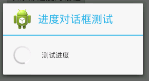
ProgressDialog
进度条对话框的设置
先看源码:
这里我们设置了在Button的点击事件时,弹出进度对话框progressDlg;
其中ProgressDlg.this表示当前的Activity
方法setTitle 设置当前进度对话框的标题
setMessage 设置当前进度对话框的消息
setIcon 设置进度对话框的图标
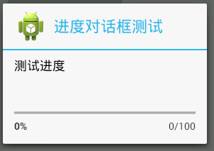
setProgressStyle设置进度条类型。包括ProgressDialog.STYLE_SPINNER(圆形 (默认))、ProgressDialog.STYLE_HORIZONTAL(长条形)
setCancelable() 表示是否可按回退键取消对话框。true表示可以通过回退键取消对话框,否则不能通过回退键取消对话框。
效果图如下:
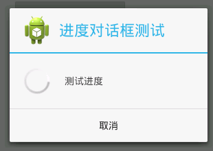
给进度对话框添加上按钮
可以个进度对话框添加三种按钮:
DialogInterface.BUTTON_POSITIVE 确定
DialogInterface.BUTTON_NEGATIVE 取消
DialogInterface.BUTTON_NEUTRAL 普通
添加按钮的方法如下:
第一个参数制定按钮类型,第二个参数指定响应按钮点击事件的监听
效果如下:
http://blog.csdn.net/wqjsir/article/details/23569543


 扫一扫
扫一扫
 1503
1503

 被折叠的 条评论
为什么被折叠?
被折叠的 条评论
为什么被折叠?
 到【灌水乐园】发言


