


上一篇文章实现一个图片和文字混合展示的控件,这篇文章在此基础上面继续实现一个动态的圆弧控件.
一、在attrs.xml中添加自定义属性:
<?xml version="1.0" encoding="utf-8"?>
<resources>

    <attr name="firstColor" format="color" />
    <attr name="secondColor" format="color" />
    <attr name="circleLength" format="dimension" />
    <attr name="circleWidth" format="dimension" />
    <attr name="speed" format="integer" />

    <declare-styleable name="CustomProgressBar">
        <attr name="firstColor" />
        <attr name="secondColor" />
        <attr name="circleLength" />
        <attr name="circleWidth" />
        <attr name="speed" />
    </declare-styleable>
</resources>
二、对应的布局文件:
<?xml version="1.0" encoding="utf-8"?>
<LinearLayout xmlns:android="http://schemas.android.com/apk/res/android"
xmlns:app="http://schemas.android.com/apk/res-auto"
xmlns:tools="http://schemas.android.com/tools"
android:layout_width="match_parent"
android:layout_height="match_parent"
android:orientation="vertical"
android:gravity="center_horizontal"
tools:context="com.shi.androidstudio.brokenline.MainActivity">
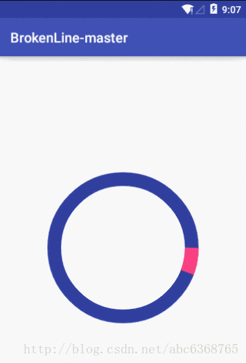
<com.shi.androidstudio.brokenline.SimpleView_03
android:layout_width="wrap_content"
android:layout_height="wrap_content"
android:padding="10dp"
app:firstColor = "@color/colorAccent"
app:secondColor = "@color/colorPrimaryDark"
app:speed = "20"
app:circleLength = "100dp"
app:circleWidth = "20dp"
/>
</LinearLayout>
三、重写SimpleView_03控件的构造函数:
    public SimpleView_03(Context context) {
        this(context, null);
    }

    public SimpleView_03(Context context, AttributeSet attrs) {
        this(context, attrs, 0);
    }

    public SimpleView_03(Context context, AttributeSet attrs, int defStyleAttr) {
        super(context, attrs, defStyleAttr);
        /**
         * 获得我们所定义的自定义样式属性
         */
        TypedArray a = context.getTheme().obtainStyledAttributes(attrs, R.styleable.CustomProgressBar, defStyleAttr, 0);
        int length = a.getIndexCount();
        for (int i = 0; i < length; i++) {
            int attr = a.getIndex(i);
            switch (attr) {
                case R.styleable.CustomProgressBar_firstColor:
                   mFirstColor =  a.getColor(attr,Color.BLACK);
                    break;
                case R.styleable.CustomProgressBar_secondColor:
                    mSecondColor =  a.getColor(attr,Color.WHITE);
                    break;
                case R.styleable.CustomProgressBar_circleLength:
                    mCircleLength = a.getDimension(attr, 50.00f);
                    break;
                case R.styleable.CustomProgressBar_circleWidth:
                    mCircleWidth = a.getDimension(attr, 20.00f);
                    break;
                case R.styleable.CustomProgressBar_speed:
                    mSpeed = a.getInt(attr,10);
                    break;
            }
        }
        a.recycle();

        new Thread(new Runnable() {
            @Override
            public void run() {
                while (true) {
                    mProgress = mProgress % 360;
                    postInvalidate();
                    mProgress++;
                    if (mProgress == 360) {
                        isNext = !isNext;
                    }
                    SystemClock.sleep(mSpeed);
                }
            }
        }).start();
    }
四、重写SimpleView_03控件的onDraw:
   @Override
     protected void onDraw(Canvas canvas) {
        Paint mPaint_01 = new Paint();
        mPaint_01.setAntiAlias(true);                   //设置画笔为无锯齿
        mPaint_01.setColor(mFirstColor);                  //设置画笔颜色
        canvas.drawColor(Color.WHITE);                  //白色背景
        mPaint_01.setStrokeWidth(mCircleWidth);           //线宽
        mPaint_01.setStyle(Paint.Style.STROKE);

        int centerX = getMeasuredWidth()/2;
        int centerY = getMeasuredHeight()/2;

        RectF oval = new RectF();                       //RectF对象
        oval.left = centerX - mCircleLength;            //左边
        oval.top = centerY - mCircleLength;             //上边
        oval.right = centerX + mCircleLength;           //右边
        oval.bottom = centerY + mCircleLength;          //下边

        Paint mPaint_02 = new Paint();
        mPaint_02.setAntiAlias(true);                   //设置画笔为无锯齿
        mPaint_02.setColor(mSecondColor);                //设置画笔颜色
        canvas.drawColor(Color.WHITE);                  //白色背景
        mPaint_02.setStrokeWidth(mCircleWidth);           //线宽
        mPaint_02.setStyle(Paint.Style.STROKE);

        if(!isNext){
            canvas.drawCircle(centerX,centerY,mCircleLength,mPaint_01);
            canvas.drawArc(oval, 0, mProgress, false, mPaint_02);    //绘制圆弧
        }else{
            canvas.drawCircle(centerX,centerY,mCircleLength,mPaint_02);
            canvas.drawArc(oval, 0, mProgress, false, mPaint_01);    //绘制圆弧
        }

     }
这里讲解一下drawCircle和drawArc函数:
drawCircle(float cx, float cy, float radius, Paint paint)官方解释:
Draw the specified circle using the specified paint.
使用指定的画笔绘制一个指定的圆,其中cx,cy为圆的圆心,radius为圆的半径,paint为画笔.
drawArc(RectF oval, float startAngle, float sweepAngle, boolean useCenter, Paint paint)官方解释:
Draw the specified arc, which will be scaled to fit inside the specified oval.
使用指定的画笔绘制一个指定圆弧,其中oval为圆弧所在的椭圆对象;
系统默认在当前页面建立一个X轴向右,Y轴向下的坐标系,其中的startAngle为圆弧的起始角度
,sweepAngle为圆弧的角度,useCenter表示是否显示半径连线,为true则显示圆弧与圆心的半径连线,false不显示
,paint为画笔.


 1651
1651


 被折叠的 条评论
为什么被折叠?
被折叠的 条评论
为什么被折叠?
 到【灌水乐园】发言


