


最近在项目中封装了个Dialog组件,iOS和Android平台上通用。
组件Dialog显示时,从页面顶部滑动到中间,点击确认或取消后,从页面底部划出页面,需要注意动画的实现。
源码如下:
'use strict';
import React, { Component } from 'react';
import {
  StyleSheet,
  View,
  Image,
  Text,
  TouchableHighlight,
  Animated,
  Easing,
  Dimensions,
} from 'react-native';

import TimerMixin from 'react-timer-mixin';

const {width, height} = Dimensions.get('window');
const navigatorH = 64; // navigator height
const [aWidth, aHeight] = [270, 108];
const [left, top] = [0, 0];
const [middleLeft, middleTop] = [(width - aWidth) / 2, (height - aHeight) / 2 - navigatorH];

/**
* Dialog组件
* <Dialog ref="dialog" callback={this.callback.bind(this)}/>
* 调用show方法,调起组件   this.refs.dialog.show("确定删除吗");
*/

export default class Dialog extends Component {
  mixins = [TimerMixin];
  parent ={};


  constructor(props) {
    super(props);
    this.state = {
      offset: new Animated.Value(0),
      opacity: new Animated.Value(0),
      title: "",
      hide: true,
    };
  }

  render() {
    if(this.state.hide){
      return (<View />)
    } else {
      return (
        <View style={styles.container} >
          <Animated.View style={ styles.mask } >
          </Animated.View>

          <Animated.View style={[styles.tip , {transform: [{
                translateY: this.state.offset.interpolate({
                 inputRange: [0, 1,2],
                 outputRange: [0, middleTop,height]
                }),
              }]
            }]}>
            <View style={styles.tipTitleView}>
              <Text style={styles.tipTitleText}>{this.state.title}</Text>
            </View>

            <View style={styles.btnView}>
              <TouchableHighlight style={styles.cancelBtnView} underlayColor='#f0f0f0' onPress={this.cancelBtn.bind(this)}>
                <Text style={styles.cancelBtnText}>取消</Text>
              </TouchableHighlight>
              <TouchableHighlight style={styles.okBtnView} underlayColor='#f0f0f0' onPress={this.okBtn.bind(this)}>
                <Text style={styles.okBtnText}>确定</Text>
              </TouchableHighlight>
            </View>
          </Animated.View>
        </View>
      );
    }
  }


  //显示动画
  in() {
    Animated.parallel([
      Animated.timing(
        this.state.opacity,
        {
          easing: Easing.linear,
          duration: 500,
          toValue: 0.8,
        }
      ),
      Animated.timing(
        this.state.offset,
        {
          easing: Easing.linear,
          duration: 500,
          toValue: 1,
        }
      )
    ]).start();
  }

  //隐藏动画
  out(){
    Animated.parallel([
      Animated.timing(
        this.state.opacity,
        {
          easing: Easing.linear,
          duration: 500,
          toValue: 0,
        }
      ),
      Animated.timing(
        this.state.offset,
        {
          easing: Easing.linear,
          duration: 500,
          toValue: 2,
        }
      )
    ]).start();

    setTimeout(
      () => {
        this.setState({hide: true});
        //还原到顶部
        Animated.timing(
          this.state.offset,
          {
            easing: Easing.linear,
            duration: 500,
            toValue: 0,
          }
        ).start();
      },
      500
    );
  }

  //取消
  cancelBtn(event) {
    if(!this.state.hide){
      this.out();
    }
  }

  // doCallback(fn,args){
  //   fn.apply(this.parent, args);
  // }

  //选择
  okBtn() {
    if(!this.state.hide){
      this.out();
      setTimeout(
        () => {
          let {callback} = this.props;
          callback.apply(null,[]);
        },
        500
      );
    }
  }

  /**
  * 弹出控件
  * titile: 标题
  */
  show(title: string) {
    if(this.state.hide){
      this.setState({title: title, hide: false}, this.in);
    }
  }
}

const styles = StyleSheet.create({
  container: {
    position:"absolute",
    width:width,
    height:height,
    left:left,
    top:top,
  },
  mask: {
    justifyContent:"center",
    backgroundColor:"#383838",
    opacity:0.8,
    position:"absolute",
    width:width,
    height:height,
    left:left,
    top:top,
  },
  tip: {
    width:aWidth,
    height:aHeight,
    left:middleLeft,
    backgroundColor:"#fff",
    alignItems:"center",
    justifyContent:"space-between",
  },
  tipTitleView: {
    width:aWidth,
    flexDirection:'row',
    alignItems:'center',
    justifyContent:'center',
    borderBottomWidth:1/2,
    borderColor:'#f0f0f0',
  },
  tipTitleText:{
    color:"#333333",
    fontSize:17,
    marginTop:28,
    marginBottom:19,
    textAlignVertical:'center',
    textAlign:'center',
  },

  btnView:{
    flexDirection:'row',
    height: 44,
  },
  cancelBtnView:{
    width:aWidth/2,
    height: 44,
    backgroundColor: '#fff',
    alignItems: 'center',
    justifyContent: 'center',
    borderRightWidth:1/2,
    borderColor:'#f0f0f0',
  },
  cancelBtnText: {
    fontSize:17,
    color:"#e6454a",
    textAlign:"center",
    fontWeight:'bold',
  },
  okBtnView:{
    width:aWidth/2,
    height: 44,
    backgroundColor: '#fff',
    alignItems: 'center',
    justifyContent: 'center',
  },
  okBtnText: {
    fontSize:17,
    color:"#e6454a",
    textAlign:"center",
  },

});
如果需要使用该组件,只需要3步即可:
1、在你的页面import 组件,加入代码:
<Dialog ref="dialog" callback={this.callback.bind(this)}/>
2、自定义回调方法callback,处理选中逻辑
3、调用show方法
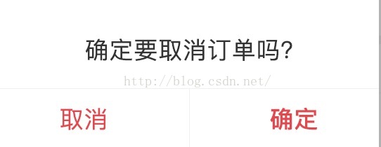
调用show方法,调起组件 this.refs.dialog.show("确定要取消订单吗");备注:组件的样式可以根据你的需求修改,组件的动画也可以修改。
组件效果如下:


 扫一扫
扫一扫
 1948
1948

 被折叠的 条评论
为什么被折叠?
被折叠的 条评论
为什么被折叠?
 到【灌水乐园】发言


