


前言
正如其名,calc是css3中新增的计算属性,让很多属性增加了一个表达式的说法;
标准的写法:
  .class{
       /*
		 area: expression;
       */
	   width:calc();
	   padding:calc();
	   margin-top:calc();
	   ...
   }
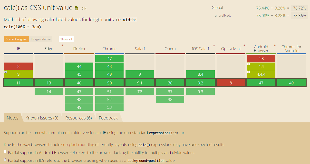
兼容性
基本理论
calc可以做用于任何具有大小的东东,比如border、margin、pading、font-size和width等属性设置动态值- 支持的运算单位:
rem , em , percentage , px - 计算优先级别和数学一致
注意点:
calc 内部的表达式,在使用运算符号时,两遍必须加上空格(虽然乘除可以无视,但还是建议带上)!!!!!,不然会解析错误!!,看演示写法
	width:calc(10 * 10px);
	width:calc(50% - 50px);
	width:calc(50% + 5em);
	width:calc(10% / 1rem);
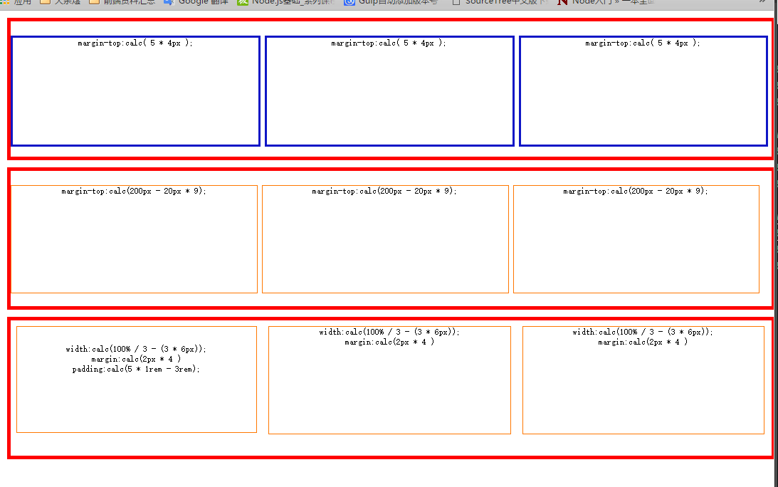
实战效果图
仅仅作为演示,响应伸缩
实战代码
<!DOCTYPE html>
<html lang="en">

<head>
    <meta charset="UTF-8">
    <title>CSS3 Calc</title>
    <style type="text/css" media="screen">
    	html{
    		font-size:62.5%;
    	}
		.wrapper{
			width:100%;
			border:5px solid #f00;
			margin:10px ;
			box-sizing:border-box;
			height:200px;
			clear:b;
		}
		.items{
			height:calc(100% - 40px);
			display:inline-block;
			border:1px solid #f70;
			text-align:center;
		}

		.w1 .items{

			float:left;
			margin-top:calc( 5 * 4px  );
			border:3px solid #0F16C6;
			width:calc(100% / 3 - 6px)
		}

		.w2 .items{
			float:left;
			margin-top:calc(200px - 20px * 9);
			width:calc(100% / 3 - 2px)
		}

		.w3 .items{
			float:left;
			width:calc(100% / 3 - (3 * 6px));
			margin:calc(2px * 4 );
		}

		.w3 .items:first-child{
			padding:calc(5 * 1rem - 3rem);
			box-sizing:border-box;
		}

    </style>
</head>

<body>
    <div class="wrapper w1">
        <div class="items">margin-top:calc( 5 * 4px  );</div>
        <div class="items">margin-top:calc( 5 * 4px  );</div>
        <div class="items">margin-top:calc( 5 * 4px  );</div>
    </div>
    <div class="wrapper w2">
        <div class="items">margin-top:calc(200px - 20px * 9);</div>
        <div class="items">margin-top:calc(200px - 20px * 9);</div>
        <div class="items">margin-top:calc(200px - 20px * 9);</div>
    </div>
    <div class="wrapper w3">
        <div class="items">width:calc(100% / 3 - (3 * 6px));<br>margin:calc(2px * 4 );<br>padding:calc(5 * 1rem - 3rem);</div>
        <div class="items";>width:calc(100% / 3 - (3 * 6px));<br>margin:calc(2px * 4 )</div>
        <div class="items";>width:calc(100% / 3 - (3 * 6px));<br>margin:calc(2px * 4 )</div>
    </div>
</body>

</html>
总结
calc 和flexbox搭配,用来写流式布局非常好;


 1424
1424


 被折叠的 条评论
为什么被折叠?
被折叠的 条评论
为什么被折叠?
 到【灌水乐园】发言


