


在Silverlight 2中构建可重用控件
小序:
本文是Silverlight Lab系列的第二部分,详细介绍了如何创建和使用Silverlight用户控件。此系列的其它部分包括动画,网络,和浏览器集成等,英文Lab可以在Silverlight.net上免费获取。由于第一次翻译Silverlight 2的英文文章,错误在所难免,欢迎提出意见。翻译文字本来是嵌入在英文中的,在发布到博客时发现原文的格式比较复杂,简单的拷贝和粘贴会导致格式十分混乱,只好一段一段的拷贝并格式化才完成了这篇翻译,其中也发现了一些Word操纵的技巧,算是意外收获。
老外的入门指南写的非常精彩,既有详细的步骤,即使一个初学者也可以按照顺序一步一步完成,又有各种提示帮助你深入了解各种基本概念,如果我们的中文资料也能这样那真是再好不过了。
Microsoft® Silverlight™
User Controls – MIX08
Building Reusable Controls in Silverlight 2
The most common way to build reusable components in Silverlight 2 is through user controls. A user control is a simple derivative of the System.Windows.Controls.Control base class (just like the TextBox control is, for example), and acts as a generic container of other controls. Much like its web counterpart in ASP.NET, you can use the designer to lay out controls and then add handlers, set properties, and invoke methods to interact with those controls from a code behind class. This package of user interface and behavior can then be dropped into any other XAML file in your project as an encapsulated control. Furthermore, you can add properties, methods, and events to your user control to allow customization on a per-instance basis.
You may have noticed that the default Silverlight project in Visual Studio 2008 creates a UserControl for you in the main Page.xaml class, and then loads this control as the root object on application startup. We will start with a more traditional way of creating user controls – declaratively, but will also explore techniques for dynamically adding controls later on.
This lab walks you through the steps of creating reusable controls in Silverlight 2.
This lab is not designed to be worked through from start to finish. It is structured as a series of practical ‘how to’ exercises, illustrating certain techniques. You are encouraged to explore and experiment.
Contents:
A. Creating User Controls in Visual Studio 2008
B. Editing a User Control with Expression Blend
C. Adding properties to a User Control
D. Exposing events from a User Control
E. Dynamically adding User Controls
F. Building User Controls in Independent Assemblies
A Creating User Controls in Visual Studio 2008
You can create User Controls in both Visual Studio 2008 and Blend 2.5 March 2008 Preview and use the same files within both programs. In this section we will use Visual Studio to create a User Control.
你可以在 Visual Studio 2008 和 Blend 2.5 March 2008 Preview中创建用户控件,并使用相同的文件。在此节中我们将使用Visual Studio创建用户控件。
1. In Visual Studio, create a new Silverlight project called UserControls. Let Visual Studio create an associated web project.
在Visual Studio中,创建一个新的称为UserControls的Silverlight项目。让Visual Studio创建一个关联网站项目。
2. We are going to create a simple button control that responds to mouse clicks and runs an animation that expands the button to indicate it was clicked. To add a new user control in Visual Studio, right click on your UserControls project within the Solution Explorer and select Add | New Item… Select Silverlight from the list of Categories and choose the Silverlight Control template. Name the new control ExpandingButton.xaml.
我们将创建一个简单的响应鼠标点击的按钮控件,并且在被点击时运行一个伸缩动画。为了添加一个新的用户控件,右键点击位于解决方案浏览器中的UserControls项目,选择Add|New Item…从类别列表中选择Silverlight,并选择Silverlight Control模板。
3. Inspect the resulting files that were added to your project: ExpandingButton.xaml and ExpandingButton.xaml.cs. Note that the XAML file contains a UserControl declaration with single Grid element within it. Its Class attribute should be set to UserControls.ExpandingButton, which is the partial class defined in ExpandingButton.xaml.cs. Anything you add to either the XAML file or the .cs file will be added to the generated class definition (merged at compile time using the partial class mechanism in C#).
检查刚才添加到你的项目中的文件: ExpandingButton.xaml 和 ExpandingButton.xaml.cs.注意XAML文件包含一个UserControl声明,在它的里面有一个Grid元素。它的Class特性应该被设置为UserControls. ExpandingButton,ExpandingButton类是一个部分类,它的定义位于文件 ExpandingButton.xaml.cs中。你添加到XAML文件或.cs文件中的任何东西都将被添加到动态生成的类定义中(在编译时使用C#的部分类机制合并到一起)。
4. In order to quickly test your new control, add a TextBlock element with some sample text in it as a child element to the Grid element in ExpandingButton.xaml.
<Grid x:Name="LayoutRoot" Background="White">
<TextBlock Text="Hello User Controls!" />
</Grid>
为了快速测试你的新控件,添加一个TextBlock元素作为 ExpandingButton.xaml文件中Grid元素的孩子,并在其中添加一些示例文本。
5. To use your new control from within another page, you will need to add an XML namespace declaration that points to the CLR namespace in which the control is defined, as well as the assembly in which it resides. Open your Page.xaml file (the main XAML page for your project) and add the following namespace declaration just below the ‘x’ namespace declaration:
xmlns:uc="clr-namespace:UserControls"
By default, Visual Studio will have wrapped your control class in a namespace with the same name as the project, so unless you changed it the namespace should be UserControls.
要在另一个页面中使用你的新控件,需要添加一个XML名字空间声明,它指向定义那个控件的CLR名字空间,和控件所在的程序集。打开你的Page.xaml文件(你的项目的主XAML页面)并在’x’名字空间声明的下方添加下面的名字空间声明。xmlns:uc=”clr-namespace:UserControls”
默认情况下,Visual Studio将你的控件类包裹在与项目同名的名字空间中,因此除非你改变了它,否则名字空间会是UserControls
6. With the namespace declaration in place, you are now ready to place an instance of your control on the page. In your Page.xaml file, add an instance of your control using the uc prefix declared in the last step inside of the root Grid element. (Note you may not get intellisense for your control until you compile the project once, which you may want to do at this point). Since we will be referring to this control programmatically later on, give it a name identifier of myButton as well.
一旦在合适的地方声明了名字空间,那么现在你就可以在页面中添加你的控件了。在你的Page.xaml文件中,使用uc前缀添加一个你的控件的实例。(注意你可能需要编译一次你的项目,才能对你的控件支持智能提示,现在你就可以编译了)。由于我们想以后可以编程引用我们的控件,因此给它一个名字标识符
myButton。
<Grid x:Name="LayoutRoot" Background="White">
<uc:ExpandingButton x:Name="myButton" />
</Grid>
7. That should be it! Now try running your project (launch the test Web site with Debug | Start without debugging or Ctrl-F5). You should see your control text displayed in the browser.
大功告成了!现在试着运行你的项目(使用Debug|Start without debugging或者Ctrl+F5启动test web site)。你应该能够看到你的控件的文本显示在浏览器中。
B. Editing a User Control with Expression Blend
One of the key advantages to working with Silverlight is the ability to edit the XAML interface independently of (and concurrently with) the program development, creating a two-way conversation between designer and developer. User controls are no exception to this rule, and in this section you will use Expression Blend 2.5 to design the look and feel of your button control, including an animation to be invoked whenever the button is clicked. You will then move back to Visual Studio to add the logic to trigger the animation.
使用Silverlight的一个重用优点是能够在开发程序时独立(并行)的编辑XAML界面,建立起设计者和开发者之间的双向对话。用户控件也不例外,在此节中我们将使用 Expression Blend 2.5设计你的按钮控件的观感,包括点击按钮时的动画。然后你可以在Visual Studio中添加逻辑触发动画。
1. Open Expression Blend 2.5 and choose Open Project… from the initial prompt. Locate the UserControls.sln file located within the UserControls directory you created for the last project.
Note: if you already have Visual Studio open, you can also right-click on a XAML file in the Solution Explorer and select “Open in Expression Blend…”.
打开 Expression Blend 2.5从起始弹出列表中选择 Open Project…。定位位于UserControls目录中的 UserControls.sln文件。
注意:如果你已经打开了Visual Studio,那么你也可以在解决方案浏览器中右击一个XAML文件,选择“Open in Expression Blend…”
2. In the Project tab on the right, locate your ExpandingButton.xaml file and double click it to open. Use the Direct Selection tool (the white arrow cursor) to select the TextBlock you added earlier and delete it.
在右侧的Project标签中,定位你的 ExpandingButton.xaml文件,双击打开它。使用Direct Selection工具(白色箭头光标)选择你先前添加的TextBlock并删除它。
3. In the Objects and Timeline tab on the left, right-click LayoutRoot and select “Change LayoutType -> Canvas”. The will take advantage of absolute positioning within a Canvas to animate the interaction.
在左侧的 Objects and Timeline中,右击LayoutRoot选择“Change LayoutType -> Canvas”。这样可以利用Canvas的绝对定位特点来创建交互动画。
4. Using the Ellipse tool, draw an ellipse in the top left-hand corner of the canvas approximately 100x
50 in
dimension. Change the fill color of the ellipse to something more eye catching than plain white (the solution uses red, but feel free to draw on your designer capabilities to create a more sophisticated looking button here).
使用 Ellipse工具,在canvas左上角绘制一个大约100x50的椭圆。改变椭圆的fill颜色以吸引眼球(这里使用红色,但是可以自由发挥你的设计天赋来创建一个更加复杂的按钮)。
5. Next, use the TextBlock tool to add text to the button (be sure to use the TextBlock tool and not the TextBox tool for this). Set the text initially to “[default]” to indicate that is the default text for the button and can be changed. Center the TextBlock within the Ellipse you created for the button. The final design should look something like:
然后,使用TextBlock工具向按钮添加文本(在这里一定要使用TextBlock工具而不是TextBox工具)。最初将文本设置为“[default]”表示按钮的默认文本。将Ellipse中的TextBlock居中。最终的设计看起来就像这样:
6. We’re going to want to animate these two elements as one in our animation, so envelop them in their own Canvas by selecting both (with the Direct Selection tool and shift-clicking), then right-click on the selection and select Group Into | Canvas. Set the name of this new canvas to buttonCanvas.
在动画中我们希望将这两个元素作为一个整体,可以将这两个元素封装在它们的Canvas中,只需选择它们(使用Direct Selection和 shift-clicking),右击并选择 Group Into | Canvas.将这个新的canvas命名为 buttonCanvas。
7. Next, change the size of the root UserControl element to more closely reflect the size we want the button to occupy. Double-click the UserControl element in your Objects and Timeline toolbar, and change the Width to 300 and the Height to 150.
然后改变 root UserControl元素的大小使它更接近我们所希望的大小。双击位于 Objects and Timeline工具栏中的 UserControl元素,将其高度改变为150,宽度改变为300。
8. The last task in Blend is to create an animation for the button to play when it is clicked. Add a new animation by clicking on the ‘+’ sign next to the storyboard control in the Objects and Timeline toolbar. Name the animation ‘ButtonClickAnimation’.
最后在Blend中创建一个点击按钮时的动画。单击 Objects and Timeline工具栏中靠近storyboard控件的’+’号添加一个新的动画。将其命名为‘ButtonClickAnimation’.
9. You should now be in timeline recording mode. To make it easier to modify the animation and see what you are doing, you may want to change the window layout to the animation workspace (do this with the Window | Animation Workspace menu item).
Select the buttonCanvas and record a key frame at 0 seconds (press the Record Keyframe button with the green ‘+’ sign in the animation editor)
现在你应该处于 timeline recording模式。为了便于修改动画,你可以切换到animation工作区(单击 Window | Animation Workspace菜单条目)。
10. Next, move the timeline position to 0.5 seconds, and then Shift-drag the resize handle on the lower right of the Canvas you added earlier (that contains the Ellipse and TextBlock) until the button is about 300x
150 in
dimension. Then move the timeline position to 1.0 seconds and Shift-drag the same resize handle so the canvas is back to its original size of 100x50. Feel free to experiment with more interesting effects here, like using Ease In and Ease Out to smooth out the animation. You can test your animation by pressing the ‘play’ button above the timeline.
下一步,移动timeline位置到0.5秒, Shift-drag 先前添加的Canvas(包含Ellipse和TextBlock)右下角的resize句柄直到按钮尺寸大约为300x150。然后移动timeline位置到1秒并 Shift-drag同样的resize句柄使它回到原来的尺寸100xx50。可以自由实验一些更有趣的效果,例如使用 Ease In and Ease Out以平滑动画。你可以单击timeline上面的play按钮测试你的动画。
11. Save ExpandingButton.xaml in Blend and go back to Visual Studio (if you left the ExpandingButton.xaml file open in Visual Studio as you used Blend, you should be prompted to reload the file as it was changed – say yes). Go ahead and run your test Web site again with the new XAML in place to verify that your control now renders as the button you designed in Blend.
在Blend中保存ExpandingButton.xaml,返回Visual Studio(如果当你使用Blend时, ExpandingButton.xaml在Visual Studio中是打开的,那么你应该选择reload文件因为它被改变了)。继续并运行你的测试Web网站确保你的控件现在和你在Blend中的设计一致。
12. Now you will kick off the animation you defined in Blend in response to the button canvas being clicked. Open your ExpandingButton.xaml.cs file, and in the constructor, after the call to InitializeComponent() subscribe a delegate to the MouseLeftButtonUp event.
The simplest way to do this is to type this.MouseLeftButtonUp +=[tab][tab] and Visual Studio will generate a new function for you to handle the event. Implement the handler by calling Begin() on your ButtonClickAnimation.
现在你可以添加在Blend中定义的响应单击的动画了。打开 ExpandingButton.xaml.cs文件,在构造函数中,在 InitializeComponent()调用之后添加一个 MouseLeftButtonUp事件的委托。
public ExpandingButton()
{
// Required to initialize variables
InitializeComponent();
this.MouseLeftButtonUp +=
new MouseButtonEventHandler(ExpandingButton_MouseLeftButtonUp);
}
void ExpandingButton_MouseLeftButtonUp(object sender,
MouseButtonEventArgs e)
{
this.ButtonClickAnimation.Begin();
}
Note: you could also have added a handler for this event declaratively through the XAML, they are equivalent techniques.
注意:你也可以在XAML中声明式的添加此事件的处理器,两种方法的效果是一样的。
13. Try running your test web site and verify that your control now expands and contracts in response to being clicked – it now lives up to its name as an expanding button!
试着运行你的测试网站,确保单击你的控件时会出现伸缩效果-现在它才是名副其实的 expanding按钮。
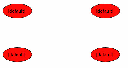
14. One of the key benefits of encapsulating XAML and logic into a user control is that you can easily create multiple instances. Test this by changing the LayoutRoot Grid to a 4x4 Grid in Page.xaml and place a separate instance of your ExpandingButton control in each cell, as follows:
将XAML和逻辑封装进用户控件的一个好处是你可以轻松的创建多个按钮实例。将LayoutRoot Grid改变为一个4x4 Grid,并在每一个单元格中放置一个单独的 ExpandingButton按钮,如下所示:
<Grid x:Name="LayoutRoot" Background="White">
<Grid.RowDefinitions>
<RowDefinition />
<RowDefinition />
</Grid.RowDefinitions>
<Grid.ColumnDefinitions>
<ColumnDefinition />
<ColumnDefinition />
</Grid.ColumnDefinitions>
<uc:ExpandingButton Grid.Row="0" Grid.Column="0" x:Name="myButton1" />
<uc:ExpandingButton Grid.Row="0" Grid.Column="1" x:Name="myButton2" />
<uc:ExpandingButton Grid.Row="1" Grid.Column="0" x:Name="myButton3" />
<uc:ExpandingButton Grid.Row="1" Grid.Column="1" x:Name="myButton4" />
</Grid>
Try running your test web site again, this time you should see four instances of your ExpandingButton control arranged in a grid!
C. Adding properties to a User Control
A control that offers no properties for customization will not likely be very reusable, since each instance will render the same way. Our button is a good example of a control that would benefit from exposing properties, which is what we will do now. In our case we will let the user change both the text and the color of the button to customize its appearance.
没有提供自定义属性的控件重用性不大,因为每个实例都以相同的方式呈现。我们的按钮就是一个很好的例子,它从暴露属性中受益良多,这就是我们现在想达到的目标。在这个例子中,用户可以修改按钮的文本和颜色来自定义按钮的外形。
1. First, we need to make sure the XAML elements whose properties we are going to expose are named and accessible from our code behind class. Open your ExpandingButton.xaml file, and add names to both the ellipse and text elements within the button canvas (use identifiers of buttonEllipse and buttonText respectively).
首先我们需要确保希望暴露属性的XAML元素可以被我们的code-behind类访问。打开 ExpandingButton.xaml文件,为按钮canvas中的ellipse和text元素添加名字(分别使用标识符 buttonEllipse 和 buttonText)。
<Ellipse x:Name="buttonEllipse" ... />
<TextBlock x:Name="buttonText" ... />
2. Open your ExpandingButton.xaml.cs code behind file, and add a public property of type string named label. Implement the get method of this property to return the current value of the Text property associated with the buttonText TextBlock element, and the set method to set the same value.
打开 ExpandingButton.xaml.cs code-behind文件,添加一个string类型的公有属性并命名为label。实现这个属性的get方法以返回与buttonText TextBlock元素关联的Text属性的当前值,set方法也设置这个值。
public string Label
{
get { return buttonText.Text; }
set { buttonText.Text = value; }
}
3. Add another property, of type Color named Color to expose the interior color of the ellipse. Implement the get method of this property to return the current value of the Color property of the Fill brush (you’ll have to cast it to a SolidColorBrush first), and the set method to assigning a new SolidColorBrush initialized to the incoming color value to the Fill property of the ellipse.
添加另一个Color类型名字为Color的属性暴露椭圆内部颜色。实现这个属性get方法返回Fill画刷Color属性的当前值(你必须首先将它强制转换为SolidColorBrush),set方法为椭圆的Fill属性分配一个新的SolidColorBrush。
public Color Color
{
get { return ((SolidColorBrush)buttonEllipse.Fill).Color; }
set { buttonEllipse.Fill = new SolidColorBrush(value); }
}
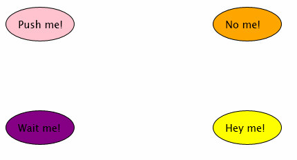
4. Go back to your Page.xaml file, and set the Label and Color properties of each of your controls to something besides their defaults, for example:
回到Page.xaml文件,为每个控件设置一个与默认值不同的Label和Color属性,例如:
<uc:ExpandingButton Color="Pink" Label="Push me!" ... />
<uc:ExpandingButton Color=" Orange " Label="No me!" ... />
<uc:ExpandingButton Color="Purple" Label="Wait me!" ... />
<uc:ExpandingButton Color="Yellow" Label="Hey me!" ... />
5. Try running your test web site again, and verify that your buttons now display different colors and text.
再次试着运行你得测试网站,确认你的按钮现在呈现为不同的颜色和文本。
D. Exposing events from a User Control
Like native controls do, you will often want to expose events from your user control, which is easy to do using the native delegate/event mechanism in the CLR. Our button control will obviously need a Click event to let the user know when it has been clicked, so we will add that next.
和原生控件一样,你经常想为你的用户控件暴露事件,通过CLR原生支持的委托/事件机制的支持,这变得非常简单。我们的按钮控件很明显需要一个Click事件让用户知道已经点击了它,因此下面我们着手实现Click事件。
1. In Visual Studio, open your user control code behind file, ExpandingButton.xaml.cs.
在Visual Studio中,打开你的用户控件code-behind文件 ExpandingButton.xaml.cs。
2. Add a public event of type EventHandler to your ExpandingButton class named Click.
向你的 ExpandingButton类添加一个EventHandler类型的公有事件,命名为Click。
public event EventHandler Click;
3. Invoke the event from within your MouseLeftButtonUp event handler, firing the event only if the Handled property of the incoming MouseButtonEventArgs is false and the Click delegate is not null. By setting the handled property of the incoming MouseButtonEventArgs to true, you are terminating the ‘bubbling’ of the event so it will not be passed up the chain to parent controls.
void ExpandingButton_MouseLeftButtonUp(object sender,
MouseButtonEventArgs e)
{
this.ButtonClickAnimation.Begin();
if (!e.Handled && (Click != null))
Click(this, EventArgs.Empty);
}
从你的 MouseLeftButtonUp事件处理器中触发Click事件,并且仅当传递进来的 MouseButtonEventArgs的Handled属性为false,Click委托不为空时才触发事件。通过设置传递进来的 MouseButtonEventArgs的handled属性为true,可以终止事件的’冒泡’,这样事件将不会传递到父控件中。
4. To test your new event, open your Page.xaml file, and in one of your ExpandingButton control declarations, add a handler for the Click event type typing Click=[tab] which will generate a new handler in your code behind file named myButton1_Click.
为了测试这个新事件,打开Page.xaml文件,在其中一个 ExpandingButton控件声明中,添加一个Click事件的处理器,键入Click=[tab]会自动在你的code-behind文件中生成一个名字为 myButton1_Click的处理器。
<uc:ExpandingButton Color="Pink" Label="Push me!" Grid.Row="0" Grid.Column="0" x:Name="myButton1" Click="myButton1_Click"/>
5. Implement the handler to change the Label of the button to something different so you know it was clicked. You can use the incoming sender parameter to access the control that generated the event, first casting it to the ExpandingButton type.
private void myButton1_Click(object sender, EventArgs e)
{
((ExpandingButton)sender).Label = "Again!";
}
在事件处理器中改变按钮的Label,这样你能知道它被单击了。你可以使用传递进来的sender参数访问产生事件的控件,当然首先要将它强制转换为 ExpandingButton类型。
6. Try running your test web site, and verify that the button changes it label once it has been clicked.
试着运行你的test网站,并确认当单击按钮时,它被改变了。
7. Feel free to wire up handlers to the Click events of each of the other button instances on the page as well.
E. Dynamically adding User Controls
You may need to add user controls dynamically to your pages, whether in response to user input or for programmatic control over the layout. Fortunately this is no more difficult than it is for standard controls, so in this part we will dynamically add an instance of our ExpandingButton control to a Canvas on our main page.
你可能需要动态添加用户控件到你的页面中,无论是为了响应用户输入或者为了编程控制布局。幸运的是,这与添加标准控件一样简单,因此在本小节中,我们将动态添加一个 ExpandingButton控件实例到主页面的一个Canvas中。
1. To dynamically add a control to a page, you need to add it to the Children of a container, so in preparation for an instance of our control to the page, insert a new Canvas element into a new row of the Grid in your Page.xaml file. To do this, add another RowDefinition element to the RowDefinitions section of your Grid. Then add a Canvas inside the Grid with its Row number set to 2. Name the new canvas buttonContainerCanvas.
为了动态向一个页面添加控件,需要将控件添加到容器的孩子中,因此为了添加此控件的实例到页面中,为你的Page.xaml文件Grid元素添加新的一行,以插入一个新的Canvas元素。向Grid元素的RowDefinitions节添加另一个RowDefinition元素。然后在Grid中添加一个Row属性为2的Canvas。将这个新Canvas命名为 buttonContainerCanvas。
<Grid>
<Grid.RowDefinitions>
<RowDefinition />
<RowDefinition />
<RowDefinition />
</Grid.RowDefinitions>
...
<Canvas x:Name="buttonContainerCanvas" Grid.Row="2" />
</Grid>
2. To dynamically inject a new instance of your control, open the Page.xaml.cs file, in the constructor after the call to InitializeComponent(), create a new instance of your ExpandingButton class.
为了动态插入一个控件的实例,打开 Page.xaml.cs文件,在构造函数中 InitializeComponent()调用之后,创建一个ExpandingButton类实例。
ExpandingButton dynamicButton = new ExpandingButton();
3. Set the Label and Color properties as desired, plus feel free to wire up the Click event to your existing handler that changes the Label text.
设置Label和Color属性,绑定Click事件到改变Label文本的处理器。
dynamicButton.Label = "Dynamic button";
dynamicButton.Color = Colors.Red;
dynamicButton.Click += myButton1_Click;
4. Finally, add the newly created button to the Children collection of the buttonContainerCanvas you added earlier.
最后,向你先前添加的 buttonContainerCanvas的Children集合中添加新创建的按钮。
buttonContainerCanvas.Children.Add(dynamicButton);
5. Try running your test web site, and verify that the new ‘dynamic’ button shows up in the last row of the grid.
试着运行你的测试web网站,并确认新动态按钮出现在grid的最后一行。
F. Building User Controls in Independent Assemblies
If you need to use your user control in multiple projects (for example, a common menu control that you would like to share across applications), you don’t want to copy the control’s XAML and source code since you would end up maintaining separate implementations. Instead, it is preferable to isolate the control into its own assembly and share only the resulting compiled binary across projects. This is easily accomplished with Visual Studio 2008 as well by creating a separate Silverlight Class Library project to house your User Control. In this part, you will create a new user control housed in a separate assembly, and then reference that control from your original project.
如果你需要在多个项目中使用你的用户控件(例如,你需要在多个应用程序中使用菜单控件),但是你不想拷贝控件的XAML和源代码,因为那样你将不得不维护多个实现。相反,将控件隔离到单独程序集,在多个项目中只共享最终的编译后的二进制文件更为稳妥。在Visual Studio 2008 中这也很容易办到,通过创建一个单独的Silverlight类库项目来承载你的用户控件即可。在本部分中,你将创建一个新的封装在独立程序集中的用户控件,并且在原来的项目中引用这个控件。
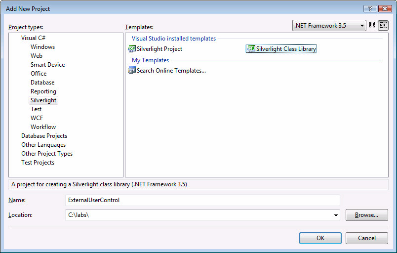
1. In your UserControls solution in Visual Studio, add a new Silverlight Class Library project by right-clicking on the solution icon in the solution explorer and selecting Add | New Project… . Choose Visual C# | Silverlight as the project type, and select the Silverlight Class Library template. Name the project ExternalUserControl and hit OK.
在UserControls解决方案中,右击解决方案浏览器中的解决方案图标选择 Add | New Project…添加一个新的Silverlight Class Library项目。选择 Visual C# | Silverlight作为项目类型,选择 Silverlight Class Library模板。命名为 ExternalUserControl,然后单击OK。
2. This will create a new class library project compiled with the Silverlight assemblies, which you can then deploy as part of another Silverlight project. To begin, delete the default Class1.cs file that was added by the project wizard – we’re not going to need it.
这将创建一个新的类库项目并与Silverlight程序集一起编译,你可以将它作为另一个Silverlight项目的一部分一起部署。让我们开始吧,删除默认的Class1.cs文件,它是由项目向导添加的-我们不需要它。
3. Next, add a new Silverlight User Control by right clicking on your ExternalUserControl project within the Solution Explorer and selecting Add | New Item… . Select Silverlight from the list of Categories and choose the Silverlight Control template. Name the new control AnotherControl.xaml.
然后,右击解决方案浏览器中的 ExternalUserControl项目选择 Add | New Item…来添加一个新的Silverlight用户控件。从Categories中选择Silverlight,选择Silverlight控件模板。命名新控件为AnotherControl.xaml。
4. Open the AnotherControl.xaml file, and add a simple TextBlock element with some text so we can see the control render something when we deploy it.
打开 AnotherControl.xaml文件,添加一个简单的 TextBlock元素和一些文本,这样当我们部署时,可以直到控件呈现出来。
<Grid x:Name="LayoutRoot" >
<TextBlock Text="Hi from another assembly!" />
</Grid>
5. Building a control in a separate assembly is no different from building it within a project, so we will leave our control to render just this simple text, understanding that all of the techniques outlined earlier in this lab could be applied here.
在一个单独的程序集中构建一个控件与在一个项目中构建它并没有什么不同,因此在这里我们只是呈现一些简单的文本,重要的是理解先前使用的技术在这里也是适用的。
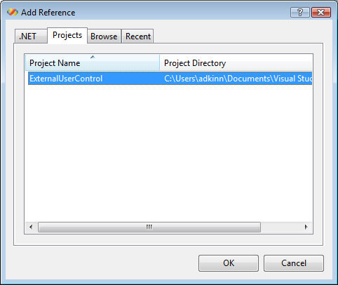
6. Compile your new control, and then add a reference to it in your UserControls project. To add a reference, right-click on the References icon under your UserControls project in the Solution Explorer, and select Add Reference… . In the Add Reference dialog, click on the Projects tab, and select the ExternalUserControl project and hit OK.
7. 编译你的新控件,然后添加一个到UserControls项目的引用。为了添加一个引用,在解决方案浏览器中UserControls项目标签上右击Reference图标,点击Project标签,选择ExternalUserControl项目并单击OK。
To verify that your external control can now be used, open your Page.xaml file and add a new namespace declaration to the UserControl element pointing to the namespace and assembly of your external control.
为了确认现在可以使用你的外部控件,打开你的Page.xaml文件,添加一个到UserControl元素的名字空间声明,其中名字空间和程序集指向你的外部控件。
xmlns:euc="clr-namespace:ExternalUserControl;assembly=ExternalUserControl"
8. Now add an instance of AnotherControl to your page using the euc namespace. The solution places this control in the third row and second column of the existing Grid, which was not in use.
现在使用euc名字空间添加一个 AnotherControl实例到你的页面中。这里将控件放到Grid的第三行第二列中。
<euc:AnotherControl x:Name="myOtherControl" Grid.Row="2" Grid.Column="1" />
9. Try running your test web site again, and verify that the TextBlock of your external control renders correctly. You could use this technique to create controls to share and distribute easily across projects and applications.
再次试着运行你的测试web网站,确保外部控件的TextBlock呈现正确。你可以使用此技术创建控件,并在不同的项目和应用程序中轻松的共享和发布它们。


 扫一扫
扫一扫
 4652
4652

 被折叠的 条评论
为什么被折叠?
被折叠的 条评论
为什么被折叠?
 到【灌水乐园】发言


