


google官方教程 自定义ListView列表项的选中状态。
注:以下代码来自google官方Demo。
我们有个数据展示的需求,需要以ListView形式展示,但是我们需要一个状态去标识出已选择或者未选择,如图:
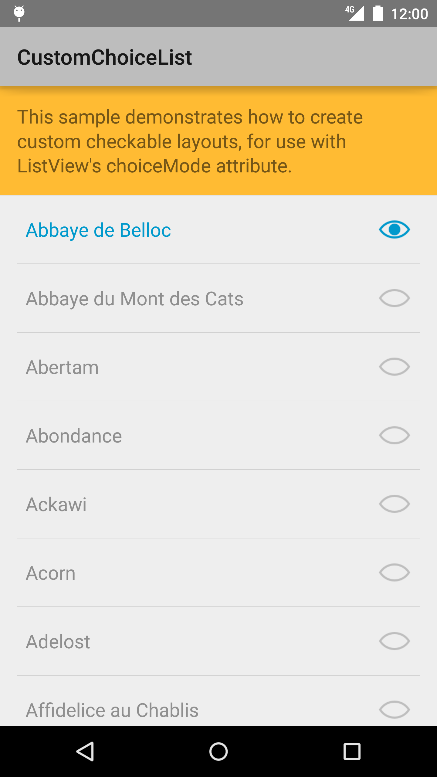
可以看到,如果是已选择状态,列表项的文字和右侧图标是高亮的。
接下来看如何实现:
首先,定义一下 color state,定义文字被选中和未选中时的颜色变化 :
文件:hideable_text_color.xml
<selector xmlns:android="http://schemas.android.com/apk/res/android">
    <item android:state_checked="false" android:color="#6000" />
    <item android:color="#09c" />
</selector>
同样,对右侧图标定义一个drawable state:
文件:ic_hideable_item.xml
<selector xmlns:android="http://schemas.android.com/apk/res/android">
    <item android:state_checked="false" android:drawable="@drawable/ic_hideable_item_unchecked" />
    <item android:drawable="@drawable/ic_hideable_item_checked" />
</selector>
接下来,定义列表项的布局容器,定义其状态切换的功能。这里采用的是一个LinearLayout作为父布局。我们需要继承它,然后复写它的onCreateDrawableState方法,把我们自定义的状态在合适的时候添加进去。并实现Checkable接口,实现该接口的好处是:当列表被点击时,Checkable实现类的相关方法,如 isChecked(),setChecked()自动会被调用,不用我们再显示实现列表项点击事件,再调用这些方法去改变列表状态,所以是很方便的。
public class CheckableLinearLayout extends LinearLayout implements Checkable {
    private static final int[] CHECKED_STATE_SET = {android.R.attr.state_checked};

    private boolean mChecked = false;

    public CheckableLinearLayout(Context context, AttributeSet attrs) {
        super(context, attrs);
    }

    public boolean isChecked() {
        return mChecked;
    }

    public void setChecked(boolean b) {
        if (b != mChecked) {
            mChecked = b;
            refreshDrawableState();
        }
    }

    public void toggle() {
        setChecked(!mChecked);
    }

    @Override
    public int[] onCreateDrawableState(int extraSpace) {
        final int[] drawableState = super.onCreateDrawableState(extraSpace + 1);
        if (isChecked()) {
            mergeDrawableStates(drawableState, CHECKED_STATE_SET);
        }
        return drawableState;
    }
}
代码不复杂,声明了一个mChecked,然后在mChecked=true的情况下,通过onCreateDrawableState方法,加入我们自定义的状态。
接下来使用该布局容器:注释里写了:使用该布局作为列表项容器的 ListView 要设置为”选择模式”。这就是为什么该布局容器要实现 Checkable的原因,因为一旦列表项被选择,就会调用Checkable接口的方法,这是Android为我们实现的一套机制,很方便,直接使用吧。
文件:list_item.xml
<!--
    The ListView from sample_main.xml has a choiceMode set, meaning that when a user
    selects a list item, the ListView will set the state for that item's root view
    (this CheckableLinearLayout) to "checked". Note that this requires that the root view
    implements the Checkable interface. Once the root view is checked, any children that
    have the duplicateParentState attribute set will inherit this "checked" state.
-->
<com.example.android.customchoicelist.CheckableLinearLayout
    xmlns:android="http://schemas.android.com/apk/res/android"
    android:orientation="horizontal"
    android:layout_width="match_parent"
    android:layout_height="match_parent"
    android:paddingLeft="8dp"
    android:paddingRight="8dp"
    android:minHeight="?android:listPreferredItemHeight"
    android:gravity="center_vertical">

    <!--
        The duplicateParentState attribute on this TextView, along with the color state list
        used in the textColor attribute causes its text color to change when its parent
        is checked or unchecked.
    -->
    <TextView android:id="@android:id/text1"
        android:duplicateParentState="true"
        android:layout_width="0dp"
        android:layout_weight="1"
        android:layout_height="wrap_content"
        android:textAppearance="?android:textAppearanceMedium"
        android:textColor="@color/hideable_text_color" />

    <!--
        The duplicateParentState attribute on this ImageView, along with the state list
        drawable in the src attribute causes its image to change when its parent
        is checked or unchecked.

        To use the standard radio or checkmark image, set the src to
        ?android:listChoiceIndicatorMultiple or ?android:listChoiceIndicatorSingle. These
        are system theme attributes that reference a state list drawable.
    -->
    <ImageView android:src="@drawable/ic_hideable_item"
        android:duplicateParentState="true"
        android:layout_width="wrap_content"
        android:layout_height="wrap_content"
        android:layout_marginLeft="16dp" />

</com.example.android.customchoicelist.CheckableLinearLayout>
注意控件都有个 android:duplicateParentState=”true” 的属性,如果设置此属性,将直接从父容器中获取绘图状态(光标,按下等)。 注意仅仅是获取绘图状态,而没有获取事件,也就是你点一下LinearLayout时Button有被点击的效果,但是不执行点击事件,这样就可以更新控件的状态了。
接下来定义一个ListView:
文件:sample_main.xml:
<LinearLayout xmlns:android="http://schemas.android.com/apk/res/android"
    android:layout_width="match_parent"
    android:layout_height="match_parent"
    android:orientation="vertical"
    android:showDividers="middle"
    android:divider="?android:dividerHorizontal">

    <TextView style="@style/Widget.DescriptionBar"
        android:layout_width="match_parent"
        android:layout_height="wrap_content"
        android:text="@string/intro_message" />

    <!--
        When a ListView has a choiceMode set, it will allow users to "choose"
        one or more items. The framework provides default list item layouts
        that show standard radio buttons or check boxes next to a
        single line of text:

        android.R.layout.simple_list_item_single_choice and
        android.R.layout.simple_list_item_multiple_choice.

        In some cases, you may want to customize this layout. When doing so,
        the root view must implement the Checkable interface.

        Lastly, remember to use padding on your ListViews to adhere to the standard
        metrics described in the Android Design guidelines. When doing so,
        you should set the android:scrollbarStyle such that the scrollbar
        doesn'isn't inset.
    -->
    <ListView android:id="@android:id/list"
        android:layout_width="match_parent"
        android:layout_height="0dp"
        android:layout_weight="1"
        android:paddingLeft="@dimen/page_margin"
        android:paddingRight="@dimen/page_margin"
        android:scrollbarStyle="outsideOverlay"
        android:choiceMode="multipleChoice" />
</LinearLayout>
注释里写到:ListView的”android:choiceMode”有两种值:multipleChoice 和singleChoice 意思很清楚,将ListView的选择模式设置为多选或者单选模式,不管哪种模式,列表项被选中时都会改变样式。
接下来是Activity,很简单的实现,其中,类Cheese只是数据的提供类,就不写出来了:
/**
 * This sample demonstrates how to create custom single- or multi-choice
 * {@link android.widget.ListView} UIs. The most interesting bits are in
 * the <code>res/layout/</code> directory of this sample.
 */
public class MainActivity extends ListActivity {
    protected void onCreate(Bundle savedInstanceState) {
        super.onCreate(savedInstanceState);
        setContentView(R.layout.sample_main);
        setListAdapter(new MyAdapter());
    }

    /**
     * A simple array adapter that creates a list of cheeses.
     */
    private class MyAdapter extends BaseAdapter {
        @Override
        public int getCount() {
            return Cheeses.CHEESES.length;
        }

        @Override
        public String getItem(int position) {
            return Cheeses.CHEESES[position];
        }

        @Override
        public long getItemId(int position) {
            return Cheeses.CHEESES[position].hashCode();
        }

        @Override
        public View getView(int position, View convertView, ViewGroup container) {
            if (convertView == null) {
                convertView = getLayoutInflater().inflate(R.layout.list_item, container, false);
            }

            ((TextView) convertView.findViewById(android.R.id.text1))
                    .setText(getItem(position));
            return convertView;
        }
    }
}
到此为止,效果就实现了。
其实这个功能的实现主要是依靠StateListDrawable的使用,关于StateListDrawable使用详解 可以看这篇文章:
http://blog.csdn.net/qinjuning/article/details/7474827


 3773
3773


 被折叠的 条评论
为什么被折叠?
被折叠的 条评论
为什么被折叠?
 到【灌水乐园】发言


