


Android Support Library 23.2
Posted by Ian Lake, Developer Advocate
由
Ian Lake 发布,开发者提倡:
Android Support Library 23.2
安卓支持库 23.2版本
When talking about the Android Support Library, it is important to realize this isn’t one monolithic library,
but a whole collection of libraries that seek to provide backward-compatible versions of APIs,
as well as offer unique features without requiring the latest platform version. Version 23.2 adds a few new support
libraries as well as new features to many of the existing libraries.
当提及安卓支持库
(Android Support Library)
的时候,非常重要的一点就是我们必须要认识到它不是一个库,
而是对APIs寻找一种提供向后
Support Vector Drawables and Animated Vector Drawables
支持矢量图片和带动画的矢量图片
Vector drawables allow you to replace multiple png assets with a single vector graphic, defined in XML.
While previously limited to Lollipop and higher devices, both VectorDrawable andAnimatedVectorDrawable are now
available through two new Support Libraries support-vector-drawable and animated-vector-drawable, respectively.
矢量图片(Vector drawables)
允许你仅使用一个定义在XML中的矢量的图形来替换多个png图片资源。而以前这种特性限制在棒棒糖
(
Lollipop
)以及以上的设备上才有效,但是现在可以分别通过两个新的支持库
support-vector-drawable 和animated-vector-drawable 来实现。
Android Studio 1.4 introduced limited support for vector drawables by generating pngs at build time. To disable
this functionality (and gain the true advantage and space savings of this Support Library), you need to add
vectorDrawables.useSupportLibrary = true to your build.gradle file:
Android Studio 1.4 介绍了一种通过在编译时生成png图片的办法对矢量图片提供了有限的支持。为了禁用这个功能(获得支持库真正的优势和节省空间)
,你需要添加
vectorDrawables.useSupportLibrary = true 到你的
build.gradle 文件里面。
 // Gradle Plugin 2.0+
 android {
   defaultConfig {
     vectorDrawables.useSupportLibrary = true
    }
 }
You’ll note this new attribute only exists in the version 2.0 of the Gradle Plugin. If you are using Gradle 1.5 you’ll
instead use
你会发现这个新的属性只存在于Gradle
Plugin
2.0版本(或更高版本)。如果你使用
Gradle
Plugin
1.5,你可以使用以下配置来代替
 // Gradle Plugin 1.5
 android {
   defaultConfig {
     generatedDensities = []
  }

  // This is handled for you by the 2.0+ Gradle Plugin
  aaptOptions {
    additionalParameters "--no-version-vectors"
  }
 }
You’ll be able to use VectorDrawableCompat back to API 7 and AnimatedVectorDrawableCompat on all API 11 and higher devices.
Due to how drawables are loaded by Android, not every place that accepts a drawable id (such as in an XML file) will support
loading vector drawables. Thankfully, AppCompat has added a number of features to make it easy to use your new vector
drawables.
你现在可以在API7上使用
VectorDrawableCompat,在API11上使用
AnimatedVectorDrawableCompat 。介于安卓加载图片的方法,并不是所有接受
一个图片ID(比如在XML中的)的地方都支持加载矢量图片。值得庆幸的是,AppCompat已经添加了大量的特性来让你在使用新的矢量图片时变得很
简单。
Firstly, when using AppCompat with ImageView (or subclasses such as ImageButton and FloatingActionButton), you’ll
be able to use the new app:srcCompat attribute to reference vector drawables (as well as any other drawable
available to android:src):
首先,当你在 ImageView (或者他的子类比如 ImageButton 和 FloatingActionButton )上使用
AppCompat时,你可以使用新的属性
app:srcCompat 来引用矢量图片(也可以是其他任何可使用 android:src 的可绘制的控件):
 <ImageView
  android:layout_width="wrap_content"
  android:layout_height="wrap_content"
  app:srcCompat="@drawable/ic_add" />
And if you’re changing drawables at runtime, you’ll be able to use the same setImageResource() method as before - no changes there. Using AppCompat and app:srcCompat is the most foolproof method of integrating vector drawables into your app.
并且,如果你想在运行时改变图片,你可以像以前一样,使用 setImageResource()
方法 - 在这里并没有改变什么。
在你的应用里面
使用
AppCompat 和
app:srcCompat 来整合矢量图片是最有效的。
You’ll find directly referencing vector drawables outside of app:srcCompat will fail prior to Lollipop. However, AppCompat does support loading vector drawables when they are referenced in another drawable container such as a StateListDrawable, InsetDrawable, LayerDrawable, LevelListDrawable, and RotateDrawable. By using this indirection, you can use vector drawables in cases such as TextView’s android:drawableLeft attribute, which wouldn’t normally be able to support vector drawables.
Lollipop之前版本,
你会发现
在
app:srcCompat 外
直接引用矢量图片会失败。但是,
AppCompat 却支持其他的drawable 容器加载矢量图片,比如StateListDrawable, InsetDrawable, LayerDrawable, LevelListDrawable和 RotateDrawable等。通过这种间接的方法,你能在诸如TextView 的amdroid:drawableLeft
属性
等通常是不支持矢量图片的容器里面使用矢量图片了。
AppCompat DayNight theme
While enabling the use of vector graphics throughout your app is already a large change to AppCompat, there’s a new theme added to AppCompat in this release: Theme.AppCompat.DayNight.
对于
AppCompat来说,在你整个的应用里面使用矢量图形成为了可能已经是一个非常大的改变了,但是,这次发布还加入了一个新的主题:
Theme.AppCompat.DayNight.


Prior to API 14, The DayNight theme and its descendents DayNight.NoActionBar, DayNight.DarkActionBar, DayNight.Dialog, etc. become their Light equivalents. But on API 14 and higher devices, this theme allows apps to easily support both a Light and Dark theme, effectively switching from a Light theme to a Dark theme based on whether it is ‘night’.
在API 14之前,
DayNight主题以及它的后代
DayNight.NoActionBar, DayNight.DarkActionBar, DayNight.Dialog等等和Light是一样的。但是在API 14以及以上的设备上,这个主题让应用更简单的支持白天和黑夜两个主题。
By default, whether it is ‘night’ will match the system value (from UiModeManager.getNightMode()), but you can override that value with methods in AppCompatDelegate. You’ll be able to set the default across your entire app (until process restart) with the static AppCompatDelegate.setDefaultNightMode() method or retrieve an AppCompatDelegate via getDelegate() and use setLocalNightMode() to change only the current Activity or Dialog.
默认的情况下,是否是“晚上”将由系统值来决定(从UiModeManager.getNightMode()),但是你可以通过 AppCompatDelegate 里的方法来覆盖这个值。你可以在你的整个应用里面(直到进程重启)使用静态方法
AppCompatDelegate.setDefaultNightMode() 来设置这个默认值,或者通过 getDelegate() 来获取一个
AppCompatDelegate然后使用
setLocalNightMode() 来改变仅仅当前activity或者Dialog的
默认值。
When using AppCompatDelegate.MODE_NIGHT_AUTO, the time of day and your last known location (if your app has the location permissions) are used to automatically switch between day and night, while MODE_NIGHT_NO and MODE_NIGHT_YES forces the theme to never or always use a dark theme, respectively.
当使用
AppCompatDelegate.MODE_NIGHT_AUTO,根据当天的时间以及你最近一次已知的位置信息(如果你的应用有获取位置信息的权限的话)将会被用来自动却换白天和黑夜主题。
MODE_NIGHT_NO 和MODE_NIGHT_YES分别表示强制不适用和总是使用黑色主题。
It is critical that you test your app thoroughly when using the DayNight themes as hardcoded colors can easily make for unreadable text or icons. If you are using the standardTextAppearance.AppCompat styles for your text or colors pulled from your theme such as android:textColorPrimary, you’ll find these automatically update for you.
至关重要的是,务必要彻底测试一下你的应用,因为在
DayNight 主题下使用硬编码书写颜色会很容易造成文本或图片的
不可读
。如果你文本使用的是标准的 TextAppearance.AppCompat 样式或者颜色是
从主题里面(比如android:textColorPrimary )
得到的,你将发现这些将为你自动更新视图。
However, if you’d like to customize any resources specifically for night mode, AppCompat reuses the night resource qualifier folder, making it possible customize every resource you may need. Please consider using the standard colors or taking advantage of the tinting support in AppCompat to make supporting this mode much easier.
然而,
如果你想专门为夜间模式自定义自己的一套资源,正由于
AppCompat 是重用夜间模式资源限定符的,这让自定义你所需要的所有资源成为可能。
为了让对这个模式的支持变得更轻松,请考虑使用标准的颜色或者使用AppCompat中有优势的着色。
Design Support Library: Bottom Sheets
The Design Support Library provides implementations of many patterns of material design. This release allows developers to easily add bottom sheets to their app.
Design Support Library 提供了许多 materia design 设计模式的实现。 此次发布让开发者更加容易的在他们的应用上添加 bottom sheets。

By attaching a BottomSheetBehavior to a child View of a CoordinatorLayout (i.e., adding app:layout_behavior="android.support.design.widget.BottomSheetBehavior"), you’ll automatically get the appropriate touch detection to transition between five state:
通过在 CoordinatorLayout (比如添加
app:layout_behavior="android.support.design.widget.BottomSheetBehavior"
)的子View里面加上一个
BottomSheetBehavior ,你可以
你将自动得到能在5个状态间切换的触摸检测功能:
- STATE_COLLAPSED: this collapsed state is the default and shows just a portion of the layout along the bottom. The height can be controlled with theapp:behavior_peekHeight attribute (defaults to 0)
- STATE_COLLAPSED:默认状态:折叠的状态,只显示布局底部的一部分。它的高度可以通过 app:behavior_peekHeight 属性来控制(默认高度为0)。
- STATE_DRAGGING: the intermediate state while the user is directly dragging the bottom sheet up or down
- STATE_DRAGGING:中间状态:此时用户可以直接上下拖动bottom sheet
- STATE_SETTLING: that brief time between when the View is released and settling into its final position
- STATE_SETTLING:在View被释放到View滑到最底部之间有一个短暂的时间
- STATE_EXPANDED: the fully expanded state of the bottom sheet, where either the whole bottom sheet is visible (if its height is less than the containing CoordinatorLayout) or the entire CoordinatorLayout is filled
- 不管是整个 bottom sheet 都是可见的(如果它的高度比所包含的CoordinatorLayout 还要小,即一屏就能显示) 还是整个 CoordinatorLayout 都被填充满了(一屏显示不够)都会将 bottom sheet 全部展开
- STATE_HIDDEN: disabled by default (and enabled with the app:behavior_hideable attribute), enabling this allows users to swipe down on the bottom sheet to completely hide the bottom sheet
- 默认这种状态是被禁止的(可以通过使用 app:behavior_hideable 属性来开启),如果开启了这种状态,允许用户向下滑动bottom sheet 直到完全隐藏掉 bottom sheet
Keep in mind that scrolling containers in your bottom sheet must support
nested scrolling
(for example, NestedScrollView, RecyclerView, or ListView/ScrollView on API 21+).
记住。
bottom sheet 滚动容器必须支持
nested scrolling (比如 NestedScrollView,RecyclerView,或者API 21以上的ListView和ScrollView)
If you’d like to receive callbacks of state changes, you can add a BottomSheetCallback:
如果你想接收一个状态改变时的回调,你可以添加一个
BottomSheetCallback:
 // The View with the BottomSheetBehavior
 View bottomSheet = coordinatorLayout.findViewById(R.id.bottom_sheet);
 BottomSheetBehavior behavior = BottomSheetBehavior.from(bottomSheet);
 behavior.setBottomSheetCallback(new BottomSheetCallback() {
    @Override
    public void onStateChanged(@NonNull View bottomSheet, int newState) {
      // React to state change
    }
      @Override
      public void onSlide(@NonNull View bottomSheet, float slideOffset) {
       // React to dragging events
   }
 });
While BottomSheetBehavior captures the persistent bottom sheet case, this release also provides a BottomSheetDialog and BottomSheetDialogFragment to fill the modal bottom sheets use case. Simply replace AppCompatDialog or AppCompatDialogFragment with their bottom sheet equivalents to have your dialog styled as a bottom sheet.
尽管
BottomSheetBehavior 针对的是 persistent bottom sheet 情景,但是这次发布也提供了一个
BottomSheetDialog 和 BottomSheetDialogFragment 来填补 modal bottom sheets 用例。可以简单地使用bottm sheet的替代品更换 AppCompatDialog 或者 AppCompatDialogFragment使你的对话框呈现出
bottom sheet的风格。
Support v4: MediaBrowserServiceCompat
The Support v4 library serves as the foundation for much of the support libraries and includes backports of many framework features introduced in newer versions of the platform (as well anumber of unique features).
Adding onto the previously released MediaSessionCompat class to provide a solid foundation for media playback, this release adds MediaBrowserServiceCompat and MediaBrowserCompat providing a compatible solution that brings the latest APIs (even those added in Marshmallow) back to all API 4 and higher devices. This makes it much easier to support audio playback on Android Auto and browsing through media on Android Wear along with providing a standard interface you can use to connect your media playback service and your UI.
上个版本发布的 MediaSessionCompat 类里面已经为媒体播放提供一个结实的基础,这次发布新添加的
MediaBrowserServiceCompat 和
MediaBrowserCompat 提供了一个兼容性上的解决办法,做到了最新的APIs(甚至这些已经被添加到
Marshmallow
)向后兼容到API 4及以上设备。这让支持 安卓车载 上的音频播放,安卓手表上的媒体浏览变得更加简单,另外还为连接媒体播放服务和 UI提供了一个标准的接口。
RecyclerView
The RecyclerView widget provides an advanced and flexible base for creating lists and grids as well as supporting animations. This release brings an exciting new feature to theLayoutManager API: auto-measurement! This allows a RecyclerView to size itself based on the size of its contents. This means that previously unavailable scenarios, such as usingWRAP_CONTENT for a dimension of the RecyclerView, are now possible. You’ll find all built in LayoutManagers now support auto-measurement.
RecyclerView 为创建列表和表格提供了一个先进而且很灵活的基础,并且还支持动画 animations。这次发布为
LayoutManager API
带来了一个令人兴奋的新特性:自动测量!这让
RecyclerView 可以基于它的内容来测量自身的大小。这就意味着一些以前不可能实现的情况现在成为了能,比如使用为
RecyclerView 的尺寸使用
WRAP_CONTENT。你会发现所有内置
LayoutManagers 现在都支持自动测量了。
Due to this change, make sure to double check the layout parameters of your item views: previously ignored layout parameters (such as MATCH_PARENT in the scroll direction) will now be fully respected.
由于这个改变,一定要仔细检查 item views 的布局参数:以前一直被忽略的布局参数(比如 在滚动方向上的
MATCH_PARENT
)现在将会被认真地对待。
If you have a custom LayoutManager that does not extend one of the built in LayoutManagers, this is an opt-in API - you’ll be required to call setAutoMeasureEnabled(true) as well as make some minor changes as detailed in the Javadoc of the method.
如果你有一个自定义的
LayoutManager
而不是去扩展一个内置的
LayoutManagers,这是一个API的选择,你需要调用
setAutoMeasureEnabled(true) ,关于这个方法的一些小变化请参考
Javadoc(java文档)。
Note that although RecyclerView animates its children, it does not animate its own bounds changes. If you would like to animate the RecyclerView bounds as they change, you can use the Transition APIs.
Custom Tabs
Custom Tabs makes it possible to seamlessly transition to web content while keeping the look and feel of your app. With this release, you’ll now be able to add actions to a bottom bar for display alongside the web content.
自定义标签可以在保持你应用的外观与风格的同时无缝的过渡到网页内容。通过这个版本,你现在可以在网页内容旁边添加一个底部按钮操作项。

With the new addToolbarItem() method, you’ll be able to add up to currently 5 (MAX_TOOLBAR_ITEMS) actions to the bottom bar and update them with setToolbarItem() once the session has begun. Similar to the previous setToolbarColor() method, you’ll also find a setSecondaryToolbarColor() method for customizing the background color of the bottom bar.
使用这个新的
addToolbarItem() 方法,你目前可以添加至多5个(
MAX_TOOLBAR_ITEMS
)操作到底部按钮,一旦回话开始,再用
setToolbarItem() 方法更新他们,你还会发现一个
setSecondaryToolbarColor() 方法,用来自定义底部按钮的背景颜色。
Leanback for Android TV
The Leanback Library gives you the tools you need to easily bring your app to Android TV with many standard components optimized for the TV experience. The GuidedStepFragment received a significant set of improvements with this release.
Leanback Library 给了你需要的工具,方便你把你的应用带到 Android TV 上,里面还有需要专门为TV而优化的组件。
这次发布,
GuidedStepFragment 得到了一个显著的改善。
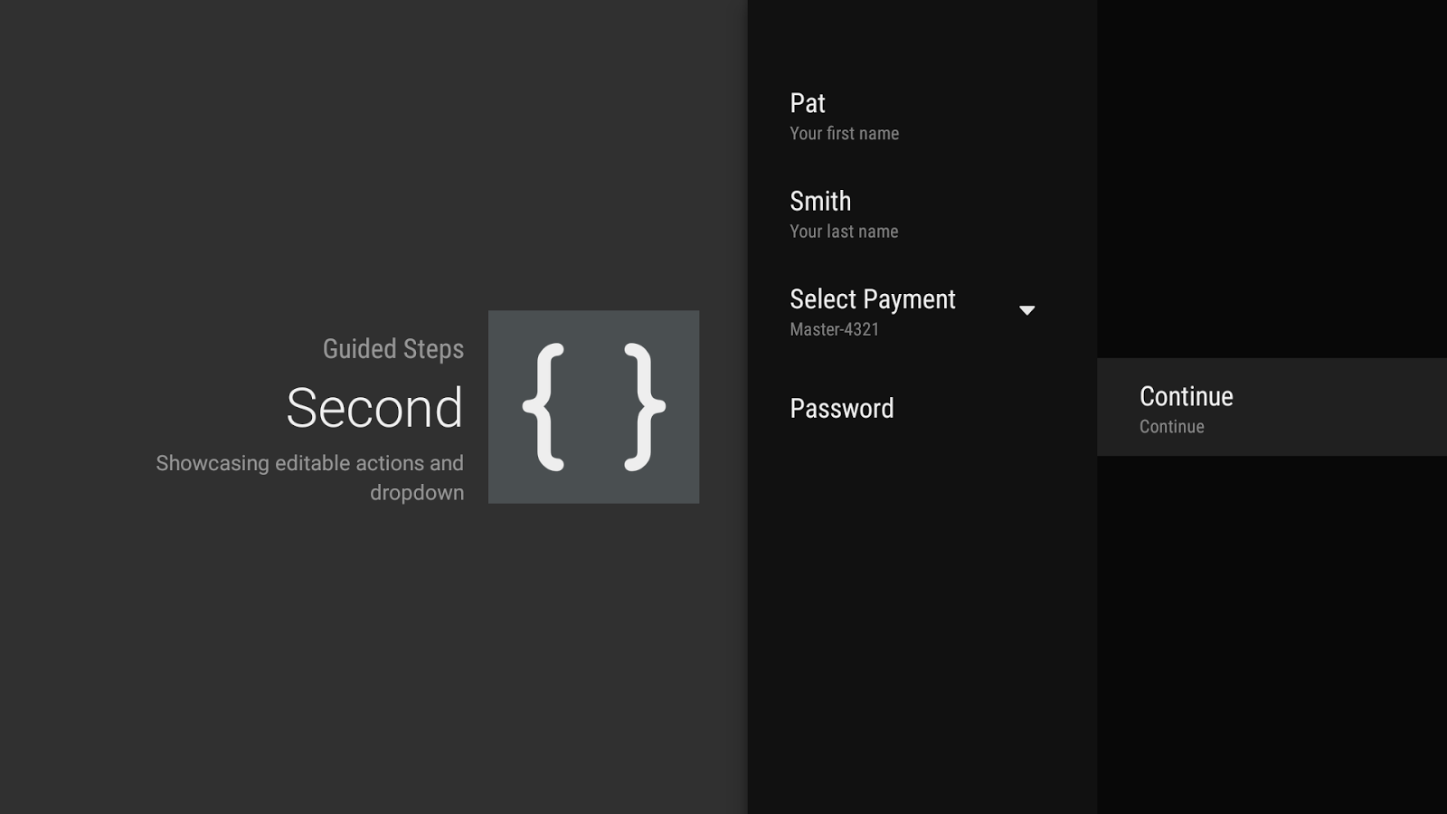

The most visible change may be the introduce of a second column used for action buttons (added by overriding onCreateButtonActions() or calling setButtonActions()). This makes it much easier to reach completion actions without having to scroll through the list of available GuidedActions.
最直观的改变可能就是在动作按钮上(可以通过复写
onCreateButtonActions() 或者 调用 setButtonActions()来添加
)引入第二列。这将使得我们不必再滚动可见的 GuidedActions 列表就可以完成所有动作。
Speaking of GuidedActions, there’s a number of new features to allow richer input including editable descriptions (via descriptionEditable()), sub actions in the form of a dropdown (with subActions()), and a GuidedDatePickerAction.
提到
GuidedActions,有一系列的让输入更加丰富的新特性,包括输入框的描述(通过
descriptionEditable()
),下拉输入框的二级操作和一个
GuidedDatePickerAction。


These components should make it much easier for you to get information from the user when absolutely required.
在你最需要的时候,
这些组件一定会
让你
更加容易的
从用户那里得到信息。
Available Now
Version 23.2 of the Android Support Library is available via your SDK Manager and Android Studio. Take advantage of all of
the new features as well as additional bug fixes starting now! As always, file bug reports at b.android.com and connect
with other developers on the Android Development Google+ community.
Android Support Library 23.2 现在已经可以通过 SDK Manager 和 Android Studio 下载使用了。充分利用这些新特性吧,以及一些
Posted by Reto Meier at 2:19 PM
Translator : hymanme at 2016-3-3


 796
796


 被折叠的 条评论
为什么被折叠?
被折叠的 条评论
为什么被折叠?
 到【灌水乐园】发言


