


一、圆角|文本属性
1、知识点汇总
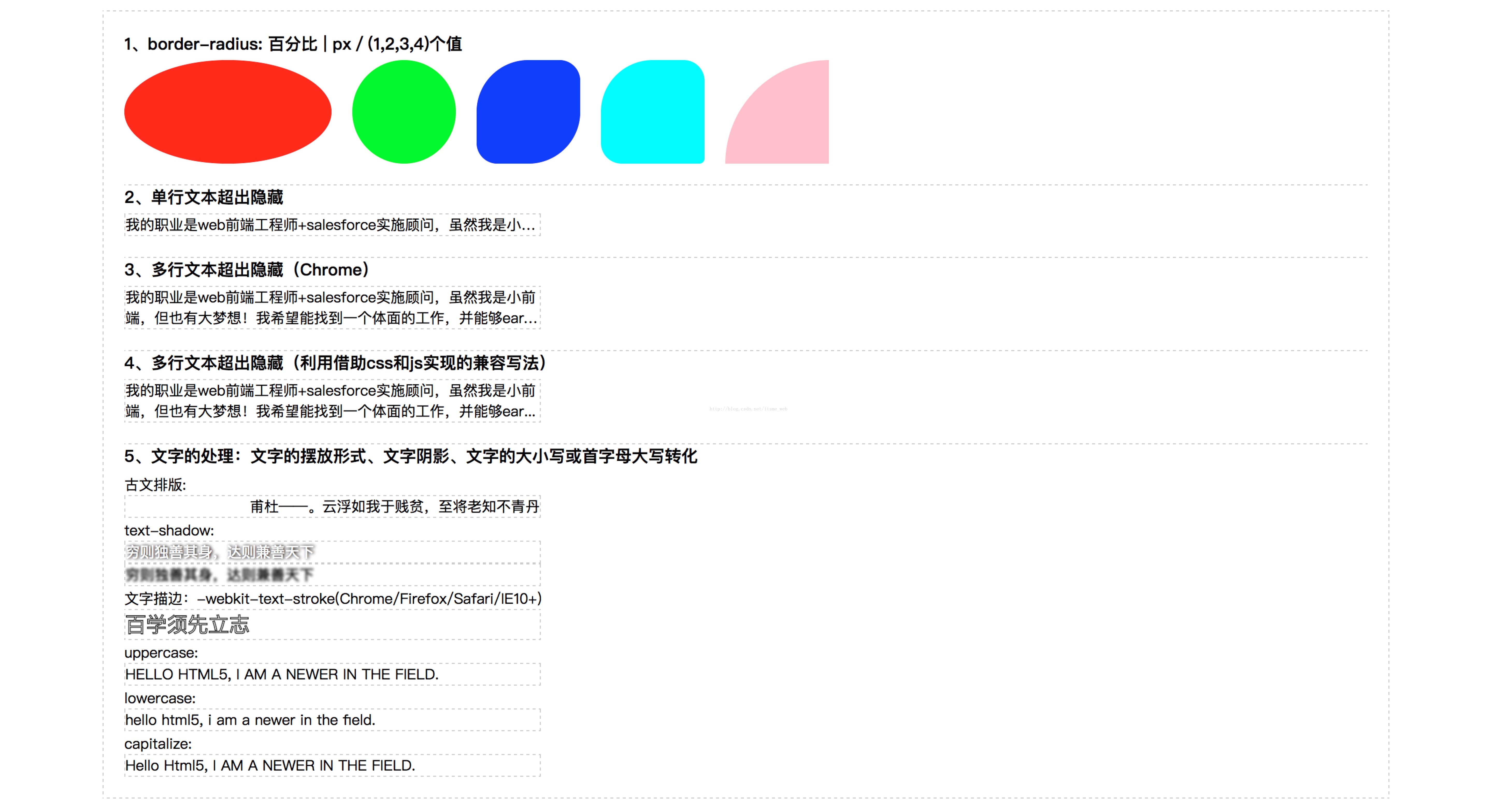
a、border-radius: 百分比 | px;当大于或等于正方形盒子宽度的一半就变成了圆;
b、border-image: 兼容性不是很好,不做整理;
c、多行文本超出省略号:空格/缩进/换行 white-space: normal/pre==<pre></pre>==pre-wrap/pre-line(只保留换行,空格和缩进不执行)/nowrap(强制不换行);tab-size: 8(默认);
white-space: nowrap(强制不换行) | pre(保留所有空格/缩进/换行) | pre-line(保留所有换行);
text-overflow: normal | ellipsis;
d、单行文本超出省略号必须配合三个才能显示,缺一不可:white-space: nowrap;text-overflow: ellipsis; overflow: hidden;
e、多行文本超出省略号(只兼容谷歌chrome内核或者手机浏览器):display: -webkit-box;/*必须要*/-webkit-box-orient: vertical;/*控制文字竖直对齐*/-webkit-line-clamp: 2;/*显示几行*/overflow: hidden;注:应用时不需高度或者高度合理,只需要宽度
f、多行文本超出省略号可以使用js来兼容其他内核:
兼容写法思路:1、必须规定区域高度;2、用伪类来模拟省略号效果;3、用js判断文本实际高度是否大于规定高度,是则增添包含after伪类的类。
g、古文排版:direction: rtl;/*表现形式将文本整体右对齐*/ unicode-bidi: bidi-override;
h、文字阴影:text-shadow: x偏移量, y偏移量, 扩散程度, 阴影颜色 | x偏移量, y偏移量, 扩散程度, 阴影颜色(可使用多层阴影);
i、文字描边:-webkit-text-stroke: 1px #333;
j、文字(for english)转换:text-transform: uppercase | lowercase | capitalize
2、实例练习代码部分:
<!DOCTYPE HTML>
<html>
  <head>
    <title>your title name</title>
    <meta charset="utf-8">
    <meta name="Author" content="Wilson Xu">
    <style type="text/css">
      *{margin: 0;padding: 0;font-family: "Microsoft yahei";}
      a{text-decoration: none;}
      a img{display: block;border: none;}
      li{list-style: none;}

      .container{
        width: 1200px;
        padding: 20px;
        margin: 10px auto;
        border: 1px dashed #ccc;
      }
      .container h4{padding-bottom: 5px;}
      .container ul{
        width: 1200px;
        overflow: hidden;
      }
      .container ul li{
        float: left;
        margin-right: 20px;
      }
      .container section:not(:nth-child(1)) h4{
        margin-top: 20px;
        border-top: 1px dashed #ccc;
      }
      /*圆角处理-需要加前缀来兼容其他浏览器,使用时,请自行查看caniuse网站的兼容性列表*/
      .container ul.radius li:nth-child(1){
        width: 200px;
        height: 100px;
        border-radius: 50%;
        background: #f00;
      }
      .container ul.radius li:nth-child(2){
        width: 100px;
        height: 100px;
        border-radius: 50px;
        background: #0f0;
      }
      .container ul.radius li:nth-child(3){
        width: 100px;
        height: 100px;
        border-radius: 50px 20px;/*两个值时:左上右下,右上左下*/
        background: #00f;
      }
      .container ul.radius li:nth-child(4){
        width: 100px;
        height: 100px;
        border-radius: 50px 20px 5px;/*三个值时:左上,右上左下,右下*/
        background: cyan;
      }
      .container ul.radius li:nth-child(5){
        width: 100px;
        height: 100px;
        border-radius: 100px 0 0 0;/*四个值时:从左上到左下顺时针方向*/
        border-top-left-radius: 100px;
        border-top-right-radius: 0;
        border-bottom-right-radius: 0;
        border-bottom-right-radius: 0;
        background: pink;
      }

      section p{
        width: 400px;
        font-size: 14px;
        border: 1px dashed #ccc;
      }
      section p.txt{
        white-space: nowrap;
        text-overflow: ellipsis;
        overflow: hidden;
      }
      /*多行超出隐藏-兼容Chrome*/
      section p.txt-lines{
        display: -webkit-box;
        -webkit-box-orient: vertical;
        -webkit-line-clamp: 2;
        overflow: hidden;
      }
      /*多行超出隐藏兼容写法*/
      section p#txt{
        height: 40px;
        position: relative;
        line-height: 20px;
        overflow: hidden;
      }
      section p.ellipsis:after{
        content: '...';
        height: 20px;
        line-height: 20px;
        position: absolute;
        right: 4px;
        bottom: 0;
        background: #fff;
      }

      section label{
        font-size: 14px;
      }
      /*古文排版*/
      section p.rtl{
        direction: rtl;/*表现形式将文本整体右对齐*/
        unicode-bidi: bidi-override;
      }
      /*文本阴影*/
      section p.shadow{
        color: #fff;
        text-shadow: 1px 0px 3px #000, 2px 0 3px #ccc;
      }
      section p.shadow1{
        color: transparent;
        text-shadow: 0px 0px 2px #000;
      }
      /*文本描边*/
      section p.stroke{
        color: #fff;
        font-size: 20px;
        -webkit-text-stroke: 1px #333;
      }
      /*文字大小写及首字母大写转化*/
      section p.uppercase{
        text-transform: uppercase;
      }
      section p.lowercase{
        text-transform: lowercase;
      }
      section p.capitalize{
        text-transform: capitalize;
      }
    </style>
  </head>
  <body>
    <div class="container">
      <section>
        <h4>1、border-radius: 百分比 | px/(1,2,3,4)个值</h4>
        <ul class="radius">
          <li></li>
          <li></li>
          <li></li>
          <li></li>
          <li></li>
        </ul>
      </section>
      <section>
        <h4>2、单行文本超出隐藏</h4>
        <p class="txt">我的职业是web前端工程师+salesforce实施顾问,虽然我是小前端,但也有大梦想!</p>
      </section>
      <section>
        <h4>3、多行文本超出隐藏(Chrome)</h4>
        <p class="txt-lines">我的职业是web前端工程师+salesforce实施顾问,虽然我是小前端,但也有大梦想!我希望能找到一个体面的工作,并能够earn much money。</p>
      </section>
      <section>
        <h4>4、多行文本超出隐藏(利用借助css和js实现的兼容写法)</h4>
        <p id="txt">我的职业是web前端工程师+salesforce实施顾问,虽然我是小前端,但也有大梦想!我希望能找到一个体面的工作,并能够earn much money。</p>
      </section>
      <section>
        <h4>5、文字的处理:文字的摆放形式、文字阴影、文字的大小写或首字母大写转化</h4>
          <label>古文排版:</label><p class="rtl">丹青不知老将至,贫贱于我如浮云。——杜甫</p>
          <label>text-shadow:</label>
          <p class="shadow">穷则独善其身,达则兼善天下</p>
          <p class="shadow1">穷则独善其身,达则兼善天下</p>
          <label>文字描边:-webkit-text-stroke(Chrome/Firefox/Safari/IE10+)</label><p class="stroke">百学须先立志</p>
          <label>uppercase:</label><p class="uppercase">hello html5, I AM A NEWER IN THE FIELD.</p>
          <label>lowercase:</label><p class="lowercase">hello html5, I AM A NEWER IN THE FIELD.</p>
          <label>capitalize:</label><p class="capitalize">hello html5, I AM A NEWER IN THE FIELD.</p>
      </section>
    </div>
  </body>
  <script type="text/javascript">
    var oTxt = document.getElementById('txt');
    if(oTxt.scrollHeight > oTxt.clientHeight){//如果文本的高度>设置的区域宽度就为该区块增加一个lei名
      oTxt.className += 'ellipsis';
    }
  </script>
</html>
3、效果preview:
二、过渡|动画
1、知识点汇总:
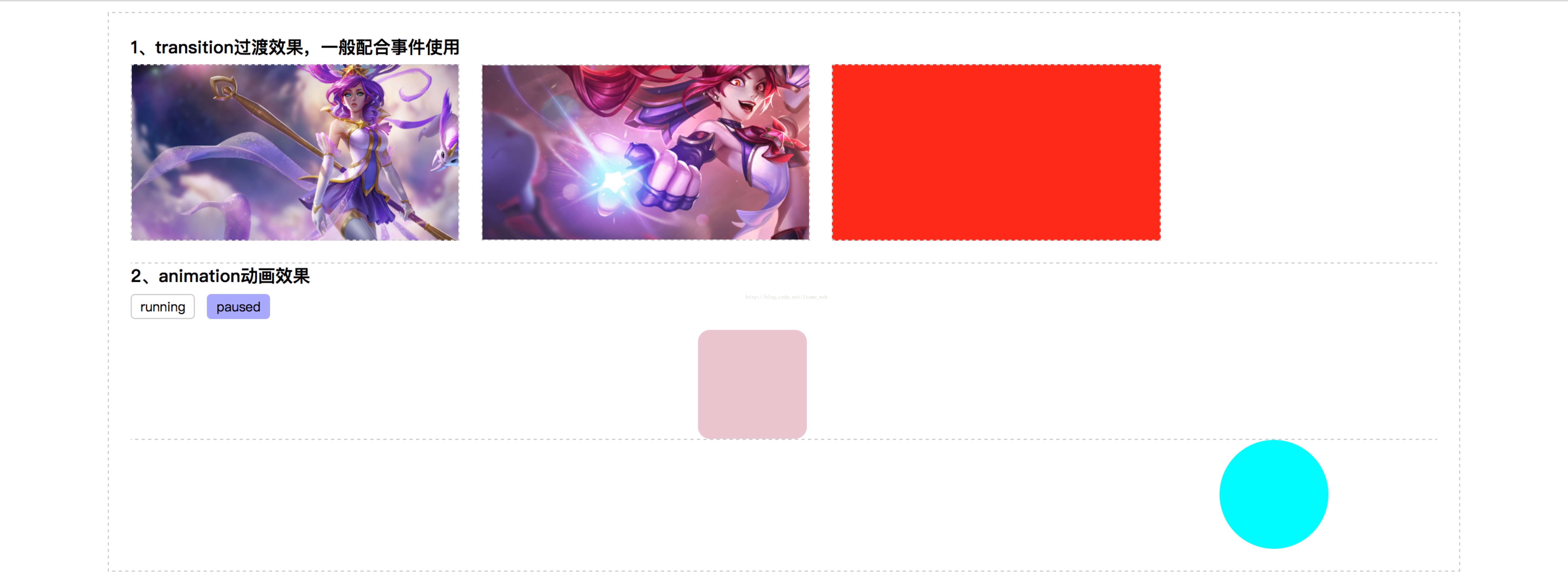
a、利用过渡实现hover图片放大效果,本案例提供了两种思路。IE9-不兼容
transition-property: width | height | color |background-color...;
transition-duration: ms/s;//每一个属性值对应一个过渡运行时间
eg:transition-property: width, height;
transition-duration: 1s,2s;
transition-delay: 1s;延迟1s执行
transition-timing-function: linear(匀速) | ease(默认值,慢快慢) | ease-in(匀加速) | ease-out(匀减速) | ease-in-out(快慢)
==transition: width 1s 1s,height 2s;//宽度过渡1s,延迟1s执行
注:利用transition的时候只能将其应用到有数值变化的属性上,例如颜色,宽高...,不能应用到如display:block/none上。
b、animation动画效果拆分:
animation-name: sport;//调用sport动画
animation-duration: 8s;//动画执行8s
animation-delay: 800ms;//延迟800ms
animation-timing-function: linear | ease | ease-in | ease-out | ease-in-out;
ainmation-iteration-count: 2;//循环2次,其中无限循环是infinite
animation-direction: alternate;//执行完之后反向再执行一次,一般和animation-iteration-count联合使用
animation-play-state: running | paused;//一般通过按钮和js来控制动画播放
animation-fill-mode: forwards;//保留最后一帧动画的状态,动画结束时不直接返回到最初状态,前提不是无限循环的时候
2、实例练习代码部分:
<!DOCTYPE HTML>
<html>
  <head>
    <title>your title name</title>
    <meta charset="utf-8">
    <meta name="Author" content="Wilson Xu">
    <style type="text/css">
      *{margin: 0;padding: 0;font-family: "Microsoft yahei";}
      a{text-decoration: none;}
      a img{display: block;border: none;}
      li{list-style: none;}
      hr{border: 0;border-top: 1px dashed #ccc;height: 0;outline: none;}

      .container{
        width: 1200px;
        padding: 20px;
        margin: 10px auto;
        border: 1px dashed #ccc;
      }
      .container h4{padding-bottom: 5px;}
      .container ul{
        width: 1200px;
        overflow: hidden;
      }
      .container ul li{
        float: left;
        margin-right: 20px;
      }
      .container section:not(:nth-child(1)) h4{
        margin-top: 20px;
        border-top: 1px dashed #ccc;
      }
      section button{
        padding: 2px 8px;
        margin-bottom: 10px;
        outline: none;
        border: 1px solid #ccc;
        border-radius: 4px;
        background: #fff;

      }
      section button:focus{
        background: #aaf;
        border-color: #aaf;
      }

      section label{
        font-size: 14px;
      }

      /*transition过渡效果*/
      .container ul.transition li{
        width: 300px;
        height: 160px;
        overflow: hidden;
        border: 1px dashed #ccc;
      }

      .container ul.transition li:nth-child(1){
        background: url(images/1.jpg) no-repeat center/300px auto;
        transition: 1.2s;
      }
      .container ul.transition li:nth-child(1):hover{
        background-size: 360px auto;
      }

      .container ul.transition li img{
        display: block;
        width: 100%;
        height: 100%;
        transition: 1200ms;
      }
      .container ul.transition li img:hover{
        transform: scale(1.2);
      }

      .container ul.transition li:nth-child(3){
        background: #f00;
        transition: width 1s 800ms, background-color 2s ease-in-out;
      }
      .container ul.transition li:nth-child(3):hover{
        background: cyan;
        width: 500px;
      }

      /*animation动画效果*/
      .container section ul.animation,
      .container section ul.fill-mode{
        position: relative;
        height: 100px;
      }
      .container section ul.animation li,
      .container section ul.fill-mode li{
        width: 100px;
        height: 100px;
        border-radius: 50%;
        background: pink;
        position: absolute;
        left: 0;
        top: 0;
        animation: sport 8s 2s ease-in;/*前者是duration 后者是delay*/
      }

      .container section ul.animation li{
        animation-iteration-count: infinite;/*循环执行动画*/
        animation-direction: alternate;/*反向执行动画*/
      }
      .container section ul.animation li.click{
        animation-play-state: paused;
      }

      .container section ul.fill-mode li{
        animation-fill-mode: forwards;
      }

      @keyframes sport{/*@keyframes 动画名*/
        /*from{left: 0;background: pink;}from等价于0%
          to{left: 1000px;background: cyan;}to等价于100%*/
        0%{left: 0;background: pink;}
        25%{left: 600px;border-radius: 5%;}
        50%{left: 400px;border-top-left-radius: 25%}
        75%{left: 800px;border-bottom-right-radius: 25%}
        100%{left: 1000px;border-radius: 50%;background: cyan;}
      }
    </style>
  </head>
  <body>
    <div class="container">
      <section>
        <h4>1、transition过渡效果,一般配合事件使用</h4>
        <ul class="transition">
          <li></li>
          <li><img src="images/2.jpg" alt=""></li>
          <li></li>
        </ul>
      </section>
      <section>
        <h4>2、animation动画效果</h4>
        <p><button type="button" name="running" id="run">running</button>  <button type="button" name="paused" id="pause">paused</button></p>
        <ul class="animation">
          <li id='object'></li>
        </ul>
        <hr/>
        <ul class="fill-mode">
          <li></li>
        </ul>
      </section>
    </div>
  </body>
  <script type="text/javascript">
    var oRun = document.getElementById('run');
    var oPause = document.getElementById('pause');
    var object = document.getElementById('object');
    oRun.onclick = function(){
      object.className = '';
    }
    oPause.onclick = function(){
      object.className = 'click';
    }
  </script>
</html>
三、项目实战(旋转的八卦图 | 闪闪发光的文字)
1、代码部分:
<!DOCTYPE HTML>
<html>
<head>
<title>your title name</title>
<meta charset="utf-8">
<meta name="Author" content="Wilson Xu">
<style type="text/css">
*{margin: 0;padding: 0;font-family: "Microsoft yahei";}
a{text-decoration: none;}
a img{display: block;border: none;}
li{list-style: none;}
hr{border: 0;border-top: 1px dashed #ccc;height: 0;outline: none;}
.container{
width: 1200px;
padding: 20px;
margin: 10px auto;
border: 1px dashed #ccc;
}
.container h4{padding-bottom: 5px;}
.container ul{
width: 1200px;
overflow: hidden;
}
.container ul li{
float: left;
margin-right: 20px;
}
.container section:not(:nth-child(1)) h4{
margin-top: 20px;
border-top: 1px dashed #ccc;
}
section label{
font-size: 14px;
}
/*1、旋转的八卦图*/
#box{
width: 200px;
height: 200px;
border: 1px solid #000;
border-radius: 100%;
overflow: hidden;
animation: rotate 4s linear infinite;
}
@keyframes rotate {
from{transform: rotate(0deg);}
to{transform: rotate(360deg);}
}
#box .black{
width: 200px;
height: 100px;
background: #000;
position: relative;
}
#box .black::before{
content: '';
display: block;
width: 100px;
height: 100px;
position: absolute;
background: #fff;
border-radius: 100%;
left: 0;
top: 50px;
}
#box .black::after{
content: '';
display: block;
width: 20px;
height: 20px;
position: absolute;
background: #fff;
border-radius: 100%;
right: 40px;
top: 90px;
z-index: 1;
}
#box .white{
width: 200px;
height: 100px;
background: #fff;
position: relative;
}
#box .white::before{
content: '';
display: block;
width: 100px;
height: 100px;
position: absolute;
background: #000;
border-radius: 100%;
right: 0;
bottom: 50px;
}
#box .white::after{
content: '';
display: block;
width: 20px;
height: 20px;
position: absolute;
background: #000;
border-radius: 100%;
left: 40px;
bottom: 90px;
z-index: 1;
}
/*2、闪闪发光的文字*/
.blink{
font-size: 30px;
color: #74e718;
animation: blink 2s linear infinite;
}
@keyframes blink {
0%{text-shadow: 0 0 0 #fff;}
20%{text-shadow: 1px 1px 2px #e91870;}
40%{text-shadow: 1px 1px 4px #67183a;}
60%{text-shadow: 1px 1px 6px #b72362;}
80%{text-shadow: 1px 1px 4px #67183a;}
100%{text-shadow: 0 0 0 #fff;color: #3cf005;}
}
</style>
</head>
<body>
<div class="container">
<section>
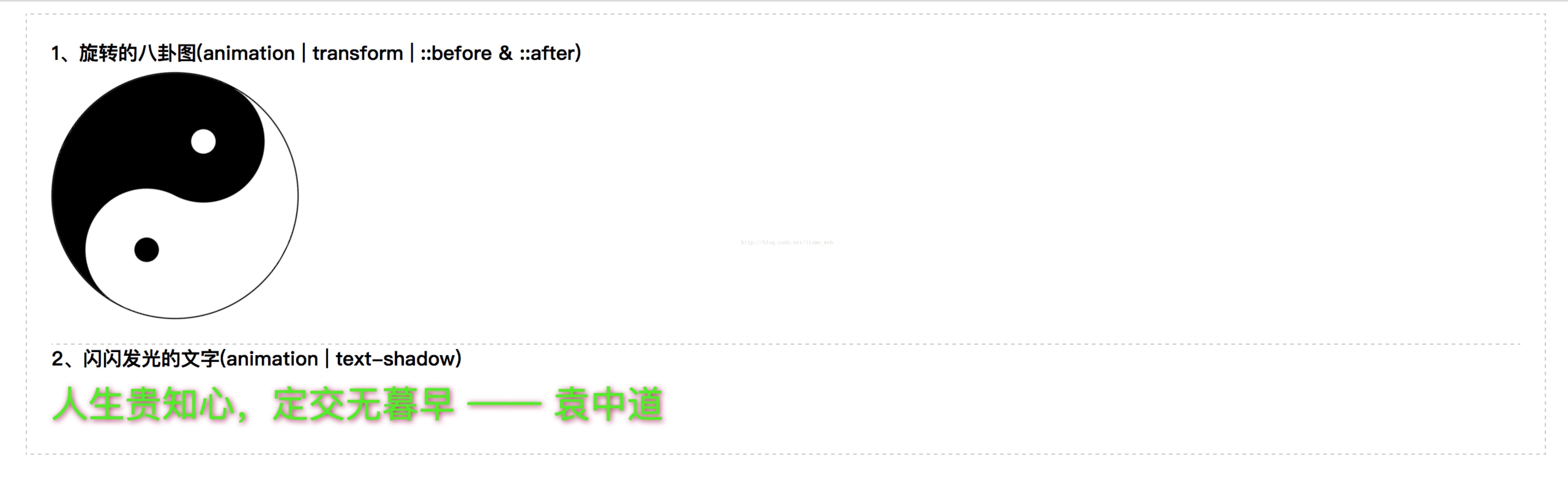
<h4>1、旋转的八卦图(animation | transform | ::before & ::after)</h4>
<div id="box">
<div class="black"></div>
<div class="white"></div>
</div>
</section>
<section>
<h4>2、闪闪发光的文字(animation | text-shadow)</h4>
<p class="blink">人生贵知心,定交无暮早 —— 袁中道</p>
</section>
</div>
</body>
</html>2、效果preview:


 1786
1786


 被折叠的 条评论
为什么被折叠?
被折叠的 条评论
为什么被折叠?
 到【灌水乐园】发言


