


按钮可以说是界面上用的最多的组件了,当用户进行选择的时候,就可以通过监听事件来接收用户的选择,今天不是讲监听事件的,后面有专门的篇幅来讲事件,所以今天来学习android中Button的用法,在android中,使用<Button>标签就可以定义出一个显示的按钮,同时还可以设置显示在按钮上面的文字,老规矩,先看看Button的继承结构:
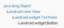
可以发现,button是上一篇讲的textview的子类,所以可以知道button就是一个特殊的textview,大部分的属性都差不多,一样,下面通过一个例子来看看button的属性效果。
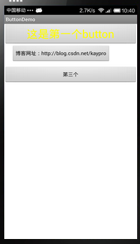
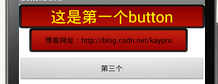
效果图如下:
main.xml文件:
<LinearLayout xmlns:android="http://schemas.android.com/apk/res/android"
    xmlns:tools="http://schemas.android.com/tools"
    android:id="@+id/LinearLayout1"
    android:layout_width="match_parent"
    android:layout_height="match_parent"
    android:orientation="vertical"
    >

    <Button
        android:id="@+id/one"
        android:layout_width="fill_parent"
        android:layout_height="wrap_content"
        android:textColor="#FFFF00"
        android:textSize="30sp"
        android:text="这是第一个button"/>
	<Button
	    android:id="@+id/two"
	    android:layout_width="wrap_content"
        android:layout_height="wrap_content"
         android:text="博客网址:http://blog.csdn.net/kaypro"
        android:layout_marginLeft="20dp"/>
	<Button
	    android:id="@+id/three"
	    android:layout_width="fill_parent"
        android:layout_height="wrap_content"
        android:text="第三个按钮"
        android:maxLength="3"
        android:layout_marginTop="10dp"/>
</LinearLayout>
我们可以发现是不是和昨天的textview的属性好像,没错,其实就是一样的,所以才会说button是一个特殊的textview,这里就不在解释那些属性的含义了,不知道的可以看前一篇讲textview的博文。
昨天写到这里可能就会说结束了,今天可不行,因为这么丑陋的button是不能拿到项目中用的,所以我们需要自定义button,让他变的好看,首先我这里准备了两张图片button_red_down.png和button_red_normal.png

把它们拷到昨天说的drawable-hdpi资源文件夹下面。准备工作完成了,下面开始自定义:
1.首先新建一个drawable文件夹(点击res,右击,new->folder,然后命名为drawable),作用后面会再说
2.再在drawable文件夹下面新建一个xml文件(右击drawable,new->android xml file),命名为button_selector(命名的时候不能用大写)
3.开始编码,我这边直接贴出button_selector代码:
<?xml version="1.0" encoding="utf-8"?>
<selector xmlns:android="http://schemas.android.com/apk/res/android" >
	<item android:state_focused="true"
	    android:drawable="@drawable/button_red_down"></item>
	<item android:state_pressed="true"
	    android:drawable="@drawable/button_red_down"></item>
	 <item android:drawable="@drawable/button_red_normal"></item>
</selector>
<LinearLayout xmlns:android="http://schemas.android.com/apk/res/android"
    xmlns:tools="http://schemas.android.com/tools"
    android:id="@+id/LinearLayout1"
    android:layout_width="match_parent"
    android:layout_height="match_parent"
    android:orientation="vertical"
    >

    <Button
        android:id="@+id/one"
        android:layout_width="fill_parent"
        android:layout_height="wrap_content"
        android:textColor="#FFFF00"
        android:textSize="30sp"
        android:background="@drawable/button_selector"
        android:text="这是第一个button"/>
	<Button
	    android:id="@+id/two"
	    android:layout_width="wrap_content"
        android:layout_height="wrap_content"
        android:background="@drawable/button_selector"
         android:text="博客网址:http://blog.csdn.net/kaypro"
        android:layout_marginLeft="20dp"/>
	<Button
	    android:id="@+id/three"
	    android:layout_width="fill_parent"
        android:layout_height="wrap_content"
        android:text="第三个按钮"
        android:maxLength="3"
        android:layout_marginTop="10dp"/>
</LinearLayout>
我们先看下改了代码之后的效果图:
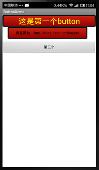
可以看到前面两个加了android:background="@drawable/button_selector"这句话的都变了样子,变好看了,然后我们在点击第一个button,效果如下:
第一个又变了样子,这个功能全部都是靠我们前面写的那个button_selector来实现的,今天是第一次,所以讲下这个文件的作用,以后再自定义别的组件时就不重复讲了,首先建立一个选择器文件,即节点为selector开始的xml文件,在你新建,命名的时候那里可以选择,然后是<item android:state_focused="true"
android:drawable="@drawable/button_red_down"></item>这句话,意思是,这个选择器包含这项——获取焦点状态,设置一张图片,当然我这里没有这个图片,所以就用按下状态的图片冒充下,其实实际应用一般下面两个状态就可以了,只是有些要求高的就要多个状态。
<item android:state_pressed="true"
android:drawable="@drawable/button_red_down"></item>这个就是按下状态,设置按下状态图片
<item android:drawable="@drawable/button_red_normal"></item>正常状态,设置正常状态图片
这样就完成了一个背景选择器,然后设置到button的background中,就有了上面的效果。
前面说drawable文件夹的作用就是保存选择器文件,这样比较规范。
说到这里,今天的东西就真的讲完了,以后所有的组件我都会先讲用法,再讲自定义修改样式,希望帮助大家制作好看的控件。


 806
806

 被折叠的 条评论
为什么被折叠?
被折叠的 条评论
为什么被折叠?
 到【灌水乐园】发言


