 CSS动画案例


 本文介绍了一个使用CSS实现的精美动画案例,通过多种动画效果营造出动态仿真的波浪背景特效。案例中详细展示了如何利用CSS属性如transition和animation来创建平滑过渡及波浪动画。
前言
本编文章纯属个人形为,如果对您有帮助将不胜感激。
canvas 实例
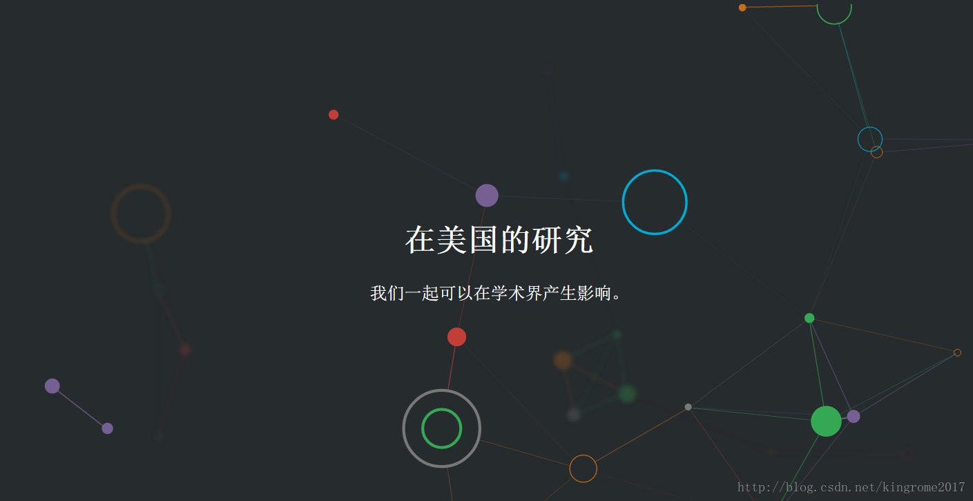
关于背景图片切换动画 实例
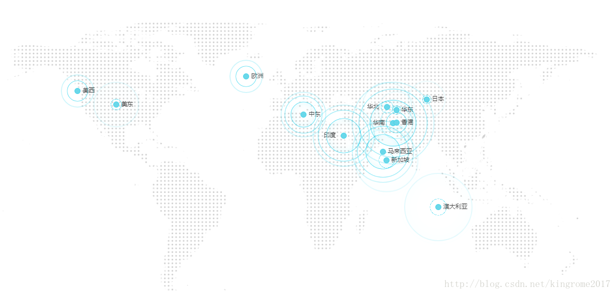
阿里云 动画实例
<!DOCTYPE html>
<html lang="en">
<head>
    <meta charset="UTF-8">
    <title>Document</title>
    <style>
        *{margin:0; padding:0; font-family: "微软雅黑"; font-size:12px; color:#333;}
        section{width:150px; height:150px; position: fixed; top:0; right:0; bottom:0; left:0; margin:auto;}
        .point-area {
            text-align: center;
            position: relative;
            width: 150px;
            height: 150px;
            -webkit-transition: opacity .5s ease-out;
            -ms-transition: opacity .5s ease-out;
            transition: opacity .5s ease-out;
        }
        a{color: #00c1de;}

        .point-area .point {
            position: absolute;
            top: 0;
            left: 0;
            right: 0;
            bottom: 0;
            width: 10px;
             height: 10px;
            margin: auto;
            -webkit-border-radius: 50%;
            -webkit-background-clip: padding-box;
            -moz-border-radius: 50%;
            -moz-background-clip: padding;
            border-radius: 50%;
            background-clip: padding-box;
            background: transparent;
        }
        .point-area .point-dot {
            z-index: 1;
            background-color: #6ad7e9;
            border: 1px solid rgba(0,205,236,.37);
        }
        .point-area .point-10:after {
            content: "";
            display: block;
            position: absolute;
            top: 0;
            right: 0;
            bottom: 0;
            left: 0;
            border-radius: 50%;
            border: 2px solid #00cdec;
            opacity: 0;
            -webkit-animation: ripple 4.5s ease-out 225ms infinite;
            -ms-animation: ripple 4.5s ease-out 225ms infinite;
            animation: ripple 4.5s ease-out 225ms infinite;
        }
        .point-area .point-40:after {
            content: "";
            display: block;
            position: absolute;
            top: 0;
            right: 0;
            bottom: 0;
            left: 0;
            border-radius: 50%;
            border: 2px solid #00cdec;
            opacity: 0;
            -webkit-animation: ripple 4.5s ease-out .9s infinite;
            -ms-animation: ripple 4.5s ease-out .9s infinite;
            animation: ripple 4.5s ease-out .9s infinite;
        }
        .point-area .point-80:after {
            content: "";
            display: block;
            position: absolute;
            top: 0;
            right: 0;
            bottom: 0;
            left: 0;
            border-radius: 50%;
            border: 2px solid #00cdec;
            opacity: 0;
            -webkit-animation: ripple 4.5s ease-out 1.8s infinite;
            -ms-animation: ripple 4.5s ease-out 1.8s infinite;
            animation: ripple 4.5s ease-out 1.8s infinite;
        }
        .point-area .point-shadow:after {
            box-shadow: inset 0 0 5em rgba(0,205,236,.16);
        }
        .point-area .point-10 {
            width: 100%;
            height: 100%
        }


        .point-area .point-20 {
            width: 100%;
            height: 100%
        }


        .point-area .point-30 {
            width: 100%;
            height: 100%
        }
        .point-area .point-30:after {
            content: "";
            display: block;
            position: absolute;
            top: 0;
            right: 0;
            bottom: 0;
            left: 0;
            border-radius: 50%;
            border: 2px solid #00cdec;
            opacity: 0;
            -webkit-animation: ripple 4.5s ease-out 675ms infinite;
            -ms-animation: ripple 4.5s ease-out 675ms infinite;
            animation: ripple 4.5s ease-out 675ms infinite
        }

        .point-area .point-40 {
            width: 100%;
            height: 100%
        }

        .point-area .point-50 {
            width: 100%;
            height: 100%
        }

        .point-area .point-50:after {
            content: "";
            display: block;
            position: absolute;
            top: 0;
            right: 0;
            bottom: 0;
            left: 0;
            border-radius: 50%;
            border: 2px solid #00cdec;
            opacity: 0;
            -webkit-animation: ripple 4.5s ease-out 1125ms infinite;
            -ms-animation: ripple 4.5s ease-out 1125ms infinite;
            animation: ripple 4.5s ease-out 1125ms infinite
        }

        .point-area .point-60 {
            width: 100%;
            height: 100%
        }

        .point-area .point-60:after {
            content: "";
            display: block;
            position: absolute;
            top: 0;
            right: 0;
            bottom: 0;
            left: 0;
            border-radius: 50%;
            border: 2px solid #00cdec;
            opacity: 0;
            -webkit-animation: ripple 4.5s ease-out 1.35s infinite;
            -ms-animation: ripple 4.5s ease-out 1.35s infinite;
            animation: ripple 4.5s ease-out 1.35s infinite
        }

        .point-area .point-70 {
            width: 100%;
            height: 100%
        }

        .point-area .point-70:after {
            content: "";
            display: block;
            position: absolute;
            top: 0;
            right: 0;
            bottom: 0;
            left: 0;
            border-radius: 50%;
            border: 2px solid #00cdec;
            opacity: 0;
            -webkit-animation: ripple 4.5s ease-out 1575ms infinite;
            -ms-animation: ripple 4.5s ease-out 1575ms infinite;
            animation: ripple 4.5s ease-out 1575ms infinite
        }

        .point-area .point-80 {
            width: 100%;
            height: 100%
        }

        .point-area .point-80:after {
            content: "";
            display: block;
            position: absolute;
            top: 0;
            right: 0;
            bottom: 0;
            left: 0;
            border-radius: 50%;
            border: 2px solid #00cdec;
            opacity: 0;
            -webkit-animation: ripple 4.5s ease-out 1.8s infinite;
            -ms-animation: ripple 4.5s ease-out 1.8s infinite;
            animation: ripple 4.5s ease-out 1.8s infinite
        }

        .point-area .point-90 {
            width: 100%;
            height: 100%
        }

        .point-area .point-90:after {
            content: "";
            display: block;
            position: absolute;
            top: 0;
            right: 0;
            bottom: 0;
            left: 0;
            border-radius: 50%;
            border: 2px solid #00cdec;
            opacity: 0;
            -webkit-animation: ripple 4.5s ease-out 2025ms infinite;
            -ms-animation: ripple 4.5s ease-out 2025ms infinite;
            animation: ripple 4.5s ease-out 2025ms infinite
        }

        .point-area .point-100 {
            width: 100%;
            height: 100%
        }

        .point-area .point-100:after {
            content: "";
            display: block;
            position: absolute;
            top: 0;
            right: 0;
            bottom: 0;
            left: 0;
            border-radius: 50%;
            border: 2px solid #00cdec;
            opacity: 0;
            -webkit-animation: ripple 4.5s ease-out 2.25s infinite;
            -ms-animation: ripple 4.5s ease-out 2.25s infinite;
            animation: ripple 4.5s ease-out 2.25s infinite
        }


        /*帧动画start*/
        @-webkit-keyframes ripple {
            0% {
                opacity: 0;
                -webkit-transform: scale(.1);
            }

            5% {
                opacity: 1
            }

            to {
                opacity: 0;
                -webkit-transform: scale(1);
            }
        }

        @-ms-keyframes ripple {
            0% {
                opacity: 0;
                -ms-transform: scale(.1)
            }

            5% {
                opacity: 1
            }

            to {
                opacity: 0;
                -ms-transform: scale(1)
            }
        }

        @keyframes ripple {
            0% {
                opacity: 0;
                transform: scale(.1)
            }

            5% {
                opacity: 1
            }

            to {
                opacity: 0;
                transform: scale(1)
            }
        }[not-existing] {
            zoom: 1
        }
        /*帧动画end*/
    </style>
</head>
<body>
    <section>
          <div class="point-area" style="top: 0; left: 0; position: absolute; width: 110px; height: 110px; visibility: visible; opacity: 1;">
               <p class="point-name" style="position: absolute; top: 45px; left: 65px;">运去哪</p>
               <a href="https://www.aliyun.com/chinaglobal/home?tabId=7#guid-633594" target="_blank" class="point point-dot"></a>
               <div class="point point-10"></div>
               <div class="point point-40"></div>
               <div class="point point-shadow point-80"></div>
          </div>
    </section>
</body>
</html>
动态仿真波浪背景特效

下载地址:


 扫一扫
扫一扫


 9288
9288

 被折叠的 条评论
为什么被折叠?
被折叠的 条评论
为什么被折叠?
 到【灌水乐园】发言


