


按钮由文本或(和)图标组成,这些文本或图标传递着当用户点击该按钮时会发生什么。
根据你是想创建带文本、图标或者两者都有的按钮,你可以以以下三种方式在你的布局文件中创建按钮。
- 创建只带有文本的按钮,使用
Button类:
<Button
    android:layout_width="wrap_content"
    android:layout_height="wrap_content"
    android:text="@string/button_text"
... />- 创建只带有图标的按钮,使用
ImageButton类:
<ImageButton
    android:layout_width="wrap_content"
    android:layout_height="wrap_content"
    android:src="@drawable/button_icon"
... />- 创建带有文本和图标的按钮,使用
Button类并使用其android:drawableLeft属性指定图标。
<Button
    android:layout_width="wrap_content"
    android:layout_height="wrap_content"
    android:text="@string/button_text"
    android:drawableLeft="@drawable/button_icon"
    ... />
响应点击事件
当用户点击一个按钮时,按钮对象会接收到一个on-click事件。
为了定义on-click事件的事件处理器,为你的XML布局文件的<Button>属性添加android:onClick属性。这个属性的值必须是你想要调用以响应一个点击事件的方法名。加载这个布局的活动必须实现相应的方法。
例如,以下是一个使用设置了android:onClick属性的按钮:
<?xml version="1.0" encoding="utf-8"?>
<Button xmlns:android="http://schemas.android.com/apk/res/android"
    android:id="@+id/button_send"
    android:layout_width="wrap_content"
    android:layout_height="wrap_content"
    android:text="@string/button_send"
    android:onClick="sendMessage" />
在加载这个布局的活动中,下面的方法处理点击事件:
/** Called when the user touches the button */
public void sendMessage(View view) {
    // Do something in response to button click
}声明在android:onClick属性中的方法必须具有如上例中的签名。具体地,这个方法必须是:
- 公有方法
- 返回
void - 定义一个视图作为它自己的参数(这个视图将是被点击的视图)
使用OnClickListener
你可以在程序中而不是在XML布局文件中声明按钮的点击事件处理器。当你在运行时实例化按钮或者你需要在Fragment子类中声明点击行为时这样做可能是必要的。
为了以程序的方式声明事件处理器,创建一个View.onClickListener对象,并且通过调用按钮的setOnClickListener(View.onClickListener)方法为该按钮指定给该按钮。例如:
Button button = (Button) findViewById(R.id.button_send);
button.setOnClickListener(new View.OnClickListener() {
    public void onClick(View v) {
        // Do something in response to button click
    }
});
定义你的按钮样式
你的按钮的外观(背景图片和字体)可能在不同的设备上不同,因为不同配置的设备通常有不同类型的输入控件的样式。
你可以使用应用于你整个应用程序的主题来精确地控制你的按钮的样式。例如,为了确保所有运行Android 4.0或更高系统的设备在你的应用中使用Holo主题,在你的清单文件中的<application>元素中声明android:theme="@android:style/Theme.Holo。也可以通过其他方式支持旧设备支持Holo主题。
为了定制每个按钮使用不同的背景,使用一个颜色资源或drawable图片来指定按钮的android:background属性。另外,你可以为按钮指定一个样式,类似于HTML样式一样定义多个样式属性例如背景、字体、大小等。
无边界按钮
关于按钮可用的一个设计就是无边界按钮。无边界按钮类似于普通的按钮,除了他们没有边界或背景,但仍然可以在不同的状态下改变外观,例如当在点击的时候。
为了声明一个无边界按钮,为按钮应用borderlessButtonStyle。例如:
<Button
    android:id="@+id/button_send"
    android:layout_width="wrap_content"
    android:layout_height="wrap_content"
    android:text="@string/button_send"
    android:onClick="sendMessage"
    style="?android:attr/borderlessButtonStyle" />
定制背景
如果你想要真正的重新定义你的按钮的外观,你可以指定一个定制的背景。与提供一个简单的位图或颜色不同,你的背景应该是一个状态列表资源,根据按钮当前的状态概念外观。
你可以在一个XML文件中定义状态列表,定义三个不同的颜色或图片为不同的按钮状态使用。
为了为你的按钮创建一个状态列表可绘制图像,需要完成以下步骤:
为按钮背景创建三个位图代表默认、点击和获得焦点的按钮状态。为了确保你的图片符合按钮的各种各样的大小,使用
Nine-patch位图。将位图放置在你的项目的
res/drawable目录下。确保每个位图适当命名来反映它们表示的按钮的状态,例如button_default.9.png,button_pressed_9.png和button_focused.9.png。在res/drawable目录下创建一个新的
XML文件(命名为类似为button_custom.xml),并加入以下内容:
<?xml version="1.0" encoding="utf-8"?>
<selector xmlns:android="http://schemas.android.com/apk/res/android">
    <item android:drawable="@drawable/button_pressed"
          android:state_pressed="true" />
    <item android:drawable="@drawable/button_focused"
          android:state_focused="true" />
    <item android:drawable="@drawable/button_default" />
</selector>
上例定义了一个单一的可绘制资源,它将根据按钮的当前状态改变它的图片。
- 第一个
<item>元素定义了当按钮被按下时使用的位图 - 第二个
<item>元素定义了当按钮获得焦点时使用的位图 - 第三个
<item>元素定义了当按钮处于默认状态时使用的位图
注意:<item>的顺序是很重要的。当这个可绘制资源被引用时,<item>会依序遍历去决定哪个是适合当前状态的。因为默认的位图是最后一个,它只在条件android:state_pressed和android:state_focused都为false时应用。
这个XML文件代表一个单个的绘制资源,并且当赋给按钮作为背景时,图像将根据这三个状态改变。
4. 然后简单地将上面的XML文件应用到按钮的背景。
<Button
android:id="@+id/button_send"
android:layout_width="wrap_content"
android:layout_height="wrap_content"
android:text="@string/button_send"
android:onClick="sendMessage"
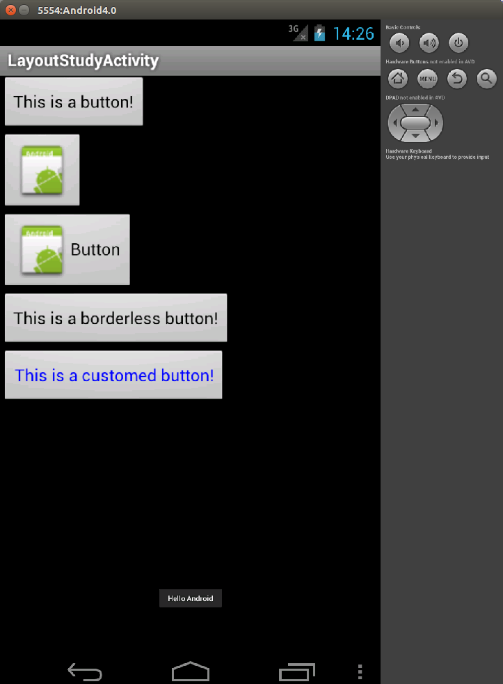
android:background="@drawable/button_custom" />示例
layout_different_buttons.xml
<?xml version="1.0" encoding="utf-8"?>
<LinearLayout
    xmlns:android="http://schemas.android.com/apk/res/android"
    android:layout_width="match_parent"
    android:layout_height="match_parent"
    android:orientation="vertical">
  <Button android:layout_height="wrap_content"
          android:layout_width="wrap_content"
          android:text="This is a button!"/>
  <ImageButton android:id="@+id/button"
      android:layout_height="wrap_content"
      android:layout_width="wrap_content"
      android:src="@drawable/ic_launcher"/>
  <Button android:layout_height="wrap_content"
          android:layout_width="wrap_content"
          android:text="Button"
          android:drawableLeft="@drawable/ic_launcher"
          android:onClick="sayHi"/>
  <Button android:layout_height="wrap_content"
          android:layout_width="wrap_content"
          style="?android:attr/borderlessButtonStyle"
          android:text="This is a borderless button!"/>
  <Button android:layout_height="wrap_content"
          android:layout_width="wrap_content"
          android:textColor="@drawable/button_custom"
          android:text="This is a customed button!"/>
</LinearLayout>
button_custom.xml
<?xml version="1.0" encoding="utf-8"?>
<selector xmlns:android="http://schemas.android.com/apk/res/android">
          <item android:color="#FFFF0000"
                android:state_pressed="true"/>
          <item android:color="#FF00FF00"
                android:state_focused="true"/>
          <item android:color="#FF0000FF"/>
</selector>
package lemon.learnandroid;
import android.app.Activity;
import android.os.Bundle;
import android.view.View;
import android.widget.Toast;
import android.widget.ImageButton;
public class LayoutStudyActivity extends Activity
{
/** Called when the activity is first created. */
@Override
public void onCreate(Bundle savedInstanceState)
{
super.onCreate(savedInstanceState);
setContentView(R.layout.layout_different_buttons);
ImageButton btn = (ImageButton)findViewById(R.id.button);
btn.setOnClickListener(new View.OnClickListener()
{
public void onClick(View v)
{
Toast.makeText(LayoutStudyActivity.this,
"Hello again, Android!",
Toast.LENGTH_SHORT).show();
}
});
}
public void sayHi(View view)
{
Toast.makeText(this,"Hello Android", Toast.LENGTH_SHORT).show();
}
}
原文
http://wear.techbrood.com/guide/topics/ui/controls/button.html


 扫一扫
扫一扫
 423
423

 被折叠的 条评论
为什么被折叠?
被折叠的 条评论
为什么被折叠?
 到【灌水乐园】发言


