你是否曾抱怨过产品经理,为什么一个app里面按钮正常/按下状态颜色不统一起来?
你是否曾埋怨过UI,为什么不同地方输入框的颜色、圆角和聚焦字体颜色不一样?
你是否曾因为为了避免少些一个selector的.xml文件而手动的去控制TextView在选中/非选中状态下的颜色?
你是否曾因为drawable目录下selector,shape文件太多,第二次要用却忘了以前有没有定义过又找不到而苦恼?
今天,我便是为解决此问题而来
- 传统方式对于Button背景色不同状态下以XML文件的方式的定义
通常状态下我们对于Button的按压状态下和非按压状态下我们需要两种不同的背景
一般都是通过xml文件来书写Selector方式来实现的:
<selector xmlns:android="http://schemas.android.com/apk/res/android">
    <item android:drawable="@drawable/blue_bg_dark" android:state_pressed="true"/>
    <item android:drawable="@drawable/blue_bg" android:state_pressed="false"/>
</selector>
当然了其实后面一个item不用写state_pressed=”false”也无妨(而且正确的写法,selector最后一个item就应该不写state),这是以图片的方式来定义不同状态下的背景,当然你也可是换成颜色的方式。
不过这两种方式有个共同的缺点,就是你无法去定义item的形状。图片是什么形状,就是什么形状。通常设计给我们的按钮、输入框通常都会是一个圆角的矩形,这个时候我们就需要用到Shape。这里就以EditText的圆角背景为例,通常我们会这么定义:
<selector xmlns:android="http://schemas.android.com/apk/res/android">
    <item android:state_window_focused="true">
        <shape android:shape="rectangle">
            <corners android:radius="10dp"/>
            <stroke android:width="1dp" android:color="@color/red"/>
            <solid android:color="@color/transparent"/>
        </shape>
    </item>

    <item android:state_focused="false">
        <shape android:shape="rectangle">
            <corners android:radius="10dp"/>
            <stroke android:width="1dp" android:color="@color/gray"/>
            <solid android:color="@color/transparent"/>
        </shape>
    </item>
</selector>
- 1
- 2
- 3
- 4
- 5
- 6
- 7
- 8
- 9
- 10
- 11
- 12
- 13
- 14
- 15
- 16
- 17
- 1
- 2
- 3
- 4
- 5
- 6
- 7
- 8
- 9
- 10
- 11
- 12
- 13
- 14
- 15
- 16
- 17
这样便是定义了一个圆角半径为10dp的矩形背景框,当EditText获得焦点的时候边框会呈现红色,没有获取焦点时会呈现灰色,需要两个或以上各EditText一起使用时可以看出效果。比如:

因为我们这里定义的填充色是透明的所有只有边框色,让了如果你需要Button有点击反应的同时还能有圆角的样式,也是可以通过Shape来实现的,只需要修改填充色(solid)和对应的state即可。效果如下:

当然我们也可以在原有的基础上给边框加上对应状态下不同的颜色

这里我要说的注意点只有一点,就是前面所提到的Selector的最后一个item一定要加上一个没有写state的item,这个item就是默认状态下的item。不过对于这里的默认,大多数人存在误区,很多人可能认为对于state_pressed默认状态就是false,state_selected默认状态也是false,我们只需要写一个state_pressed=true或者state_selected=true的item再写一个默认状态下的item即可。
我要告诉大家的是:尔等错了~~
至于为什么错了,我们就以一个按钮(默认:浅蓝色,按下去:深蓝色)为例。
按照大部分人以往的认知,应该是这么写
<selector xmlns:android="http://schemas.android.com/apk/res/android">
    <item android:drawable="@android:color/holo_blue_dark" android:state_pressed="true"/>
    <item android:drawable="@android:color/holo_blue_light"/>
</selector>
没有任何问题,效果也如我们预期的一样(大家都知道的,图就不贴了)。
那么,为什么我会说大家错了呢?如果我们将上面的代码片段改成下面这样呢:
<selector xmlns:android="http://schemas.android.com/apk/res/android">
    <item android:drawable="@android:color/holo_blue_dark"  android:state_pressed="false"/>
    <item android:drawable="@android:color/holo_blue_light"/>
</selector>
我们只是把第一个item的state_pressed由true改为了false。如果找大家之前的想法“最后一个默认的item对于state_pressed值为false”,那么照理来讲那么对于这个按钮默认状态下(没有按下去)是深蓝色(selector对于重复state只会取第一个有效值,后面的无效,大家可以自己验证),按下去我们是没有设置的(照理来讲应该是透明的,或者系统默认的button背景色,大部分手机是深灰色)。我们来看一下效果是什么样的:

我们发现:没有按下去的时候确实是深蓝色,按下去之后却成了浅蓝色。
这是不是就印证了我所说的“尔等错了”(容我嘚瑟一下,哈哈~)
正解应该是最后一个默认item的state包含前面所有item的state值的相反值。意思就是前面有个state_pressed=true的最后一个item就默认加上了一个state_pressed=false,前面有个state_focused=false的最后一个item就默认加上了一个state_focused=true的item。(我已经多次验证过了,如果谁有更好的理解,欢迎指出!)
我们先来把之前的代码修改一下:
<selector xmlns:android="http://schemas.android.com/apk/res/android">
    <item android:drawable="@android:color/holo_orange_dark" android:state_selected="true"/>
    <item android:drawable="@android:color/holo_blue_dark" android:state_pressed="true"/>
    <item android:drawable="@android:color/holo_blue_light"/>
</selector>
在给按钮加个监听:
button.setOnClickListener(new View.OnClickListener() {
    @Override
    public void onClick(View v) {
        button.setSelected(!button2.isSelected());
    }
});
效果是这样的:

没有任何问题,但是如果我们将selector的默认item放到最前面:
<selector xmlns:android="http://schemas.android.com/apk/res/android">
    <item android:drawable="@android:color/holo_blue_light"/>
    <item android:drawable="@android:color/holo_orange_dark" android:state_selected="true"/>
    <item android:drawable="@android:color/holo_blue_dark" android:state_pressed="true"/>
</selector>
效果就变成了这样:
我们发现不论是默认状态、点击状态、还是选中状态全都是一样的,显示的都是默认item。
这里就要注意另一个很重要的一点了:范围大的item必须写在范围小的item的后面,默认item必须写在selector的最后一行。其实根据这一点,我们又会发现我们前面对于默认item的state的总结是有误的,如果默认item只是有与其他item的state相反的state那么,当把它放在前面的时候应该是不会影响其他的item的,可想而知默认item应该是对于每个state不论true还是false都存在,因为selector对于重复的state只取第一个有效,这也就解释了为什么把默认item放在最前面,后面的item不起作用了。
-
Selector代码实现
-
废话了那么多,终于到了重点了。在Android SDK中Selector对应的Java类是android.graphics.drawable.StateListDrawable,对于Selector下的每一个item我们使用addState的方式来添加,比如我们想要添加一个state_pressed=true时背景色为蓝色的item,我们可以采用这段代码
StateListDrawable selector = new StateListDrawable()
selector.addState(new int[]{android.R.attr.state_pressed}, new ColorDrawable(Color.BLACK))
如果想要添加一个state_enabled=false的item,我们可以这样:
selector.addState(new int[]{-android.R.attr.state_enabled}, new ColorDrawable(Color.GRAY))
之后再给对应的view setBackground即可。
需要注意的是默认item的state我们写:new int[]{}
-
对于Shape对应的Java类是android.graphics.drawable.GradientDrawable,如果想要实现一个我一开始给大家展示的EditText的那种边框,我们可以采用以下这段代码:
StateListDrawable selector = new StateListDrawable()
GradientDrawable focusedShape = getItemShape(GradientDrawable.RECTANGLE,
20, Color.TRANSPARENT, 1, Color.RED)
selector.addState(new int[]{android.R.attr.state_focused}, focusedShape)
GradientDrawable defaultShape = getItemShape(GradientDrawable.RECTANGLE,
20, Color.TRANSPARENT, 1, Color.GRAY)
selector.addState(new int[]{android.R.attr.state_focused}, defaultShape)
private GradientDrawable getItemShape(int shape, int cornerRadius,
int solidColor, int strokeWidth, int strokeColor) {
GradientDrawable drawable = new GradientDrawable()
drawable.setShape(shape)
drawable.setStroke(strokeWidth, strokeColor)
drawable.setCornerRadius(cornerRadius)
drawable.setColor(solidColor)
return drawable
}
- 1
- 2
- 3
- 4
- 5
- 6
- 7
- 8
- 9
- 10
- 11
- 12
- 13
- 14
- 15
- 16
- 17
- 18
- 19
- 1
- 2
- 3
- 4
- 5
- 6
- 7
- 8
- 9
- 10
- 11
- 12
- 13
- 14
- 15
- 16
- 17
- 18
- 19
-
知道了Selector与Shape对应的Java类,以及item的规则(前面废话了那么多,就是为了现在服务)之后,开始完成我们的工具类(我们就以Selector套Shape为例,其他的关于文字颜色,以及使用图片作为背景会在后文源码中公布):平时我们用到的Selector无非就是enabled,pressed,selected,focused和默认这几种状态。对于Shape而言,还有个形状。好的,我们就定义一个类ShapeSelector
public static final class ShapeSelector {
@IntDef({GradientDrawable.RECTANGLE, GradientDrawable.OVAL,
GradientDrawable.LINE, GradientDrawable.RING})
private @interface Shape {}
private int mShape;
private int mDefaultBgColor;
private int mDisabledBgColor;
private int mPressedBgColor;
private int mSelectedBgColor;
private int mFocusedBgColor;
private int mStrokeWidth;
private int mDefaultStrokeColor;
private int mDisabledStrokeColor;
private int mPressedStrokeColor;
private int mSelectedStrokeColor;
private int mFocusedStrokeColor;
private int mCornerRadius;
private boolean hasSetDisabledBgColor = false;
private boolean hasSetPressedBgColor = false;
private boolean hasSetSelectedBgColor = false;
private boolean hasSetFocusedBgColor = false;
private boolean hasSetDisabledStrokeColor = false;
private boolean hasSetPressedStrokeColor = false;
private boolean hasSetSelectedStrokeColor = false;
private boolean hasSetFocusedStrokeColor = false;
public ShapeSelector() {
mShape = GradientDrawable.RECTANGLE;
mDefaultBgColor = Color.TRANSPARENT;
mDisabledBgColor = Color.TRANSPARENT;
mPressedBgColor = Color.TRANSPARENT;
mSelectedBgColor = Color.TRANSPARENT;
mFocusedBgColor = Color.TRANSPARENT;
mStrokeWidth = 0;
mDefaultStrokeColor = Color.TRANSPARENT;
mDisabledStrokeColor = Color.TRANSPARENT;
mPressedStrokeColor = Color.TRANSPARENT;
mSelectedStrokeColor = Color.TRANSPARENT;
mFocusedStrokeColor = Color.TRANSPARENT;
mCornerRadius = 0;
}
public ShapeSelector setShape(@Shape int shape) {
mShape = shape;
return this;
}
public ShapeSelector setDefaultBgColor(@ColorInt int color) {
mDefaultBgColor = color;
if (!hasSetDisabledBgColor)
mDisabledBgColor = color;
if (!hasSetPressedBgColor)
mPressedBgColor = color;
if (!hasSetSelectedBgColor)
mSelectedBgColor = color;
if (!hasSetFocusedBgColor)
mFocusedBgColor = color;
return this;
}
public ShapeSelector setDisabledBgColor(@ColorInt int color) {
mDisabledBgColor = color;
hasSetDisabledBgColor = true;
return this;
}
public ShapeSelector setPressedBgColor(@ColorInt int color) {
mPressedBgColor = color;
hasSetPressedBgColor = true;
return this;
}
public ShapeSelector setSelectedBgColor(@ColorInt int color) {
mSelectedBgColor = color;
hasSetSelectedBgColor = true;
return this;
}
public ShapeSelector setFocusedBgColor(@ColorInt int color) {
mFocusedBgColor = color;
hasSetPressedBgColor = true;
return this;
}
public ShapeSelector setStrokeWidth(@Dimension int width) {
mStrokeWidth = width;
return this;
}
public ShapeSelector setDefaultStrokeColor(@ColorInt int color) {
mDefaultStrokeColor = color;
if (!hasSetDisabledStrokeColor)
mDisabledStrokeColor = color;
if (!hasSetPressedStrokeColor)
mPressedStrokeColor = color;
if (!hasSetSelectedStrokeColor)
mSelectedStrokeColor = color;
if (!hasSetFocusedStrokeColor)
mFocusedStrokeColor = color;
return this;
}
public ShapeSelector setDisabledStrokeColor(@ColorInt int color) {
mDisabledStrokeColor = color;
hasSetDisabledStrokeColor = true;
return this;
}
public ShapeSelector setPressedStrokeColor(@ColorInt int color) {
mPressedStrokeColor = color;
hasSetPressedStrokeColor = true;
return this;
}
public ShapeSelector setSelectedStrokeColor(@ColorInt int color) {
mSelectedStrokeColor = color;
hasSetSelectedStrokeColor = true;
return this;
}
public ShapeSelector setFocusedStrokeColor(@ColorInt int color) {
mFocusedStrokeColor = color;
hasSetFocusedStrokeColor = true;
return this;
}
public ShapeSelector setCornerRadius(@Dimension int radius) {
mCornerRadius = radius;
return this;
}
public StateListDrawable create() {
StateListDrawable selector = new StateListDrawable();
if (hasSetDisabledBgColor || hasSetDisabledStrokeColor) {
GradientDrawable disabledShape = getItemShape(mShape, mCornerRadius,
mDisabledBgColor, mStrokeWidth, mDisabledStrokeColor);
selector.addState(new int[]{-android.R.attr.state_enabled}, disabledShape);
}
if (hasSetPressedBgColor || hasSetPressedStrokeColor) {
GradientDrawable pressedShape = getItemShape(mShape, mCornerRadius,
mPressedBgColor, mStrokeWidth, mPressedStrokeColor);
selector.addState(new int[]{android.R.attr.state_pressed}, pressedShape);
}
if (hasSetSelectedBgColor || hasSetSelectedStrokeColor) {
GradientDrawable selectedShape = getItemShape(mShape, mCornerRadius,
mSelectedBgColor, mStrokeWidth, mSelectedStrokeColor);
selector.addState(new int[]{android.R.attr.state_selected}, selectedShape);
}
if (hasSetFocusedBgColor || hasSetFocusedStrokeColor) {
GradientDrawable focusedShape = getItemShape(mShape, mCornerRadius,
mFocusedBgColor, mStrokeWidth, mFocusedStrokeColor);
selector.addState(new int[]{android.R.attr.state_focused}, focusedShape);
}
GradientDrawable defaultShape = getItemShape(mShape, mCornerRadius,
mDefaultBgColor, mStrokeWidth, mDefaultStrokeColor);
selector.addState(new int[]{}, defaultShape);
return selector;
}
private GradientDrawable getItemShape(int shape, int cornerRadius,
int solidColor, int strokeWidth, int strokeColor) {
GradientDrawable drawable = new GradientDrawable();
drawable.setShape(shape);
drawable.setStroke(strokeWidth, strokeColor);
drawable.setCornerRadius(cornerRadius);
drawable.setColor(solidColor);
return drawable;
}
}
- 1
- 2
- 3
- 4
- 5
- 6
- 7
- 8
- 9
- 10
- 11
- 12
- 13
- 14
- 15
- 16
- 17
- 18
- 19
- 20
- 21
- 22
- 23
- 24
- 25
- 26
- 27
- 28
- 29
- 30
- 31
- 32
- 33
- 34
- 35
- 36
- 37
- 38
- 39
- 40
- 41
- 42
- 43
- 44
- 45
- 46
- 47
- 48
- 49
- 50
- 51
- 52
- 53
- 54
- 55
- 56
- 57
- 58
- 59
- 60
- 61
- 62
- 63
- 64
- 65
- 66
- 67
- 68
- 69
- 70
- 71
- 72
- 73
- 74
- 75
- 76
- 77
- 78
- 79
- 80
- 81
- 82
- 83
- 84
- 85
- 86
- 87
- 88
- 89
- 90
- 91
- 92
- 93
- 94
- 95
- 96
- 97
- 98
- 99
- 100
- 101
- 102
- 103
- 104
- 105
- 106
- 107
- 108
- 109
- 110
- 111
- 112
- 113
- 114
- 115
- 116
- 117
- 118
- 119
- 120
- 121
- 122
- 123
- 124
- 125
- 126
- 127
- 128
- 129
- 130
- 131
- 132
- 133
- 134
- 135
- 136
- 137
- 138
- 139
- 140
- 141
- 142
- 143
- 144
- 145
- 146
- 147
- 148
- 149
- 150
- 151
- 152
- 153
- 154
- 155
- 156
- 157
- 158
- 159
- 160
- 161
- 162
- 163
- 164
- 165
- 166
- 167
- 168
- 169
- 170
- 171
- 172
- 173
- 174
- 175
- 176
- 177
- 178
- 179
- 180
- 181
- 182
- 183
- 184
- 185
我们采用Builder模式方便对ShapeSelector设置各种状态下的属性,最后调用create方法直接生成StateListDrawable对象设置给对应的View即可。
-
接下来我们来看一下效果
et1.setBackground(SelectorFactory.newShapeSelector()
.setDefaultStrokeColor(Color.GRAY)
.setFocusedStrokeColor(Color.YELLOW)
.setStrokeWidth(2)
.create())
et2.setBackground(SelectorFactory.newShapeSelector()
.setDefaultStrokeColor(Color.GRAY)
.setFocusedStrokeColor(Color.YELLOW)
.setStrokeWidth(2)
.setCornerRadius(20)
.create())
et3.setBackground(SelectorFactory.newShapeSelector()
.setDefaultStrokeColor(Color.GRAY)
.setFocusedStrokeColor(Color.RED)
.setStrokeWidth(2)
.create())
et1.setHintTextColor(SelectorFactory.newColorSelector()
.setDefaultColor(Color.GRAY)
.setFocusedColor(Color.BLACK)
.create())
et2.setHintTextColor(SelectorFactory.newColorSelector()
.setDefaultColor(Color.GRAY)
.setFocusedColor(Color.BLACK)
.create())
et3.setHintTextColor(SelectorFactory.newColorSelector()
.setDefaultColor(Color.GRAY)
.setFocusedColor(Color.BLACK)
.create())
et1.setTextColor(SelectorFactory.newColorSelector()
.setDefaultColor(Color.BLACK)
.setFocusedColor(Color.YELLOW)
.create())
et2.setTextColor(SelectorFactory.newColorSelector()
.setDefaultColor(Color.BLACK)
.setFocusedColor(Color.YELLOW)
.create())
et3.setTextColor(SelectorFactory.newColorSelector()
.setDefaultColor(Color.BLACK)
.setFocusedColor(Color.RED)
.create())
- 1
- 2
- 3
- 4
- 5
- 6
- 7
- 8
- 9
- 10
- 11
- 12
- 13
- 14
- 15
- 16
- 17
- 18
- 19
- 20
- 21
- 22
- 23
- 24
- 25
- 26
- 27
- 28
- 29
- 30
- 31
- 32
- 33
- 34
- 35
- 36
- 37
- 38
- 39
- 40
- 41
- 42
- 1
- 2
- 3
- 4
- 5
- 6
- 7
- 8
- 9
- 10
- 11
- 12
- 13
- 14
- 15
- 16
- 17
- 18
- 19
- 20
- 21
- 22
- 23
- 24
- 25
- 26
- 27
- 28
- 29
- 30
- 31
- 32
- 33
- 34
- 35
- 36
- 37
- 38
- 39
- 40
- 41
- 42

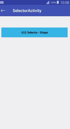
btn1.setBackground(SelectorFactory.newGeneralSelector()
.setDefaultDrawable(ContextCompat.getDrawable(this, R.mipmap.blue_primary))
.setPressedDrawable(this, R.mipmap.blue_primary_dark)
.create())
btn2.setBackground(SelectorFactory.newShapeSelector()
.setDefaultBgColor(ContextCompat.getColor(this, android.R.color.holo_blue_light))
.setPressedBgColor(ContextCompat.getColor(this, android.R.color.holo_blue_dark))
.create())
btn3.setBackground(SelectorFactory.newShapeSelector()
.setDefaultBgColor(ContextCompat.getColor(this, android.R.color.holo_blue_light))
.setPressedBgColor(ContextCompat.getColor(this, android.R.color.holo_blue_dark))
.setSelectedBgColor(ContextCompat.getColor(this, android.R.color.holo_blue_dark))
.setCornerRadius(20)
.create())
btn3.setOnClickListener(new View.OnClickListener() {
@Override
public void onClick(View v) {
btn3.setSelected(!btn3.isSelected())
}
})
btn4.setBackground(SelectorFactory.newShapeSelector()
.setDefaultBgColor(ContextCompat.getColor(this, android.R.color.holo_blue_light))
.setPressedBgColor(ContextCompat.getColor(this, android.R.color.holo_blue_dark))
.setDisabledBgColor(Color.GRAY)
.create())
btn4.setEnabled(false)
- 1
- 2
- 3
- 4
- 5
- 6
- 7
- 8
- 9
- 10
- 11
- 12
- 13
- 14
- 15
- 16
- 17
- 18
- 19
- 20
- 21
- 22
- 23
- 24
- 25
- 26
- 1
- 2
- 3
- 4
- 5
- 6
- 7
- 8
- 9
- 10
- 11
- 12
- 13
- 14
- 15
- 16
- 17
- 18
- 19
- 20
- 21
- 22
- 23
- 24
- 25
- 26

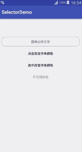
tv1.setBackground(SelectorFactory.newShapeSelector()
.setDefaultStrokeColor(Color.GRAY)
.setStrokeWidth(1)
.setCornerRadius(20)
.create())
tv2.setTextColor(SelectorFactory.newColorSelector()
.setDefaultColor(Color.BLACK)
.setPressedColor(Color.YELLOW)
.create())
tv3.setTextColor(SelectorFactory.newColorSelector()
.setDefaultColor(Color.BLACK)
.setSelectedColor(Color.YELLOW)
.create())
tv3.setOnClickListener(new View.OnClickListener() {
@Override
public void onClick(View v) {
tv3.setSelected(!tv3.isSelected())
}
})
tv4.setTextColor(SelectorFactory.newColorSelector()
.setDefaultColor(Color.BLACK)
.setSelectedColor(Color.YELLOW)
.setDisabledColor(Color.GRAY)
.create())
tv4.setEnabled(false)
- 1
- 2
- 3
- 4
- 5
- 6
- 7
- 8
- 9
- 10
- 11
- 12
- 13
- 14
- 15
- 16
- 17
- 18
- 19
- 20
- 21
- 22
- 23
- 24
- 25
- 1
- 2
- 3
- 4
- 5
- 6
- 7
- 8
- 9
- 10
- 11
- 12
- 13
- 14
- 15
- 16
- 17
- 18
- 19
- 20
- 21
- 22
- 23
- 24
- 25


 扫一扫
扫一扫
 672
672

 被折叠的 条评论
为什么被折叠?
被折叠的 条评论
为什么被折叠?
 到【灌水乐园】发言


