


一、模板内函
模板就是“具有一定规格的样板”,有了模板,就可以依据它制造出很多一样的实例。
模板分为三大类:
DataTemplate 数据外衣
ControlTemplate 控件外衣
ItemsPanelTemplate 项布局(如:ListBox的item)
<Application.Resources>
<Style>
<Setter Property="Template">
<Setter.Value>
<ControlTemplate></ControlTemplate>
</Setter.Value>
</Setter>
</Style>
<DataTemplate></DataTemplate>
</Application.Resources>
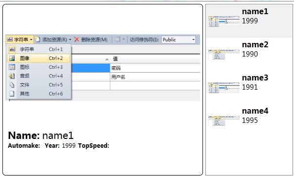
二、DataTemplate 数据外衣(使用数据驱动)
效果:
代码:
    public class Car
    {
        public string Automake { get; set; }
        public string Name { get; set; }
        public string Year { get; set; }
        public string TopSpeed { get; set; }
    }
//厂商名称转换成Logo图片路径
public class AutomakerTologoPathConverter:IValueConverter
{
public object Convert(object value, Type targetType, object parameter, System.Globalization.CultureInfo culture)
{
string uriStr = string.Format(@"/Resources/Images/{0}.jpg", (string)value);
return new BitmapImage(new Uri(uriStr, UriKind.Relative));
}
public object ConvertBack(object value, Type targetType, object parameter, System.Globalization.CultureInfo culture)
{
throw new NotImplementedException();
}
}窗体代码:
<Window x:Class="WpfApplication.Window15"
        xmlns="http://schemas.microsoft.com/winfx/2006/xaml/presentation"
        xmlns:x="http://schemas.microsoft.com/winfx/2006/xaml"
        xmlns:local="clr-namespace:WpfApplication"
        Title="Window15" Height="400" Width="700">

    <Window.Resources>
        <local:AutomakerTologoPathConverter x:Key="n2p"/>
        <!--详细页外衣-->
        <DataTemplate x:Key="carDetailViewTemplate">
            <Border BorderBrush="Black" BorderThickness="1" CornerRadius="6">
                <StackPanel Margin="5">
                    <Image Width="400" Height="250"
                           Source="{Binding Automake,Converter={StaticResource n2p}}"/>
                    <StackPanel Orientation="Horizontal" Margin="5,0">
                        <TextBlock Text="Name:" FontWeight="Bold" FontSize="20"/>
                        <TextBlock Text="{Binding Name}" FontSize="20" Margin="5,0"/>
                    </StackPanel>
                    <StackPanel Orientation="Horizontal" Margin="5,0">
                        <TextBlock Text="Automake:" FontWeight="Bold"/>
                        <TextBlock Text="{Binding Automaker}" Margin="5,0"/>
                        <TextBlock Text="Year:" FontWeight="Bold" />
                        <TextBlock Text="{Binding Year}" Margin="5,0"/>
                        <TextBlock Text="TopSpeed:" FontWeight="Bold" />
                        <TextBlock Text="{Binding TopSeed}" Margin="5,0"/>
                    </StackPanel>
                </StackPanel>
            </Border>
        </DataTemplate>
        <!--列表外衣-->
       <DataTemplate x:Key="carListItemViewTemplate">
            <Grid Margin="2">
                <StackPanel Orientation="Horizontal">
                    <Image Source="{Binding Automake, Converter={StaticResource n2p}}" Grid.RowSpan="3" Width="64" Height="64"/>
                    <StackPanel Margin="5,0">
                        <TextBlock Text="{Binding Name}" FontSize="16" FontWeight="Bold"/>
                        <TextBlock Text="{Binding Year}" FontSize="14"/>
                    </StackPanel>
                </StackPanel>
            </Grid>
        </DataTemplate>
    </Window.Resources>

    <!--窗体内容-->
    <StackPanel Orientation="Horizontal" Margin="5">
        <UserControl ContentTemplate="{StaticResource carDetailViewTemplate}"
                     Content="{Binding SelectedItem,ElementName=listboxCars}"/>

        <ListBox x:Name="listboxCars" Width="180" Margin="5,0"
                 ItemTemplate="{StaticResource carListItemViewTemplate}"/>
    </StackPanel>
</Window>
ContentTemplate="{StaticResource carDetailViewTemplate}" 给用户控件添加外衣
ItemTemplate="{StaticResource carListItemViewTemplate}" 给ListBox每个Item项添加外衣
    public partial class Window15 : Window
    {
        public Window15()
        {
            InitializeComponent();
            InitialCarList();
        }

        private void InitialCarList()
        {
            List<Car> carList = new List<Car>()
            {
               new Car(){Automake="4",Name="name1",Year="1999",TopSpeed="300"},
               new Car(){Automake="5",Name="name2",Year="1990",TopSpeed="150"},
               new Car(){Automake="4",Name="name3",Year="1991",TopSpeed="350"},
               new Car(){Automake="5",Name="name4",Year="1995",TopSpeed="400"},
            };
            listboxCars.ItemsSource = carList;
        }
    }
三、ControlTemplate 控件外衣
<Application.Resources>
<Style x:Key="键名" BasedOn="{x:Null}" TargetType="{x:Type TextBox}">
<!---属性简单直接value,属性复杂就Setter.Value->
<Setter Property="Foreground" Value="{DynamicResource {x:Static SystemColors.ControlTextBrushKey}}"/>
<Setter Property="Template">
<Setter.Value>
<ControlTemplate TargetType="{x:Type TextBox}">
外衣
<ControlTemplate.Triggers>
<Trigger>
触发器
</Trigger>
</ControlTemplate.Triggers>
</ControlTemplate>
</Setter.Value>
</Setter>
</Style>
<Application.Resources>
实例:输入文本框,边圆角
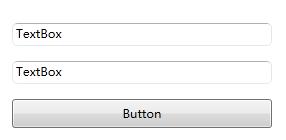
第一步:控件模板
	<Application.Resources>
		<LinearGradientBrush x:Key="TextBoxBorder" EndPoint="0,20" MappingMode="Absolute" StartPoint="0,0">
			<GradientStop Color="#ABADB3" Offset="0.05"/>
			<GradientStop Color="#E2E3EA" Offset="0.07"/>
			<GradientStop Color="#E3E9EF" Offset="1"/>
		</LinearGradientBrush>
		<Style x:Key="RoundCornerTextBoxStyle" BasedOn="{x:Null}" TargetType="{x:Type TextBox}">
			<Setter Property="Foreground" Value="{DynamicResource {x:Static SystemColors.ControlTextBrushKey}}"/>
			<Setter Property="Background" Value="{DynamicResource {x:Static SystemColors.WindowBrushKey}}"/>
			<Setter Property="BorderBrush" Value="{StaticResource TextBoxBorder}"/>
			<Setter Property="BorderThickness" Value="1"/>
			<Setter Property="Padding" Value="1"/>
			<Setter Property="AllowDrop" Value="true"/>
			<Setter Property="FocusVisualStyle" Value="{x:Null}"/>
			<Setter Property="ScrollViewer.PanningMode" Value="VerticalFirst"/>
			<Setter Property="Stylus.IsFlicksEnabled" Value="False"/>
			<Setter Property="Template">
				<Setter.Value>
					<ControlTemplate TargetType="{x:Type TextBox}">
                       <Border x:Name="Bd" Background="{TemplateBinding Background}" BorderBrush="{TemplateBinding BorderBrush}" BorderThickness="{TemplateBinding BorderThickness}" CornerRadius="5">
						<ScrollViewer x:Name="PART_ContentHost" SnapsToDevicePixels="{TemplateBinding SnapsToDevicePixels}"/>
					   </Border>

						<ControlTemplate.Triggers>
							<Trigger Property="IsEnabled" Value="false">
								<Setter Property="Background" TargetName="Bd" Value="{DynamicResource {x:Static SystemColors.ControlBrushKey}}"/>
								<Setter Property="Foreground" Value="{DynamicResource {x:Static SystemColors.GrayTextBrushKey}}"/>
							</Trigger>
						</ControlTemplate.Triggers>
					</ControlTemplate>
				</Setter.Value>
			</Setter>
		</Style>
	<!-- 应该在此定义应用程序级的资源。-->
	</Application.Resources>
注意:TemplateBinding 将自己的属性关联到目标控件的某个属性上。
第二步:样式绑定模板
<TextBox Style="{DynamicResource RoundCornerTextBoxStyle}"/>
四、ItemsControl的PanelTemplate
控制 ItemControl条目容器
<ListBox>
<ListBox.ItemsPanel>
<ItemsPanelTemplate>
<StackPanel Orientation="Horizontal"/> 条目会包装放到一个水平排列的StackPanel中
</ItemsPanelTemplate>
</ListBox.ItemsPanel>
<!--条目-->
<TextBlock Text="A"/>
<TextBlock Text="B"/>
<TextBlock Text="C"/>
<TextBlock Text="D"/>
</ListBox>
五、DataTemplate 与 ControlTemplate 的关系与应用
决定控件外观的是 ControlTemplate, 是控件 Template 属性的值。决定数据外观的是 DataTemplate , 是控件 ContentTemplate 属性的值。
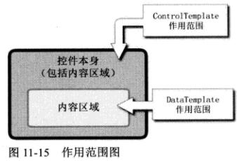
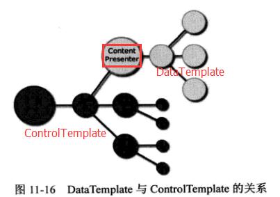
ContentPresenter(内容content,内容位置,内容模板 contentTemplate) 控件是ControlTemplate控件树的一个结点。DataTemplate 控件树是 ControlTemplae控件树的一颗子树。
1、所有目标样式
<Window>
<Style TargetType="{x:Type TextBox}">
<Setter Property="Template">
<Setter.Value>
<ControlTemplate TargetType="{x:Type TextBox}">
控件模板
</ControlTemplate>
</Setter.Value>
</Setter>
</Style>
<StackPanel>
<TextBox/>
<TextBox Style="{x:null}" text="不应用样式"/>
</StackPanel>
</Window>
2、设置 DataTemplate 的 DataType 属性,可以把 DataTemplate 应用在那种数据类型上。
效果:
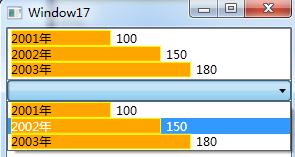
代码:
创建数据类型
    public class Unit
    {
        public int Price { get; set; }
        public string Year { get; set; }
    }
数据类型模板、数据类型源
<Window x:Class="WpfApplication.Window17"
xmlns="http://schemas.microsoft.com/winfx/2006/xaml/presentation"
xmlns:x="http://schemas.microsoft.com/winfx/2006/xaml"
xmlns:local="clr-namespace:WpfApplication"
xmlns:c="clr-namespace:System.Collections;assembly=mscorlib"
Title="Window17" Height="300" Width="300">
<Window.Resources>
<!--数据类型 (模板)-->
<DataTemplate DataType="{x:Type local:Unit}">
<Grid>
<StackPanel Orientation="Horizontal">
<Grid>
<Rectangle Stroke="Yellow" Fill="Orange" Width="{Binding Price}"/>
<TextBlock Text="{Binding Year}"/>
</Grid>
<TextBlock Text="{Binding Price}" Margin="5,0"/>
</StackPanel>
</Grid>
</DataTemplate>
<!--数据类型 (源)-->
<c:ArrayList x:Key="ds">
<local:Unit Year="2001年" Price="100"/>
<local:Unit Year="2002年" Price="150"/>
<local:Unit Year="2003年" Price="180"/>
</c:ArrayList>
</Window.Resources>
<StackPanel>
<!--绑定数据类型源-->
<ListBox ItemsSource="{StaticResource ds}"/>
<ComboBox ItemsSource="{StaticResource ds}"/>
</StackPanel>
</Window>
3、XmlDataProvider 做为数据源
<Window x:Class="WpfApplication.Window17"
xmlns="http://schemas.microsoft.com/winfx/2006/xaml/presentation"
xmlns:x="http://schemas.microsoft.com/winfx/2006/xaml"
xmlns:local="clr-namespace:WpfApplication"
xmlns:c="clr-namespace:System.Collections;assembly=mscorlib">
<Window.Resources>
<!--数据类型 (模板)-->
<DataTemplate DataType="Unit">
<Grid>
<StackPanel Orientation="Horizontal">
<Grid>
<Rectangle Stroke="Yellow" Fill="Orange" Width="{Binding XPath=@Price}"/>
<TextBlock Text="{Binding XPath=@Year}"/>
</Grid>
<TextBlock Text="{Binding XPath=@Price}" Margin="5,0"/>
</StackPanel>
</Grid>
</DataTemplate>
<XmlDataProvider x:Key="ds" XPath="Units/Unit">
<x:XData>
<Units xmlns="">
<Unit Year="2001" Price="150"/>
<Unit Year="2002" Price="180"/>
<Unit Year="2003" Price="200"/>
</Units>
</x:XData>
</XmlDataProvider>
</Window.Resources>
<StackPanel>
<!--绑定数据类型源-->
<ListBox ItemsSource="{Binding Source={StaticResource ds}}"/>
<ComboBox ItemsSource="{Binding Source={StaticResource ds}}"/>
</StackPanel>
</Window>
4、TreeView 显示多层级,不同类型的数据。因为数据类型不同,我们需要每种数据类型设置一种模板。
使用层级数据模板 HierarchicalDataTemplate
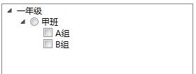
xml数据
<?xml version="1.0" encoding="utf-8" ?>
<Data xmlns="">
  <Grade Name="一年级">
    <Class Name="甲班">
      <Group Name="A组"/>
      <Group Name="B组"/>
    </Class>
  </Grade>
</Data>
<Window x:Class="AutomaticConfigurationAPP.Window3"
xmlns="http://schemas.microsoft.com/winfx/2006/xaml/presentation"
xmlns:x="http://schemas.microsoft.com/winfx/2006/xaml"
Title="Window3" Height="300" Width="300">
<Window.Resources>
<!--Source数据源 XPath数据源路径-->
<XmlDataProvider x:Key="ds" Source="/Resources/Xml/Data.xml" XPath="Data/Grade"/>
<!--年级模板-->
<HierarchicalDataTemplate DataType="Grade" ItemsSource="{Binding XPath=Class}">
<TextBlock Text="{Binding XPath=@Name}" />
</HierarchicalDataTemplate>
<!--班级模板-->
<HierarchicalDataTemplate DataType="Class" ItemsSource="{Binding XPath=Group}">
<RadioButton Content="{Binding XPath=@Name}" GroupName="gn"/>
</HierarchicalDataTemplate>
<!--小组模板-->
<HierarchicalDataTemplate DataType="Group">
<CheckBox Content="{Binding XPath=@Name}"/>
</HierarchicalDataTemplate>
</Window.Resources>
<Grid>
<TreeView Margin="5" ItemsSource="{Binding Source={StaticResource ds}}"/>
</Grid>
</Window>
5、同一种数据类型的嵌套结构。
只设计一个 HierarchicalDataTemplate ,会自动产生迭代效果。
效果:
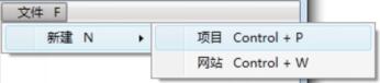
<?xml version="1.0" encoding="utf-8" ?>
<Data xmlns="">
  <Operation Name="文件" Gesture="F">
    <Operation Name="新建" Gesture="N">
      <Operation Name="项目" Gesture="Control + P"/>
      <Operation Name="网站" Gesture="Control + W"/>
    </Operation>
  </Operation>
</Data>
<Window x:Class="AutomaticConfigurationAPP.Window4"
xmlns="http://schemas.microsoft.com/winfx/2006/xaml/presentation"
xmlns:x="http://schemas.microsoft.com/winfx/2006/xaml"
Title="Window4" Height="300" Width="300">
<Window.Resources>
<!--Source数据源 XPath数据路径-->
<XmlDataProvider x:Key="ds" Source="/Resources/Xml/Data2.xml" XPath="Data/Operation"/>
<!--数据模板-->
<HierarchicalDataTemplate DataType="Operation" ItemsSource="{Binding XPath=Operation}">
<StackPanel Orientation="Horizontal">
<TextBlock Text="{Binding XPath=@Name}" Margin="10,0"/>
<TextBlock Text="{Binding XPath=@Gesture}"/>
</StackPanel>
</HierarchicalDataTemplate>
</Window.Resources>
<StackPanel MenuItem.Click="StackPanel_Click">
<Menu ItemsSource="{Binding Source={StaticResource ds}}"/>
</StackPanel>
</Window>
        private void StackPanel_Click(object sender, RoutedEventArgs e)
        {
            MenuItem mi = e.OriginalSource as MenuItem;
            //HierarchicalDataTemplate 作用的目标是MenuItem.Header
            XmlElement xe = mi.Header as XmlElement;
            MessageBox.Show(xe.Attributes["Name"].Value);

        }
六、从外部访问 Template (模板)的控件、获取它的属性值
DataTemplate 和 ControlTemplate 两个类均派生自 FrameWorkTemplate类。这个类有个 FindName方法 供我们查询内部控件。
ControlTemplate 对象: 访问其目标控件 Template . FindName就能拿到。
DataTemplate 对象: 直接使用低层数据(如果想获得控件长度、宽度 Template . FindName)。
1、获得ControlTemplate 中的控件。
效果:
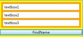
<Window x:Class="AutomaticConfigurationAPP.Window5"
xmlns="http://schemas.microsoft.com/winfx/2006/xaml/presentation"
xmlns:x="http://schemas.microsoft.com/winfx/2006/xaml"
Title="Window5" Height="300" Width="300">
<Window.Resources>
<ControlTemplate x:Key="cTmp">
<StackPanel Background="Orange">
<TextBox x:Name="textbox1" Margin="6"/>
<TextBox x:Name="textbox2" Margin="6,0"/>
<TextBox x:Name="textbox3" Margin="6"/>
</StackPanel>
</ControlTemplate>
</Window.Resources>
<StackPanel Background="Yellow">
<UserControl x:Name="uc" Template="{StaticResource cTmp}" Margin="5"/>
<Button Content="FindName" Click="Button_Click"/>
</StackPanel>
</Window>
事件
private void Button_Click(object sender, RoutedEventArgs e)
{
//Template.FindName
TextBox tb= uc.Template.FindName("textbox1", this.uc) as TextBox;
tb.Text = "textbox1";
StackPanel sp = tb.Parent as StackPanel;
(sp.Children[1] as TextBox).Text = "textbox2";
(sp.Children[2] as TextBox).Text = "textbox3";
}
2、获得DataTemplate 中的控件。
如果获得与用户界面相关的数据(比如控件的宽度、高度)ContentTemplate.FindName("")。
如果获得与业务相关的数据,直接访问底层(WPF采用数据驱动UI逻辑)Content
效果:
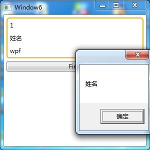
    public class Student
    {
        public int Id { get; set; }
        public string Name { get; set; }
        public string Skill { get; set; }
        public bool HasJob { get; set; }
    }
XAML
<Window x:Class="AutomaticConfigurationAPP.Window6"
xmlns="http://schemas.microsoft.com/winfx/2006/xaml/presentation"
xmlns:x="http://schemas.microsoft.com/winfx/2006/xaml"
xmlns:local="clr-namespace:AutomaticConfigurationAPP"
Title="Window6" Height="300" Width="300">
<Window.Resources>
<local:Student x:Key="stu" Id="1" Name="姓名" Skill="wpf" HasJob="True"/>
<DataTemplate x:Key="stuDT">
<Border BorderBrush="Orange" BorderThickness="2" CornerRadius="5">
<StackPanel>
<TextBlock Text="{Binding Id}" Margin="5"/>
<TextBlock x:Name="textblockname" Text="{Binding Name}" Margin="5"/>
<TextBlock Text="{Binding Skill}" Margin="5"/>
</StackPanel>
</Border>
</DataTemplate>
</Window.Resources>
<StackPanel>
<ContentPresenter x:Name="cp"
Content="{StaticResource stu}"
ContentTemplate="{StaticResource stuDT}"
Margin="5"/>
<!--Content="{StaticResource 内容数据源}" ContentTemplate="{StaticResource 内容模板}"-->
<Button Content="Find" Margin="5,0" Click="Button_Click"/>
</StackPanel>
</Window>
C#
//内容模板查找控件
TextBlock tb= this.cp.ContentTemplate.FindName("textblockname", this.cp) as TextBlock;
MessageBox.Show(tb.Text);
//直接使用底层数据
Student stu = this.cp.Content as Student;
MessageBox.Show(stu.Name);
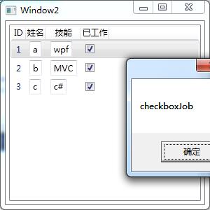
实例:访问业务逻辑数据、访问界面逻辑数据
界面:
XAML
<Window x:Class="AutomaticConfigurationAPP.Window2"
xmlns="http://schemas.microsoft.com/winfx/2006/xaml/presentation"
xmlns:x="http://schemas.microsoft.com/winfx/2006/xaml"
xmlns:c="clr-namespace:System.Collections;assembly=mscorlib"
xmlns:local="clr-namespace:AutomaticConfigurationAPP"
Title="Window2" Height="300" Width="300">
<Window.Resources>
<c:ArrayList x:Key="stuList">
<local:Student Id="1" Name="a" Skill="wpf" HasJob="True"/>
<local:Student Id="2" Name="b" Skill="MVC" HasJob="True"/>
<local:Student Id="3" Name="c" Skill="c#" HasJob="True"/>
</c:ArrayList>
<DataTemplate x:Key="nameDT">
<TextBox x:Name="textboxname" Text="{Binding Name}" GotFocus="textboxname_GotFocus"/>
</DataTemplate>
<DataTemplate x:Key="skillDT">
<TextBox x:Name="textboxskill" Text="{Binding Skill}"/>
</DataTemplate>
<DataTemplate x:Key="hasjobDT">
<CheckBox x:Name="checkboxJob" IsChecked="{Binding HasJob}"/>
</DataTemplate>
</Window.Resources>
<Grid Margin="5">
<ListView x:Name="listviewStudent" ItemsSource="{StaticResource stuList}">
<ListView.View>
<!--ListView的View属性是GridView-->
<GridView>
<GridViewColumn Header="ID" DisplayMemberBinding="{Binding Id}"/>
<!--CellTemplate是TextBox-->
<GridViewColumn Header="姓名" CellTemplate="{StaticResource nameDT}"/>
<GridViewColumn Header="技能" CellTemplate="{StaticResource skillDT}"/>
<GridViewColumn Header="已工作" CellTemplate="{StaticResource hasjobDT}"/>
</GridView>
</ListView.View>
</ListView>
</Grid>
</Window>
c#
private void textboxname_GotFocus(object sender, RoutedEventArgs e)
{
//访问业务逻辑数据
TextBox tb = e.OriginalSource as TextBox;//获得事件的源头(TextBox)
//沿UI元素树上溯到DataTemplate的目标控件(ContentPresenter),并获取它内容,它内容一定是个Student
ContentPresenter cp = tb.TemplatedParent as ContentPresenter;
Student stu = cp.Content as Student;//一行
//MessageBox.Show(stu.HasJob.ToString());
this.listviewStudent.SelectedItem = stu;
//访问界面逻辑数据
//查找包含的ListViewItem
ListViewItem lvi = this.listviewStudent.ItemContainerGenerator.ContainerFromItem(stu) as ListViewItem;
CheckBox chb = this.FindVisualChild<CheckBox>(lvi);
MessageBox.Show(chb.Name);
}
private ChildType FindVisualChild<ChildType>(DependencyObject obj)
where ChildType:DependencyObject
{
//可视化对象包含的子集个数
for (int i = 0; i < VisualTreeHelper.GetChildrenCount(obj); i++)
{
//返回指定父可视对象中位于指定集合索引位置的子可视对象
DependencyObject child = VisualTreeHelper.GetChild(obj, i);
if (child != null && child is ChildType)
{
return child as ChildType;
}
else
{
ChildType childofChild = FindVisualChild<ChildType>(child);
if (childofChild != null)
return childofChild;
}
}
return null;
}
七、Style 样式
Style样式包含两种元素:
Setter类 设置控件静态的外观。
Trigger类 设置控件行为的风格。
实例一:模板绑定Padding属性的值,并使用属性值在ContentPresenter 元素周围创建外边距。
            <Button Margin="5" Padding="5" Background="Black" Template="{Binding Source={StaticResource ButtonTemplate}}">
                控件模板
            </Button>
<Window.Resources>
<ControlTemplate x:Key="ButtonTemplate" TargetType="{x:Type Button}">
<Border Name="borderName"
BorderBrush="Orange"
BorderThickness="3"
CornerRadius="2"
Background="Red"
TextBlock.Foreground="White">
<!-- ContentPresenter 就是負責將Content屬性顯示出來 -->
<!--模板绑定:模板从 应用模板 中获取值 Margin="{TemplateBinding Padding}"-->
<ContentPresenter
RecognizesAccessKey="True"
Margin="{TemplateBinding Padding}">
</ContentPresenter>
</Border>
<ControlTemplate.Triggers>
<Trigger Property="IsMouseOver" Value="True">
<Setter TargetName="borderName" Property="Background" Value="DarkRed"/>
</Trigger>
<Trigger Property="IsPressed" Value="True">
<Setter TargetName="borderName" Property="Background" Value="IndianRed"/>
<Setter TargetName="borderName" Property="BorderBrush" Value="DarkKhaki"/>
</Trigger>
</ControlTemplate.Triggers>
</ControlTemplate>
</Window.Resources>实例二:动画按钮
<Window.Resources>
<ControlTemplate x:Key="ButtonTemplate" TargetType="{x:Type Button}">
<Border BorderBrush="Orange"
BorderThickness="3"
CornerRadius="2"
Background="Red"
TextBlock.Foreground="White"
Name="Border">
<Grid>
<Rectangle Name="FocusCue"
Visibility="Hidden"
Stroke="Black"
StrokeThickness="1"
StrokeDashArray="1 2"
SnapsToDevicePixels="True" >
</Rectangle>
<ContentPresenter RecognizesAccessKey="True"
Margin="{TemplateBinding Padding}">
</ContentPresenter>
</Grid>
</Border>
<ControlTemplate.Triggers>
<EventTrigger RoutedEvent="MouseEnter">
<BeginStoryboard>
<Storyboard>
<ColorAnimation Storyboard.TargetName="Border" Storyboard.TargetProperty="Background.Color"
To="Blue" Duration="0:0:1" AutoReverse="True" RepeatBehavior="Forever"></ColorAnimation>
</Storyboard>
</BeginStoryboard>
</EventTrigger>
<EventTrigger RoutedEvent="MouseLeave">
<BeginStoryboard>
<Storyboard>
<ColorAnimation Storyboard.TargetName="Border" Storyboard.TargetProperty="Background.Color" Duration="0:0:0.5"></ColorAnimation>
</Storyboard>
</BeginStoryboard>
</EventTrigger>
<Trigger Property="IsPressed" Value="True">
<Setter TargetName="Border" Property="Background" Value="IndianRed" />
<Setter TargetName="Border" Property="BorderBrush" Value="DarkKhaki" />
</Trigger>
<Trigger Property="IsKeyboardFocused" Value="True">
<Setter TargetName="FocusCue" Property="Visibility" Value="Visible" />
</Trigger>
</ControlTemplate.Triggers>
</ControlTemplate>
</Window.Resources>
实例三:修改LIstBox样式(嵌套模板)。
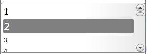
步骤:
1、ItemsPresenter 外观(ListBox)
2、ContentPresenter 外观(ListBoxItem)
3、ScrollBar外观
<Window x:Class="AutomaticConfigurationAPP.Window1"
xmlns="http://schemas.microsoft.com/winfx/2006/xaml/presentation"
xmlns:x="http://schemas.microsoft.com/winfx/2006/xaml"
Title="Window1" Height="300" Width="300">
<Window.Resources>
<!--单色画刷-->
<SolidColorBrush x:Key="StandardBorderBrush" Color="#888" />
<SolidColorBrush x:Key="HoverBorderBrush" Color="#DDD" />
<SolidColorBrush x:Key="SelectedBackgroundBrush" Color="Gray" />
<SolidColorBrush x:Key="SelectedForegroundBrush" Color="White" />
<LinearGradientBrush x:Key="ListBoxBackgroundBrush" StartPoint="0,0" EndPoint="1,0.001">
<GradientBrush.GradientStops>
<GradientStopCollection>
<GradientStop Color="White" Offset="0.0" />
<GradientStop Color="White" Offset="0.6" />
<GradientStop Color="#DDDDDD" Offset="1.2"/>
</GradientStopCollection>
</GradientBrush.GradientStops>
</LinearGradientBrush>
<LinearGradientBrush x:Key="StandardBrush" StartPoint="0,0" EndPoint="0,1">
<GradientBrush.GradientStops>
<GradientStopCollection>
<GradientStop Color="#FFF" Offset="0.0"/>
<GradientStop Color="#CCC" Offset="1.0"/>
</GradientStopCollection>
</GradientBrush.GradientStops>
</LinearGradientBrush>
<SolidColorBrush x:Key="GlyphBrush" Color="#444" />
<LinearGradientBrush x:Key="PressedBrush" StartPoint="0,0" EndPoint="0,1">
<GradientBrush.GradientStops>
<GradientStopCollection>
<GradientStop Color="#BBB" Offset="0.0"/>
<GradientStop Color="#EEE" Offset="0.1"/>
<GradientStop Color="#EEE" Offset="0.9"/>
<GradientStop Color="#FFF" Offset="1.0"/>
</GradientStopCollection>
</GradientBrush.GradientStops>
</LinearGradientBrush>
<!--滚动条按钮为圆圈-->
<Style x:Key="ScrollBarLineButtonStyle" TargetType="{x:Type RepeatButton}">
<Setter Property="Focusable" Value="False"/>
<Setter Property="Template">
<Setter.Value>
<ControlTemplate TargetType="{x:Type RepeatButton}">
<Grid Margin="1">
<Ellipse Name="Border" StrokeThickness="1" Stroke="{StaticResource StandardBorderBrush}"
Fill="{StaticResource StandardBrush}"></Ellipse>
<ContentPresenter HorizontalAlignment="Center" VerticalAlignment="Center"></ContentPresenter>
</Grid>
<ControlTemplate.Triggers>
<Trigger Property="IsPressed" Value="true">
<Setter TargetName="Border" Property="Fill" Value="{StaticResource PressedBrush}" />
</Trigger>
</ControlTemplate.Triggers>
</ControlTemplate>
</Setter.Value>
</Setter>
</Style>
<!--滚动条Thumb上的RepeatButton对象,背景为透明-->
<Style x:Key="ScrollBarPageButtonStyle" TargetType="{x:Type RepeatButton}">
<Setter Property="IsTabStop" Value="False"/>
<Setter Property="Focusable" Value="False"/>
<Setter Property="Template">
<Setter.Value>
<ControlTemplate TargetType="{x:Type RepeatButton}">
<Border Background="Transparent" />
</ControlTemplate>
</Setter.Value>
</Setter>
</Style>
<!--滚动条Thumb形状为椭圆-->
<Style x:Key="ScrollBarThumbStyle" TargetType="{x:Type Thumb}">
<Setter Property="IsTabStop" Value="False"/>
<Setter Property="Focusable" Value="False"/>
<Setter Property="Margin" Value="1,0,1,0" />
<Setter Property="Background" Value="{StaticResource StandardBrush}" />
<Setter Property="BorderBrush" Value="{StaticResource StandardBorderBrush}" />
<Setter Property="Template">
<Setter.Value>
<ControlTemplate TargetType="{x:Type Thumb}">
<Ellipse Stroke="{StaticResource StandardBorderBrush}"
Fill="{StaticResource StandardBrush}"></Ellipse>
</ControlTemplate>
</Setter.Value>
</Setter>
</Style>
<ControlTemplate x:Key="VerticalScrollBar" TargetType="{x:Type ScrollBar}">
<Grid>
<!--滚动条包含三行网格。顶部,低部放按钮。中间Track元素-->
<Grid.RowDefinitions>
<RowDefinition MaxHeight="18"/>
<RowDefinition Height="*"/>
<RowDefinition MaxHeight="18"/>
</Grid.RowDefinitions>
<RepeatButton
Grid.Row="0"
Height="18"
Style="{StaticResource ScrollBarLineButtonStyle}"
Command="ScrollBar.LineUpCommand" >
<!--绘制向上箭头的Path对象(箭头使用,微语言路径)-->
<Path
Fill="{StaticResource GlyphBrush}"
Data="M 0 4 L 8 4 L 4 0 Z">
</Path>
</RepeatButton>
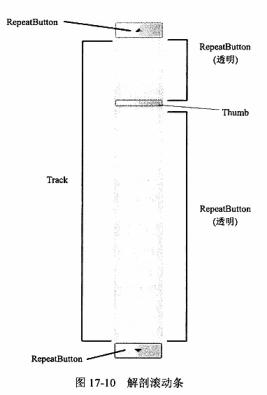
<!--Track名称必须是PART_Track,为了使ScrollBar能成功关联到它的代码-->
<!--ViewportSize="0" 尺度更具内容变化-->
<Track
Name="PART_Track"
Grid.Row="1"
IsDirectionReversed="True"
ViewportSize="0">
<!--Track封装两个RepeatButton对象和Thumb元素-->
<Track.DecreaseRepeatButton>
<RepeatButton Command="ScrollBar.PageUpCommand" Style="{StaticResource ScrollBarPageButtonStyle}">
</RepeatButton>
</Track.DecreaseRepeatButton>
<Track.Thumb>
<Thumb Style="{StaticResource ScrollBarThumbStyle}">
</Thumb>
</Track.Thumb>
<Track.IncreaseRepeatButton>
<RepeatButton Command="ScrollBar.PageDownCommand" Style="{StaticResource ScrollBarPageButtonStyle}">
</RepeatButton>
</Track.IncreaseRepeatButton>
</Track>
<RepeatButton
Grid.Row="3"
Height="18"
Style="{StaticResource ScrollBarLineButtonStyle}"
Command="ScrollBar.LineDownCommand">
<Path
Fill="{StaticResource GlyphBrush}"
Data="M 0 0 L 4 4 L 8 0 Z">
</Path>
</RepeatButton>
</Grid>
</ControlTemplate>
<Style TargetType="{x:Type ScrollBar}">
<Setter Property="SnapsToDevicePixels" Value="True"/>
<Setter Property="OverridesDefaultStyle" Value="true"/>
<Style.Triggers>
<!--垂直滚动条模板-->
<Trigger Property="Orientation" Value="Vertical">
<Setter Property="Width" Value="18"/>
<Setter Property="Height" Value="Auto" />
<Setter Property="Template" Value="{StaticResource VerticalScrollBar}" />
</Trigger>
</Style.Triggers>
</Style>
<!-- ItemsPresenter 外观-->
<Style TargetType="{x:Type ListBox}">
<Setter Property="Template">
<Setter.Value>
<ControlTemplate TargetType="{x:Type ListBox}">
<!--嵌套模板-->
<Border
Name="border"
Background="{StaticResource ListBoxBackgroundBrush}"
BorderBrush="{StaticResource StandardBorderBrush}"
BorderThickness="1" CornerRadius="3"
>
<!--ScrollViewer 容纳所有列表项(ItemsPresenter)-->
<ScrollViewer Focusable="False">
<ItemsPresenter Margin="2"></ItemsPresenter>
</ScrollViewer>
</Border>
</ControlTemplate>
</Setter.Value>
</Setter>
</Style>
<!-- ContentPresenter 外观-->
<Style TargetType="{x:Type ListBoxItem}">
<Setter Property="Template">
<Setter.Value>
<ControlTemplate TargetType="{x:Type ListBoxItem}">
<Border
Name="Border"
BorderThickness="2"
CornerRadius="3"
Padding="1"
SnapsToDevicePixels="True">
<ContentPresenter></ContentPresenter>
</Border>
<ControlTemplate.Triggers>
<EventTrigger RoutedEvent="ListBoxItem.MouseEnter">
<EventTrigger.Actions>
<BeginStoryboard>
<Storyboard>
<DoubleAnimation
Storyboard.TargetProperty="FontSize"
To="20"
Duration="0:0:1">
</DoubleAnimation>
<!--字体1秒钟=20大小-->
</Storyboard>
</BeginStoryboard>
</EventTrigger.Actions>
</EventTrigger>
<EventTrigger RoutedEvent="ListBoxItem.MouseLeave">
<EventTrigger.Actions>
<BeginStoryboard>
<Storyboard>
<DoubleAnimation
Storyboard.TargetProperty="FontSize"
BeginTime="0:0:0.5"
Duration="0:0:0.2">
<!--字体延迟0.5秒,0.2秒缩小-->
</DoubleAnimation>
</Storyboard>
</BeginStoryboard>
</EventTrigger.Actions>
</EventTrigger>
<Trigger Property="IsMouseOver" Value="True">
<Setter TargetName="Border" Property="BorderBrush" Value="{StaticResource HoverBorderBrush}"/>
</Trigger>
<Trigger Property="IsSelected" Value="True">
<Setter TargetName="Border" Property="Background" Value="{StaticResource SelectedBackgroundBrush}"/>
<Setter TargetName="Border" Property="TextBlock.Foreground" Value="{StaticResource SelectedForegroundBrush}"/>
</Trigger>
</ControlTemplate.Triggers>
</ControlTemplate>
</Setter.Value>
</Setter>
</Style>
</Window.Resources>
<Grid>
<ListBox Height="100">
<ListBoxItem Content="1" />
<ListBoxItem Content="2" />
<ListBoxItem Content="3" />
<ListBoxItem Content="4" />
<ListBoxItem Content="5" />
<ListBoxItem Content="6" />
<ListBoxItem Content="7" />
<ListBoxItem Content="8" />
</ListBox>
</Grid>
</Window>


 扫一扫
扫一扫
 1246
1246

 被折叠的 条评论
为什么被折叠?
被折叠的 条评论
为什么被折叠?
 到【灌水乐园】发言


