


本节引言
本节分享的Android中常用的布局LinearLayout(线性布局),它能够将View水平或者垂直摆放。最有意思的是,LinearLayout中的View可以通过权重来达到屏幕适配的效果。
View与ViewGroup
在Android中,一个丰富的界面是由很多控件(View)组成,而我之前分享的就是属于这个范畴。既然这样,我们肯定不能让View乱糟糟地出现在我们的界面中,所以我们需要借助ViewGroup的力量,让我们的View按照一些顺序有条不紊地呈现给用户。常用的布局有LinearLayout(线性布局)、RelativeLayout(相对布局)、FrameLayout(帧布局)等,接下来就开始介绍LinearLayout。
LinearLayout用法详解
1.LinearLayout中控件的方向
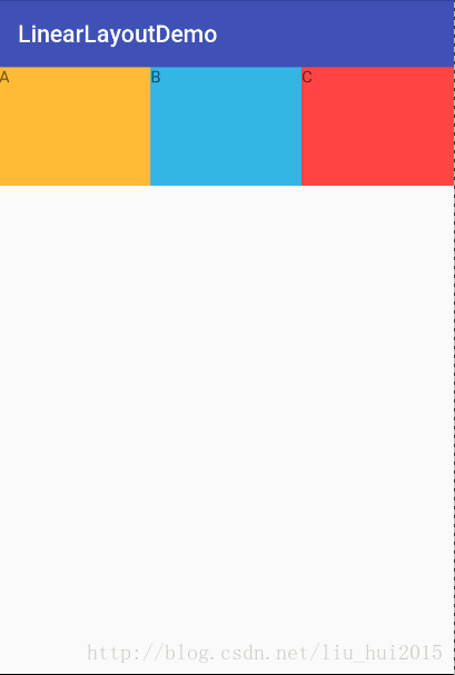
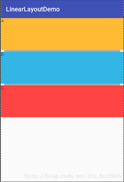
LinearLayout翻译过来意为线性布局,见名之意,它能够将它包含的控件在线性方向上排列,下面是演示图:
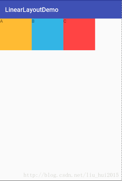
XML布局文件代码:
<?xml version="1.0" encoding="utf-8"?>
<LinearLayout xmlns:android="http://schemas.android.com/apk/res/android"
    android:layout_width="match_parent"
    android:layout_height="match_parent"
    android:orientation="horizontal"
    >

    <TextView
        android:layout_width="100dp"
        android:layout_height="100dp"
        android:background="@android:color/holo_orange_light"
        android:text="A" />
    <TextView
        android:layout_width="100dp"
        android:layout_height="100dp"
        android:background="@android:color/holo_blue_light"
        android:text="B" />
    <TextView
        android:layout_width="100dp"
        android:layout_height="100dp"
        android:background="@android:color/holo_red_light"
        android:text="C" />
</LinearLayout>在LinerLayout中添加了三个TextView,长和宽都是100dp,并且用不同的背景色使得容易区分。注意android:orientation这个属性,值为horizontal就表示控件会在水平方向排列,而值为vertical代表垂直方向排列。我们将值改为vertical看看效果:
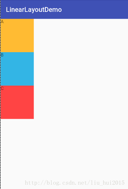
不出意料的,三个TextView在垂直方向排列了。如果不设置orientation,默认值为horizontal。
2.gravity与layout_gravity的区别
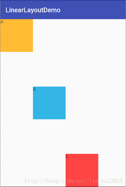
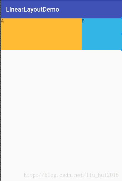
在刚刚编写xml布局文件的时候,发现android:layout_gravity和android:gravity两个长得很相似的属性,他们有什么区别呢?其实很简单,android:layout_gravity 用于控件在ViewGroup中的对齐方式,而android:gravity用于控件中内容的对齐方式。先来看看android:layout_gravity吧,演示效果图如下:
代码如下:
<?xml version="1.0" encoding="utf-8"?>
<LinearLayout xmlns:android="http://schemas.android.com/apk/res/android"
    android:layout_width="match_parent"
    android:layout_height="match_parent"
    android:orientation="horizontal"
    android:layout_gravity="center">

    <TextView
        android:layout_width="100dp"
        android:layout_height="100dp"
        android:background="@android:color/holo_orange_light"
        android:layout_gravity="center_horizontal"
        android:text="A" />
    <TextView
        android:layout_width="100dp"
        android:layout_height="100dp"
        android:background="@android:color/holo_blue_light"
        android:layout_gravity="center_vertical"
        android:text="B" />

    <TextView
        android:layout_width="100dp"
        android:layout_height="100dp"
        android:background="@android:color/holo_red_light"
        android:layout_gravity="bottom"
        android:text="C"
        android:id="@+id/textView" />
</LinearLayout>
内容为A的TextView的android:layout_gravity属性为center_horizontal,按理说应该水平居中,但是它并没有,原因是当Linearlayout的方向是horizontal时,每添加一个控件,水平方向的长度会变化,所以无法指定该方向的对齐方式,因而只有垂直方向上的对齐方式才会生效,同理,当LinearLayout的方向是vertical时,只用水平方向的对齐方式有效。根据上述结论,内容为B和C的对齐方式的效果就理所当然了,分别为垂直居中和底部。
可是LinearLayout也设置android:layout_gravity为center,为什么也没有特别的效果呀?上文也说过android:layout_gravity是控件在ViewGroup中的对齐方式,三个TextView是被包裹在LinearLayout中的,所以能够看到效果,但是LinearLayout并没有包含在任何ViewGroup中,因此不管设置任何值,都不会改变三个TextView的位置了。
接下来我们看看android:gravity有何效果,效果图如下:
代码如下:
<?xml version="1.0" encoding="utf-8"?>
<LinearLayout xmlns:android="http://schemas.android.com/apk/res/android"
    android:layout_width="match_parent"
    android:layout_height="match_parent"
    android:orientation="horizontal"
    android:gravity="center_horizontal">

    <TextView
        android:layout_width="100dp"
        android:layout_height="100dp"
        android:background="@android:color/holo_orange_light"
        android:layout_gravity="center_horizontal"
        android:gravity="center_horizontal"
        android:text="A" />
    <TextView
        android:layout_width="100dp"
        android:layout_height="100dp"
        android:background="@android:color/holo_blue_light"
        android:layout_gravity="center_vertical"
        android:gravity="center"
        android:text="B" />

    <TextView
        android:layout_width="100dp"
        android:layout_height="100dp"
        android:background="@android:color/holo_red_light"
        android:layout_gravity="bottom"
        android:gravity="bottom|right"
        android:text="C"
        android:id="@+id/textView" />
</LinearLayout>
上文说了android:gravity用于控件中内容的对齐方式。首先看LinearLayout的android:gravity值为center_horizontal,三个TextView水平居中了(需要注意,这里只有水平方向的值会生效,例如设置为bottom是不会有效果的)。内容为A的TextView的”A”是水平居中的,android:gravity值为center_horizontal。内容为B的TextView的”B”是垂直居中的,android:gravity值为center_vertical。需要注意的是第三个TextView,android:gravity值为bottom|right,显示效果是”C”位于底部靠右了,说明这些对齐方式是可以配合使用的。
3.weight属性详解
我在引言中就提到LinearLayout可以利用权重达到一个屏幕适配效果,其实就是利用weight属性来实现。
演示效果如下:
代码如下:
<?xml version="1.0" encoding="utf-8"?>
<LinearLayout xmlns:android="http://schemas.android.com/apk/res/android"
    android:layout_width="match_parent"
    android:layout_height="match_parent"
    android:orientation="horizontal">

    <TextView
        android:layout_width="wrap_content"
        android:layout_height="100dp"
        android:layout_weight="1"
        android:background="@android:color/holo_orange_light"
        android:text="A" />

    <TextView
        android:layout_width="wrap_content"
        android:layout_height="100dp"
        android:layout_weight="1"
        android:background="@android:color/holo_blue_light"
        android:text="B" />

    <TextView
        android:layout_width="wrap_content"
        android:layout_height="100dp"
        android:layout_weight="1"
        android:background="@android:color/holo_red_light"
        android:text="C" />
</LinearLayout>
分别在三个TextView中添加android:layout_weight=”1”后,它们的宽度就变为屏幕的三分之一了,至于为什么只改变宽度,是由于android:orientation=”horizontal”的原因。看到现在,你也许会觉得android:layout_weight就是控件在布局中的占比,其实不完全是这样,先看下面的演示图:
代码如下:
<?xml version="1.0" encoding="utf-8"?>
<LinearLayout xmlns:android="http://schemas.android.com/apk/res/android"
    android:layout_width="match_parent"
    android:layout_height="match_parent"
    android:orientation="horizontal">

    <TextView
        android:layout_width="match_parent"
        android:layout_height="100dp"
        android:layout_weight="1"
        android:background="@android:color/holo_orange_light"
        android:text="A" />

    <TextView
        android:layout_width="match_parent"
        android:layout_height="100dp"
        android:layout_weight="2"
        android:background="@android:color/holo_blue_light"
        android:text="B" />

    <TextView
        android:layout_width="match_parent"
        android:layout_height="100dp"
        android:layout_weight="3"
        android:background="@android:color/holo_red_light"
        android:text="C" />
</LinearLayout>根据代码,如果按照之前理解,三个TextView的宽度应该会是屏幕的1/6、2/6和3/6,但是结果却是内容为C的TextView不见了,这是怎么回事呢?我们发现,代码中将TextView的android:layout_width改为match_parent,android:layout_weight就不按照我们的理解现实效果了。其实通过看官方文档发现,android:layout_weight真正的意义是一旦View设置了该属性(假设有效的情况下),那么该 View的宽度等于原有宽度(android:layout_width)加上剩余空间的占比。
既然有了结论,那么我们来计算一下例子中的情况吧。假设屏幕的宽度为L,三个TextView宽度都是match_parent,也就是说三个TextView的宽度都为L,那么剩余宽度为L-(L+L+L)=-2L。内容为A的TextView的宽度就是L+(-2L)*1/6=(2/3)L,内容为B的TextView的宽度为L+(-2L)*2/6=(1/3)L,内容为C的TextView的宽度为L+(-2L)*3/6=0,结果正好符合我们看到的效果。
Google官方推荐,当使用weight属性时,将android:layout_width或android:layout_weight设为0dip即可(这样做可以提高性能),效果跟设成wrap_content是一样的。
4.利用divider属性设置分割线
我们在编写界面的过程中,经常需要添加分割线的情况,LinearLayout中可以利用divider属性来实现这个效果,效果图如下:
代码如下:
<?xml version="1.0" encoding="utf-8"?>
<LinearLayout xmlns:android="http://schemas.android.com/apk/res/android"
    android:layout_width="match_parent"
    android:layout_height="match_parent"
    android:divider="@drawable/divider"
    android:dividerPadding="10dp"
    android:showDividers="middle"
    android:orientation="vertical">

    <TextView
        android:layout_width="match_parent"
        android:layout_height="100dp"
        android:background="@android:color/holo_orange_light"
        android:text="A"
        android:id="@+id/textView2" />

    <TextView
        android:layout_width="match_parent"
        android:layout_height="100dp"
        android:background="@android:color/holo_blue_light"
        android:text="B"
        android:id="@+id/textView" />

    <TextView
        android:layout_width="match_parent"
        android:layout_height="100dp"
        android:background="@android:color/holo_red_light"
        android:text="C" />

</LinearLayout>
我们可以看到每两个TextView之间有一条灰色的分割线,用到的属性就只有三个。
1.android:divider:设置作为分割线的drawable(只能是图片或shape),下面是本例中用到的shape:
<?xml version="1.0" encoding="utf-8"?>
<shape xmlns:android="http://schemas.android.com/apk/res/android">
    <solid android:color="@android:color/darker_gray" />
    <size android:height="5dp" />
</shape>
2.android:showDividers:设置分割线的位置,none(无),begining(开始),end(结束),middle(每两个组件间)。
3.android:dividerPadding:设置分割线的Padding。
本节小结
本节讲解了LinearLayout的一些重要的属性,其中需要注意的就是android:layout_weight,它并不是简单的屏幕占比哟。


 2万+
2万+


 被折叠的 条评论
为什么被折叠?
被折叠的 条评论
为什么被折叠?
 到【灌水乐园】发言


