


关于Toolbar的定制–文字或图片居中
不得不说Toolbar出来也有很长一段时间时了,基本使用都已经了解,然而在实际中由于Toolbar的一些限制,所以项目中使用得很少。都是自己用布局搞定。然而Toolbar毕竟作为一个重量级控件,在和其他控件的交互上还是有很好的。于是现在又来重新了解一下Toolbar。
原先ActionBar的可定制性太差,使用不方便,因此作为ActionBar的升级版Toolbar出现了。Toolbar本身继承至ViewGroup,在保留了原先ActionBar的相关功能基础上,加入了自定义的可能性。
在使用时,若要添加自己的标题或内容,可将toolbar作为一个普通的ViewGroup来使用:
  <android.support.v7.widget.Toolbar
        android:id="@+id/toolbar"
        android:layout_width="match_parent"
        android:layout_height="wrap_content">

        <TextView
            android:layout_width="wrap_content"
            android:layout_height="wrap_content"
            android:layout_gravity="center"
            android:text="Title"
            />

        <TextView
            android:layout_width="wrap_content"
            android:layout_height="wrap_content"
            android:layout_gravity="end"
            android:text="OK"
            />

    </android.support.v7.widget.Toolbar>
如上,利用给layout_gravity属性给Toolbar加上居中标题和右侧文字,必要时可以使用自带的api方法toolbar.setTitle("")隐藏自带标题。只显示自己设置的文字。自己可以去测试下,使用还是蛮方便的。
但是平时使用时如果界面比较多,每个界面都需要按布局方式去写的话比较麻烦。为了方便标题的显示,特对Toolbar做了一些包装,方便使用。
public class TitleBar extends Toolbar {继承至Toolbar未修改toolbar自带功能,只是添加了一些接口能实现居中文字/居中图片等功能。例如居中文字的功能
public void setMyCenterTitle(CharSequence text) {
        Context context = this.getContext();
        if (this.mCenterTitle == null) {
            this.mCenterTitle = new TextView(context);
            this.mCenterTitle.setGravity(Gravity.CENTER);
            this.mCenterTitle.setSingleLine();
            this.mCenterTitle.setEllipsize(TextUtils.TruncateAt.END);
            setMyCenterTextAppearance(getContext(), R.style.TextAppearance_TitleBar_Title);
            //textView in center
            this.addMyView(this.mCenterTitle, Gravity.CENTER);
        } else {
            if (this.mCenterTitle.getVisibility() != VISIBLE) {
                mCenterTitle.setVisibility(VISIBLE);
            }
        }
        if (mCenterIcon != null && mCenterIcon.getVisibility() != GONE) {
            mCenterIcon.setVisibility(GONE);
        }
        //隐藏toolbar自带的标题
        setTitle("");
        mCenterTitle.setText(text);
    }
动态创建一个TextView显示于Toolbar中央,实现居中文字。文字主题默认为系统自带标题样式。当然你也可以设置自己的主题
public void setMyCenterTextAppearance(Context context, @StyleRes int resId) {
        if (this.mCenterTitle != null) {
            this.mCenterTitle.setTextAppearance(context, resId);
        }
    }

    public void setMyCenterTextColor(@ColorInt int color) {
        if (this.mCenterTitle != null) {
            this.mCenterTitle.setTextColor(color);
        }
    }
对添加的标题文字进行自定义。
其他功能,左上角显示文字,右上角显示文字或图片等都采用同样的方式,代码很简单,有需要可以看下。
在使用方面和原先Toolbar使用一样,在布局文件中添加:
<test.yyg.com.titlebar.TitleBar
        android:id="@+id/main_toolbar"
        android:layout_width="match_parent"
        android:layout_height="wrap_content"
        android:background="@color/actionbar_color" />
在Activity中使用,定制自由内容
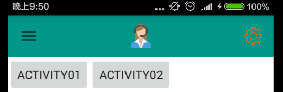
private void initToolBar() {
toolbar = (TitleBar) findViewById(R.id.main_toolbar);
//居中图标
toolbar.setMyCenterIcon(R.drawable.support);
//右侧图标
toolbar.setMySettingIcon(R.drawable.selector_setting);
setSupportActionBar(toolbar);
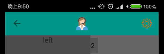
}并且不影响Toolbar自带功能,如与DrawLayout绑定:
 private void setDrawerLayoutStyle() {
        //设置左边侧滑只能通过按扭点开
        drawerLayout.setDrawerLockMode(DrawerLayout.LOCK_MODE_LOCKED_CLOSED,
                Gravity.START);
        //将navigationButton采用系统默认图标,与drawablelayout绑定(含动画)
        actionBarDrawerToggle = new ActionBarDrawerToggle(this,
                drawerLayout, toolbar, R.string.open, R.string.close);
        actionBarDrawerToggle.syncState();
        drawerLayout.setDrawerListener(actionBarDrawerToggle);
    }
实现的效果图如下:


 扫一扫
扫一扫
 2077
2077

 被折叠的 条评论
为什么被折叠?
被折叠的 条评论
为什么被折叠?
 到【灌水乐园】发言


