


相对于父元素宽度的:
[max/min-]width、left、right、padding、margin 等;
相对于父元素高度的:
[max/min-]height、top、bottom 等;
相对于继承字号的:
font-size 等;
相对于自身字号的:
line-height 等;
相对于自身宽高的:
border-radius、background-size、transform: translate()、transform-origin、zoom、clip-path 等;
特殊算法的:
background-position(方向长度 / 该方向除背景图之外部分总长度 * 100)、
filter 系列函数等;
例子1: margin子元素百分比 height子元素百分比
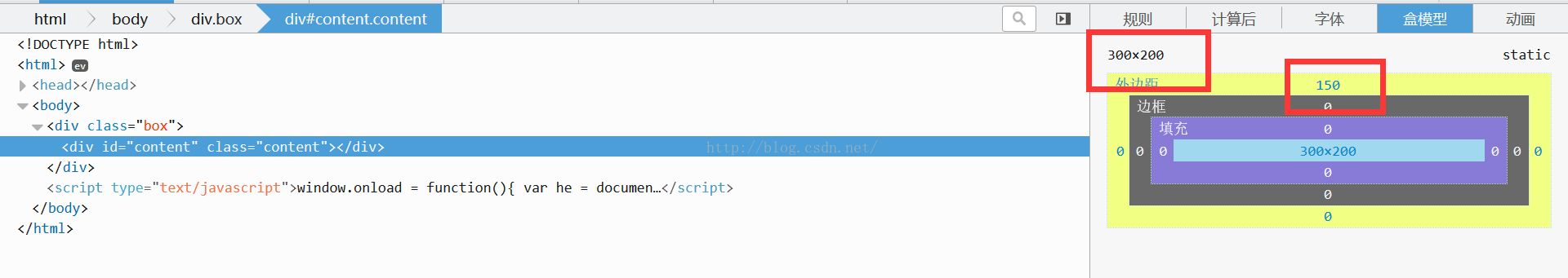
从图中可以看出 content中的height:50% 是父元素的height 400*0.5=200px;
content的margin-top确是 父元素的width 600*0.25=150px;
例子2:line-height:相对于自身字号

原因:
line-height与height相等垂直居中原理可参见http://www.jianshu.com/p/6e4d683f6cf2
垂直水平居中的方法有很多,上面用了css3的新方法,利用flex,flex可以嵌套使用,这里这样即可简单达到效果:

[max/min-]width、left、right、padding、margin 等;
相对于父元素高度的:
[max/min-]height、top、bottom 等;
相对于继承字号的:
font-size 等;
相对于自身字号的:
line-height 等;
相对于自身宽高的:
border-radius、background-size、transform: translate()、transform-origin、zoom、clip-path 等;
特殊算法的:
background-position(方向长度 / 该方向除背景图之外部分总长度 * 100)、
filter 系列函数等;
例子1: margin子元素百分比 height子元素百分比
    <body>
        <div class="box">
            <div class="content">我要垂直居中</div>
        </div>
    </body>
		div,body{
			padding: 0;
			margin: 0;
		}
		body{
			background-color: darkgrey;
		}
		.box{
			width: 600px;
			height: 400px;
			margin: 50px auto;
			background-color: palegreen;
			overflow: hidden;
		}
		.content {
			width: 50%;
			height: 50%;     /*父元素的height 400*0.5*/
			margin-top: 25%; /*margin-top用百分比用的是父元素的width 600*0.25=150*/
			background-color: tomato;
		}
从图中可以看出 content中的height:50% 是父元素的height 400*0.5=200px;
content的margin-top确是 父元素的width 600*0.25=150px;
例子2:line-height:相对于自身字号
    <body>
        <div class="box">
            <div class="content">我要垂直居中</div>
        </div>
    </body>
		div,body{
			padding: 0;
			margin: 0;
		}
		body{
			background-color: darkgrey;
		}
		.box{
			width: 600px;
			height: 400px;
			margin: 50px auto;
			background-color: palegreen;
			display: flex;/*这里用了css3的flex新特性垂直水平居中*/
			justify-content: center;/*水平居中*/
			align-items: center;/*垂直居中*/
		}
		.content {
			width: 50%;
			height: 20%;
			line-height: 20%; /*这里的line-height与height相等,使其垂直居中*/
			vertical-align: middle;
			text-align: center;
			background-color: tomato;
		}
原因:
line-height
line-height居中的话就使用绝对的px值。line-height与height相等垂直居中原理可参见http://www.jianshu.com/p/6e4d683f6cf2
垂直水平居中的方法有很多,上面用了css3的新方法,利用flex,flex可以嵌套使用,这里这样即可简单达到效果:
			div,body{
			padding: 0;
			margin: 0;
		}
		body{
			background-color: darkgrey;
		}
		.box{
			width: 600px;
			height: 400px;
			margin: 50px auto;
			background-color: palegreen;
			display: flex;/*这里用了css3的flex新特性垂直水平居中*/
			justify-content: center;/*水平居中*/
			align-items: center;/*垂直居中*/
		}
		.content {
			width: 50%;
			height: 20%;
			display: flex;
			justify-content: center;
			align-items: center;
			background-color: tomato;
		}


 7826
7826


 被折叠的 条评论
为什么被折叠?
被折叠的 条评论
为什么被折叠?
 到【灌水乐园】发言


