


##CSS常见布局实现
炮炮兵
 镇楼
镇楼
镇楼
之前初学HTML和CSS,写静态网页和样式的时候,没有太在意网页的整体布局,直接上去就去写header,mian,footer,后来才发现自己写的几乎都是单列水平居中布局(好多固定值),然后在里面又分几列;现在回头看看感觉真的好low,所以在这里总结一下常用的布局;
常见的布局有以下几种:
- 单列水平居中布局
- 两列布局
- 两侧定宽中间自适应三列布局
下面简单说一下前两种,重点说一下三列布局,以及三列布局中的:圣杯布局和双飞翼布局
单列水平居中布局
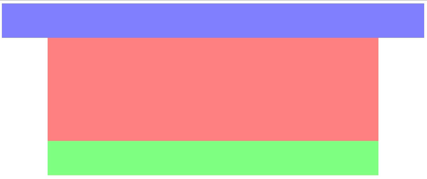
这个布局相对简单,它经常使用固定px,比如百度首页;
<style>
     .header{
        height: 100px;
        background-color:rgba(0,0,255,0.5);
     }
     .main{
         width: 960px;
         height: 300px;
         background-color:rgba(255,0,0,0.5);
         margin: 0 auto;
     }
     .footer{
        height: 100px;
        width: 960px;
        background-color: rgba(0,255,0,0.5);
        margin: 0 auto;
     }
</style>
<body>
     <div class="header"></div>
     <div class="main"></div>
     <div class="footer"></div>
</body>这里用了固定的宽度、高度;居中主要用了margin:0 auto;这个属性
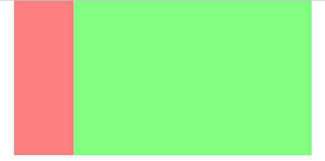
两列布局
<style>
    body{margin: 0;padding: 0}
    .main{
        width: 960px;
        margin: 0 auto;
    }
    .left{
        width: 20%;
        height: 500px;
        float: left;
        background-color: rgba(255,0,0,0.5);
    }
    .right{
        width: 80%;
        height: 500px;
        float: left;
        background-color: rgba(0,255,0,0.5);
    }
</style>
<body>
     <div class="main">
         <div class="left"></div>
         <div class="right"></div>
     </div>
</body>
两列主要用了浮动和百分比来实现;
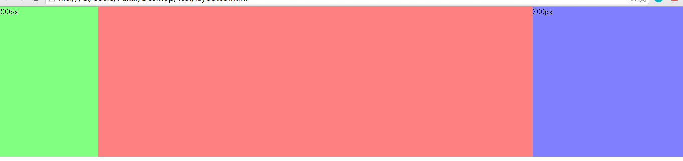
三列布局
方式一:根据相对定位来放置两侧定宽的div,然后main用margin两侧的定宽
  <div class="container">
     <div class="left">200px</div>
     <div class="main"></div>
     <div class="right">300px</div>
</div>body{margin: 0;padding: 0}
.container{
min-width: 960px;
position: relative;
margin: 0 auto;
}
.left{
position: absolute;
left: 0;
top: 0;
width: 200px;
height: 300px;
background-color:rgba(0,255,0,0.5);
}
.main{
margin-left:200px;
margin-right: 300px;
height: 300px;
background-color:rgba(255,0,0,0.5);
}
.right{
position: absolute;
right:0;
top: 0;
width: 300px;
height: 300px;
background-color:rgba(0,0,255,0.5);
}方式二:圣杯
这里图上main内容区域的那天线是没有的,这里只是为了帮助理解;
<div class="header"><h2>圣杯</h2></div>
    <div class="container">
         <div class="main"></div>
         <div class="sub"></div>
         <div class="extra"></div>
</div> body{
min-width: 600px; /*2*sub+extra*/
}
.header{
text-align: center;
padding: 20px;
background-color: rgba(155,155,0,.5);
color: #fff;
}
.container{
padding-left: 210px;
padding-right: 190px;
}
.main{
width: 100%;
height: 300px;
float: left;
background-color: rgba(255,0,0,.5);
}
.sub{
position: relative;
left: -210px;
width: 200px;
height: 300px;
float: left;
margin-left: -100%;
background-color:rgba(0,255,0,0.5);
}
.extra{
position: relative;
right: -190px;
width: 180px;
height: 300px;
margin-left: -180px;
float: left;
background-color:rgba(0,0,255,0.5);
}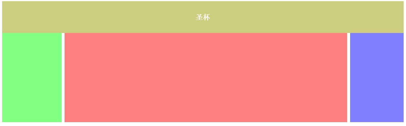
- 把主列放在文档流最前面,使主列优先加载
- 让三列浮动,然后通过负外边距形成三列布局。
- 处理中间主列的位置:圣杯布局是利用父容器的左、右内边距定位;
方式二:双飞翼
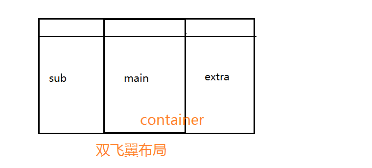
同上,main里面的线也是辅助理解的,实际上并没有
 <div class="title"><h2>双飞翼</h2></div>
    <div class="container">
         <div class="main"></div>
    </div>
         <div class="sub"></div>
<div class="extra"></div> body{
min-width: 600px; /*2*sub+extra*/
}
.title{
text-align: center;
padding: 20px;
background-color: rgba(155,155,0,.5);
color: #fff;
}
.container{
float: left;
width: 100%;
}
.main{
height: 300px;
margin-left: 210px;
margin-right: 190px;
background-color: rgba(255,0,0,.5);
}
.sub{
width: 200px;
height: 300px;
float: left;
margin-left: -100%;
background-color:rgba(0,255,0,0.5);
}
.extra{
width: 180px;
height: 300px;
margin-left: -180px;
float: left;
background-color:rgba(0,0,255,0.5);
}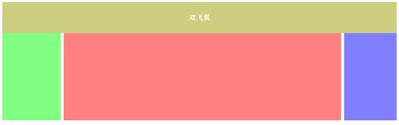
- 把主列放在文档流最前面,使主列优先加载
- 让三列浮动,然后通过负外边距形成三列布局。
- 处理中间主列的位置:双飞翼布局是把主列嵌套在div后利用主列的左、右外边距定位。
布局暂时先说这么多,有什么不对的地方多多指教,未完待续…


 扫一扫
扫一扫
 2942
2942

 被折叠的 条评论
为什么被折叠?
被折叠的 条评论
为什么被折叠?
 到【灌水乐园】发言


