


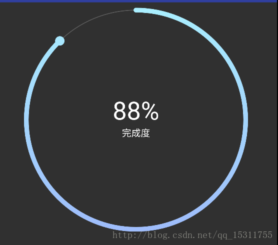
产品跟圆杠上了系列,比较简单的控件,记录下方便下次直接取。主要用到sahder,神奇的渐变色
/**shader绘制渐变色的弧度*/
 LinearGradient shader = new LinearGradient(0, mHeight/2, mWidth,
 mHeight/2, SECTION_COLORS, null, Shader.TileMode.MIRROR);
 mPaint.setShader(shader);
思路很简单
1.绘制最底层圆,根据动画获得实时的比例数据
2.根据shader绘制上层渐变色的圆弧
3.根据实时数据计算移动的弧度,并计算获得最终点坐标
4.根据坐标绘制圆点
注意事项
1.布局的时候设置成正方形
2.绘制的时候由于最终的圆点会比线宽要粗,所以添加了padding,代码中已绘制padding
attrs文件
<declare-styleable name="Loan_ColorProgressView">
 <attr name="corner_pro_int_size" format="dimension" />
 <attr name="corner_pro_text_size" format="dimension" />
 <attr name="corner_bg_circle_color" format="color" />
 </declare-styleable>
java文件
package com.cai.yi.myapplication0.wight;


import android.animation.ObjectAnimator;
import android.animation.ValueAnimator;
import android.content.Context;
import android.content.res.TypedArray;
import android.graphics.Canvas;
import android.graphics.Color;
import android.graphics.LinearGradient;
import android.graphics.Paint;
import android.graphics.RectF;
import android.graphics.Shader;
import android.text.TextPaint;
import android.text.TextUtils;
import android.util.AttributeSet;
import android.view.View;

import com.cai.yi.myapplication0.R;


/**
 *
 */
public class ColorProgressView extends View {
    //分段颜色
    private static final int[] SECTION_COLORS ={0xFF9EBBFB, 0xFFAAF0FF};
    private float maxCount = 100;
    private float currentCount = 0;
    private int score;
    private Paint mPaint;
    private Paint mBgPaint;
    private Paint mTextPaint;

    private float offset;
    private int mWidth, mHeight;
    /**
     * 数字的大小
     */
    private float mIntSize;
    /**
     * 文字的大小
     */
    private float mTextSize;
    /**
     * 底部圆的颜色
     */
    private int mBgCicleColor;
    private int value;
    private RectF rectBlackBg;

    public ColorProgressView(Context context, AttributeSet attrs, int defStyleAttr) {
        super(context, attrs, defStyleAttr);
        TypedArray typedArray = context.obtainStyledAttributes(attrs, R.styleable.Loan_ColorProgressView);

        mIntSize = typedArray.getDimension(R.styleable.Loan_ColorProgressView_corner_pro_int_size, dip2px(getContext(), 32));
        mTextSize = typedArray.getDimension(R.styleable.Loan_ColorProgressView_corner_pro_text_size, dip2px(getContext(), 12));
        mBgCicleColor = typedArray.getColor(R.styleable.Loan_ColorProgressView_corner_bg_circle_color,
                getResources().getColor(R.color.loan_start_color));
        typedArray.recycle();


        init(context);
        initPaint();

    }

    public ColorProgressView(Context context, AttributeSet attrs) {
        this(context, attrs, 0);
    }

    public ColorProgressView(Context context) {
        this(context, null);
    }

    private void init(Context context) {
        mPaint = new Paint();
        mBgPaint = new Paint();
        mTextPaint = new Paint();
        offset = dip2px(getContext(), 10);

    }

    @Override
    protected void onSizeChanged(int w, int h, int oldw, int oldh) {
        super.onSizeChanged(w, h, oldw, oldh);
    }

    @Override
    protected void onDraw(Canvas canvas) {
        super.onDraw(canvas);
        float roud = (mWidth - offset * 2 ) /2;
        /**绘制基础圆环*/
        canvas.drawArc(rectBlackBg, 0, 360, false, mBgPaint);
        /**绘制百分比和文字*/
        mPaint.setColor(Color.BLACK);
        mTextPaint.setTextSize(mIntSize);
        float section = currentCount / maxCount;
        canvas.drawText((int)(section * 100) + "%", mWidth / 2, mHeight / 2 , mTextPaint);
        TextPaint textPaint = new TextPaint(mTextPaint);
        Paint.FontMetrics fontMetrics = textPaint.getFontMetrics();
        float textheight = fontMetrics.bottom - fontMetrics.top;
        mTextPaint.setTextSize(mTextSize);
        canvas.drawText("完成度", mWidth / 2, mHeight / 2 + textheight/2 , mTextPaint);

        /**shader绘制渐变色的弧度*/
        LinearGradient shader = new LinearGradient(0, mHeight/2, mWidth,
                mHeight/2, SECTION_COLORS, null, Shader.TileMode.MIRROR);
        mPaint.setShader(shader);

        /**旋转画布方便绘制,动态获取绘制在弧上最后的点坐标*/
        canvas.save();
        canvas.rotate(-90, mWidth/2, mHeight/2);
        float x = (float) (roud * Math.cos(value * Math.PI / 180));
        float y = (float) (roud * Math.sin(value * Math.PI / 180));
        canvas.drawArc(rectBlackBg, 0, value, false, mPaint);
        if (currentCount < maxCount && currentCount != 0) {
            /**开始的原点*/
            canvas.drawCircle(x + mWidth/2, y + mHeight/2, dip2px(getContext(), 3f), mPaint);
        }
        canvas.restore();
    }

    private void startAnimat(int num) {
        ValueAnimator valueAnimator = ObjectAnimator.ofInt(0, num);
        valueAnimator.setDuration(1000);
        valueAnimator.addUpdateListener(new ValueAnimator.AnimatorUpdateListener() {
            @Override
            public void onAnimationUpdate(ValueAnimator animation) {
                value = (int)animation.getAnimatedValue();
                invalidate();
            }
        });
        valueAnimator.start();
    }

    private void initPaint() {
        mPaint.setAntiAlias(true);
        mPaint.setStrokeWidth(dip2px(getContext(), 6));
        mPaint.setStyle(Paint.Style.STROKE);
        mPaint.setStrokeCap(Paint.Cap.ROUND);
        mPaint.setColor(Color.TRANSPARENT);

        mBgPaint.setAntiAlias(true);
        mBgPaint.setStrokeWidth(dip2px(getContext(), 1f));
        mBgPaint.setStyle(Paint.Style.STROKE);
        mBgPaint.setStrokeCap(Paint.Cap.ROUND);
        mBgPaint.setColor(mBgCicleColor);

        mTextPaint.setAntiAlias(true);
        mTextPaint.setStrokeWidth((float) 8.0);
        mTextPaint.setTextAlign(Paint.Align.CENTER);
        mTextPaint.setTextSize(80);
        mTextPaint.setColor(Color.WHITE);

    }

    private int dipToPx(int dip) {
        float scale = getContext().getResources().getDisplayMetrics().density;
        return (int) (dip * scale + 0.5f * (dip >= 0 ? 1 : -1));
    }

    public int getScore() {
        return score;
    }


    public float getMaxCount() {
        return maxCount;
    }

    public float getCurrentCount() {
        return currentCount;
    }


    /***
     * 设置最大的进度值
     *
     * @param maxCount
     */
    public void setMaxCount(float maxCount) {
        this.maxCount = maxCount;
    }

    /***
     * 设置当前的进度值
     *
     * @param currentCount
     */
    public void setCurrentCount(float currentCount) {
        this.currentCount = currentCount > maxCount ? maxCount : currentCount;
        invalidate();
    }

    @Override
    protected void onMeasure(int widthMeasureSpec, int heightMeasureSpec) {
        int widthSpecMode = MeasureSpec.getMode(widthMeasureSpec);
        int widthSpecSize = MeasureSpec.getSize(widthMeasureSpec);
        int heightSpecMode = MeasureSpec.getMode(heightMeasureSpec);
        int heightSpecSize = MeasureSpec.getSize(heightMeasureSpec);
        if (widthSpecMode == MeasureSpec.EXACTLY
                || widthSpecMode == MeasureSpec.AT_MOST) {
            mWidth = widthSpecSize;
        } else {
            mWidth = 0;
        }
        if (heightSpecMode == MeasureSpec.AT_MOST
                || heightSpecMode == MeasureSpec.UNSPECIFIED) {
            mHeight = dipToPx(15);
        } else {
            mHeight = heightSpecSize;
        }
        setMeasuredDimension(Math.min(mWidth, mHeight), Math.min(mWidth, mHeight));

        rectBlackBg = new RectF(offset, offset, mWidth - offset, mHeight - offset);
    }

    public void setScroce(String scroce) {
        if (!TextUtils.isEmpty(scroce)) {
           setMaxCount(100);
            setCurrentCount(Integer.parseInt(scroce) <= 100 ? Integer.parseInt(scroce) : 100);
            startAnimat((int) (Integer.parseInt(scroce) / 100.0f * 360));
        }
    }


    public int dip2px(Context var0, float var1) {
        float var2 = var0.getResources().getDisplayMetrics().density;
        return (int)(var1 * var2 + 0.5F);
    }
}


 1万+
1万+


 被折叠的 条评论
为什么被折叠?
被折叠的 条评论
为什么被折叠?
 到【灌水乐园】发言


