


1、The sum of the length of the whole inner div < the outer div
<!doctype html>
<html>
<head>
    <style type="text/css">
        #main{
            border: 1px solid black;
            width: 150px;
            height: 300px;
            display: flex;
        }
        #div1{
            width: 50px;
            height: 70px;
            background-color: pink;
            flex-grow:2;
            }
        #div2{
            flex-grow:1;
            width: 50px;
            height: 70px;
            background-color: orange;
        }
        #div3{
            flex-grow:1;
            width: 50px;
            height: 70px;
            background-color: green;
        }
        #div4{
            flex-grow:1;
            width: 50px;
            height: 70px;
            background-color: yellow;
        }
    </style>
</head>
<body>
    <div id="main">
        <div id="div1"></div>
        <div id="div2"></div>
        <div id="div3"></div>
        <div id="div4"></div>
    </div>
</body>
</html>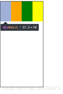
As you can see in the picture,sum of the length of the four div should be 50*4=200px,but the outer div is 150px,so each div will be reduced to 150/4=37.5px equally.The flex-grow does not work.
2、The sum of the length of the whole inner div > the outer div
<!doctype html>
<html>
<head>
    <style type="text/css">
        #main{
            border: 1px solid black;
            width: 400px;
            height: 300px;
            display: flex;
        }
        #div1{
            width: 50px;
            height: 70px;
            background-color: pink;
            flex-grow:2;
            }
        #div2{
            flex-grow:1;
            width: 50px;
            height: 70px;
            background-color: orange;
        }
        #div3{
            flex-grow:1;
            width: 50px;
            height: 70px;
            background-color: green;
        }
        #div4{
            flex-grow:1;
            width: 50px;
            height: 70px;
            background-color: yellow;
        }
    </style>
</head>
<body>
    <div id="main">
        <div id="div1"></div>
        <div id="div2"></div>
        <div id="div3"></div>
        <div id="div4"></div>
    </div>
</body>
</html>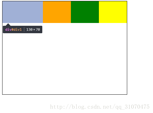
The flex-grow of div1 is 2,and others is 1,so the width of div1 is 50+2/(2+1+1+1)*(400-50*4)=130px.It just add the proportion of spare space.


 扫一扫
扫一扫
 3207
3207

 被折叠的 条评论
为什么被折叠?
被折叠的 条评论
为什么被折叠?
 到【灌水乐园】发言


