


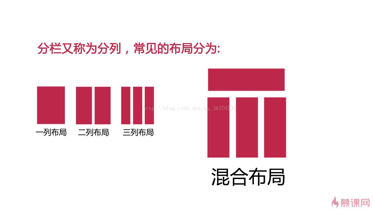
一列布局小案例
<style>
body{margin:0;padding:0}
.main{width:700px;height:200px;background:#F06;margin:0 auto}
.top{height:100px;background:blue;}
.footer{width:700px;height:100px;background:#0F3;margin:0 auto}
</style>
</head>
<body>
<div class="top"></div>
<div class="main"></div>
<div class="footer"></div>
</body>
</html>
重点:margin:0 auto 上下0px,左右auto自适应,能让div居中
body{margin:0;padding:0} 清除默认样式
两列布局小案例
<style>
body{margin:0;padding:0}
.main{width:800px;margin:0 auto}
.left{width:20%;height:500px;float:left;background:#F00}
.right{width:80%;height:500px;float:right;background:#0F3}
</style>
</head>
<body>
<div class="main">
<div class="left"></div>
<div class="right"></div>
</div>
</body>
三列布局:左右各设置绝对定位 中间自适应
<!DOCTYPE html PUBLIC "-//W3C//DTD XHTML 1.0 Transitional//EN" "http://www.w3.org/TR/xhtml1/DTD/xhtml1-transitional.dtd">
<html xmlns="http://www.w3.org/1999/xhtml">
<head>
<meta http-equiv="Content-Type" content="text/html; charset=utf-8" />
<title>三列布局</title>
<style type="text/css">
body{ margin:0; padding:0; font-size:30px; font-weight:bold}
div{ line-height:50px}
.left{ width:200px; height:600px; background:#ccc; position:absolute; left:0; top:0}
.main{ height:600px; margin:0 310px 0 210px ;background:#9CF}
.right{ height:600px; width:300px; position:absolute; top:0; right:0; background:#FCC;}
</style>
</head>

<body>

    <div class="left">left</div>
    <div class="main">设计首页的第一步是设计版面布局。就象传统的报刊杂志编辑一样,我们将网页看作一张报纸,一本杂志来进行排版布局。 虽然动态网页技术的发展使得我们开始趋向于学习场景编剧,但是固定的网页版面设计基础依然是必须学习和掌握的。它们的基本原理是共通的,你可以领会要点,举一反三。</div>
    <div class="right">right</div>
</body>
</html>
简单混合布局
<!DOCTYPE html PUBLIC "-//W3C//DTD XHTML 1.0 Transitional//EN" "http://www.w3.org/TR/xhtml1/DTD/xhtml1-transitional.dtd">
<html xmlns="http://www.w3.org/1999/xhtml">
<head>
<meta http-equiv="Content-Type" content="text/html; charset=utf-8" />
<title>混合布局</title>
<style>
body{ margin:0; padding:0; font-size:30px; font-weight:bold}
div{ text-align:center; line-height:50px}
.top{ height:100px;background:#9CF}
.head,.main{ width:960px; margin:0 auto}
.head{ height:100px; background:#F90}
.left{ width:220px; height:600px; background:#ccc; float:left;}
.right{ width:740px; height:600px;background:#FCC; float:right}
.r_sub_left{ width:540px; height:600px; background:#9C3; float:left}
.r_sub_right{ width:200px; height:600px; background:#9FC; float:right;}
.footer{ height:50px; background:#9F9; clear:both;}
</style>
</head>

<body>
<div class="top">
    <div class="head">head</div>
</div>
<div class="main">
    <div class="left">left</div>
    <div class="right">
        <div class="r_sub_left">sub_left
        </div>
        <div class=" r_sub_right">sub_right
        </div>
    </div>
</div>
<div class="footer">footer</div>
</body>
</html>


 扫一扫
扫一扫
 418
418

 被折叠的 条评论
为什么被折叠?
被折叠的 条评论
为什么被折叠?
 到【灌水乐园】发言


