


目录
一步一步教你写股票走势图——分时图一(概述)
一步一步教你写股票走势图——分时图二(自定义xy轴)
一步一步教你写股票走势图——分时图三(对齐图表、自定义柱状图高亮)
一步一步教你写股票走势图——分时图四(高亮联动)
一步一步教你写股票走势图——分时图五(自定义标记)
一步一步教你写股票走势图——K线图一(概述)
一步一步教你写股票走势图——K线图二(图表联动)
一步一步教你写股票走势图——K线图三(添加均线)
一步一步教你写股票走势图——K线图四(高亮联动一)
一步一步教你写股票走势图——K线图五(高亮联动二)
一步一步教你写股票走势图——商业版
demo更新地址https://github.com/AndroidJiang/StockChart
股票分时图部分已经开发完毕,受到了广大开发者的好评!界面、功能都挺完美,解决了好一些MP开发者的问题,博主甚是欣悦,更有动力去开源K线图。这里说一下,如果有问题直接留言或者发邮件,github上个人信息有邮件,我看到基本都会回复,博主不加qq的,体谅O(∩_∩)O。
分析
好了,废话不多说,我们分析下K线图吧,首先我们看下自选股K线图的效果吧
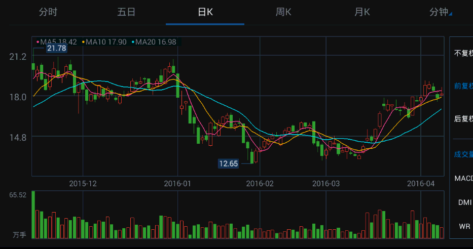
效果还是很赞的,经过分时图的研究后,博主越来越确信自选股用的应该也是MP的库,效果太相似了,不过人家优化做的好,自定义的效果也很赞,不愧是腾讯程序员啊!赞~
我们简单剖析下K线界面,由上下两部分组成,和分时图一样,下面都是柱状图,区别是K线可以滚动,而上面就比较复杂了,由折线图和蜡烛图组合而成,好在MP库现在支持组合图了,那么我们干嘛不动手开始码代码呢?
核心代码
初始表
 private void initChart() {
        barChart.setDrawBorders(true);
        barChart.setBorderWidth(1);
        barChart.setBorderColor(getResources().getColor(R.color.minute_grayLine));
        barChart.setDescription("");
        barChart.setDragEnabled(true);
        barChart.setScaleYEnabled(false);
        barChart.setAutoScaleMinMaxEnabled(true);
        Legend barChartLegend = barChart.getLegend();
        barChartLegend.setEnabled(false);
        //bar x y轴
        xAxisBar = barChart.getXAxis();
        xAxisBar.setDrawLabels(true);
        xAxisBar.setDrawGridLines(false);
        xAxisBar.setDrawAxisLine(false);
        xAxisBar.setTextColor(getResources().getColor(R.color.minute_zhoutv));
        xAxisBar.setPosition(XAxis.XAxisPosition.BOTTOM);
        xAxisBar.setGridColor(getResources().getColor(R.color.minute_grayLine));

        axisLeftBar = barChart.getAxisLeft();
        axisLeftBar.setAxisMinValue(0);
        axisLeftBar.setDrawGridLines(false);
        axisLeftBar.setDrawAxisLine(false);
        axisLeftBar.setTextColor(getResources().getColor(R.color.minute_zhoutv));
        axisLeftBar.setDrawLabels(true);
        axisLeftBar.setShowOnlyMinMax(true);
        axisRightBar = barChart.getAxisRight();
        axisRightBar.setDrawLabels(false);
        axisRightBar.setDrawGridLines(false);
        axisRightBar.setDrawAxisLine(false);

        /****************************************************************/
        combinedchart.setDrawBorders(true);
        combinedchart.setBorderWidth(1);
        combinedchart.setBorderColor(getResources().getColor(R.color.minute_grayLine));
        combinedchart.setDescription("");
        combinedchart.setDragEnabled(true);
        combinedchart.setScaleYEnabled(false);
        combinedchart.setAutoScaleMinMaxEnabled(true);
        Legend combinedchartLegend = combinedchart.getLegend();
        combinedchartLegend.setEnabled(false);
        //bar x y轴
        xAxisK = combinedchart.getXAxis();
        xAxisK.setDrawLabels(true);
        xAxisK.setDrawGridLines(false);
        xAxisK.setDrawAxisLine(false);
        xAxisK.setTextColor(getResources().getColor(R.color.minute_zhoutv));
        xAxisK.setPosition(XAxis.XAxisPosition.BOTTOM);
        xAxisK.setGridColor(getResources().getColor(R.color.minute_grayLine));

        axisLeftK = combinedchart.getAxisLeft();
        axisLeftK.setDrawGridLines(true);
        axisLeftK.setDrawAxisLine(false);
        axisLeftK.setDrawLabels(true);
        axisLeftK.setTextColor(getResources().getColor(R.color.minute_zhoutv));
        axisLeftK.setGridColor(getResources().getColor(R.color.minute_grayLine));
        axisLeftK.setPosition(YAxis.YAxisLabelPosition.OUTSIDE_CHART);
        axisRightK = combinedchart.getAxisRight();
        axisRightK.setDrawLabels(false);
        axisRightK.setDrawGridLines(true);
        axisRightK.setDrawAxisLine(false);
        axisRightK.setGridColor(getResources().getColor(R.color.minute_grayLine));
    }
数据
 private void setData(MinuteHelper mData) {
        kLineDatas = mData.getKLineDatas();
        axisLeftBar.setAxisMaxValue(mData.getVolmax());
        String unit = MyUtils.getVolUnit(mData.getVolmax());
        int u = 1;
        if (unit.equals("万手")) {
            u = 4;
        } else if (unit.equals("亿手")) {
            u = 8;
        }
        axisLeftBar.setValueFormatter(new VolFormatter((int) Math.pow(10, u)));
        axisRightBar.setAxisMaxValue(mData.getVolmax());


        ArrayList<String> xVals = new ArrayList<String>();
        ArrayList<BarEntry> barEntries = new ArrayList<BarEntry>();
        ArrayList<CandleEntry> candleEntries = new ArrayList<CandleEntry>();
        for (int i = 0, j = 0; i < mData.getKLineDatas().size(); i++, j++) {
            xVals.add(mData.getKLineDatas().get(i).date + "");
            barEntries.add(new BarEntry(mData.getKLineDatas().get(i).vol, i));
            candleEntries.add(new CandleEntry(i, mData.getKLineDatas().get(i).high, mData.getKLineDatas().get(i).low, mData.getKLineDatas().get(i).open, mData.getKLineDatas().get(i).close));
        }
        barDataSet = new BarDataSet(barEntries, "成交量");
        barDataSet.setBarSpacePercent(50); //bar空隙
        barDataSet.setHighLightColor(Color.WHITE);
        barDataSet.setHighLightAlpha(255);
        barDataSet.setDrawValues(false);
        barDataSet.setHighlightEnabled(true);
        barDataSet.setColor(Color.RED);
        BarData barData = new BarData(xVals, barDataSet);
        barChart.setData(barData);
        barChart.setVisibleXRange(30, 100);


        CandleDataSet candleDataSet = new CandleDataSet(candleEntries, "KLine");
        candleDataSet.setDrawHorizontalHighlightIndicator(false);
        candleDataSet.setValueTextSize(10f);
        candleDataSet.setDrawValues(false);
        candleDataSet.setColor(Color.RED);
        candleDataSet.setAxisDependency(YAxis.AxisDependency.LEFT);
        CandleData candleData = new CandleData(xVals, candleDataSet);


        CombinedData combinedData=new CombinedData(xVals);
        combinedData.setData(candleData);
        combinedchart.setData(combinedData);
        combinedchart.setVisibleXRange(30, 100);
        barChart.invalidate();
        combinedchart.invalidate();
    }
离线数据已经放在Constant中,方便用户的测试,代码已经搞完,我们到目前为止没有加任何特效,单纯的使用了MP库,小伙伴们肯定迫不及待要看效果了,没问题,请看:
这个效果跟人家的差了猴子一跟头的距离啊!下面说下存在哪些需要优化的地方,这些地方将会在接下来的文章中得意优化。
- 初始化表时K线左边y轴不显示labels和gridlines
- 表之间联动
- 高亮问题
- 柱状图y轴labels显示
- 三条均线图
- 表数据滑动加载更多
暂时已经发现了那么多问题,看来K线开发要比分时图复杂啊!不急,只要大家能star我的项目,相信以上的问题都会解决掉的,有了大家的star,博主才会更有动力去解决以上的一些问题!谢谢大家的关注,本篇结束,请期待下一篇的发布吧!
补充:
如果发现图表初始化不对齐,需要手动移动后才对齐的话,则采用handler延迟刷新图表即可,y轴没有图标,也可采用如上方法,详见demo。
目录
一步一步教你写股票走势图——分时图一(概述)
一步一步教你写股票走势图——分时图二(自定义xy轴)
一步一步教你写股票走势图——分时图三(对齐图表、自定义柱状图高亮)
一步一步教你写股票走势图——分时图四(高亮联动)
一步一步教你写股票走势图——分时图五(自定义标记)
一步一步教你写股票走势图——K线图一(概述)
一步一步教你写股票走势图——K线图二(图表联动)
一步一步教你写股票走势图——K线图三(添加均线)
一步一步教你写股票走势图——K线图四(高亮联动一)
一步一步教你写股票走势图——K线图五(高亮联动二)
一步一步教你写股票走势图——商业版
demo更新地址https://github.com/AndroidJiang/StockChart


 407
407

 被折叠的 条评论
为什么被折叠?
被折叠的 条评论
为什么被折叠?
 到【灌水乐园】发言


