


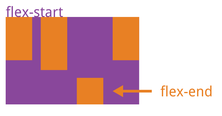
1.order:0//属性定义项目的排列顺序。数值越小,排列越靠前,默认为0。
测试代码:
<!DOCTYPE html>
<html lang="en">
<head>
    <meta charset="UTF-8">
    <title></title>
    <style type="text/css">
        .layout-box {
            width: 600px;
            height: 300px;
            background-color: #f0f0f0;

            display: flex;
        }
        .item {
            font-size: 36px;
        }

/*
        重新设置伸缩项目在主轴方向的排列顺序,
        order: 0 --- 默认值,沿着主轴从start -> end

        order: 大于0 重新按order设置的数字排序(start -> end)

*/

        .item1 { background-color: #f00; order: 2}
        .item2 { background-color: #ff0;}
        .item3 { background-color: #00f;}
        .item4 { background-color: #101; color: #fff; order: 0}
        .item5 { background-color: #f8f;}


    </style>
</head>
<body>

<div class="layout-box">
    <div class="item item1">1</div>
    <div class="item item2">2</div>
    <div class="item item3">3</div>
    <div class="item item4">4</div>
    <div class="item item5">5</div>

</div>

<script type="text/javascript">
</script>
</body>
</html>
如果所有项目的flex-grow属性都为1,则它们将等分剩余空间(如果有的话)。如果一个项目的flex-grow属性为2,其他项目都为1,则前者占据的剩余空间将比其他项多一倍。
测试代码:
<!DOCTYPE html>
<html lang="en">
<head>
<meta charset="UTF-8">
<title></title>
<style type="text/css">
.layout-box {
width: 800px;
height: 300px;
background-color: #f0f0f0;
display: flex;
}
/*设置伸缩项目的初始化宽度*/
.item {
/*flex-basis 优先生效,当我们不设置 flex-basis 默认使用 width.*/
flex-basis: 50px;
width: 200px;
}
/*分配主轴的剩余空间 flex-grow . 默认值是0 */
.item1 { background-color: #f00; flex-grow: 1;}
.item2 { background-color: #ff0; flex-grow: 2;}
.item3 { background-color: #00f; flex-grow: 1;}
.item4 { background-color: #f0f; flex-grow: 1;}
</style>
</head>
<body>
<div class="layout-box">
<div class="item item1">1</div>
<div class="item item2">222</div>
<div class="item item3">3</div>
<div class="item item4">4</div>
</div>
<script type="text/javascript">
</script>
</body>
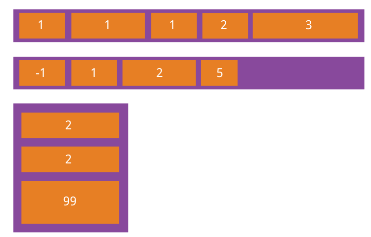
</html>3.flex-shrink:1; //属性定义了项目的缩小比例,默认为1。即如果空间不足,该项目将缩小。
如果所有项目的flex-shrink属性都为1,当空间不足时,都将等比例缩小。如果一个项目的flex-shrink属性为0,其他项目都为1,则空间不足时,前者不缩小。
负值对该属性无效。
测试代码:
<!DOCTYPE html>
<html lang="en">
<head>
<meta charset="UTF-8">
<title></title>
<style type="text/css">
.layout-box {
width: 600px;
height: 300px;
background-color: #f0f0f0;
display: flex;
}
.item {
flex-basis: 300px;
}
.item1 { background-color: #f00; flex-shrink: 1}
.item2 { background-color: #ff0; flex-shrink: 1}
.item3 { background-color: #00f; flex-shrink: 2}
/*
压缩率计算练习
1.需要压缩的空间
300+300+300 - 600 = 300px
2.压缩率的基数
300*1 + 300*1 + 300*2 = 1200
3.每个伸缩项目的压缩比率
1~ 300*1/1200 = 1/4 = .25
2~ 300*1/1200 = 1/4 = .25
3~ 300*2/1200 = 1/2 = .5
4.每个伸缩项目实际需要压缩的空间
1~ 300px*.25 = 75px
2~ 300px*.25 = 75px
3~ 300px*.5 = 150px
5.每个伸缩项目实际宽度
1~ 300px - 75px = 225px
2~ 300px - 75px = 225px
3~ 300px - 150px = 150px
*/
</style>
</head>
<body>
<div class="layout-box">
<div class="item item1">1</div>
<div class="item item2">2</div>
<div class="item item3">3</div>
</div>
<script type="text/javascript">
</script>
</body>
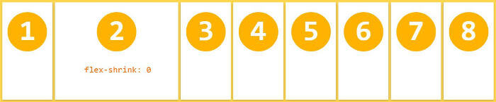
</html>4.flex-basis:auto(px);//属性定义了在分配 多余空间之前,项目占据的主轴空间(main size)。浏览器根据这个属性,计算主轴是否有多余空间。它的默认值为auto,即项目的本来大小。
它可以设为跟width或height属性一样的值(比如350px),则项目将占据固定空间。
测试代码
<!DOCTYPE html>
<html lang="en">
<head>
    <meta charset="UTF-8">
    <title></title>
    <style type="text/css">
        .layout-box {
            width: 600px;
            height: 300px;
            background-color: #f0f0f0;

            display: flex;

            flex-direction: column-reverse;
        }
        .item {
            flex-basis: 80px;
        }
/*
        设置压缩率
        flex-shrink: 1 默认值
        flex-shrink: 0 -- 不压缩
*/
        .item1 { background-color: #f00; flex-shrink: 0}
        .item2 { background-color: #ff0;}
        .item3 { background-color: #00f;}
        .item4 { background-color: #f0f;}
    </style>
</head>
<body>

<div class="layout-box">
    <div class="item item1">1</div>
    <div class="item item2">222</div>
    <div class="item item3">3</div>
    <div class="item item4">4</div>
</div>

<script type="text/javascript">
</script>
</body>
</html>
5.flex:属性是flex-grow, flex-shrink 和 flex-basis的简写,默认值为0 1 auto。后两个属性可选
.item {
flex: none | [ <'flex-grow'> <'flex-shrink'>? || <'flex-basis'> ]
}
注:该属性有两个快捷值:auto (1 1 auto) 和 none (0 0 auto)。
建议优先使用这个属性,而不是单独写三个分离的属性,因为浏览器会推算相关值。
6.align-self:auto;//属性允许单个项目有与其他项目不一样的对齐方式,可覆盖align-items属性。默认值为auto,表示继承父元素的align-items属性,如果没有父元素,则等同于stretch。
注:该属性可能取6个值,除了auto,其他都与align-items属性完全一致。
测试代码:
<!DOCTYPE html>
<html lang="en">
<head>
    <meta charset="UTF-8">
    <title></title>
    <style type="text/css">
        .layout-box {
            width: 600px;
            height: 300px;
            background-color: #f0f0f0;
            display: flex;
            flex-wrap: wrap;

        }
        .item {
            font-size: 36px;
            width: 200px;
        }

/*
        伸缩项目自己决定在行的侧轴的位置
                align-self: stretch  -- 默认值 拉伸
                align-self: flex-start - 侧轴的 start 处
                align-self: center - 侧轴的 center 处
                align-self: flex-end - 侧轴的 end 处

*/

        .item1 { background-color: #f00; align-self: flex-end}
        .item2 { background-color: #ff0; align-self: center}
        .item3 { background-color: #00f; align-self: flex-start}
        .item4 { background-color: #101; color: #fff; align-self:stretch}
        .item5 { background-color: #f8f;}


    </style>
</head>
<body>

<div class="layout-box">
    <div class="item item1">1</div>
    <div class="item item2">2</div>
    <div class="item item3">3</div>
    <div class="item item4">4</div>
    <div class="item item5">5</div>

</div>

<script type="text/javascript">
</script>
</body>
</html>


 扫一扫
扫一扫
 356
356

 被折叠的 条评论
为什么被折叠?
被折叠的 条评论
为什么被折叠?
 到【灌水乐园】发言


