


1.linear-gradient基础:
<!DOCTYPE html>
<html lang="en">
<head>
    <meta charset="UTF-8">
    <title></title>
    <style type="text/css">
        .box {
            margin: 200px 0 0 200px;
            width: 200px;
            height: 200px;
            background-color: orange;

            /*基本用法*/
            background-image: linear-gradient(red, yellow, blue, green);
            background-image: linear-gradient(rgba(255, 0, 0, .2), yellow, blue, green);

            /*控制颜色渐变的方向

                to right -- 从左向右
                to top -- 从下到上
                to left -- 从右到左
                to bottom --- 从上到下(默认值)

            */
            background-image: linear-gradient(to right, red, yellow, blue, green);
            background-image: linear-gradient(to top, red, yellow, blue, green);
            background-image: linear-gradient(to left, red, yellow, blue, green);
            background-image: linear-gradient(to bottom, red, yellow, blue, green);


            /*0deg = to top -- 从下到上*/
            background-image: linear-gradient(0deg, red, yellow, blue, green);
            /*基于0度顺时针旋转45deg*/
            background-image: linear-gradient(45deg, red, yellow, blue, green);
            /*基于0度逆时针旋转45deg*/
            background-image: linear-gradient(-45deg, red, yellow, blue, green);


            /*设置过渡颜色的起始位置*/
            /*从过渡起始位置50px开始让红色和黄色之间产生颜色渐变效果*/
            background-image: linear-gradient(to right, red 50px, yellow, blue, green);
            background-image: linear-gradient(to right, red 50px, yellow 50px, blue, green);
            background-image: linear-gradient(to right, red 50px, yellow 50px, yellow 100px, blue, green);


        }

        .box:hover {

        }
    </style>
</head>
<body>

<div class="box"></div>

<script type="text/javascript">
</script>
</body>
</html>
2.重复线性渐变:repeating-linear-gradient
<!DOCTYPE html>
<html lang="en">
<head>
    <meta charset="UTF-8">
    <title></title>
    <style type="text/css">
        .box {
            margin: 200px 0 0 200px;
            width: 1200px;
            height: 200px;
            background-color: orange;

            background-image: linear-gradient(to right
            , red 0
            , red 50px
            , yellow 50px
            , yellow 100px
            , red 100px
            , red 150px
            , yellow 150px
            , yellow 200px);
            /**与上面重复写渐变有相同的效果*/
            background-image: repeating-linear-gradient(
                    to right
                    , red 0
                    , red 50px
                    , yellow 50px
                    , yellow 100px
            );


        }

        .box:hover {

        }
    </style>
</head>
<body>

<div class="box"></div>

<script type="text/javascript">
</script>
</body>
</html>
3.记事本制作:
<!DOCTYPE html>
<html lang="en">
<head>
    <meta charset="UTF-8">
    <title></title>
    <style type="text/css">
        .box {
            margin: 0 auto;
            width: 800px;
            height: 500px;
            background-color: orange;
            border: 1px solid;

            background-image: repeating-linear-gradient(
                     #fff 0
                    , #fff 50px
                    , #999 50px
                    , #999 51px
            );
        }

        .box:hover {

        }
    </style>
</head>
<body>

<div class="box"></div>

<script type="text/javascript">
</script>
</body>
</html>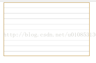
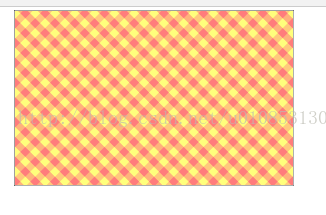
4.帆布背景制作:
<!DOCTYPE html>
<html lang="en">
<head>
    <meta charset="UTF-8">
    <title></title>
    <style type="text/css">
        .box {
            margin: 0 auto;
            width: 800px;
            height: 500px;
            /*background-color: orange;*/
            border: 1px solid;

            background-image: repeating-linear-gradient(
                     rgba(255, 0, 0, .3) 0
                    ,  rgba(255, 0, 0, .3) 20px
                    , rgba(255, 255, 0, .3)  20px
                    , rgba(255, 255, 0, .3)  40px
            ), repeating-linear-gradient( to right,
                    rgba(255, 0, 0, .3) 0
                    ,  rgba(255, 0, 0, .3) 20px
                    , rgba(255, 255, 0, .3)  20px
                    , rgba(255, 255, 0, .3)  40px
            );


            background-image: repeating-linear-gradient(45deg,
                    rgba(255, 0, 0, .3) 0
                    ,  rgba(255, 0, 0, .3) 20px
                    , rgba(255, 255, 0, .3)  20px
                    , rgba(255, 255, 0, .3)  40px
            ), repeating-linear-gradient( -45deg,
                    rgba(255, 0, 0, .3) 0
                    ,  rgba(255, 0, 0, .3) 20px
                    , rgba(255, 255, 0, .3)  20px
                    , rgba(255, 255, 0, .3)  40px
            );


        }

        .box:hover {

        }
    </style>
</head>
<body>

<div class="box"></div>

<script type="text/javascript">
</script>
</body>
</html>
效果如下:
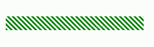
5.进度条效果:原理重复线性渐变,移动背景图.
<!DOCTYPE html>
<html lang="en">
<head>
    <meta charset="UTF-8">
    <title></title>
    <style type="text/css">
        .box {
            margin: 100px 0 0 100px;
            width: 800px;
            height: 80px;

            /*渐变图形的大小*/
            background-image: repeating-linear-gradient(
                45deg,
                green 0px,
                green 10px,
                #fff 10px,
                #fff 20px
            );

            background-size: 12000px 80px;
        }

        /*鼠标悬浮,改变背景图位置*/
        .box:hover{
            background-position: -500px 0;
            transition: 10s;
        }


    </style>
</head>
<body>

<div class="box"></div>

<script type="text/javascript">
</script>
</body>
</html>
效果:


 8459
8459


 被折叠的 条评论
为什么被折叠?
被折叠的 条评论
为什么被折叠?
 到【灌水乐园】发言


