


平常开发的时候总会遇到一些分割线,之前都是用一个View或者一个ImageView来绘制一条比较细的分割线,时间长了再去修改代码,有的时候就去要看一下,也比较乱.所以就打算写一个带有边框的ViewGroup方便日常开发.
一、代码实现
代码很简单,直接放下代码:
定义一下自定义属性,在attr文件:
    <!--边框的粗度-->
    <attr name="borderStrokeWidth" format="float"/>
    <!--边框颜色-->
    <attr name="borderColor" format="color"/>
    <!--底边边线左边断开距离-->
    <attr name="borderBottomLeftBreakSize" format="dimension"/>
    <!--底边边线右边断开距离-->
    <attr name="borderBottomRightBreakSize" format="dimension"/>
    <!--是否需要上边框-->
    <attr name="needTopBorder" format="boolean"/>
    <!--是否需要左右边框-->
    <attr name="needLeftAndRigtBorder" format="boolean"/>
    <!--是否需要下边框-->
    <attr name="needBottomBorder" format="boolean"/>
    <declare-styleable name="BorderRelativeLayout">
        <attr name="borderStrokeWidth"/>
        <attr name="borderColor"/>
        <attr name="borderBottomLeftBreakSize"/>
        <attr name="borderBottomRightBreakSize"/>
        <attr name="needTopBorder"/>
        <attr name="needLeftAndRigtBorder"/>
        <attr name="needBottomBorder"/>
    </declare-styleable>
定义一个BorderRelativeLayout继承自RelativeLayout:
package com.junweiliu.widget;

import android.content.Context;
import android.content.res.TypedArray;
import android.graphics.Canvas;
import android.graphics.Color;
import android.graphics.Paint;
import android.util.AttributeSet;
import android.widget.RelativeLayout;

import com.junweiliu.R;

/**
 * Created by junweiliu on 16/6/3.
 */
public class BorderRelativeLayout extends RelativeLayout {
    /**
     * 画笔
     */
    private Paint mPaint;
    /**
     * 边框颜色
     */
    private int mPaintColor;
    /**
     * 边框粗细
     */
    private float mBorderStrokeWidth;
    /**
     * 底边边线左边断开距离
     */
    private int mBorderBottomLeftBreakSize;
    /**
     * 底边边线右边断开距离
     */
    private int mBorderBottomRightBreakSize;
    /**
     * 是否需要上边框
     */
    private boolean isNeedTopBorder;
    /**
     * 是否需要左右边框
     */
    private boolean isNeedLeftAndRightBorder;
    /**
     * 是否需要下边框
     */
    private boolean isNeedBottomBorder;


    public BorderRelativeLayout(Context context) {
        this(context, null);
    }

    public BorderRelativeLayout(Context context, AttributeSet attrs) {
        this(context, attrs, 0);
    }

    public BorderRelativeLayout(Context context, AttributeSet attrs, int defStyleAttr) {
        super(context, attrs, defStyleAttr);
        // 获取自定义属性
        TypedArray ta = context.obtainStyledAttributes(attrs, R.styleable.BorderRelativeLayout);
        mPaintColor = ta.getColor(R.styleable.BorderRelativeLayout_borderColor, Color.GRAY);
        mBorderStrokeWidth = ta.getFloat(R.styleable.BorderRelativeLayout_borderStrokeWidth, 2.0f);
        mBorderBottomLeftBreakSize = ta.getDimensionPixelSize(R.styleable.BorderRelativeLayout_borderBottomLeftBreakSize, 0);
        mBorderBottomRightBreakSize = ta.getDimensionPixelSize(R.styleable.BorderRelativeLayout_borderBottomRightBreakSize, 0);
        isNeedTopBorder = ta.getBoolean(R.styleable.BorderRelativeLayout_needTopBorder, true);
        isNeedLeftAndRightBorder = ta.getBoolean(R.styleable.BorderRelativeLayout_needLeftAndRigtBorder, false);
        isNeedBottomBorder = ta.getBoolean(R.styleable.BorderRelativeLayout_needBottomBorder, true);
        ta.recycle();
        init();

    }

    private void init() {
        mPaint = new Paint();
        mPaint.setColor(mPaintColor);
        mPaint.setAntiAlias(true);
        mPaint.setStrokeWidth(mBorderStrokeWidth);
    }

    @Override
    protected void dispatchDraw(Canvas canvas) {
        super.dispatchDraw(canvas);
        //  画4个边
        if (isNeedTopBorder) {
            canvas.drawLine(0, 0, this.getWidth(), 0, mPaint);
        }
        if (isNeedBottomBorder) {
            canvas.drawLine(mBorderBottomLeftBreakSize, this.getHeight(), this.getWidth() - mBorderBottomRightBreakSize, this.getHeight(), mPaint);
        }
        if (isNeedLeftAndRightBorder) {
            canvas.drawLine(0, 0, 0, this.getHeight(), mPaint);
            canvas.drawLine(this.getWidth(), 0, this.getWidth(), this.getHeight(), mPaint);
        }
    }

    /**
     * 设置边框颜色
     *
     * @param color
     */
    public void setBorderColor(int color) {
        mPaint.setColor(color);
        invalidate();
    }

    /**
     * 设置边框宽度
     *
     * @param size
     */
    public void setBorderStrokeWidth(float size) {
        mPaint.setStrokeWidth(size);
        invalidate();
    }


    /**
     * 设置是否需要顶部边框
     *
     * @param needtopborder
     */
    public void setNeedTopBorder(boolean needtopborder) {
        isNeedTopBorder = needtopborder;
        invalidate();
    }

    /**
     * 设置是否需要底部边框
     *
     * @param needbottomborder
     */
    public void setNeedBottomBorder(boolean needbottomborder) {
        isNeedBottomBorder = needbottomborder;
        invalidate();
    }
}
二、使用方法
来使用一下,我们可以在平常的布局中使用,比如在一个类似个人信息的页面,代码如下:
<LinearLayout xmlns:android="http://schemas.android.com/apk/res/android"
xmlns:br="http://schemas.android.com/apk/res-auto"
android:layout_width="match_parent"
android:layout_height="match_parent"
android:orientation="vertical">
<LinearLayout
android:layout_width="match_parent"
android:layout_height="wrap_content"
android:background="#ffffff"
android:orientation="vertical"
>
<!--第一行-->
<com.junweiliu.widget.BorderRelativeLayout
android:layout_width="match_parent"
android:layout_height="68dp"
android:gravity="center_vertical"
br:borderBottomLeftBreakSize="16dp"
br:borderBottomRightBreakSize="16dp"
br:borderColor="#eeeeee"
br:borderStrokeWidth="3.0"
>
<TextView
android:id="@+id/tv_balance_txt"
android:layout_width="wrap_content"
android:layout_height="match_parent"
android:layout_marginLeft="16dp"
android:gravity="center"
android:text="第一行"
android:textSize="15sp"
/>
<ImageView
android:id="@+id/iv_ia_prompt"
android:layout_width="14dp"
android:layout_height="match_parent"
android:layout_marginLeft="16dp"
android:layout_toRightOf="@+id/tv_balance_txt"
android:src="@mipmap/ic_launcher"
/>
<TextView
android:id="@+id/tv_balance_number"
android:layout_width="wrap_content"
android:layout_height="wrap_content"
android:layout_alignParentRight="true"
android:layout_marginRight="16dp"
android:layout_marginTop="24dp"
android:textColor="#333333"
android:text="第一行内容"
android:textSize="12sp"
/>
</com.junweiliu.widget.BorderRelativeLayout>
<!--第二行-->
<com.junweiliu.widget.BorderRelativeLayout
android:layout_width="match_parent"
android:layout_height="67dp"
android:gravity="center_vertical"
br:borderColor="#eeeeee"
br:borderStrokeWidth="3.0"
br:needTopBorder="false"
>
<TextView
android:layout_width="wrap_content"
android:layout_height="match_parent"
android:layout_marginLeft="16dp"
android:gravity="center"
android:text="第二行"
android:textSize="15sp"
/>
<TextView
android:layout_width="wrap_content"
android:layout_height="match_parent"
android:layout_alignParentRight="true"
android:layout_marginRight="16dp"
android:gravity="center"
android:text="第二行内容"
android:textColor="#333333"
android:textSize="12sp"
/>
</com.junweiliu.widget.BorderRelativeLayout>
</LinearLayout>
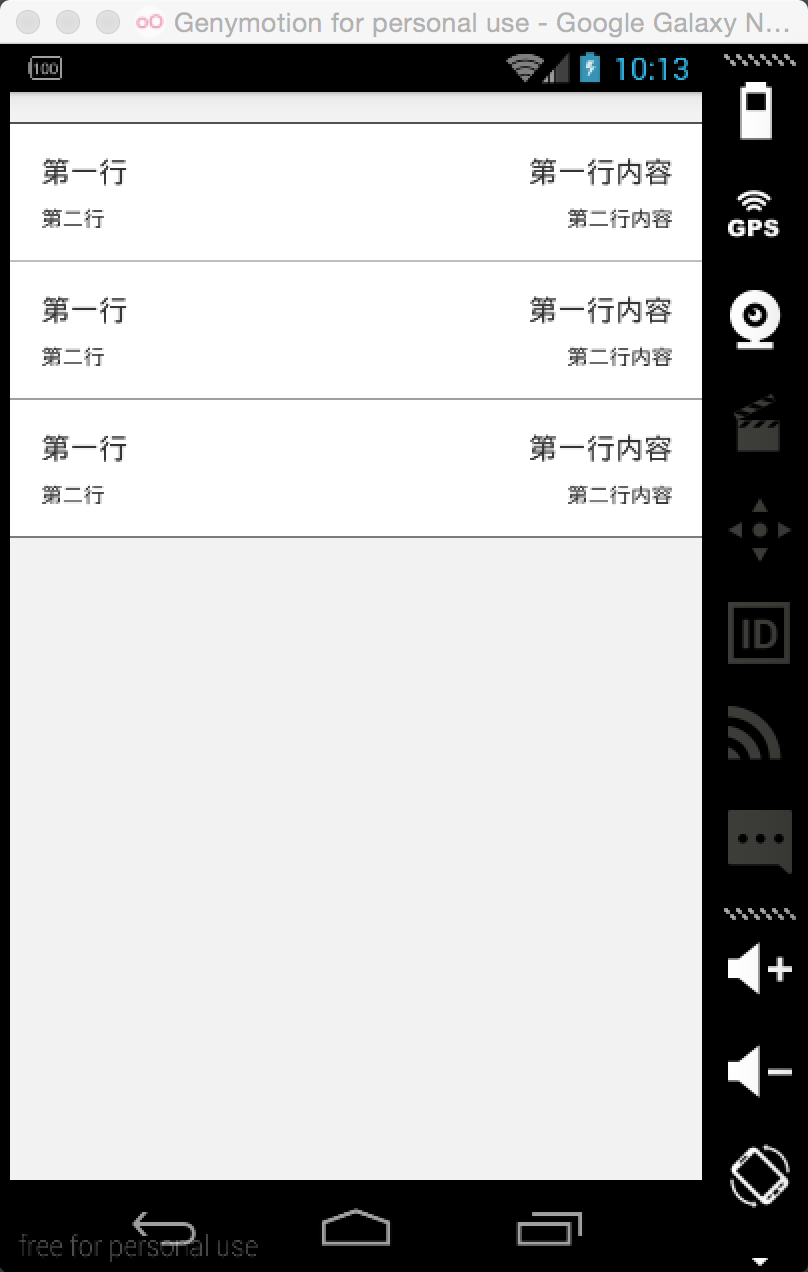
</LinearLayout>效果图如下:

在ListView中也经常会使用到分割线,比如带有头部分割线的ListView,使用方法如下:
先写一个布局文件:
<?xml version="1.0" encoding="utf-8"?>
<LinearLayout xmlns:android="http://schemas.android.com/apk/res/android"
              xmlns:br="http://schemas.android.com/apk/res-auto"
              android:layout_width="match_parent"
              android:layout_height="match_parent"
              android:background="@color/white"
              android:orientation="vertical">

    <com.junweiliu.widget.BorderRelativeLayout
        android:id="@+id/br_ia_detail"
        android:layout_width="match_parent"
        android:layout_height="72dp"
        br:borderColor="#333333"
        br:borderStrokeWidth="2.0"
        br:needTopBorder="false"
        >
        <!--上边部分-->
        <TextView
            android:id="@+id/tv_ia_detail_name"
            android:layout_width="match_parent"
            android:layout_height="wrap_content"
            android:layout_alignParentLeft="true"
            android:layout_marginLeft="16sp"
            android:layout_marginTop="15dp"
            android:text="第一行"
            android:textSize="15sp"
            />

        <TextView
            android:id="@+id/tv_ia_detail_money"
            android:layout_width="wrap_content"
            android:layout_height="wrap_content"
            android:layout_alignParentRight="true"
            android:layout_marginRight="15dp"
            android:layout_marginTop="15dp"
            android:text="第一行内容"
            android:textSize="15sp"
            />
        <!--下边部分-->
        <TextView
            android:id="@+id/tv_ia_detail_balance"
            android:layout_width="wrap_content"
            android:layout_height="wrap_content"
            android:layout_alignParentBottom="true"
            android:layout_alignParentLeft="true"
            android:layout_marginBottom="15dp"
            android:layout_marginLeft="16dp"
            android:layout_marginTop="12dp"
            android:text="第二行"
            android:textSize="11sp"
            />

        <TextView
            android:id="@+id/tv_ia_detail_date"
            android:layout_width="wrap_content"
            android:layout_height="wrap_content"
            android:layout_alignParentBottom="true"
            android:layout_alignParentRight="true"
            android:layout_marginBottom="15dp"
            android:layout_marginRight="15dp"
            android:layout_marginTop="12dp"
            android:text="第二行内容"
            android:textSize="11sp"
            />
    </com.junweiliu.widget.BorderRelativeLayout>

</LinearLayout>
绑定数据部分就不去写了,只需要在适配器中进行判断,就能够添加头部分割线了.在适配器getView部分添加:
    @Override
    public View getView(int position, View convertView, ViewGroup parent) {

        ...

        // 如果是第一个位置显示顶部边框
        BorderRelativeLayout br = (BorderRelativeLayout) convertView.findViewById(R.id.br_ia_detail);
        if (0 == position) {
            br.setNeedTopBorder(true);
        } else {
            br.setNeedTopBorder(false);
        }
        return convertView;
    }
效果图如下:
使用比较简单,用法也比较多变,如果需要LinearLayout,只需改变一下继承关系就可以了.


 扫一扫
扫一扫
 6005
6005

 被折叠的 条评论
为什么被折叠?
被折叠的 条评论
为什么被折叠?
 到【灌水乐园】发言


