


细心的开发者可能在我先前的应用"Ubuntu文件浏览器 - 开发Scope/应用利器"已经看到过在我们应用的header的有上角位置上已经显示了一个ActionBar用来显示一排图标按钮供我们做出我们的选择.
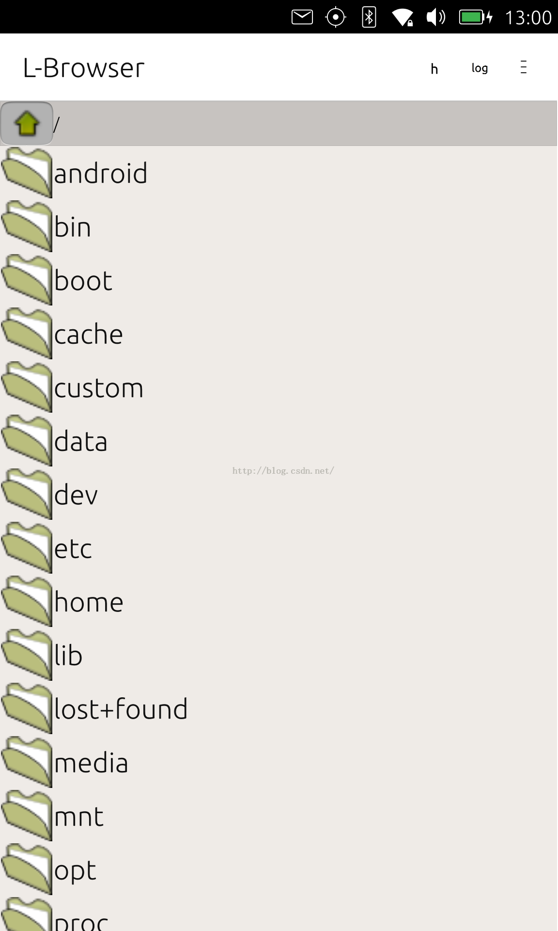
事实上,我们也可以在我们的应用的其它位置也可以使用ActionBar.在今天的例程中,我们来展示如何利用ActionBar来实现我们所需要的一些功能.事实上,我们上面的Browser应用中,也可以在我们的"/"位置提供一个这样的ActionBar来选择不同的drive.当然这目前不在我们的考虑范围之内.
我们还是来看一下我们的例子:
Main.qml
import QtQuick 2.4
import Ubuntu.Components 1.3
MainView {
// objectName for functional testing purposes (autopilot-qt5)
objectName: "mainView"
// Note! applicationName needs to match the "name" field of the click manifest
applicationName: "actionbar.liu-xiao-guo"
width: units.gu(60)
height: units.gu(85)
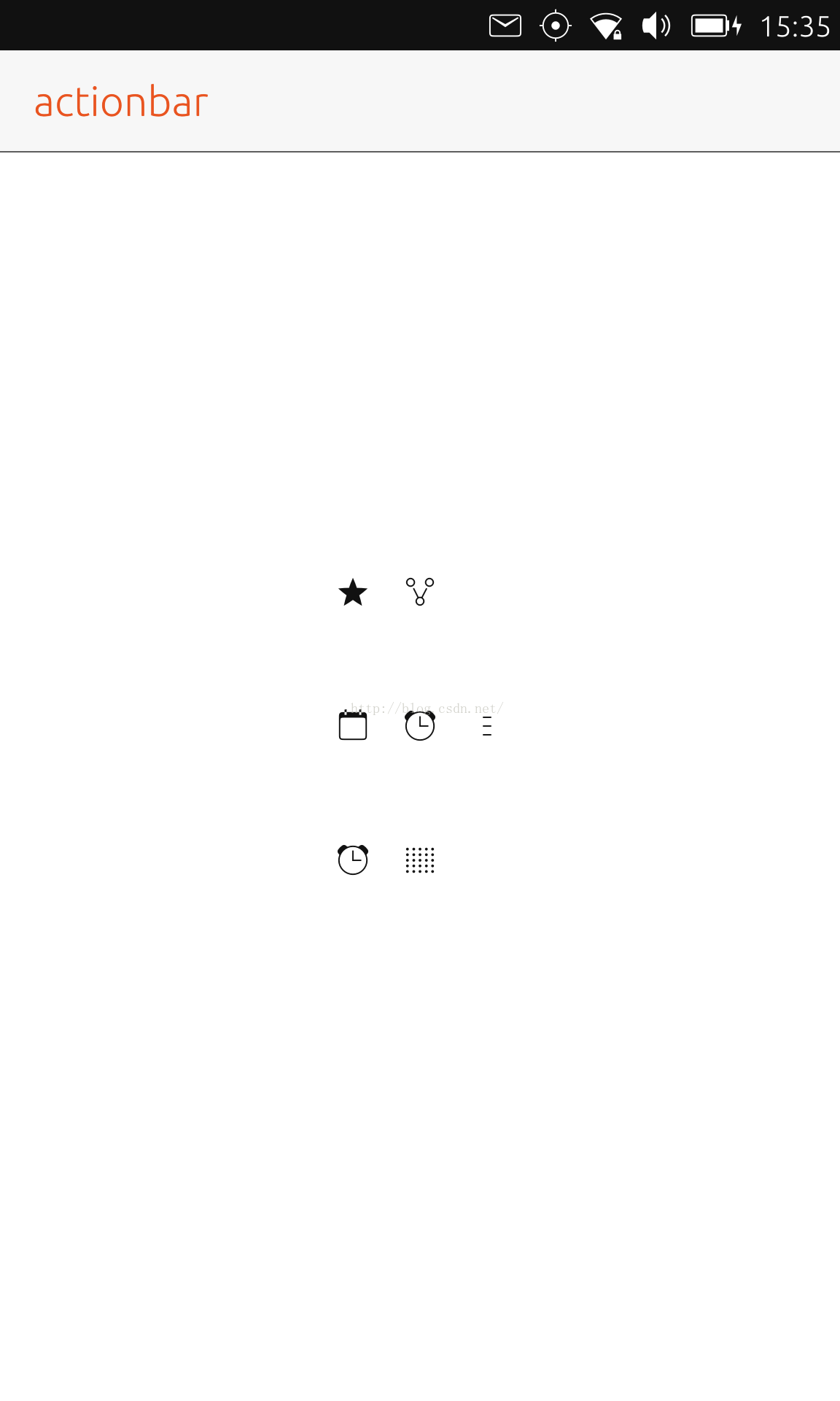
property list<Action> shortActionList: [
Action {
iconName: "share"
text: "Share"
onTriggered: {
console.log("share is clicked")
}
},
Action {
iconName: "starred"
text: "Favorite"
onTriggered: {
console.log("starred is clicked")
}
}
]
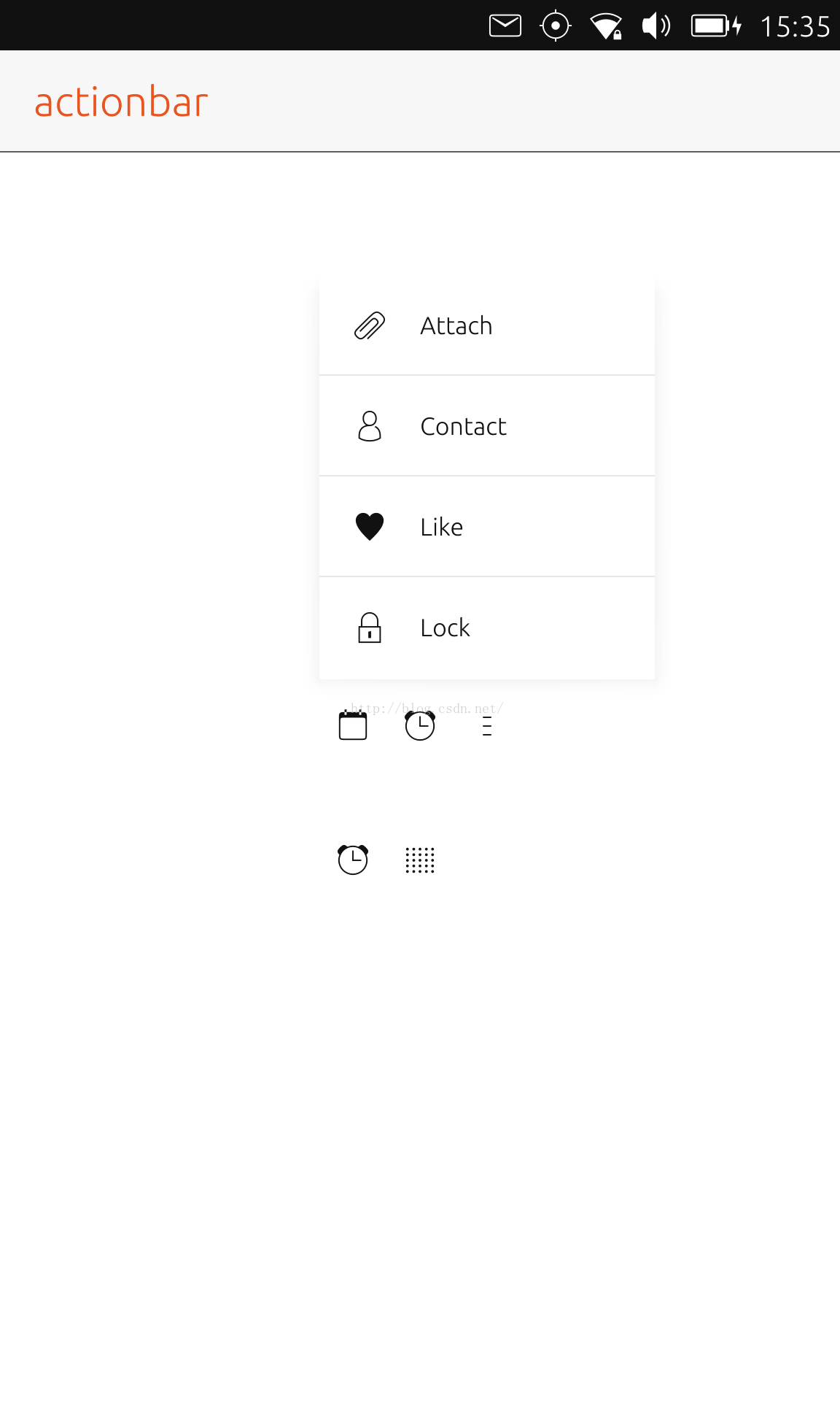
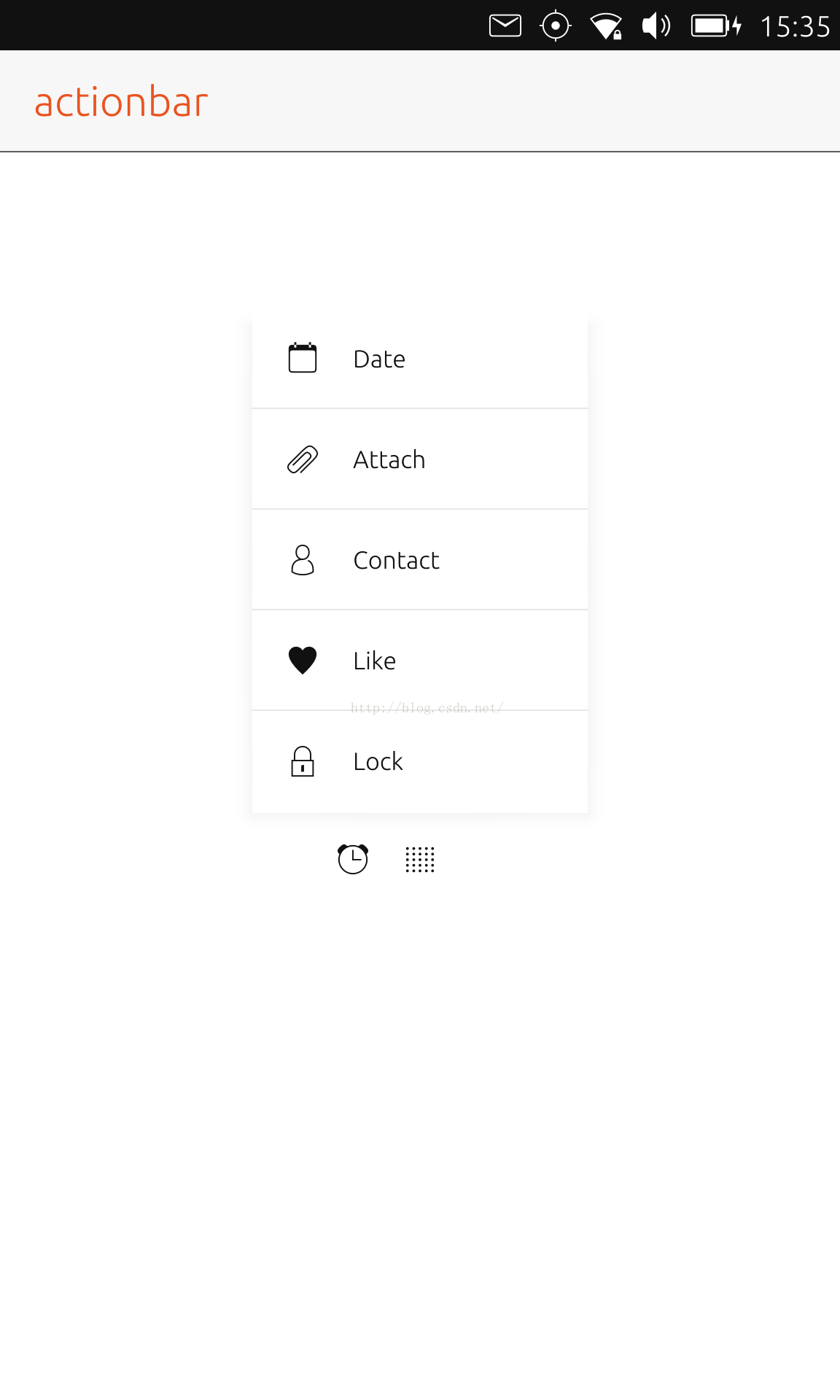
property list<Action> actionList: [
Action {
iconName: "alarm-clock"
text: "Tick tock"
onTriggered: {
console.log("alarm-clock is clicked")
}
},
Action {
iconName: "appointment"
text: "Date"
onTriggered: {
console.log("appointment is clicked")
}
},
Action {
iconName: "attachment"
text: "Attach"
onTriggered: {
console.log("attachment is clicked")
}
},
Action {
iconName: "contact"
text: "Contact"
onTriggered: {
console.log("contact is clicked")
}
},
Action {
iconName: "like"
text: "Like"
onTriggered: {
console.log("like is clicked")
}
},
Action {
iconName: "lock"
text: "Lock"
onTriggered: {
console.log("lock is clicked")
}
}
]
Page {
id: page
header: PageHeader {
id: pageHeader
title: i18n.tr("actionbar")
StyleHints {
foregroundColor: UbuntuColors.orange
backgroundColor: UbuntuColors.porcelain
dividerColor: UbuntuColors.slate
}
}
Column {
anchors.centerIn: parent
spacing: units.gu(3)
ActionBar {
// no numberOfSlots specified. Using default value.
id: shortBar
actions: shortActionList
}
ActionBar {
id: bar
numberOfSlots: 3
actions: actionList
}
ActionBar {
id: bar1
actions: actionList
StyleHints {
overflowIconName: "grip-large"
overflowText: "More"
defaultNumberOfSlots: 2
}
}
}
}
}


 扫一扫
扫一扫

 1287
1287

 被折叠的 条评论
为什么被折叠?
被折叠的 条评论
为什么被折叠?
 到【灌水乐园】发言


