


版本:1.0


日期:2014.5.16
版权:© 2014 kince 转载注明出处
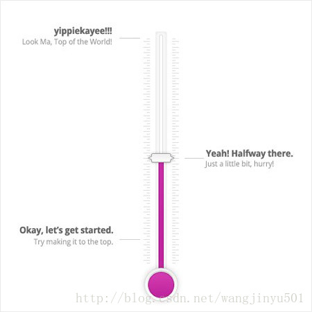
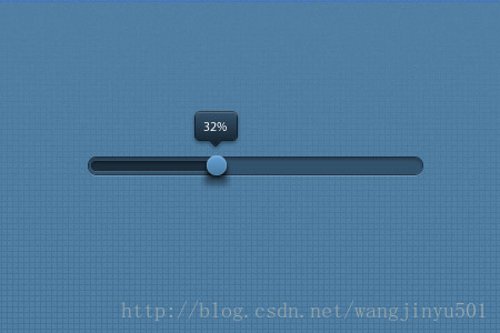
这一次主要说一下Android下的进度条,为什么是它呢,因为近期被其各种美轮美奂的设计所倾倒,计划逐渐去实现。另外一个因素也是它也是为数不多的直接继承于View类的控件,从中可以学习到一些自定义控件的知识。下面列举了一些个人觉得还算漂亮的进度条,仅供参考。
是不是很漂亮,其实就像上面图形展示的那样,进度条大体上无非就是这几种形式。这样一来肯定是需要自定义了,所以方向有两个:要么继承于系统的ProgressBar;要么继承于View类(前者就是如此实现)。那就先看一下系统的进度条吧。
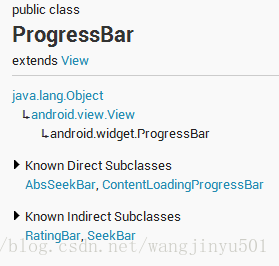
继承于View类,直接子类有AbsSeekBar和ContentLoadingProgressBar,其中AbsSeekBar的子类有SeekBar和RatingBar,可见这二者也是基于ProgressBar实现的。对于ProgressBar的使用,有三个地方需要注意一下:
1、ProgressBar有两个进度,一个是android:progress,另一个是android:secondaryProgress。后者主要是为缓存需要所涉及的,比如在看网络视频时候都会有一个缓存的进度条以及还要一个播放的进度,在这里缓存的进度就可以是android:secondaryProgress,而播放进度就是android:progress。
2、ProgressBar分为确定的和不确定的,上面说的播放进度、缓存等就是确定的。相反地,不确定的就是不清楚、不确定一个操作需要多长时间来完成,这个时候就需要用的不确定的ProgressBar了。这个是由属性android:indeterminate来控制的,如果设置为true的话,那么ProgressBar就可能是圆形的滚动条或者水平的滚动条(由样式决定)。默认情况下,如果是水平进度条,那么就是确定的。
3、ProgressBar的样式设定其实有两种方式,在API文档中说明的方式如下:
- Widget.ProgressBar.Horizontal
- Widget.ProgressBar.Small
- Widget.ProgressBar.Large
- Widget.ProgressBar.Inverse
- Widget.ProgressBar.Small.Inverse
- Widget.ProgressBar.Large.Inverse
使用的时候可以这样:style="@android:style/Widget.ProgressBar.Small"。另外还有一种方式就是使用系统的attr,上面的方式是系统的style:
- style="?android:attr/progressBarStyle"
- style="?android:attr/progressBarStyleHorizontal"
- style="?android:attr/progressBarStyleInverse"
- style="?android:attr/progressBarStyleLarge"
- style="?android:attr/progressBarStyleLargeInverse"
- style="?android:attr/progressBarStyleSmall"
- style="?android:attr/progressBarStyleSmallInverse"
- style="?android:attr/progressBarStyleSmallTitle"
然后再看一下ProgressBar的其他常用属性,
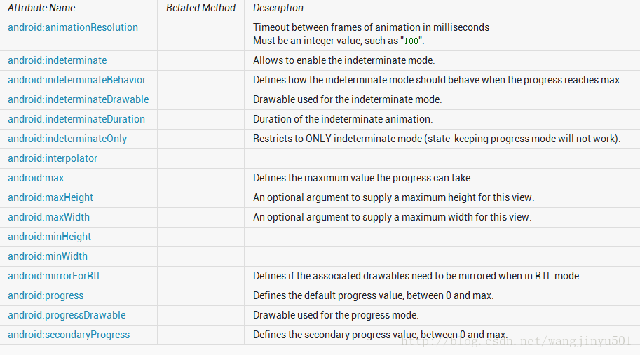
关于这些属性的使用还是比较简单,不多做介绍。其中第一个android:animationResolution已经呗舍弃了,所以不要去研究它了。重点说一下android:progressDrawable以及android:indeterminateDrawable。那这个Drawable在ProgressBar中是如何使用的呢,如果我们是这样在xml中设置ProgressBar的话,
   <ProgressBar
        android:id="@+id/progressbar"
        style="@android:style/Widget.ProgressBar.Horizontal"
        android:layout_width="match_parent"
        android:layout_height="wrap_content"
android:secondaryProgress="50" /> <style name="Widget.ProgressBar.Horizontal">
<item name="android:indeterminateOnly">false</item>
<item name="android:progressDrawable">@android:drawable/progress_horizontal</item>
<item name="android:indeterminateDrawable">@android:drawable/progress_indeterminate_horizontal</item>
<item name="android:minHeight">20dip</item>
<item name="android:maxHeight">20dip</item>
<item name="android:mirrorForRtl">true</item>
</style>
先看一下progress_horizontal,源码如下:
<?xml version="1.0" encoding="utf-8"?>
<!-- Copyright (C) 2008 The Android Open Source Project

     Licensed under the Apache License, Version 2.0 (the "License");
     you may not use this file except in compliance with the License.
     You may obtain a copy of the License at

          http://www.apache.org/licenses/LICENSE-2.0

     Unless required by applicable law or agreed to in writing, software
     distributed under the License is distributed on an "AS IS" BASIS,
     WITHOUT WARRANTIES OR CONDITIONS OF ANY KIND, either express or implied.
     See the License for the specific language governing permissions and
     limitations under the License.
-->

<layer-list xmlns:android="http://schemas.android.com/apk/res/android">

    <item android:id="@android:id/background">
        <shape>
            <corners android:radius="5dip" />
            <gradient
                    android:startColor="#ff9d9e9d"
                    android:centerColor="#ff5a5d5a"
                    android:centerY="0.75"
                    android:endColor="#ff747674"
                    android:angle="270"
            />
        </shape>
    </item>

    <item android:id="@android:id/secondaryProgress">
        <clip>
            <shape>
                <corners android:radius="5dip" />
                <gradient
                        android:startColor="#80ffd300"
                        android:centerColor="#80ffb600"
                        android:centerY="0.75"
                        android:endColor="#a0ffcb00"
                        android:angle="270"
                />
            </shape>
        </clip>
    </item>

    <item android:id="@android:id/progress">
        <clip>
            <shape>
                <corners android:radius="5dip" />
                <gradient
                        android:startColor="#ffffd300"
                        android:centerColor="#ffffb600"
                        android:centerY="0.75"
                        android:endColor="#ffffcb00"
                        android:angle="270"
                />
            </shape>
        </clip>
    </item>

</layer-list>
可以看到,系统使用的是图层方式,以覆盖的方式进行的。所以如果需要其他的样式的话,改变系统默认的值即可,或者参考一下系统自带的样式设置就行了。
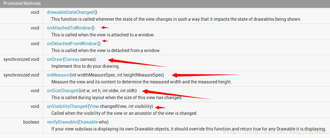
紧接着,说一下ProgressBar的方法,总体来说,可以分为两个部分。一是和自身属性相关的,比如获取进度、设置进度的最大值、设置插入器等等。二是和绘制相关的部分,如图所示:
所以、所以我们本次最重要的部分来了,那就是如何自定义一个漂亮ProgressBar。在自定义之前,先看一下系统是如何实现的。Android下ProgressBar的代码量不算多,除去注释估计也就是几百行左右。首先从构造方法看是看,
  /**
     * Create a new progress bar with range 0...100 and initial progress of 0.
     * @param context the application environment
     */
    public ProgressBar(Context context) {
        this(context, null);
    }

    public ProgressBar(Context context, AttributeSet attrs) {
        this(context, attrs, com.android.internal.R.attr.progressBarStyle);
    }

    public ProgressBar(Context context, AttributeSet attrs, int defStyle) {
        this(context, attrs, defStyle, 0);
    }

    /**
     * @hide
     */
    public ProgressBar(Context context, AttributeSet attrs, int defStyle, int styleRes) {
        super(context, attrs, defStyle);
        mUiThreadId = Thread.currentThread().getId();
        initProgressBar();

        TypedArray a =
            context.obtainStyledAttributes(attrs, R.styleable.ProgressBar, defStyle, styleRes);

        mNoInvalidate = true;

        Drawable drawable = a.getDrawable(R.styleable.ProgressBar_progressDrawable);
        if (drawable != null) {
            drawable = tileify(drawable, false);
            // Calling this method can set mMaxHeight, make sure the corresponding
            // XML attribute for mMaxHeight is read after calling this method
            setProgressDrawable(drawable);
        }


        mDuration = a.getInt(R.styleable.ProgressBar_indeterminateDuration, mDuration);

        mMinWidth = a.getDimensionPixelSize(R.styleable.ProgressBar_minWidth, mMinWidth);
        mMaxWidth = a.getDimensionPixelSize(R.styleable.ProgressBar_maxWidth, mMaxWidth);
        mMinHeight = a.getDimensionPixelSize(R.styleable.ProgressBar_minHeight, mMinHeight);
        mMaxHeight = a.getDimensionPixelSize(R.styleable.ProgressBar_maxHeight, mMaxHeight);

        mBehavior = a.getInt(R.styleable.ProgressBar_indeterminateBehavior, mBehavior);

        final int resID = a.getResourceId(
                com.android.internal.R.styleable.ProgressBar_interpolator,
                android.R.anim. linear_interpolator); // default to linear interpolator
        if (resID > 0) {
            setInterpolator(context, resID);
        }

        setMax(a.getInt(R.styleable.ProgressBar_max, mMax));

        setProgress(a.getInt(R.styleable.ProgressBar_progress, mProgress));

        setSecondaryProgress(
                a.getInt(R.styleable.ProgressBar_secondaryProgress, mSecondaryProgress));

        drawable = a.getDrawable(R.styleable.ProgressBar_indeterminateDrawable);
        if (drawable != null) {
            drawable = tileifyIndeterminate(drawable);
            setIndeterminateDrawable(drawable);
        }

        mOnlyIndeterminate = a.getBoolean(
                R.styleable.ProgressBar_indeterminateOnly, mOnlyIndeterminate);

        mNoInvalidate = false;

        setIndeterminate( mOnlyIndeterminate || a.getBoolean(
                R.styleable.ProgressBar_indeterminate, mIndeterminate));

        mMirrorForRtl = a.getBoolean(R.styleable.ProgressBar_mirrorForRtl, mMirrorForRtl);

        a.recycle();
    }
R.styleable.Progre:
 <declare-styleable name="ProgressBar">
        <!-- Defines the maximum value the progress can take. -->
        <attr name="max" format="integer" />
        <!-- Defines the default progress value, between 0 and max. -->
        <attr name="progress" format="integer" />
        <!-- Defines the secondary progress value, between 0 and max. This progress is drawn between
             the primary progress and the background.  It can be ideal for media scenarios such as
             showing the buffering progress while the default progress shows the play progress. -->
        <attr name="secondaryProgress" format="integer" />
        <!-- Allows to enable the indeterminate mode. In this mode the progress
         bar plays an infinite looping animation. -->
        <attr name="indeterminate" format="boolean" />
        <!-- Restricts to ONLY indeterminate mode (state-keeping progress mode will not work). -->
        <attr name="indeterminateOnly" format="boolean" />
        <!-- Drawable used for the indeterminate mode. -->
        <attr name="indeterminateDrawable" format="reference" />
        <!-- Drawable used for the progress mode. -->
        <attr name="progressDrawable" format="reference" />
        <!-- Duration of the indeterminate animation. -->
        <attr name="indeterminateDuration" format="integer" min="1" />
        <!-- Defines how the indeterminate mode should behave when the progress
        reaches max. -->
        <attr name="indeterminateBehavior">
            <!-- Progress starts over from 0. -->
            <enum name="repeat" value="1" />
            <!-- Progress keeps the current value and goes back to 0. -->
            <enum name="cycle" value="2" />
        </attr>
        <attr name="minWidth" format="dimension" />
        <attr name="maxWidth" />
        <attr name="minHeight" format="dimension" />
        <attr name="maxHeight" />
        <attr name="interpolator" format="reference" />
        <!-- Timeout between frames of animation in milliseconds
             {@deprecated Not used by the framework.} -->
        <attr name="animationResolution" format="integer" />
    </declare-styleable>
ProgressBar把三个构造方法都列出来了,并使用了递归调用的方式,还有一个方式就是分别在每一个构造方法中都调用初始化的代码,个人觉得还是此处比较正规。然后看一下第三个构造方法,在这里主要做了两件事情,一个是从attrs文件中读取设置的属性;一个是initProgressBar()方法,为ProgressBar设置一些默认的属性值。
  private void initProgressBar() {
        mMax = 100;
        mProgress = 0;
        mSecondaryProgress = 0;
        mIndeterminate = false;
        mOnlyIndeterminate = false;
        mDuration = 4000;
        mBehavior = AlphaAnimation.RESTART;
        mMinWidth = 24;
        mMaxWidth = 48;
        mMinHeight = 24;
        mMaxHeight = 48;
    }
这就是默认的属性值。这在自定义View中算是最基础的了,不多说,不过在这里需要注意两个地方。一是mUiThreadId,他是干嘛的呢,它获取的是当前UI线程的id,然后在更新ProgressBar进度的时候进行一个判断,如果是UI线程,那么直接进行更新,如果不是就post出去,使用Handler等进行更新。二是tileify(drawable, false)方法和tileifyIndeterminate(drawable)方法。这两个方法主要是对Drawable进行一个解析、转换的过程。在这里需要重点强调一下,在ProgressBar中,最重要的部分就是Drawable的使用了,因为不仅是它的背景包括进度等都是使用Drawable来完成的,所以在源码中也可以看到基本上百分之七八十的代码都是和Drawable有关的。因为这一部分篇幅较多,所以就不详细介绍了,下面重点说一下如何绘制ProgressBar,首先看onMeasure()方法,
 @Override
    protected synchronized void onMeasure( int widthMeasureSpec, int heightMeasureSpec) {
        Drawable d = mCurrentDrawable;

        int dw = 0;
        int dh = 0;
        if (d != null) {
            dw = Math. max(mMinWidth , Math.min( mMaxWidth, d.getIntrinsicWidth()));
            dh = Math. max(mMinHeight , Math.min( mMaxHeight, d.getIntrinsicHeight()));
        }
        updateDrawableState();
        dw += mPaddingLeft + mPaddingRight;
        dh += mPaddingTop + mPaddingBottom;

        setMeasuredDimension( resolveSizeAndState(dw, widthMeasureSpec, 0),
                resolveSizeAndState(dh, heightMeasureSpec, 0));
    }
按照正常的流程,有些朋友可能会想到重写onLayout()方法了,但是这里ProgressBar只是一个View,不需要进行位置的处理。所以直接进入onDraw()方法,在
 @Override
    protected synchronized void onDraw(Canvas canvas) {
        super.onDraw(canvas);

        Drawable d = mCurrentDrawable;
        if (d != null) {
            // Translate canvas so a indeterminate circular progress bar with padding
            // rotates properly in its animation
            canvas.save();
            if(isLayoutRtl() && mMirrorForRtl) {
                canvas.translate(getWidth() - mPaddingRight, mPaddingTop);
                canvas.scale(-1.0f, 1.0f);
            } else {
                canvas.translate(mPaddingLeft, mPaddingTop);
            }
            long time = getDrawingTime();
            if ( mHasAnimation) {
                mAnimation.getTransformation(time, mTransformation);
                float scale = mTransformation.getAlpha();
                try {
                    mInDrawing = true;
                    d.setLevel(( int) (scale * MAX_LEVEL));
                } finally {
                    mInDrawing = false;
                }
                postInvalidateOnAnimation();
            }
            d.draw(canvas);
            canvas.restore();
            if ( mShouldStartAnimationDrawable && d instanceof Animatable) {
                ((Animatable) d).start();
                mShouldStartAnimationDrawable = false ;
            }
        }
首先也是先获取当前的Drawable对象,如果不为空就开始绘图,先是一个判断,根据布局的方向来转移画布,isLayoutRtl()是View类的方法,
  public boolean isLayoutRtl() {
        return (getLayoutDirection() == LAYOUT_DIRECTION_RTL);
    }
这个LAYOUT_DIRECTION_RTL是LayoutDirection的一个常量,
package android.util;

/**
* A class for defining layout directions. A layout direction can be left-to-right (LTR)
* or right-to-left (RTL). It can also be inherited (from a parent) or deduced from the default
* language script of a locale.
*/
public final class LayoutDirection {

    // No instantiation
    private LayoutDirection() {}

    /**
     * Horizontal layout direction is from Left to Right.
     */
    public static final int LTR = 0;

    /**
     * Horizontal layout direction is from Right to Left.
     */
    public static final int RTL = 1;

    /**
     * Horizontal layout direction is inherited.
     */
    public static final int INHERIT = 2;

    /**
     * Horizontal layout direction is deduced from the default language script for the locale.
     */
    public static final int LOCALE = 3;
}
然后再判断有没有动画,如果有的话,就调用View类的postInvalidateOnAnimation()方法去执行一个动画。最后调用Drawable对象去画出来d.draw(canvas)。
总的来说,系统的ProgressBar是和Drawable紧密相关的,所以说,如果我们自定义的ProgressBar和Drawable有关,那么完全可以继承于系统的ProgressBar来开发即可。如果你的自定义ProgressBar和Drawable关系不大,比如是这样的,

其实,就不需要Drawable了,完全可以直接继承于View类开发。
那下面就从两个方面来自定义ProgressBar,
一、继承于系统ProgressBar
首先看一下上面给出的进度条其中的一个,
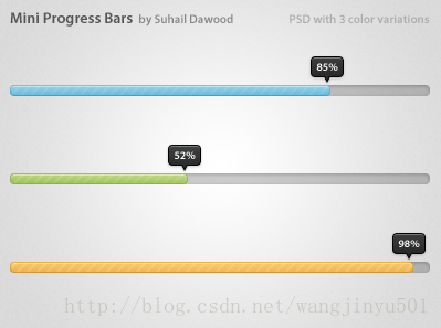
思路:
Mini ProgressBar在原生ProgressBar的基础上加入了一个指示器,并且有文字显示。实现的时候可以这样,
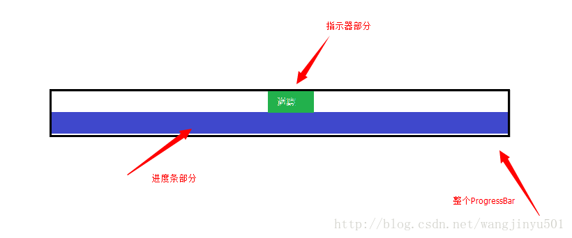
也就是说,自定义的ProgressBar包含了两个部分,一部分是默认的;另一部分是新添加的指示器。其实指示器就是一个Drawable和文本的组合,而且直接画在系统ProgressBar的上面即可。接着,关于自定义的ProgressBar的属性也要定义一下,比如Drawable、比如文本、比如间隔等。所以attrs文件可以这样来写了:
<?xml version= "1.0" encoding ="utf-8"?>
<resources>

    <declare-styleable >
        <attr name= "progressIndicator" format="reference" ></attr>
        <attr name= "offset" format ="dimension"></ attr>
        <attr name= "textSize" format ="dimension"></ attr>
        <attr name= "textColor" format="reference|color" ></attr>
        <attr name= "textStyle">
            <flag name= "normal" value ="0" />
            <flag name= "bold" value ="1" />
            <flag name= "italic" value ="2" />
        </attr>
        <attr name= "textAlign">
            <flag name= "left" value ="0" />
            <flag name= "center" value ="1" />
            <flag name= "right" value ="2" />
        </attr>
    </declare-styleable >

</resources>
ps:我发现eclipse在写declare-styleable不会自动提示,不清楚什么原因,知道的朋友望告知。
之后我们新建一个类继承于ProgressBar,
/**
 * @author kince
 *
 */
public class IndicatorProgressBar extends ProgressBar {

     public IndicatorProgressBar(Context context) {
           this(context, null);

     }

     public IndicatorProgressBar(Context context, AttributeSet attrs) {
           this(context, attrs, 0);

     }

     public IndicatorProgressBar(Context context, AttributeSet attrs,
               int defStyle) {
           super(context, attrs, defStyle);

     }


}
然后在第三个构造方法中初始化数据,因为用到了文本以及Drawable,所以还需要声明全局变量,初始化完毕后代码如下:
 /**
*
*/
package com.example.indicatorprogressbar.widget;

import com.example.indicatorprogressbar.R;

import android.content.Context;
import android.content.res.TypedArray;
import android.graphics.Color;
import android.graphics.Paint;
import android.graphics.Paint.Align;
import android.graphics.drawable.Drawable;
import android.text.TextPaint;
import android.util.AttributeSet;
import android.widget.ProgressBar;

/**
* @author kince
*
*/
public class IndicatorProgressBar extends ProgressBar {


     private TextPaint mTextPaint;
     private Drawable mDrawableIndicator;
     private int offset=5;


     public IndicatorProgressBar(Context context) {
          this(context, null);

     }

     public IndicatorProgressBar(Context context, AttributeSet attrs) {
          this(context, attrs, 0);
          mTextPaint=new TextPaint(Paint.ANTI_ALIAS_FLAG);
          mTextPaint.density=getResources().getDisplayMetrics().density;

          mTextPaint.setColor(Color.WHITE);
          mTextPaint.setTextSize(10);
          mTextPaint.setTextAlign(Align.CENTER);
          mTextPaint.setFakeBoldText(true);
     }

     public IndicatorProgressBar(Context context, AttributeSet attrs,
               int defStyle) {
          super(context, attrs, defStyle);

          TypedArray array=context.obtainStyledAttributes(attrs, R.styleable.IndicatorProgressBar, defStyle, 0);
          if(array!=null){
               mDrawableIndicator=array.getDrawable(R.styleable.IndicatorProgressBar_progressIndicator);
               offset=array.getInt(R.styleable.IndicatorProgressBar_offset, 0);
               array.recycle();
          }

     }

}
然后,为全局变量设置set、get方法,方便在程序中调用。
 public Drawable getmDrawableIndicator() {
           return mDrawableIndicator ;
     }

     public void setmDrawableIndicator(Drawable mDrawableIndicator) {
           this.mDrawableIndicator = mDrawableIndicator;
     }

     public int getOffset() {
           return offset ;
     }

     public void setOffset(int offset) {
           this.offset = offset;
     }
接下来,就是重写onMeasure()、onDraw()方法了。在onMeasure()中,需要对进度条计算好具体大小,那根据上面的图示,这个进度条的宽度和系统进度条的宽度是一样的,也就是getMeasuredWidth();高度的话,因为加了一个指示器,所以高度是指示器的高度加上系统进度条的高度。因此在onMeasure()方法中就可以这样来写:
	@Override
	protected synchronized void onMeasure(int widthMeasureSpec,
			int heightMeasureSpec) {
		// TODO Auto-generated method stub
		super.onMeasure(widthMeasureSpec, heightMeasureSpec);
		if(mDrawableIndicator!=null){
			//获取系统进度条的宽度 这个宽度也是自定义进度条的宽度 所以在这里直接赋值
			final int width=getMeasuredWidth();
			final int height=getMeasuredHeight()+getIndicatorHeight();
			setMeasuredDimension(width, height);
		}

	}

	/**
	 * @category 获取指示器的高度
	 * @return
	 */
	private int getIndicatorHeight(){
		if(mDrawableIndicator==null){
			return 0;
		}
		Rect r=mDrawableIndicator.copyBounds();
		int height=r.height();
		return height;
	}
然后是onDraw()方法,因为在onMeasure()方法中增加了进度条的高度,所以在画的时候需要将系统进度条与指示器分隔开来。在进度条的样式文件中,我们是这样配置的:
<style name="Widget.ProgressBar.RegularProgressBar">
        <item name="android:indeterminateOnly" >false </item>
        <item name="android:progressDrawable" >@drawable/progressbar </item>
        <item name="android:indeterminateDrawable" >@android:drawable/progress_indeterminate_horizontal </item>
        <item name= "android:minHeight">1dip</item >
        <item name= "android:maxHeight">10dip</item >
    </style >
在android:progressDrawable的属性中,使用的drawable是这样的:
<layer-list xmlns:android="http://schemas.android.com/apk/res/android" >

    <item
        android:id="@android:id/background"
        android:drawable="@drawable/progressbar_bg" />
    <item
        android:id="@+id/progress"
        android:drawable="@drawable/progressbar_bar" >
    </item >
    <item android:id="@+id/pattern">
        <bitmap
            android:src="@drawable/progressbar_pattern"
            android:tileMode="repeat" />
    </item >

</layer-list>
 if (m_indicator != null) {
               if (progressDrawable != null
                        && progressDrawable instanceof LayerDrawable) {
                   LayerDrawable d = (LayerDrawable) progressDrawable;

                    for (int i = 0; i < d.getNumberOfLayers(); i++) {
                        d.getDrawable(i).getBounds(). top = getIndicatorHeight();
                        d.getDrawable(i).getBounds(). bottom = d.getDrawable(i)
                                  .getBounds().height()
                                  + getIndicatorHeight();
                   }
              } else if (progressDrawable != null) {
                   progressDrawable.getBounds(). top = m_indicator
                             .getIntrinsicHeight();
                   progressDrawable.getBounds(). bottom = progressDrawable
                             .getBounds().height() + getIndicatorHeight();
              }
          }
然后需要更新进度条的位置,
private void updateProgressBar () {
          Drawable progressDrawable = getProgressDrawable();

           if (progressDrawable != null
                   && progressDrawable instanceof LayerDrawable) {
              LayerDrawable d = (LayerDrawable) progressDrawable;

               final float scale = getScale(getProgress());

               // 获取进度条 更新它的大小
              Drawable progressBar = d.findDrawableByLayerId(R.id.progress );

               final int width = d.getBounds(). right - d.getBounds().left ;

               if (progressBar != null) {
                   Rect progressBarBounds = progressBar.getBounds();
                   progressBarBounds. right = progressBarBounds.left
                             + ( int ) (width * scale + 0.5f);
                   progressBar.setBounds(progressBarBounds);
              }

               // 获取叠加的图层
              Drawable patternOverlay = d.findDrawableByLayerId(R.id.pattern );

               if (patternOverlay != null) {
                    if (progressBar != null) {
                         // 使叠加图层适应进度条大小
                        Rect patternOverlayBounds = progressBar.copyBounds();
                         final int left = patternOverlayBounds.left ;
                         final int right = patternOverlayBounds.right ;

                        patternOverlayBounds. left = (left + 1 > right) ? left
                                  : left + 1;
                        patternOverlayBounds. right = (right > 0) ? right - 1
                                  : right;
                        patternOverlay.setBounds(patternOverlayBounds);
                   } else {
                         // 没有叠加图层
                        Rect patternOverlayBounds = patternOverlay.getBounds();
                        patternOverlayBounds. right = patternOverlayBounds.left
                                  + ( int ) (width * scale + 0.5f);
                        patternOverlay.setBounds(patternOverlayBounds);
                   }
              }
          }
     }
最后,需要把指示器画出来,
if (m_indicator != null) {
              canvas.save();
               int dx = 0;

               // 获取系统进度条最右边的位置 也就是头部的位置
               if (progressDrawable != null
                        && progressDrawable instanceof LayerDrawable) {
                   LayerDrawable d = (LayerDrawable) progressDrawable;
                   Drawable progressBar = d.findDrawableByLayerId(R.id.progress );
                   dx = progressBar.getBounds(). right;
              } else if (progressDrawable != null) {
                   dx = progressDrawable.getBounds().right ;
              }

               //加入offset
              dx = dx - getIndicatorWidth() / 2 - m_offset + getPaddingLeft();

               // 移动画笔位置
              canvas.translate(dx, 0);
                                   // 画出指示器
               m_indicator .draw(canvas);
              // 画出进度数字
              canvas.drawText(
                         m_formatter != null ? m_formatter .getText(getProgress())
                                  : Math.round(getScale(getProgress()) * 100.0f)
                                           + "%" , getIndicatorWidth() / 2,
                        getIndicatorHeight() / 2 + 1, m_textPaint );

               // restore canvas to original
              canvas.restore();
          }
Github地址: https://github.com/wangjinyu501/SaundProgressBar


 1万+
1万+


 被折叠的 条评论
为什么被折叠?
被折叠的 条评论
为什么被折叠?
 到【灌水乐园】发言


