android系统自带的progressbar样式比较单一,有时候不符合项目需求,比如要实现下图这样的progressbar的话,就不得不使用自定义view。
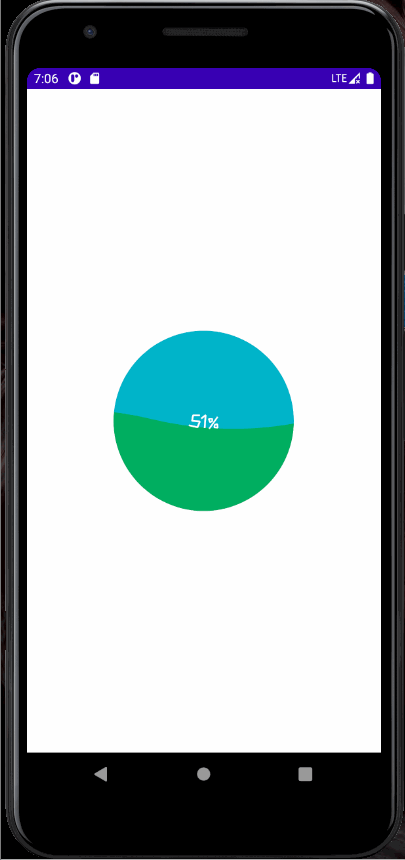
这个progressbar的原理是将canvas裁剪成一个圆形,并将canvas的涂上背景色,不断上涨的波浪其实是一个上边为贝塞尔曲线的矩形,当进度更新时矩形的高度和贝塞尔曲线的起始点会发生相应的变化。
首先,需要确定自定义view的相关属性,这里我定义了六个属性,分别是字体颜色、字体大小、进度条背景颜色、进度条颜色、进度条最大值以及进度条初始值。
在项目文件结构中找到res->values新建attrs.xml,内容为:
<?xml version="1.0" encoding="utf-8"?>
<resources>
    <declare-styleable name="CircleProgressBar">
        <attr name="textSize" format="dimension"/>
        <attr name="textColor" format="color|reference"/>
        <attr name="bgColor" format="color|reference"/>
        <attr name="waveColor" format="color|reference"/>
        <attr name="max" format="integer"/>
        <attr name="progress" format="integer"/>
    </declare-styleable>
</resources>
新建kotlin类文件CircleProgressBar,让它继承View类,按住alt+enter,选择jvmoverloads,ide会自动生成CircleProgressBar的构造函数
class CircleProgressBar @JvmOverloads constructor(
    context: Context, attrs: AttributeSet? = null, defStyleAttr: Int = 0
) : View(context, attrs, defStyleAttr) {}
利用init代码块在CircleProgressBar实例化时读取属性信息
init {
    val typedArray = context.obtainStyledAttributes(attrs,R.styleable.CircleProgressBar)
        textSize = typedArray.getDimension(R.styleable.CircleProgressBar_textSize,dip2px(14f).toFloat())
        textColor = typedArray.getColor(R.styleable.CircleProgressBar_textColor,Color.WHITE)
        bgColor = typedArray.getColor(R.styleable.CircleProgressBar_bgColor,ContextCompat.getColor(context,R.color.blue))
        waveColor = typedArray.getColor(R.styleable.CircleProgressBar_waveColor,ContextCompat.getColor(context,R.color.green))
        maxProgress = typedArray.getInt(R.styleable.CircleProgressBar_max,100)
        progress = typedArray.getInt(R.styleable.CircleProgressBar_progress,0)
        typedArray.recycle()
    	valueAnimator.start()
}
其中dip2px(dipValue: Float)函数是一个将dp转为px的顶层函数
fun dip2px(dipValue: Float): Int {
    val scale: Float = Resources.getSystem().displayMetrics.density
    return (dipValue * scale + 0.5f).toInt()
}
绘制前需要先测量自定义progressbar的长和宽
override fun onMeasure(widthMeasureSpec: Int, heightMeasureSpec: Int) {
        mWidth = when(MeasureSpec.getMode(widthMeasureSpec)){
            MeasureSpec.EXACTLY-> MeasureSpec.getSize(widthMeasureSpec).toFloat()
            else -> dip2px(150f).toFloat()
        }
        mHeight = when(MeasureSpec.getMode(heightMeasureSpec)){
            MeasureSpec.EXACTLY-> MeasureSpec.getSize(heightMeasureSpec).toFloat()
            else -> dip2px(150f).toFloat()
        }
        val radius=if(mWidth<mHeight){
            mWidth/2
        }else{
            mHeight/2
        }
        clipPath.addCircle(mWidth/2,mHeight/2,radius,Path.Direction.CW)
        setMeasuredDimension(mWidth.toInt(),mHeight.toInt())
    }
如果是指定了progressbar的宽高则以指定宽高为准,否则view的宽高默认为150px,最后用setMeasuredDimension(width:Int,height:Int)来设置宽高。此外,这里还确定了圆的半径,取长宽中较短一方的一半作为半径,并且设置裁剪路径。
在绘制之前还需要在设置paint属性,并且必须在初始化自定义progressbar时,同时初始化这些paint对象,否则在ondraw()中初始化会造成内存抖动。
private val textPaint by lazy {
Paint().apply {
color = this@CircleProgressBar.textColor
textSize = this@CircleProgressBar.textSize
isAntiAlias = true
textAlign = Paint.Align.CENTER
typeface = TypefaceCompat.createFromResourcesFontFile(context,resources,R.font.kuai_le,"",0)
}
}
private val pathPaint by lazy {
Paint().apply {
color = this@CircleProgressBar.waveColor
isAntiAlias = true
style = Paint.Style.FILL
setShadowLayer(1f,10f,10f,Color.GRAY)
}
}
设置完paint属性后便可以绘制了
 override fun onDraw(canvas: Canvas?) {
        super.onDraw(canvas)
        canvas?.apply{
            drawBackground(this)
            drawProgress(this)
            drawProgressText(this)
        }
    }
private fun drawBackground(canvas: Canvas){
        canvas.clipPath(clipPath)
        canvas.drawColor(bgColor)
    }

    private fun drawProgress(canvas: Canvas){
        progressPath.reset()
        val ratio = progress/maxProgress.toFloat()
        val top = (1-ratio)*mHeight
        val waveHeight = (-4*ratio*ratio+4*ratio)*maxWaveHeight
        progressPath.moveTo((-waveLength+offset).toFloat(),top)
        for (i in -waveLength..width+waveLength step waveLength){
            progressPath.rQuadTo(waveLength/4f,-waveHeight,waveLength/2f,0f)
            progressPath.rQuadTo(waveLength/4f,waveHeight,waveLength/2f,0f)
        }

        progressPath.lineTo(mWidth,mHeight)
        progressPath.lineTo(0f,mHeight)
        progressPath.close()
        canvas.drawPath(progressPath,pathPaint)
    }

    private fun drawProgressText(canvas: Canvas){
        val fontMetrics = textPaint.fontMetrics
        val baseline =  (mHeight - fontMetrics.bottom - fontMetrics.top)/2
        canvas.drawText("${(progress * 100 / maxProgress.toDouble()).roundToInt()}%",mWidth/2,baseline,textPaint)
    }
drawBackground(canvas: Canvas)将canvas裁剪成圆形并且填充上背景色;drawProgress()首先调用了progressPath.reset(),progressPath即贝塞尔曲线,reset会清除所有progressPath中的控制点,以便清除上一次绘制时progressPath中的控制点。由于canvas的坐标系是以x轴的下方为y轴正方向,所以矩形的上方随进度的变化公式为(1-ratio)*mHeight。为了让波浪的高度随着进度变化,在进度0%-50%时高度逐渐变大,在进度50%-100%时逐渐变小,高度公式为(-4*ratio*ratio+4*ratio)*maxWaveHeight。progressbar的起点设置在屏幕外,通过不断改变offset的值实现启动位置的变化,从而达到曲线的波动。for循环中是利用了二次贝塞尔曲线,实现波浪的形状,rQuadTo是用于设置控制点的函数,且是相对上一个控制点在x轴、y轴方向加以变化获得新的控制点。最后,的lineTo和close将曲线闭合,形成矩形。drawProgressText(canvas: Canvas),将显示进度的文字水平和垂直方向都居于圆的正中间绘制。仅仅这样还不能让画面动起来,还需要设置属性动画:
private val valueAnimator by lazy {
        ValueAnimator.ofInt(0,waveLength).apply {
            duration=2000
            repeatCount = ValueAnimator.INFINITE
            interpolator = LinearInterpolator()
            addUpdateListener {
                offset = it.animatedValue as Int
                invalidate()
            }
        }
    }
设置offset在0-wavelength之间以整数变化,变化持续时间2s,不停重复,且线性变化,变化后调用invalidate()重新绘制。
最后写一个public函数setProgress(i:Int),用于在外部设置进度条的实时进度。
 fun setProgress(i:Int){
        progress = i
    }
完整代码如下:
import android.animation.ValueAnimator
import android.annotation.SuppressLint
import android.content.Context
import android.graphics.*
import android.util.AttributeSet
import android.view.View
import android.view.animation.LinearInterpolator
import androidx.core.content.ContextCompat
import androidx.core.graphics.TypefaceCompat
import kotlin.math.roundToInt


@SuppressLint("RestrictedApi")
class CircleProgressBar @JvmOverloads constructor(
    context: Context, attrs: AttributeSet? = null, defStyleAttr: Int = 0
) : View(context, attrs, defStyleAttr) {
    private var mWidth = 0f
    private var mHeight = 0f
    private var progress = 0
    private var maxProgress = 100
    private val clipPath = Path()
    private val progressPath = Path()
    private var textSize = dip2px(14f).toFloat()
    private var textColor = Color.WHITE
    private var bgColor = ContextCompat.getColor(context,R.color.blue)
    private var waveColor = ContextCompat.getColor(context,R.color.green)
    private val textPaint by lazy {
        Paint().apply {
            color = this@CircleProgressBar.textColor
            textSize = this@CircleProgressBar.textSize
            isAntiAlias = true
            textAlign = Paint.Align.CENTER
            typeface = TypefaceCompat.createFromResourcesFontFile(context,resources,R.font.kuai_le,"",0)
        }
    }

    private val pathPaint by lazy {
        Paint().apply {
            color = this@CircleProgressBar.waveColor
            isAntiAlias = true
            style = Paint.Style.FILL
            setShadowLayer(1f,10f,10f,Color.GRAY)
        }
    }
    private val waveLength = 1000
    private var offset = 0
    private val valueAnimator by lazy {
        ValueAnimator.ofInt(0,waveLength).apply {
            duration=2000
            repeatCount = ValueAnimator.INFINITE
            interpolator = LinearInterpolator()
            addUpdateListener {
                offset = it.animatedValue as Int
                invalidate()
            }
        }
    }
    private val maxWaveHeight = 60f

    init {
        val typedArray = context.obtainStyledAttributes(attrs,R.styleable.CircleProgressBar)
        textSize = typedArray.getDimension(R.styleable.CircleProgressBar_textSize,dip2px(14f).toFloat())
        textColor = typedArray.getColor(R.styleable.CircleProgressBar_textColor,Color.WHITE)
        bgColor = typedArray.getColor(R.styleable.CircleProgressBar_bgColor,ContextCompat.getColor(context,R.color.blue))
        waveColor = typedArray.getColor(R.styleable.CircleProgressBar_waveColor,ContextCompat.getColor(context,R.color.green))
        maxProgress = typedArray.getInt(R.styleable.CircleProgressBar_max,100)
        progress = typedArray.getInt(R.styleable.CircleProgressBar_progress,0)
        typedArray.recycle()
        valueAnimator.start()
    }

    override fun onMeasure(widthMeasureSpec: Int, heightMeasureSpec: Int) {
        mWidth = when(MeasureSpec.getMode(widthMeasureSpec)){
            MeasureSpec.EXACTLY-> MeasureSpec.getSize(widthMeasureSpec).toFloat()
            else -> dip2px(150f).toFloat()
        }
        mHeight = when(MeasureSpec.getMode(heightMeasureSpec)){
            MeasureSpec.EXACTLY-> MeasureSpec.getSize(heightMeasureSpec).toFloat()
            else -> dip2px(150f).toFloat()
        }
        val radius=if(mWidth<mHeight){
            mWidth/2
        }else{
            mHeight/2
        }
        clipPath.addCircle(mWidth/2,mHeight/2,radius,Path.Direction.CW)
        setMeasuredDimension(mWidth.toInt(),mHeight.toInt())
    }

    override fun onDraw(canvas: Canvas?) {
        super.onDraw(canvas)
        canvas?.apply{
            drawBackground(this)
            drawProgress(this)
            drawProgressText(this)
        }
    }


    fun setProgress(i:Int){
        progress = i
    }

    private fun drawBackground(canvas: Canvas){
        canvas.clipPath(clipPath)
        canvas.drawColor(bgColor)
    }

    private fun drawProgress(canvas: Canvas){
        progressPath.reset()
        val ratio = progress/maxProgress.toFloat()
        val top = (1-ratio)*mHeight
        val waveHeight = (-4*ratio*ratio+4*ratio)*maxWaveHeight
        progressPath.moveTo((-waveLength+offset).toFloat(),top)
        for (i in -waveLength..width+waveLength step waveLength){
            progressPath.rQuadTo(waveLength/4f,-waveHeight,waveLength/2f,0f)
            progressPath.rQuadTo(waveLength/4f,waveHeight,waveLength/2f,0f)
        }

        progressPath.lineTo(mWidth,mHeight)
        progressPath.lineTo(0f,mHeight)
        progressPath.close()
        canvas.drawPath(progressPath,pathPaint)
    }

    private fun drawProgressText(canvas: Canvas){
        val fontMetrics = textPaint.fontMetrics
        val baseline =  (mHeight - fontMetrics.bottom - fontMetrics.top)/2
        canvas.drawText("${(progress * 100 / maxProgress.toDouble()).roundToInt()}%",mWidth/2,baseline,textPaint)
    }
}


 本文介绍如何在Android中自定义一个带有波浪效果的ProgressBar。通过创建CircleProgressBar类,设置属性,利用贝塞尔曲线实现波浪动画,并详细解释了每个关键步骤,包括属性读取、初始化、绘制方法以及属性动画的设置。最终实现了一个动态的、视觉效果丰富的进度条。


 扫一扫
扫一扫


 337
337


 到【灌水乐园】发言


