


- 标准浏览器子元素不会撑开父元素设置好的宽度,IE6下会的;
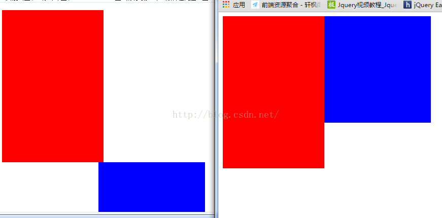
<style>
.box{ width:400px;}
.left{ width:200px;height:300px;background:red;float:left;}
.right{ width:200px;float:right;}
.div{width:180px;height:180px;background:blue;padding:15px;}
</style>
</head>
<body>
<div class="box">
	<div class="left"></div>
    <div class="right">
    	<div class="div"></div>
    </div>
</div>
</body>
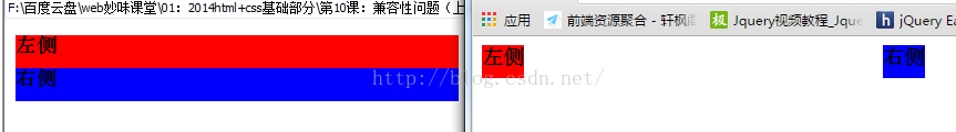
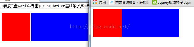
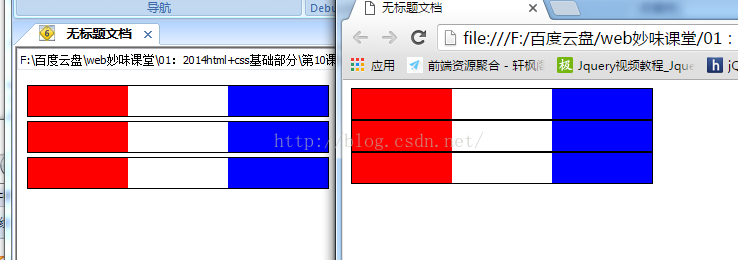
<style>
.box{ width:400px;}
.left{background:red;float:left;}
.right{float:right; background:blue;}
h3{margin:0;height:30px; <span style="color:#ff0000;"><strong><em>float:left;</em></strong></span> }
/*
	在IE6元素浮动,如果宽度需要内容撑开,就给里边的块元素都加浮动
*/
</style>
</head>
<body>
<div class="box">
	<div class="left">
    	<h3>左侧</h3>
    </div>
    <div class="right">
    	<h3>右侧</h3>
    </div>
</div>
</body>
<style> .left{width:100px;height:100px;background:Red; float:left;} .right{width:200px;height:100px;background:blue;(margin-left:100px;)<span style="color:#ff0000;"><em><strong>float:left;</strong></em></span>} /* 在IE6,7下元素要通过浮动并在同一行,就给这行元素都加浮动(本问题为3pxBUG) */ </style> </head> <body> <div class="box"> <div class="left"></div> <div class="right"></div> </div>- IE6下,最小高度为19px;解决办法:overflow:hidden;
- IE 6下,1px dotted #000不支持,解决办法:切背景平铺;
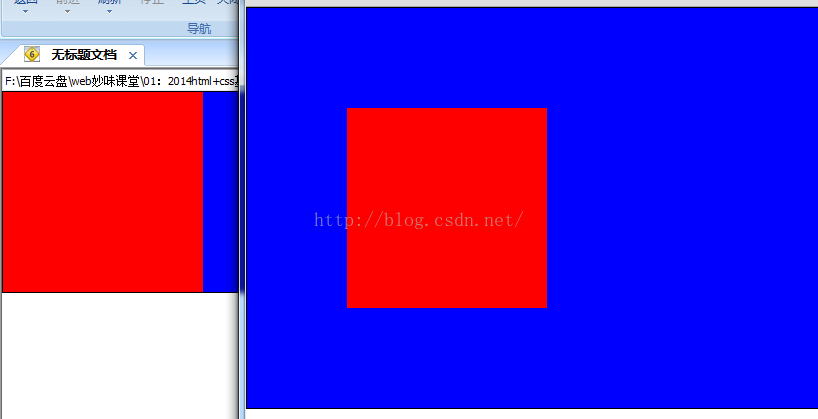
<style>
body{margin:0;}
.box{background:blue;border:1px solid #000;<span style="color:#ff0000;"><strong><em>zoom:1;</em></strong></span>}
.div{width:200px;height:200px;background:red;margin:100px;}
/*
	在IE6下解决margin传递要触发haslayout(解决:<span style="font-family: Arial, Helvetica, sans-serif;">zoom:1;</span>)
	在IE6下父级有边框的时候,子元素的margin值消失

	解决办法:触发父级的haslayout
*/
</style>
</head>
<body>
<div class="box">
	<div class="div"></div>
</div>
<style> body{margin:0;} .box{width:200px;height:200px;background:Red;float:left;margin:100px;} /* IE6下双边距BUG 在IE6,块元素有浮动和和横向的margin值 ,横向的margin值会被放大成两倍 解决办法: <span style="color:#ff0000;"><em><strong>display:inline;</strong></em></span> */ </style> </head> <body> <div class="box"></div> </body><style> .box{ float:left;border:10px solid #000;} .box div{width:100px;height:100px;background:Red;margin-right:20px;border:5px solid #ccc; float:left;} /* margin-right 一行右侧第一个元素有双边距(margin:第一个元素左侧,最后一个右侧有双边距) margin-left 一行左侧第一个元素有双边距 */ </style> </head> <body> <div class="box"> <div>1</div> <div>2</div> <div>3</div> <div>4</div> </div><pre name="code" class="html"><style> ul{margin:0;padding:0;width:302px;} li{ list-style:none;height:30px;border:1px solid #000; <strong><em><span style="color:#ff0000;">vertical-align:top;</span></em></strong>} a{width:100px;float:left;height:30px;background:Red;} span{width:100px;float:right;height:30px;background:blue;}</style><pre name="code" class="html"><body><ul><li> <span> </span><a href="#"></a> <span></span> </li><li> <span> </span><a href="#"></a> <span></span> </li> </ul> </body> /*在IE6,7下,li本身没浮动,但是li的内容有浮动,li下边就会产生一个间隙 解决办法: 1.给li加浮动,还需要加宽度width:300px; 2.给li加vertical-align,,,,,当IE6下最小高度问题,和 li的间隙问题共存的时候 给li加浮动*/
9.
<style>
.box{border:10px solid #000;width:600px; overflow:hidden;}
.box div{width:100px;height:100px;background:Red;margin:20px;border:5px solid #ccc; float:left; display:inline;}
/*
	当一行子元素占有的宽度之和和父级的宽度相差超过3px,或者有不满行状态的时候,最后一行子元素的下margin在IE6下就会失效(无解)
*/
</style>
10. IE6下的文字溢出BUG
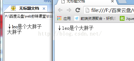
<style>
.box{ width:400px;}
.left{float:left;}
.right{width:400px;float:right;}
</style>
</head>
<body>
<div class="box">
	<div class="left"></div>
    <strong><em><span style="color:#ff0000;"><div></span></em></strong><!-- IE6下的文字溢出BUG --><span></span><span style="color:#ff0000;"><em><strong></div></strong></em></span>
    <div class="right">↓leo是个大胖子</div>
</div>
<!--
    子元素的宽度和父级的宽度相差小于3px的时候,两个浮动元素中间有注释或者内嵌元素
    解决办法:用div把注释或者内嵌元素用div包起来
-->
</body>
11.
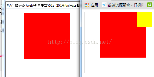
<style>
.box{ width:200px;height:200px;border:1px solid #000; position:relative;}
span{width:50px;height:50px;background:yellow; position:absolute;right:-20px;top:0;}
ul{width:150px;height:150px;background:Red;margin:0 0 0 50px;padding:0; float:left; display:inline;}
/*
	当浮动元素和绝对定位元素是并列关系的时候,在IE6下绝对定位元素会消失
	解决办法:
		给定位元素外面包个div
*/
</style>
</head>
<body>
<div class="box">
    <span style="color:#ff0000;"><strong><em><div></em></strong></span><ul></ul><span style="color:#ff0000;"><em><strong></div></strong></em></span>
    <span></span>
</div>
</body>
12.
<style>
.box{ width:200px;height:200px;border:1px solid #000; overflow:auto;<span style="font-family: Arial, Helvetica, sans-serif;"><span style="color:#ff0000;"><em><strong>position:relative;</strong></em></span></span><span style="font-family: Arial, Helvetica, sans-serif;"> }</span>
.div{ width:150px;height:300px;background:yellow; position:relative;}
/*
	在IE6,7下,子元素有相对定位的话,父级的overflow包不住子元素
	解决办法: 给父级也加相对定位
*/
</style>
</head>
<body>
<div class="box">
	<div class="div"></div>
</div>
</body>
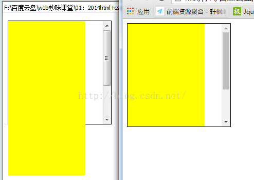
13.
<style>
.box{width:201px;height:201px;border:1px solid #000; position:relative;}
.box span{ width:20px;height:20px;background:yellow; position:absolute;right:-1px;bottom:-1px;}
/*
	在IE6下绝对定位元素的父级宽和高是奇数的时候,元素的right值和bottom值会有1px的偏差
*/
</style>
15.
<style>
.box{ width:200px;height:32px;border:1px solid red;}
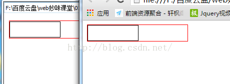
input{width:100px;height:30px;border:1px solid #000;margin:0;padding:0;<em><strong><span style="color:#ff0000;"> float:left</span></strong></em>}
/* 在IE6,7下输入类型的表单控件上下各有1px的间隙
解决办法:给input加浮动
<span style="white-space:pre"> </span>在IE6,7下输入类型的表单控件加border:none;无效
<span style="white-space:pre"> </span>解决办法: 重置input的背景 background:#fff;
<span style="white-space:pre"> </span>在IE6,7下输入类型的表单控件输入文字的时候,背景图片会跟着一块移动
<span style="white-space:pre"> </span>解决办法: 把背景图片加给父级,清掉自身背景<span style="font-family: Arial, Helvetica, sans-serif;">
*/</span><pre name="code" class="html"></style>
</head>
<body>
<div class="box">
<input type="text" />
</div>
</body>
16.css hack不建议使用
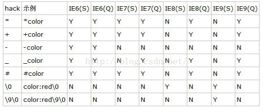
<style>
.box{ width:100px;height:100px;background:Red;background:blue\9; +background:yellow;_background:green;}
@media screen and (-webkit-min-device-pixel-ratio:0){.box{background:pink}}
/*
css hack:
	\9    IE10(包括)之前的IE浏览器解析
	+,*   IE7(包括)包括IE7之前的IE浏览器解析
	_     IE6包括IE6之前的IE浏览器
*/
</style>
17. !important 提升优先级
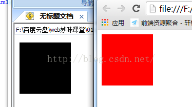
<style>
.box{width:100px;height:100px;background:red !important;background:pink;}
/*
	在IE6下 在important 后边在家一条同样的样式,会破坏掉important的作用,会按照默认的优先级顺序来走
*/
</style>
</head>
<body>
<div class="box" style="background:#000;"></div>
</body>
18.圣杯布局:左右宽度固定,中间宽度自适应伸缩,并且中间先加载
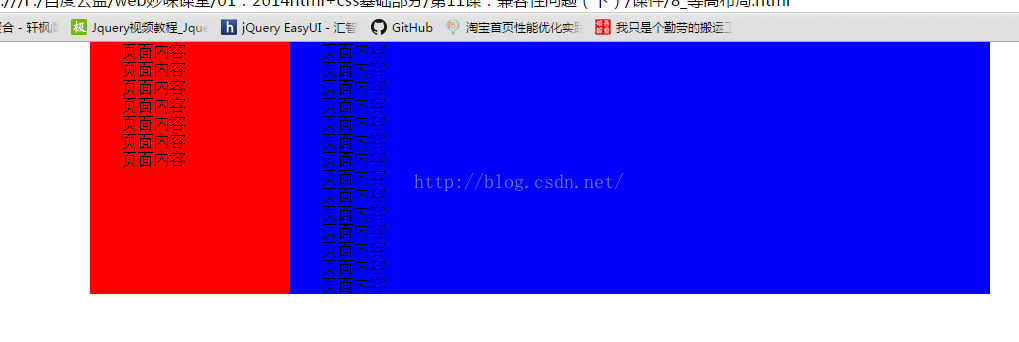
style>
body{margin:0;}
.center{height:600px;background:#f60;margin:0 200px;}
.left{width:200px;background:#fc0;height:600px; position:absolute;left:0;top:0;}
.right{width:200px;background:#fcc;height:600px;position:absolute;right:0;top:0;}
</style>
</head>
<body>
<div class="center"></div>
<div class="left"></div>
<div class="right"></div>
</body>
<style>
body{margin:0;}
.wrap{ width:900px;margin:0 auto;overflow:hidden;}
.left{width:200px;background:Red;float:left;padding-bottom:10000px;margin-bottom:-10000px;}
.right{width:700px;background:blue;float:right;padding-bottom:10000px;margin-bottom:-10000px;}
</style>
19.
img外部的border
产生条件:img外部有a标签,即img标签有链接时
解决办法:设置img边框border:0;
20.图片默认有边距
产生条件:img标签(每个img之后敲了回车)
解决办法:为img设置float的浮动布局方式。


 扫一扫
扫一扫


 被折叠的 条评论
为什么被折叠?
被折叠的 条评论
为什么被折叠?
 到【灌水乐园】发言


