


这一次,我倾尽所有,换你一世陪伴。
今天这篇列出常用控件Button的几种样式,只是简单列几个属性的,其他的自己研究吧。废话不多说,直接上效果图加代码。
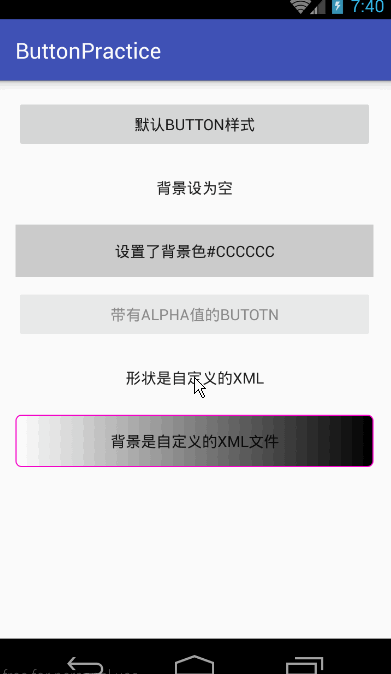
- activity_main.xml
<?xml version="1.0" encoding="utf-8"?>
<ScrollView
    android:layout_width="fill_parent"
    android:layout_height="wrap_content"
    xmlns:android="http://schemas.android.com/apk/res/android">
    <LinearLayout
        xmlns:tools="http://schemas.android.com/tools"
        android:layout_width="match_parent"
        android:layout_height="match_parent"
        android:paddingLeft="@dimen/activity_horizontal_margin"
        android:paddingRight="@dimen/activity_horizontal_margin"
        android:paddingTop="@dimen/activity_vertical_margin"
        android:paddingBottom="@dimen/activity_vertical_margin"
        android:orientation="vertical"
        tools:context=".MainActivity">

        <Button
            android:text="默认Button样式"
            android:layout_width="fill_parent"
            android:layout_height="wrap_content"
            android:layout_marginBottom="10dp"/>

        <Button
            android:text="背景设为空"
            android:layout_width="fill_parent"
            android:layout_height="wrap_content"
            android:background="@null"
            android:layout_marginBottom="10dp"/>

        <Button
            android:text="设置了背景色#CCCCCC"
            android:layout_width="fill_parent"
            android:layout_height="wrap_content"
            android:background="#CCCCCC"
            android:layout_marginBottom="10dp"/>
        <Button
            android:text="带有alpha值的Butotn"
            android:layout_width="fill_parent"
            android:layout_height="wrap_content"
            android:alpha="0.5"
            android:layout_marginBottom="10dp"/>

        <Button
            android:text="形状是自定义的xml"
            android:layout_width="fill_parent"
            android:layout_height="wrap_content"
            android:background="@drawable/circle_btn_shape"
            android:layout_marginBottom="10dp"/>

        <Button
            android:text="背景是自定义的xml文件"
            android:layout_width="fill_parent"
            android:layout_height="wrap_content"
            android:background="@drawable/button_style"
            android:layout_marginBottom="10dp"/>

    </LinearLayout>
</ScrollView>
其中有两个Button的background是自定义的两个xml下面给出来,这两个xml是放在drawable文件目录下的。
- button_style.xml
<?xml version="1.0" encoding="utf-8"?>
<selector xmlns:android="http://schemas.android.com/apk/res/android">
    <item android:state_pressed="true">
        <shape>
            <gradient
                android:startColor="#0d76e1"
                android:endColor="#0d76e1"
                android:angle="270" />
            <stroke
                android:width="1dip"
                android:color="#f403c9" />
            <corners
                android:radius="2dp" />
            <padding
                android:left="10dp"
                android:top="10dp"
                android:right="10dp"
                android:bottom="10dp" />
        </shape>
    </item>

    <item android:state_focused="true">
        <shape>
            <gradient
                android:startColor="#ffc2b7"
                android:endColor="#ffc2b7"
                android:angle="270" />
            <stroke
                android:width="1dip"
                android:color="#f403c9" />
            <corners
                android:radius="2dp" />
            <padding
                android:left="10dp"
                android:top="10dp"
                android:right="10dp"
                android:bottom="10dp" />
        </shape>
    </item>

    <item>
        <shape>
            <gradient
                android:startColor="#000000"
                android:endColor="#ffffff"
                android:angle="180" />
            <stroke
                android:width="1dip"
                android:color="#f403c9" />
            <corners
                android:radius="5dip" />
            <padding
                android:left="10dp"
                android:top="10dp"
                android:right="10dp"
                android:bottom="10dp" />
        </shape>
    </item>
</selector>- circle_btn_shape
<?xml version="1.0" encoding="utf-8"?>
<shape

    xmlns:android="http://schemas.android.com/apk/res/android"

    android:shape="oval">

    <!-- 填充的颜色 -->

    <solid android:color="#FFFFFF"/>

    <!-- 设置按钮的四个角为弧形 -->

    <!-- android:radius 弧形的半径 -->

    <corners android:radius="360dip"/>


    <!-- padding: Button 里面的文字与Button边界的间隔 -->

    <padding

        android:left="10dp"

        android:top="10dp"

        android:right="10dp"

        android:bottom="10dp"

        />

</shape>
部分内容摘自()。
- 可关注微信公众号(zhudekoudai 、smart_android)
- QQ群号: 413589216
- 专注Android分享:http://www.codernote.top/


 449
449


 被折叠的 条评论
为什么被折叠?
被折叠的 条评论
为什么被折叠?
 到【灌水乐园】发言


