Android应用开发笔记(10):制作自定义背景Button按钮、自定义形状Button的全攻略

在Android开发应用中,默认的Button是由系统渲染和管理大小的。而我们看到的成功的移动应用,都是有着酷炫的外观和使用体验的。因此,我们在开发产品的时候,需要对默认按钮进行美化。在本篇里,笔者结合在应用开发中的经验,探讨一下自定义背景的按钮、自定义形状按钮的实现方法。

首先看实现效果截图:

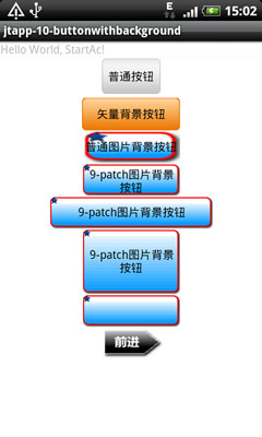
自定义背景的按钮目前有2种方式实现,矢量和位图。

1. 矢量图形绘制的方式

矢量图形绘制的方式实现简单,适合对于按钮形状和图案要求不高的场合。步骤如下:

(a) 使用xml定义一个圆角矩形,外围轮廓线实线、内填充渐变色,xml代码如下。

  • 1
    点赞
  • 159
    收藏
    觉得还不错? 一键收藏
  • 47
    评论
好的,以下是一个自定义Preference布局的示例代码,包含一个Button按钮并实现了点击事件: 首先,在res/layout目录下创建一个名为custom_preference.xml的布局文件,代码如下: ```xml <?xml version="1.0" encoding="utf-8"?> <LinearLayout xmlns:android="http://schemas.android.com/apk/res/android" android:layout_width="match_parent" android:layout_height="?android:attr/listPreferredItemHeight" android:gravity="center_vertical" android:paddingEnd="?android:attr/scrollbarSize"> <!-- Preference icon --> <ImageView android:id="@+android:id/icon" android:layout_width="wrap_content" android:layout_height="wrap_content" android:layout_marginStart="16dp" android:layout_marginEnd="10dp" android:layout_gravity="center_vertical" android:contentDescription="@null" /> <!-- Preference title and summary --> <LinearLayout android:layout_width="match_parent" android:layout_height="wrap_content" android:orientation="vertical"> <TextView android:id="@+android:id/title" android:layout_width="match_parent" android:layout_height="wrap_content" android:textAppearance="?android:attr/textAppearanceLargeInverse" android:textColor="?android:attr/textColorPrimaryInverse" android:singleLine="true" android:ellipsize="end" android:textStyle="bold" android:paddingTop="5dp" /> <TextView android:id="@+android:id/summary" android:layout_width="match_parent" android:layout_height="wrap_content" android:textAppearance="?android:attr/textAppearanceSmall" android:textColor="?android:attr/textColorSecondaryInverse" android:maxLines="3" android:ellipsize="end" android:paddingBottom="5dp" /> </LinearLayout> <!-- Custom button --> <Button android:id="@+id/custom_button" android:layout_width="wrap_content" android:layout_height="wrap_content" android:text="Custom Button" android:layout_marginEnd="10dp" android:onClick="onButtonClicked" /> </LinearLayout> ``` 其,我们添加了一个Button按钮,设置了其ID为custom_button,并在其添加了一个onClick属性,指向一个名为onButtonClicked的方法。 接着,在我们的Preference类,重写onBindViewHolder方法,以及实现onButtonClicked方法,完整代码如下: ```java public class CustomPreference extends Preference { public CustomPreference(Context context, AttributeSet attrs) { super(context, attrs); setLayoutResource(R.layout.custom_preference); } @Override public void onBindViewHolder(PreferenceViewHolder holder) { super.onBindViewHolder(holder); // Get the custom button view Button button = (Button) holder.findViewById(R.id.custom_button); // Set the click listener for the button button.setOnClickListener(new View.OnClickListener() { @Override public void onClick(View v) { // Do something when the button is clicked Toast.makeText(getContext(), "Custom button clicked", Toast.LENGTH_SHORT).show(); } }); } // Custom button click handler public void onButtonClicked(View view) { // Do something when the button is clicked Toast.makeText(getContext(), "Custom button clicked", Toast.LENGTH_SHORT).show(); } } ``` 在该类,我们重写了onBindViewHolder方法,通过ViewHolder获取了我们自定义布局Button,并设置了其点击事件。同时,我们还实现了一个名为onButtonClicked的方法,用于处理Button的点击事件。 最后,在我们的PreferenceActivity或PreferenceFragment,添加我们自定义的Preference: ```xml <PreferenceScreen xmlns:android="http://schemas.android.com/apk/res/android"> <PreferenceCategory android:title="Custom Preference Category"> <com.example.myapplication.CustomPreference android:key="custom_preference" android:title="Custom Preference" android:summary="This is a custom preference with a button" /> </PreferenceCategory> </PreferenceScreen> ``` 这样就完成了一个自定义Preference布局,并添加了一个Button按钮并实现了点击事件的示例。

“相关推荐”对你有帮助么?

  • 非常没帮助
  • 没帮助
  • 一般
  • 有帮助
  • 非常有帮助
提交
评论 47
添加红包

请填写红包祝福语或标题

红包个数最小为10个

红包金额最低5元

当前余额3.43前往充值 >
需支付:10.00
成就一亿技术人!
领取后你会自动成为博主和红包主的粉丝 规则
hope_wisdom
发出的红包
实付
使用余额支付
点击重新获取
扫码支付
钱包余额 0

抵扣说明:

1.余额是钱包充值的虚拟货币,按照1:1的比例进行支付金额的抵扣。
2.余额无法直接购买下载,可以购买VIP、付费专栏及课程。

余额充值