


High Level Of Abstraction
import matplotlib.pyplot as plt

# 2 simple lists of values
month = [1,1,2,2,4,5,5,7,8,10,10,11,12,12]
temperature = [32,15,40,35,50,55,52,80,85,60,57,45,35,105]
plt.scatter(month, temperature)
plt.show()
- 在上面这个散点图中,我们只提供了散点数据,其它的都是Matplotlib默认的设置,这可易理解为可视化的一种高级别的抽象。下面我们将深入到Matplotlib内部去套索Matplotlib是怎么工作的。
Figures And Subplots
Figure 是Matplotlib种的高级对象,它管理着整个图形区。一个Figure 就是一个容器,容纳着一些有意义的参数和方法:
- The figsize(w,h) parameter lets you specify the width w and height h,in inches, of the plotting area .
- The dpi parameter lets you specify the density, in dots per inch
- The .add_subplot() method lets you add individual plots to the
Figure instance
Subplot也是Matplotlib的对象,可以用它来创建图的坐标轴。一个Figure 可以容纳多个 Subplot,一般默认是一个plot。
- subplot(nrows, ncols, plot_number)里面的三个参数:将一个图形区划分为几个子图,plot_number表示当前操作所在的图形区域。例如下面代码将整个figure划分为4块,并且占用第三块,那么在上面画图的结果是指占用第三块并且会显示很小的图,其他的三块不会显示,不要以为不存在。
fig = plt.figure(figsize=(5,7))
ax = fig.add_subplot(2,2,3)
plt.show()

# Print the types
print(type(fig))
print(type(ax))
'''
<class 'matplotlib.figure.Figure'>
<class 'matplotlib.axes._subplots.AxesSubplot'>
'''
Axes
当调用.add_subplot()函数是会自动创建一个抽象类Subplot 的Axes 对象。这个Axes 对象控制着怎么绘图,一个Figure 可以容纳多个plots和多个Axes 对象,但是每一个Axes 只能属于一个Figure Subplots 和Axes 是同一种东西,但是调用Subplots 要更清楚更方便。
import numpy as np
month = [1,1,2,2,4,5,5,7,8,10,10,11,12,12]
temperature = [32,15,40,35,50,55,52,80,85,60,57,45,35,105]

fig = plt.figure()
ax = fig.add_subplot(1,1,1)
ax.set_xlim([0,14])
plt.show()
fig = plt.figure()
ax = fig.add_subplot(1,1,1)
ax.set_xlim([np.min(month), np.max(month)])
ax.set_ylim([np.min(temperature), np.max(temperature)])
plt.show()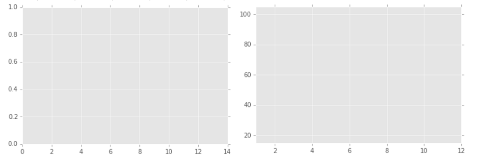
Adding Data
import numpy as np

month = [1,1,2,2,4,5,5,7,8,10,10,11,12,12]
temperature = [32,15,40,35,50,55,52,80,85,60,57,45,35,105]

fig = plt.figure()
ax = fig.add_subplot(1,1,1)
ax.set_xlim([np.min(month),np.max(month)])
ax.set_ylim([np.min(temperature), np.max(temperature)])

color = 'darkblue'
marker = 'o'

# run the .scatter() method, params: color, marker
ax.scatter(month, temperature, color=color, marker=marker)
plt.show()
Customizing The Plot
import numpy as np
month = [1,1,2,2,4,5,5,7,8,10,10,11,12,12]
temperature = [32,15,40,35,50,55,52,80,85,60,57,45,35,105]
fig = plt.figure()
ax = fig.add_subplot(1,1,1)
ax.set_xlim(0,13)
ax.set_ylim(10, 110)
ax.set_xlabel('Month')
ax.set_ylabel('Temperature')
ax.set_title('Year Round Temperature')

# run the .scatter() method, params: color, marker
ax.scatter(month, temperature, color='darkblue', marker='o')
plt.show()- 这上面的代码也可以用一句话表达:ax.set(xlim=(0,13), ylim=(10,110), xlabel=’Month’, ylabel=’Temperature’, title=’Year Round Temperature’)

Multiple Subplots
- 在前面提到过Subplots三个参数的意义,可以创建多子图。
fig = plt.figure()
ax1 = fig.add_subplot(2,1,1)
ax2 = fig.add_subplot(2,1,2)
Adding Data To Multiple Subplots
month_2013 = [1,2,3,4,5,6,7,8,9,10,11,12]
temperature_2013 = [32,18,40,40,50,45,52,70,85,60,57,45]
month_2014 = [1,2,3,4,5,6,7,8,9,10,11,12]
temperature_2014 = [35,28,35,30,40,55,50,71,75,70,67,49]

fig = plt.figure()
ax1 = fig.add_subplot(1,2,1)
ax2 = fig.add_subplot(1,2,2)

ax1.set(xlim=(0,13), ylim=(10,110), title='2013')
ax2.set(xlim=(0,13), ylim=(10,110), title='2014')

ax1.scatter(month_2013, temperature_2013, color='darkblue', marker='o')
ax2.scatter(month_2014, temperature_2014, color='darkgreen', marker='o')

plt.show()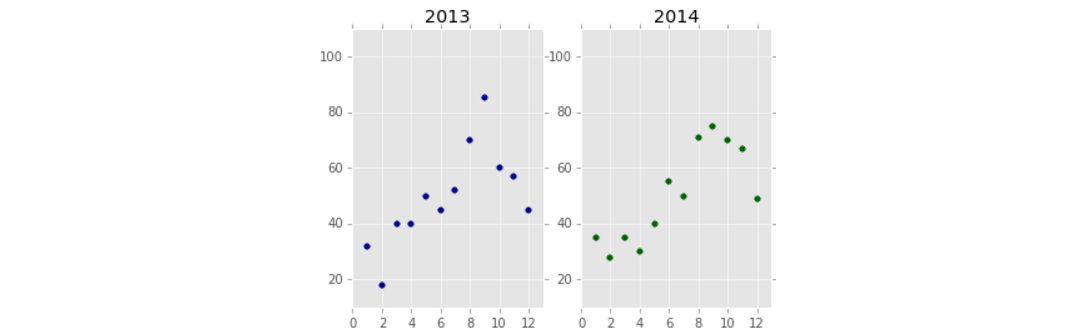


 1318
1318


 被折叠的 条评论
为什么被折叠?
被折叠的 条评论
为什么被折叠?
 到【灌水乐园】发言


