


目录
1.蜂窝热力图
2.变形地图
3.关联地图
4.气泡地图
5.choropleth地图
6.三维地理散点图
图表总结对比
以下是对地理特征类可视化图像的总结,涵盖蜂窝热力地图、变形地图等6种图表:
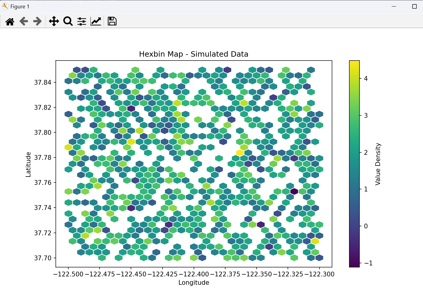
1. 蜂窝热力地图(Hexbin Map)
特点:
- 用六边形网格(蜂窝)划分地理区域,通过颜色深浅表示数据密度,兼具热力图的直观性和空间分布的规律性。
- 适合展示连续型数据的空间聚集特征,避免点重叠问题。
应用场景:
- 城市人口密度分析、交通流量热点识别、商业网点分布评估。
Python实现(基于Matplotlib):
import numpy as np
import matplotlib.pyplot as plt

# 生成模拟数据(经度、纬度、数值)
np.random.seed(0)
n = 1000
lon = np.random.uniform(-122.5, -122.3, n)  # 旧金山湾区模拟经度
lat = np.random.uniform(37.7, 37.85, n)     # 模拟纬度
values = np.random.randn(n) + 2            # 模拟数值

# 创建蜂窝热力地图
plt.figure(figsize=(10, 6))
hexbin = plt.hexbin(lon, lat, C=values, gridsize=30, cmap='viridis', edgecolor='white')
plt.colorbar(hexbin, label='Value Density')
plt.xlabel('Longitude')
plt.ylabel('Latitude')
plt.title('Hexbin Map - Simulated Data')
plt.gca().set_aspect('equal', adjustable='box')
plt.show()
结果示例:
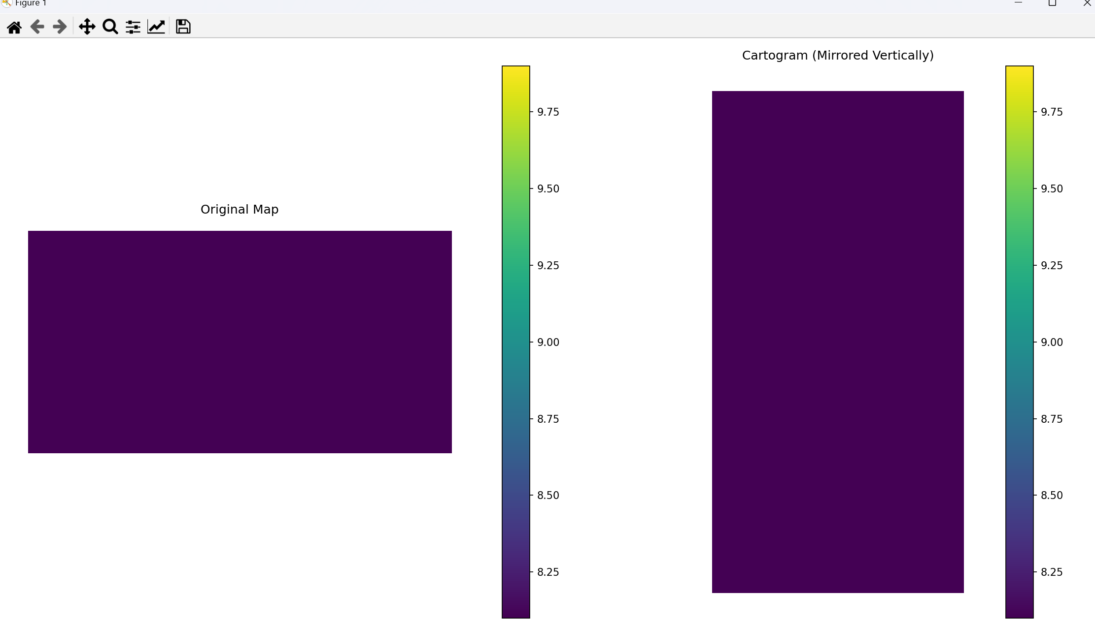
2. 变形地图(Cartogram)
特点:
- 根据属性数据(如人口、GDP)放大或缩小地理区域的面积,形状可能变形,但保持区域相对位置。
- 突出数据差异,弱化地理实际尺寸,适合对比区域间的数值差异。
应用场景:
- 选举结果可视化(人口加权)、经济指标区域对比、疾病传播范围与人口密度关联分析。
Python实现(基于PySAL):
import geopandas as gpd
import matplotlib.pyplot as plt
import numpy as np
from shapely.geometry import Polygon, MultiPolygon, Point

# 加载示例数据(美国各州)
try:
    # 尝试使用contextily获取地图数据
    import contextily as ctx

    usa = gpd.read_file(gpd.datasets.get_path('naturalearth_lowres')).query("name == 'United States of America'")
    if usa.empty:
        # 如果数据为空,创建简单的示例几何
        usa = gpd.GeoDataFrame({
            'name': ['USA'],
            'geometry': [Polygon([(-125, 25), (-125, 50), (-65, 50), (-65, 25)])]
        }, crs='EPSG:4326')
except:
    # 备选:创建简单的示例几何
    usa = gpd.GeoDataFrame({
        'name': ['USA'],
        'geometry': [Polygon([(-125, 25), (-125, 50), (-65, 50), (-65, 25)])]
    }, crs='EPSG:4326')

# 添加模拟数据用于变形
usa['value'] = np.random.randint(1, 10, len(usa))


def create_cartogram(geo_df, value_col, scale_factor=5):
    """创建基于数值的变形地图"""
    # 转换为投影坐标系以进行面积计算
    projected_df = geo_df.to_crs(epsg=3857)  # Web Mercator投影

    # 计算原始面积
    projected_df['original_area'] = projected_df.geometry.area

    # 基于值计算缩放因子
    max_value = projected_df[value_col].max()
    projected_df['scale'] = projected_df[value_col] / max_value * scale_factor

    # 创建变形后的几何
    cartogram_geoms = []
    for idx, row in projected_df.iterrows():
        geom = row.geometry
        centroid = geom.centroid

        # 根据值调整每个点到中心的距离
        if isinstance(geom, Polygon):
            new_coords = []
            for x, y in geom.exterior.coords:
                # 计算与中心的距离和角度
                dx = x - centroid.x
                dy = y - centroid.y
                distance = np.sqrt(dx ** 2 + dy ** 2)

                # 根据值缩放距离
                new_distance = distance * row['scale']

                # 计算新坐标
                angle = np.arctan2(dy, dx)
                new_x = centroid.x + new_distance * np.cos(angle)
                new_y = centroid.y + new_distance * np.sin(angle)
                new_coords.append((new_x, new_y))

            new_poly = Polygon(new_coords)
            cartogram_geoms.append(new_poly)

        elif isinstance(geom, MultiPolygon):
            new_polygons = []
            for poly in geom.geoms:
                new_coords = []
                for x, y in poly.exterior.coords:
                    dx = x - centroid.x
                    dy = y - centroid.y
                    distance = np.sqrt(dx ** 2 + dy ** 2)
                    new_distance = distance * row['scale']
                    angle = np.arctan2(dy, dx)
                    new_x = centroid.x + new_distance * np.cos(angle)
                    new_y = centroid.y + new_distance * np.sin(angle)
                    new_coords.append((new_x, new_y))

                new_poly = Polygon(new_coords)
                new_polygons.append(new_poly)

            new_multi = MultiPolygon(new_polygons)
            cartogram_geoms.append(new_multi)

    # 创建变形后的GeoDataFrame
    cartogram_df = gpd.GeoDataFrame(
        projected_df.drop(columns=['geometry']),
        geometry=cartogram_geoms,
        crs=projected_df.crs
    )

    # 转换回WGS 84坐标系
    return cartogram_df.to_crs(epsg=4326)


def mirror_geometry(geo_df, axis='vertical'):
    """镜像几何图形(垂直或水平)"""
    mirrored_geoms = []

    for geom in geo_df.geometry:
        if axis == 'vertical':  # 垂直镜像(左右翻转)
            if isinstance(geom, Polygon):
                new_coords = [(-x, y) for x, y in geom.exterior.coords]
                mirrored_geoms.append(Polygon(new_coords))
            elif isinstance(geom, MultiPolygon):
                new_polygons = []
                for poly in geom.geoms:
                    new_coords = [(-x, y) for x, y in poly.exterior.coords]
                    new_polygons.append(Polygon(new_coords))
                mirrored_geoms.append(MultiPolygon(new_polygons))

        elif axis == 'horizontal':  # 水平镜像(上下翻转)
            if isinstance(geom, Polygon):
                new_coords = [(x, -y) for x, y in geom.exterior.coords]
                mirrored_geoms.append(Polygon(new_coords))
            elif isinstance(geom, MultiPolygon):
                new_polygons = []
                for poly in geom.geoms:
                    new_coords = [(x, -y) for x, y in poly.exterior.coords]
                    new_polygons.append(Polygon(new_coords))
                mirrored_geoms.append(MultiPolygon(new_polygons))

    # 创建镜像后的GeoDataFrame
    return gpd.GeoDataFrame(
        geo_df.drop(columns=['geometry']),
        geometry=mirrored_geoms,
        crs=geo_df.crs
    )


# 创建变形地图
cartogram = create_cartogram(usa, 'value')

# 创建镜像版本
cartogram_mirrored = mirror_geometry(cartogram, axis='vertical')

# 可视化
fig, axes = plt.subplots(1, 2, figsize=(15, 8))

# 原始地图
usa.plot(ax=axes[0], column='value', cmap='viridis', legend=True)
axes[0].set_title('Original Map')
axes[0].set_axis_off()

# 变形+镜像地图
cartogram_mirrored.plot(ax=axes[1], column='value', cmap='viridis', legend=True)
axes[1].set_title('Cartogram (Mirrored Vertically)')
axes[1].set_axis_off()

plt.tight_layout()
plt.show()
结果示例:
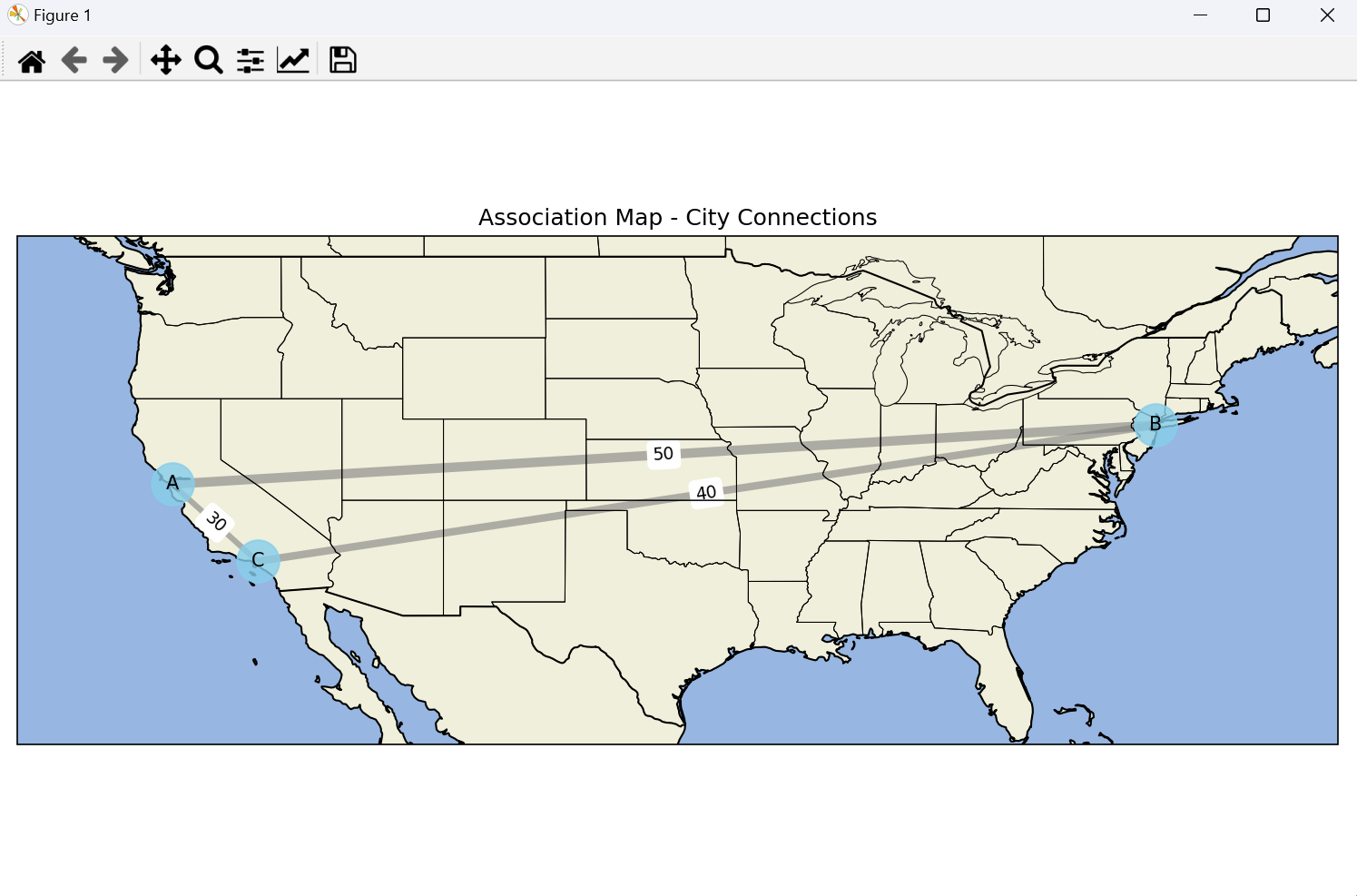
3. 关联地图(Association Map)
特点:
- 通过连线或箭头表示不同地理实体之间的关联(如贸易流、人口迁移、交通路线),可叠加流向强度(线宽/颜色)。
- 强调空间交互关系,适合展示网络数据或流动特征。
应用场景:
- 国际贸易路线可视化、城市间通勤流量分析、物流配送网络展示。
Python实现(基于NetworkX和Matplotlib):
import networkx as nx
import matplotlib.pyplot as plt
import cartopy.crs as ccrs
import cartopy.feature as cfeature

# 创建节点(经纬度坐标)
nodes = {
    'A': (-122.4, 37.8),   # 旧金山
    'B': (-74.0, 40.7),    # 纽约
    'C': (-118.2, 34.0)    # 洛杉矶
}
# 创建边(关联强度)
edges = [('A', 'B', 50), ('A', 'C', 30), ('B', 'C', 40)]

# 创建图形
plt.figure(figsize=(10, 6))
ax = plt.axes(projection=ccrs.PlateCarree())

# 添加地理特征
ax.add_feature(cfeature.LAND)
ax.add_feature(cfeature.OCEAN)
ax.add_feature(cfeature.COASTLINE)
ax.add_feature(cfeature.STATES, linewidth=0.5)
ax.add_feature(cfeature.BORDERS)

# 设置地图范围
ax.set_extent([-130, -65, 25, 50], crs=ccrs.PlateCarree())

# 创建网络图
G = nx.Graph()
G.add_nodes_from(nodes.keys())
G.add_weighted_edges_from(edges)

# 使用经纬度坐标
pos = {node: coords for node, coords in nodes.items()}

# 绘制节点和边
nx.draw_networkx_nodes(
    G, pos, node_size=500, node_color='skyblue', alpha=0.8, ax=ax)
nx.draw_networkx_labels(
    G, pos, font_size=10, font_family='sans-serif', ax=ax)

# 根据权重调整边的宽度
edge_widths = [d["weight"]/10 for _, _, d in G.edges(data=True)]
nx.draw_networkx_edges(
    G, pos, width=edge_widths, edge_color='gray', alpha=0.6, ax=ax)

# 添加边的权重标签
edge_labels = {(u, v): d["weight"] for u, v, d in G.edges(data=True)}
nx.draw_networkx_edge_labels(
    G, pos, edge_labels=edge_labels, font_size=9, ax=ax)

plt.title('Association Map - City Connections')
plt.tight_layout()
plt.show()
结果示例:
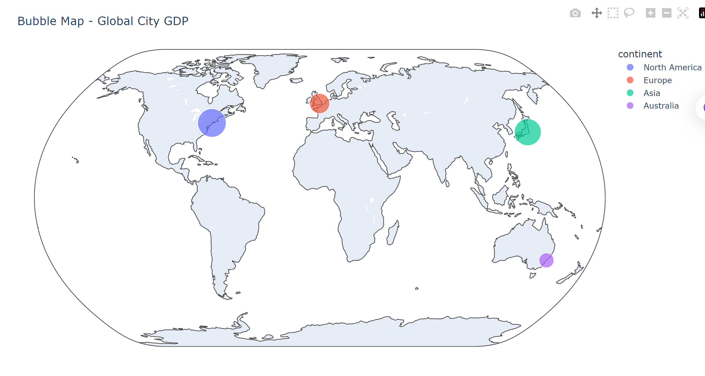
4. 气泡地图(Bubble Map)
特点:
- 用气泡(圆)的大小表示数值变量,位置对应地理坐标,颜色可表示分类变量。
- 直观展示“点-值”对应关系,适合多变量地理数据可视化。
应用场景:
- 城市GDP与人口对比、企业分支机构规模展示、灾害损失区域分布。
Python实现(基于Plotly):
import plotly.express as px
import pandas as pd

# 生成模拟数据
data = pd.DataFrame({
    'city': ['New York', 'London', 'Tokyo', 'Sydney'],
    'lat': [40.7128, 51.5074, 35.6895, -33.8688],
    'lon': [-74.0060, -0.1278, 139.6917, 151.2093],
    'gdp': [1.8, 0.9, 1.6, 0.5],  # 万亿美元
    'continent': ['North America', 'Europe', 'Asia', 'Australia']
})

# 创建气泡地图
fig = px.scatter_geo(
    data,
    lat='lat',
    lon='lon',
    size='gdp',
    color='continent',
    hover_name='city',
    size_max=30,
    projection='natural earth'
)
fig.update_layout(title='Bubble Map - Global City GDP')
fig.show()
结果示例:
5. choropleth地图(分级统计图)
特点:
- 按行政区域填充颜色或图案,颜色深浅表示属性值高低(如人均GDP、人口密度)。
- 适合展示面状数据的区域差异,简洁直观。
应用场景:
- 疫情感染率区域分布、选举结果州级展示、气候指标区域对比。
Python实现(基于Plotly):
import plotly.express as px
import pandas as pd

# 加载美国各州数据(GDP per capita)
data = px.data.gapminder().query("year == 2007").sort_values('gdpPercap', ascending=False)
data['iso_alpha'] = data['iso_alpha'].where(data['continent'] == 'Americas', None)  # 仅保留美洲国家

# 创建choropleth地图
fig = px.choropleth(
    data,
    locations='iso_alpha',
    color='gdpPercap',
    hover_name='country',
    color_continuous_scale='Viridis',
    range_color=(1000, 60000),
    projection='natural earth'  # 修改为正确的投影名称
)
fig.update_layout(title='Choropleth Map - GDP per Capita (2007, Americas)')
fig.show()
结果示例: 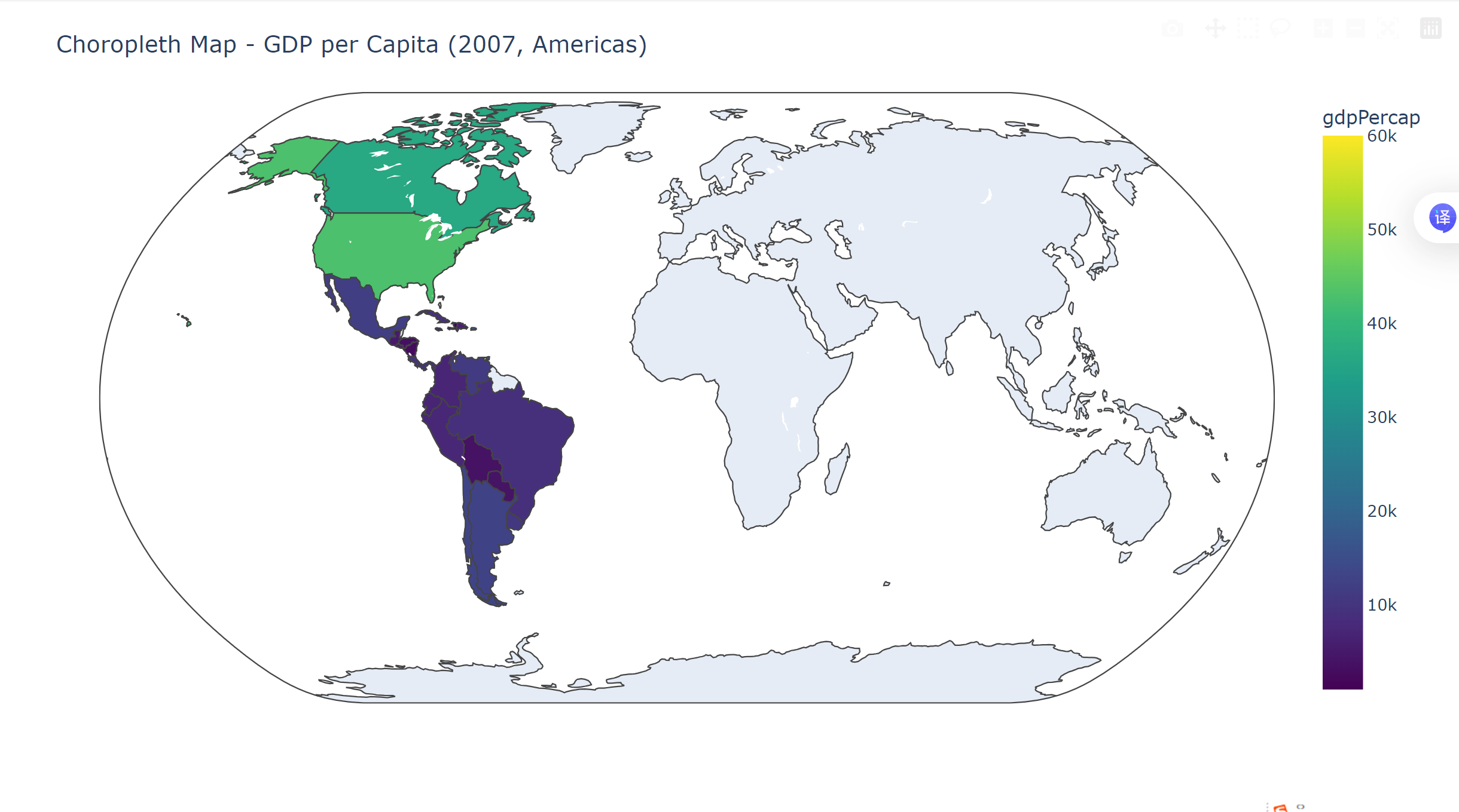
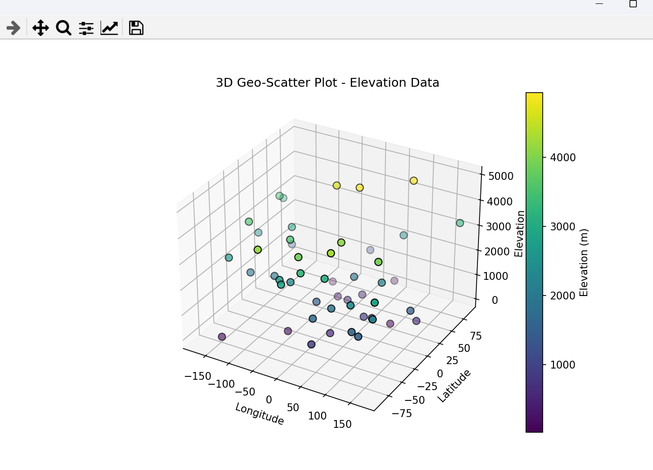
6. 三维地理散点图(3D Geo-Scatter Plot)
特点:
- 在三维空间中用散点表示地理实体,x/y轴为经纬度,z轴为数值变量(如海拔、人口数量)。
- 增强空间层次感,适合多维度数据探索。
应用场景:
- 地形海拔与植被覆盖分析、城市高层建筑分布、大气污染物垂直分布。
Python实现(基于Matplotlib):
import numpy as np
import matplotlib.pyplot as plt
from mpl_toolkits.mplot3d import Axes3D

# 生成模拟数据
np.random.seed(0)
n = 50
lon = np.random.uniform(-180, 180, n)
lat = np.random.uniform(-90, 90, n)
z = np.random.randint(0, 5000, n)  # 模拟海拔(米)

# 创建三维散点图
fig = plt.figure(figsize=(10, 6))
ax = fig.add_subplot(111, projection='3d')
scatter = ax.scatter(lon, lat, z, c=z, cmap='viridis', edgecolor='k', s=50)
plt.colorbar(scatter, label='Elevation (m)')
ax.set_xlabel('Longitude')
ax.set_ylabel('Latitude')
ax.set_zlabel('Elevation')
ax.set_title('3D Geo-Scatter Plot - Elevation Data')
plt.show()
结果示例:
图表总结对比
| 图表类型 | 核心特点 | 关键参数(Python) | 典型工具库 | 数据类型 |
|---|---|---|---|---|
| 蜂窝热力地图 | 六边形网格表示密度 | gridsize, cmap | Matplotlib | 点数据(连续型) |
| 变形地图 | 面积缩放反映属性值 | 数据源, 权重字段 | PySAL, Geopandas | 面数据(数值型) |
| 关联地图 | 连线表示空间交互关系 | 节点坐标, 边权重 | NetworkX, Matplotlib | 网络数据(关系型) |
| 气泡地图 | 气泡大小/颜色表示多变量 | 经纬度, 大小/颜色字段 | Plotly, Folium | 点数据(多变量) |
| Choropleth地图 | 区域颜色填充表示面数据 | 地理位置编码, 颜色字段 | Plotly, GeoPandas | 面数据(分级型) |
| 三维地理散点图 | 三维空间多维度展示 | 经纬度, z轴变量 | Matplotlib | 点数据(三维型) |
总结:
地理特征可视化需根据数据类型(点/面/网络)和分析目标(分布/关联/差异)选择图表。Python中常用工具包括Matplotlib(基础绘图)、Plotly(交互式可视化)、Geopandas/PySAL(地理空间分析),可灵活组合实现复杂地理图表。


 被折叠的 条评论
为什么被折叠?
被折叠的 条评论
为什么被折叠?
 到【灌水乐园】发言


