


当面试官说:请说一下什么是bfc?在css中有什么作用?
你会怎么说?
很多人会告诉你,bfc就是块级格式化上下文,那么这到底是什么意呢?
bfc的全称是Block Format Content,直译为块级格式化上下文,它是一个独立的渲染区域,也就是说,触发bfc的元素会形成一个独立的渲染区域,这个区域里面的元素(包括他自己)不会影响外部元素的渲染,
那么什么情况下,会形成bfc区域呢?
1、设置了float并且值为除none以外
2、设置overflow并且值是除visible以外的值(比如说hidden)
3、类型强制转换:display:inline-block、、table-cell、table-caption;
4、添加定位值为absolute或者fixed
5、有根元素、父元素或其他包含元素
1.当添加了float属性,且float不为none时
2.添加定位,positio值为absolute或fixed
3.将元素强制转换类型(display:inline-block,table-cell,table-caption)
4.有body根元素或者存在父元素,或其他包含元素
5.块元素添加overflow属性,且属性不能为visible
bfc能解决哪些问题?
1、解决外边距塌陷问题
当有两个div并且上边的div设置了margin-bottom:100px属性,下边的div设置了margin-top:100px;
我们会发现两个盒子上下距离不是200px而是100px,这种情况就叫做边距塌陷,而解决这种情况的方式就是在其中一个盒子外部套一个具有bfc属性的父盒子
实际情况如下:
<!DOCTYPE html>
<html lang="en">

<head>
    <meta charset="UTF-8">
    <meta name="viewport" content="width=device-width, initial-scale=1.0">
    <title>Document</title>
    <style>
        * {
            margin: 0;
            padding: 0;
        }

        div {
            width: 200px;
            height: 200px;
            background-color: aqua;
            margin: 100px;
        }
    </style>
</head>

<body>
    <div></div>
    <div></div>
</body>

</html>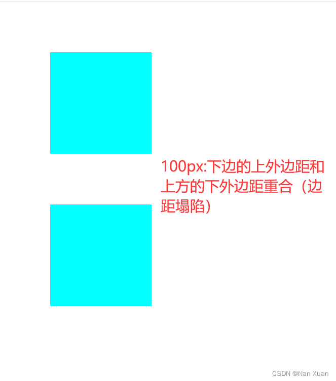
此时形成边距塌陷问题,解决办法如下:
<!DOCTYPE html>
<html lang="en">

<head>
    <meta charset="UTF-8">
    <meta name="viewport" content="width=device-width, initial-scale=1.0">
    <title>Document</title>
    <style>
        * {
            margin: 0;
            padding: 0;
        }

        .div1,
        .div2 {
            width: 200px;
            height: 200px;
            background-color: aqua;
            margin: 100px;
        }

        .container {
            /* 添加bfc的触发条件,让其形成bfc区域 */
            overflow: hidden;
        }
    </style>
</head>

<body>
    <div class="div1"></div>
    <div class="container">
        <div class="div2"></div>
    </div>
</body>

</html>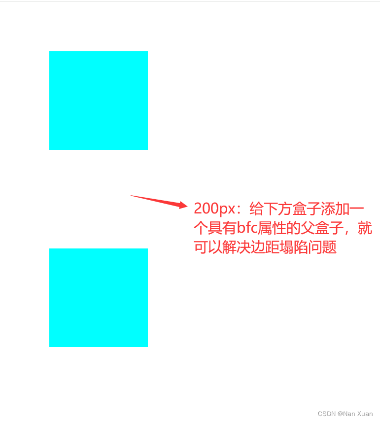
如此就解决了上下边距塌陷的问题
2、包含塌陷
当内部盒子设置margin-top属性时,父盒子会跟随内部盒子一起移动
实际情况如下:
<!DOCTYPE html>
<html lang="en">

<head>
    <meta charset="UTF-8">
    <meta name="viewport" content="width=device-width, initial-scale=1.0">
    <title>Document</title>
    <style>
        * {
            margin: 0;
            padding: 0;
        }

        .father {
            width: 150px;
            height: 150px;
            background-color: aqua;
        }

        .son {
            width: 100px;
            height: 100px;
            background-color: rgb(8, 240, 101);
            margin-top: 100px;
        }
    </style>
</head>

<body>
    <div class="father">
        <div class="son"></div>
    </div>
</body>

</html>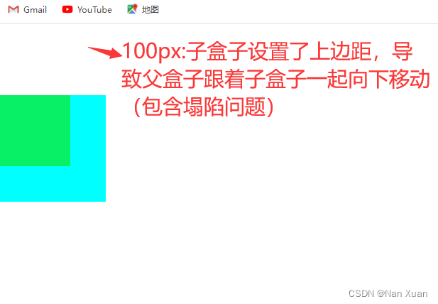
3、清除浮动元素给后面的元素带来的影响
实际情况如下:
<!DOCTYPE html>
<html lang="en">

<head>
    <meta charset="UTF-8">
    <meta name="viewport" content="width=device-width, initial-scale=1.0">
    <title>Document</title>
    <style>
        * {
            margin: 0;
            padding: 0;
        }

        div {
            width: 100px;
            height: 100px;
        }

        .box1 {
            background-color: red;
            /* float: left; */
        }

        .box2 {
            background-color: blue;
            /* float: left; */
        }

        .box3 {
            width: 150px;
            height: 150px;
            background-color: aqua;
        }
    </style>
</head>

<body>
    <div class="box1"></div>
    <div class="box2"></div>
    <div class="box3"></div>
</body>

</html>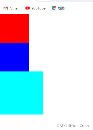
页面中有三个盒子,仅仅只设置宽高背景颜色,接下来,如果我们给上面两个盒子设置了float:left属性,那么会发生下面的情况:
<!DOCTYPE html>
<html lang="en">

<head>
    <meta charset="UTF-8">
    <meta name="viewport" content="width=device-width, initial-scale=1.0">
    <title>Document</title>
    <style>
        * {
            margin: 0;
            padding: 0;
        }

        div {
            width: 100px;
            height: 100px;
        }

        .box1 {
            background-color: red;
            float: left;
        }

        .box2 {
            background-color: blue;
            float: left;
        }

        .box3 {
            width: 150px;
            height: 150px;
            background-color: aqua;
        }
    </style>
</head>

<body>
    <div class="box1"></div>
    <div class="box2"></div>
    <div class="box3"></div>
</body>

</html>
上图可以看出,第三个盒子被上面两个盒子盖住了,为了解决这种情况,我们在这里扩展一下清除浮动的方法:
1、给浮动元素添加具有bfc属性的盒子,这里我们通常会给父元素设置overflow:hidden;属性
<!DOCTYPE html>
<html lang="en">

<head>
    <meta charset="UTF-8">
    <meta name="viewport" content="width=device-width, initial-scale=1.0">
    <title>Document</title>
    <style>
        * {
            margin: 0;
            padding: 0;
        }

        .bfc div {
            width: 100px;
            height: 100px;
        }

        .box1 {
            background-color: red;
            float: left;
        }

        .box2 {
            background-color: blue;
            float: left;
        }

        .box3 {
            width: 150px;
            height: 150px;
            background-color: aqua;
        }

        .bfc {
            overflow: hidden;
        }
    </style>
</head>

<body>
    <div class="bfc">
        <div class="box1"></div>
        <div class="box2"></div>
    </div>
    <div class="box3"></div>
</body>

</html>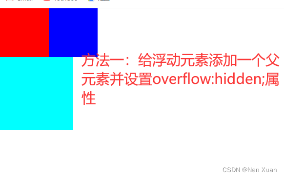
2、隔墙法
在浮动元素后面添加一个没有宽高的盒子并设置属性:clear:both;
<!DOCTYPE html>
<html lang="en">

<head>
    <meta charset="UTF-8">
    <meta name="viewport" content="width=device-width, initial-scale=1.0">
    <title>Document</title>
    <style>
        * {
            margin: 0;
            padding: 0;
        }

        .box1,
        .box2 {
            width: 100px;
            height: 100px;
            float: left;
        }

        .box1 {
            background-color: red;
        }

        .box2 {
            background-color: blue;

        }

        .box3 {
            width: 150px;
            height: 150px;
            background-color: aqua;
        }

        .aaa {
            clear: both;
        }
    </style>
</head>

<body>
    <div class="box1"></div>
    <div class="box2"></div>
    <div class="aaa"></div>
    <div class="box3"></div>
</body>

</html>
3、伪元素法 (最常用)
给浮动元素一个父元素并设置如下属性:
.clearfix::after {
content: "";
display: block;
width: 0;
height: 0;
overflow: hidden;
clear: both;
}
<!DOCTYPE html>
<html lang="en">

<head>
    <meta charset="UTF-8">
    <meta name="viewport" content="width=device-width, initial-scale=1.0">
    <title>Document</title>
    <style>
        * {
            margin: 0;
            padding: 0;
        }

        .box1,
        .box2 {
            width: 100px;
            height: 100px;
            float: left;
        }

        .box1 {
            background-color: red;
        }

        .box2 {
            background-color: blue;

        }

        .box3 {
            width: 150px;
            height: 150px;
            background-color: aqua;
        }

        .clearfix::after {
            content: "";
            display: block;
            width: 0;
            height: 0;
            overflow: hidden;
            clear: both;
        }
    </style>
</head>

<body>
    <div class="clearfix">
        <div class="box1"></div>
        <div class="box2"></div>
    </div>
    <div class="box3"></div>
</body>

</html>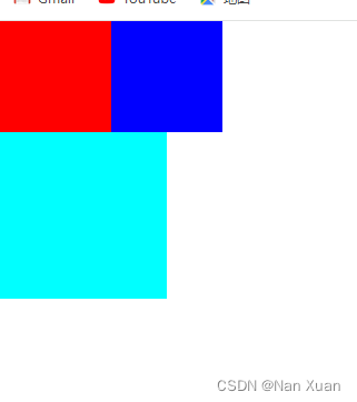
上述三种方法都能清除浮动,第一种最简单,第三种最常用也最专业,第二种不推荐使用。第二种和第三种的思想非常相似,但是第二种直接加元素会影响整体布局的结构合理性,第三种相较而言会更好。


 1515
1515


 被折叠的 条评论
为什么被折叠?
被折叠的 条评论
为什么被折叠?
 到【灌水乐园】发言


