


子组件
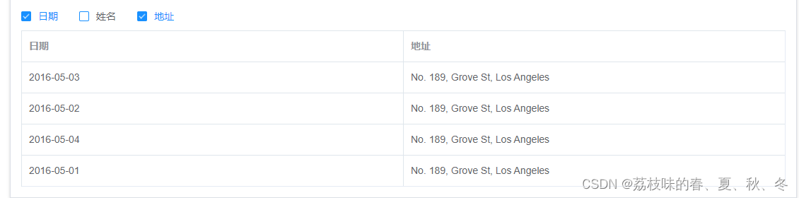
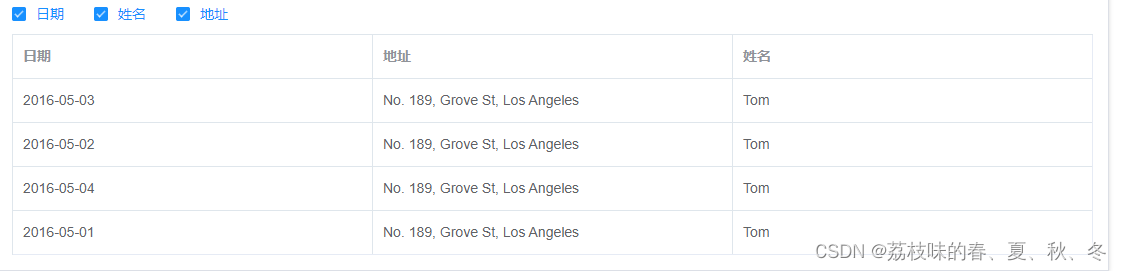
效果图
<template>
	<div>
		<!-- 表头复选框,checkList数组里面是代表选中的文本框 -->
	 <div class="filter-container checkbox">
		<el-checkbox-group v-model="checkList">
		<el-checkbox v-for="item in tableColConfig" :label="item.label"></el-checkbox>
	</el-checkbox-group>
    </div>
	<!-- tableData是组件传过来的 -->
	<el-table
		:border="border"
		:data="tableData">
		<el-table-column
			v-for="item in checkHead"
			:key="item.prop"
			:prop="item.prop"
			:label="item.label">
			<!-- 如果存在 slotName 属性,则加入动态插槽 -->
			<template #default="scope">
				<template v-if="item.slotName">
					<slot
						:name="item.slotName"
						:row="scope.row"></slot>
				</template>
				<template v-else>
					<span>{{ scope.row[item.prop] }}</span>
				</template>
			</template>
		</el-table-column>
	</el-table>
	</div>
</template>
js
<script>
export default {
	props: {
		// 实际显示的表格数据
		tableData: {
			type: Array,
			default: () => []
		},
		// 配置表格的数据
		tableColConfig: {
			type: Array,
			default: () => []
		},
		// 是否显示边框
		border: {
			type: Boolean,
			default: true
		}
	},
	data() {
		return {
			checkList: [],
			checkHead:[]
		}
	},
    mounted() {
		// 将父组件传过来的表头数据给子组件
		this.checkHead = this.tableColConfig
		//复选框需要的内容
		this.tableColConfig.forEach(item => {
			this.checkList.push(item.label)
		});
    },
	//通过复选框改变表头时的操作
	watch:{
		checkList:{
			handler(){
				this.checkHead = []
				this.checkList.forEach(item => {
					this.tableColConfig.forEach(element => {
						if(item == element.label){
							this.checkHead.push(element)
						}
					});
				});
            //下面的代码可以在动态改变时,表头顺序和复选框顺序一样
            // this.tableColConfig.forEach(element => {
				// 	this.checkList.forEach((item,index) => {
				// 		if(item == element.label){
				// 			this.checkHead.push(element)
				// 		}
				// 	});
				// });
			},
			deep:true
		}
	}
}
</script>
父组件
<template>
  <Table :tableData="tableData" :tableColConfig="tableColConfig">
  </Table>
</template>
表数据
tableData: [{
        date: '2016-05-03',
        name: 'Tom',
        address: 'No. 189, Grove St, Los Angeles'
      },
      {
        date: '2016-05-02',
        name: 'Tom',
        address: 'No. 189, Grove St, Los Angeles'
      },
      {
        date: '2016-05-04',
        name: 'Tom',
        address: 'No. 189, Grove St, Los Angeles'
      },
      {
        date: '2016-05-01',
        name: 'Tom',
        address: 'No. 189, Grove St, Los Angeles'
      }]
表头数据格式
tableColConfig : [
      { prop: 'date', label: '日期' },
      { prop: 'name', label: '姓名' },
      { prop: 'address', label: '地址'}
    ]
当需要使用插槽时,表头数据格式写成这样
 tableColConfig : [
      { prop: 'date', label: '日期' },
      { prop: 'name', label: '姓名' },
      { prop: 'address', label: '地址', slotName:'address' }
    ]
模板里面使用
 <Table style="margin-top: 30px;" :tableData="tableData" :tableColConfig="tableColConfig">
    <template #address>
      <el-button type="primary">操作</el-button>
    </template>
  </Table>
<Table style="margin-top: 30px;" :tableData="tableData" :tableColConfig="tableColConfig">
<template #address="{row}">
<!-- row是一整条数据的信息 -->
{{ row.date }}
</template>
</Table>好的,就到这里了,有任何问题欢迎大家指正


 919
919

 被折叠的 条评论
为什么被折叠?
被折叠的 条评论
为什么被折叠?
 到【灌水乐园】发言


