


android:width=“24dp”
android:height=“24dp”
android:tint=“#FFFFFF”
android:viewportWidth=“24.0”
android:viewportHeight=“24.0”>
<path
android:fillColor=“@android:color/white”
android:pathData=“M4,18h16c0.55,0 1,-0.45 1,-1l0,0c0,-0.55 -0.45,-1 -1,-1H4c-0.55,0 -1,0.45 -1,1l0,0C3,17.55 3.45,18 4,18zM4,13h16c0.55,0 1,-0.45 1,-1l0,0c0,-0.55 -0.45,-1 -1,-1H4c-0.55,0 -1,0.45 -1,1l0,0C3,12.55 3.45,13 4,13zM3,7L3,7c0,0.55 0.45,1 1,1h16c0.55,0 1,-0.45 1,-1l0,0c0,-0.55 -0.45,-1 -1,-1H4C3.45,6 3,6.45 3,7z” />
这是一个白色的菜单图标,下面回到MainActivity中,先声明变量。
private DrawerLayout drawerLayout;//滑动菜单
然后在onCreate中添加如下代码:
toolbar = findViewById(R.id.toolbar);
//工具栏按钮点击
toolbar.setNavigationOnClickListener(v -> drawerLayout.openDrawer(GravityCompat.START));
点击之后打开这个滑动菜单。
下面你再运行一下:

这样就简洁雅致了很多了。
现在我们的滑动菜单用的是一个LinearLayout,虽然用起来没有很大的问题,但是如果有更好的控件为什么不用呢?下面就来介绍一下NavigationView,不过要在AS中使用这个控件还需要添加一个依赖库:
打开你app下的build.gradle,在dependencies{}闭包中添加如下依赖
//添加material库
implementation ‘com.google.android.material:material:1.2.1’
添加之后记得点击Sync Now进行同步项目。
然后修改activity_main.xml,去掉之前的滑动菜单,修改的页面布局代码如下:
<?xml version="1.0" encoding="utf-8"?><androidx.drawerlayout.widget.DrawerLayout xmlns:android=“http://schemas.android.com/apk/res/android”
xmlns:app=“http://schemas.android.com/apk/res-auto”
xmlns:tools=“http://schemas.android.com/tools”
android:id=“@+id/drawer_layout”
android:layout_width=“match_parent”
android:layout_height=“match_parent”
tools:context=“.MainActivity”>
<LinearLayout
android:layout_width=“match_parent”
android:layout_height=“match_parent”
android:background=“@drawable/bg”
android:fitsSystemWindows=“true”>
<androidx.appcompat.widget.Toolbar
android:id=“@+id/toolbar”
android:layout_width=“match_parent”
android:layout_height=“?attr/actionBarSize”
app:navigationIcon=“@drawable/icon_menu” />
<com.google.android.material.navigation.NavigationView
android:id=“@+id/nav_view”
android:layout_width=“match_parent”
android:layout_height=“match_parent”
android:layout_gravity=“start” />
</androidx.drawerlayout.widget.DrawerLayout>
不过就算是这样,你当前还需要添加导航视图的头部视图和菜单视图。
在layout下新建一个nav_header.xml,作为导航的头部视图,常规的我们会在导航视图里面放置一些个人信息,头像,名称等。
那么头像是一个图片,而且普遍是圆形图片,常规是通过一些第三方库和自定义VIew来实现。还记得我们刚才导入的material库吗?可以用它里面的控件来实现圆形头像。
首先我们在styles.xml中增加如下代码:
然后在nav_header.xml增加一个图标控件和两个文字控件,里面代码如下:
<?xml version="1.0" encoding="utf-8"?><RelativeLayout xmlns:android=“http://schemas.android.com/apk/res/android”
xmlns:app=“http://schemas.android.com/apk/res-auto”
android:layout_width=“match_parent”
android:layout_height=“160dp”
android:background=“#1391F8”
android:fitsSystemWindows=“true”
android:orientation=“vertical”>
<com.google.android.material.imageview.ShapeableImageView
android:id=“@+id/iv_avatar”
android:layout_width=“80dp”
android:layout_height=“80dp”
android:layout_alignParentBottom=“true”
android:layout_marginStart=“24dp”
android:layout_marginBottom=“30dp”
android:padding=“1dp”
android:layout_marginEnd=“24dp”
android:src=“@mipmap/icon_default_avatar”
app:shapeAppearanceOverlay=“@style/circleImageStyle”
app:strokeColor=“#FFF”
app:strokeWidth=“2dp” />
<TextView
android:layout_marginTop=“16dp”
android:layout_alignTop=“@+id/iv_avatar”
android:id=“@+id/tv_name”
android:textSize=“16sp”
android:textColor=“#FFF”
android:layout_width=“wrap_content”
android:layout_height=“wrap_content”
android:layout_toEndOf=“@+id/iv_avatar”
android:text=“初学者-Study” />
<TextView
android:layout_marginTop=“8dp”
android:id=“@+id/tv_tip”
android:textSize=“14sp”
android:layout_below=“@+id/tv_name”
android:textColor=“#FFF”
android:layout_width=“wrap_content”
android:layout_height=“wrap_content”
android:layout_toEndOf=“@+id/iv_avatar”
android:text=“Android | Java” />
这里有一个icon_default_avatar的图标,也是我博客的头像,如下图所示
那么这个导航视图的头部就写好了,下面来写导航菜单。
在这之前能先放置五个图标,都是通过路径来绘制的。都放在drawable下。
icon_friend.xml
<?xml version="1.0" encoding="UTF-8"?><vector xmlns:android=“http://schemas.android.com/apk/res/android”
android:width=“24dp”
android:height=“24dp”
android:tint=“#000000”
android:viewportWidth=“24.0”
android:viewportHeight=“24.0”>
<path
android:fillColor=“@android:color/black”
android:pathData=“M15,8c0,-1.42 -0.5,-2.73 -1.33,-3.76C14.09,4.1 14.53,4 15,4c2.21,0 4,1.79 4,4s-1.79,4 -4,4c-0.43,0 -0.84,-0.09 -1.23,-0.21c-0.03,-0.01 -0.06,-0.02 -0.1,-0.03C14.5,10.73 15,9.42 15,8zM16.66,13.13C18.03,14.06 19,15.32 19,17v3h4v-3C23,14.82 19.42,13.53 16.66,13.13zM9,4c2.21,0 4,1.79 4,4s-1.79,4 -4,4s-4,-1.79 -4,-4S6.79,4 9,4zM9,13c2.67,0 8,1.34 8,4v3H1v-3C1,14.34 6.33,13 9,13z” />
icon_wallet.xml
<?xml version="1.0" encoding="UTF-8"?><vector xmlns:android=“http://schemas.android.com/apk/res/android”
android:width=“24dp”
android:height=“24dp”
android:tint=“#000000”
android:viewportWidth=“24.0”
android:viewportHeight=“24.0”>
<path
android:fillColor=“@android:color/black”
android:pathData=“M10,16V8c0,-1.1 0.89,-2 2,-2h9V5c0,-1.1 -0.9,-2 -2,-2H5C3.89,3 3,3.9 3,5v14c0,1.1 0.89,2 2,2h14c1.1,0 2,-0.9 2,-2v-1h-9C10.89,18 10,17.1 10,16zM13,8c-0.55,0 -1,0.45 -1,1v6c0,0.55 0.45,1 1,1h8c0.55,0 1,-0.45 1,-1V9c0,-0.55 -0.45,-1 -1,-1H13zM16,13.5c-0.83,0 -1.5,-0.67 -1.5,-1.5s0.67,-1.5 1.5,-1.5s1.5,0.67 1.5,1.5S16.83,13.5 16,13.5z” />
icon_location.xml
<?xml version="1.0" encoding="UTF-8"?><vector xmlns:android=“http://schemas.android.com/apk/res/android”
android:width=“24dp”
android:height=“24dp”
android:tint=“#000000”
android:viewportWidth=“24.0”
android:viewportHeight=“24.0”>
<path
android:fillColor=“@android:color/black”
android:pathData=“M13.02,20.77L13.02,20.77c0,0.64 0.59,1.13 1.21,0.99c1.12,-0.26 2.18,-0.7 3.12,-1.3c0.53,-0.34 0.61,-1.1 0.16,-1.55l0,0c-0.32,-0.32 -0.83,-0.4 -1.21,-0.16c-0.77,0.49 -1.62,0.85 -2.53,1.05C13.32,19.9 13.02,20.31 13.02,20.77z” />
<path
android:fillColor=“@android:color/black”
android:pathData=“M4.03,12c0,-3.79 2.65,-6.97 6.2,-7.79c0.44,-0.1 0.75,-0.51 0.75,-0.96v0c0,-0.64 -0.6,-1.13 -1.22,-0.98C5.33,3.29 2.03,7.26 2.03,12c0,4.74 3.3,8.71 7.73,9.74c0.62,0.15 1.22,-0.34 1.22,-0.98v0c0,-0.46 -0.31,-0.86 -0.75,-0.96C6.68,18.97 4.03,15.79 4.03,12z” />
<path
android:fillColor=“@android:color/black”
android:pathData=“M20.79,11L20.79,11c0.64,0 1.13,-0.59 0.99,-1.21c-0.26,-1.12 -0.7,-2.17 -1.3,-3.12c-0.34,-0.54 -1.1,-0.61 -1.55,-0.16l0,0c-0.32,0.32 -0.4,0.83 -0.15,1.21c0.49,0.76 0.85,1.61 1.05,2.53C19.92,10.7 20.33,11 20.79,11z” />
<path
android:fillColor=“@android:color/black”
android:pathData=“M17.35,3.55c-0.95,-0.6 -2,-1.04 -3.12,-1.3c-0.62,-0.14 -1.21,0.35 -1.21,0.98v0c0,0.45 0.3,0.87 0.74,0.96c0.91,0.2 1.77,0.57 2.53,1.05c0.39,0.24 0.89,0.17 1.21,-0.16l0,0C17.96,4.64 17.89,3.89 17.35,3.55z” />
<path
android:fillColor=“@android:color/black”
android:pathData=“M18.92,17.49L18.92,17.49c0.45,0.45 1.21,0.38 1.55,-0.16c0.6,-0.94 1.04,-2 1.3,-3.12c0.14,-0.62 -0.35,-1.21 -0.98,-1.21h0c-0.45,0 -0.87,0.3 -0.96,0.74c-0.2,0.91 -0.57,1.77 -1.05,2.53C18.52,16.66 18.6,17.17 18.92,17.49z” />
<path
android:fillColor=“@android:color/black”
android:pathData=“M16,11.1C16,8.61 14.1,7 12,7s-4,1.61 -4,4.1c0,1.51 1.1,3.28 3.31,5.3c0.39,0.36 0.98,0.36 1.38,0C14.9,14.37 16,12.61 16,11.1zM12,12c-0.59,0 -1.07,-0.48 -1.07,-1.07c0,-0.59 0.48,-1.07 1.07,-1.07s1.07,0.48 1.07,1.07C13.07,11.52 12.59,12 12,12z” />
icon_phone.xml
<?xml version="1.0" encoding="UTF-8"?><vector xmlns:android=“http://schemas.android.com/apk/res/android” android:height=“24dp”
android:tint=“#000000”
android:viewportHeight=“24.0”
android:viewportWidth=“24.0”
android:width=“24dp”>
<path android:fillColor=“@android:color/white”
android:pathData=“M15.63,14.4l-2.52,2.5c-2.5,-1.43 -4.57,-3.5 -6,-6l2.5,-2.52c0.23,-0.24 0.33,-0.57 0.27,-0.9L9.13,3.8C9.04,3.34 8.63,3 8.15,3L4,3C3.44,3 2.97,3.47 3,4.03C3.17,6.92 4.05,9.63 5.43,12c1.58,2.73 3.85,4.99 6.57,6.57c2.37,1.37 5.08,2.26 7.97,2.43c0.56,0.03 1.03,-0.44 1.03,-1l0,-4.15c0,-0.48 -0.34,-0.89 -0.8,-0.98l-3.67,-0.73C16.2,14.07 15.86,14.17 15.63,14.4z”/>
icon_email.xml
<?xml version="1.0" encoding="UTF-8"?><vector xmlns:android=“http://schemas.android.com/apk/res/android” android:height=“24dp”
android:tint=“#000000”
android:viewportHeight=“24.0”
android:viewportWidth=“24.0”
android:width=“24dp”>
<path android:fillColor=“@android:color/white”
android:pathData=“M20,4H4C2.9,4 2.01,4.9 2.01,6L2,18c0,1.1 0.9,2 2,2h16c1.1,0 2,-0.9 2,-2V6C22,4.9 21.1,4 20,4zM19.6,8.25l-7.07,4.42c-0.32,0.2 -0.74,0.2 -1.06,0L4.4,8.25C4.15,8.09 4,7.82 4,7.53c0,-0.67 0.73,-1.07 1.3,-0.72L12,11l6.7,-4.19C19.27,6.46 20,6.86 20,7.53C20,7.82 19.85,8.09 19.6,8.25z”/>
然后我们在res下新建一个menu文件夹,文件夹下新建一个nav_menu.xml文件。里面的代码如下:
<?xml version="1.0" encoding="utf-8"?><item
android:id=“@+id/item_friend”
android:icon=“@drawable/icon_friend”
android:title=“朋友” />
<item
android:id=“@+id/item_wallet”
android:icon=“@drawable/icon_wallet”
android:title=“钱包” />
<item
android:id=“@+id/item_location”
android:icon=“@drawable/icon_location”
android:title=“位置” />
<item
android:id=“@+id/item_phone”
android:icon=“@drawable/icon_phone”
android:title=“电话” />
<item
android:id=“@+id/item_email”
android:icon=“@drawable/icon_email”
android:title=“邮箱” />
此时你会在预览的地方看到这样的画面

不用担心,图标是有的,只不过和使用方式有关系。
下面我们回到这个activity_main.xml,把我们写的导头部和菜单都引入进NavigationView中。

运行一下吧。
这样的效果如何呢?当然我们还需要与用户交互才行,不然你就是中看不中用。
进入到MainActivity中,首先新建一个showMsg方法,用于弹出Toast提示。
/**
-
Toast提示
-
@param msg 内容
*/
private void showMsg(String msg){
Toast.makeText(this,msg,Toast.LENGTH_SHORT).show();
}
然后新增变量:
private NavigationView navView;//导航视图
然后在onCreate中绑定xml的id。
navView = findViewById(R.id.nav_view);
再通过这个navView来获取头部视图。
//获取头部视图
View headerView = navView.getHeaderView(0);
头部视图中常规的头像是有点击动作的了,那么可以这样写:
//头像点击
headerView.findViewById(R.id.iv_avatar).setOnClickListener(v -> showMsg(“头像”));
然后就是菜单视图的点击了,如下所示,通过点击item的id进行判断,然后提示,之后关闭滑动菜单。
//导航菜单点击
navView.setNavigationItemSelectedListener(item -> {
switch (item.getItemId()) {
case R.id.item_friend:
showMsg(“朋友”);
break;
case R.id.item_wallet:
showMsg(“钱包”);
break;
case R.id.item_location:
showMsg(“位置”);
break;
case R.id.item_phone:
showMsg(“电话”);
break;
case R.id.item_email:
showMsg(“邮箱”);
break;
default:
break;
}
//关闭滑动菜单
drawerLayout.closeDrawer(GravityCompat.START);
return true;
});
运行之后一一点击测试一下:

嗯,和预想的效果一致,这也是现在很多APP侧滑菜单的用法,基本上就差不多了。
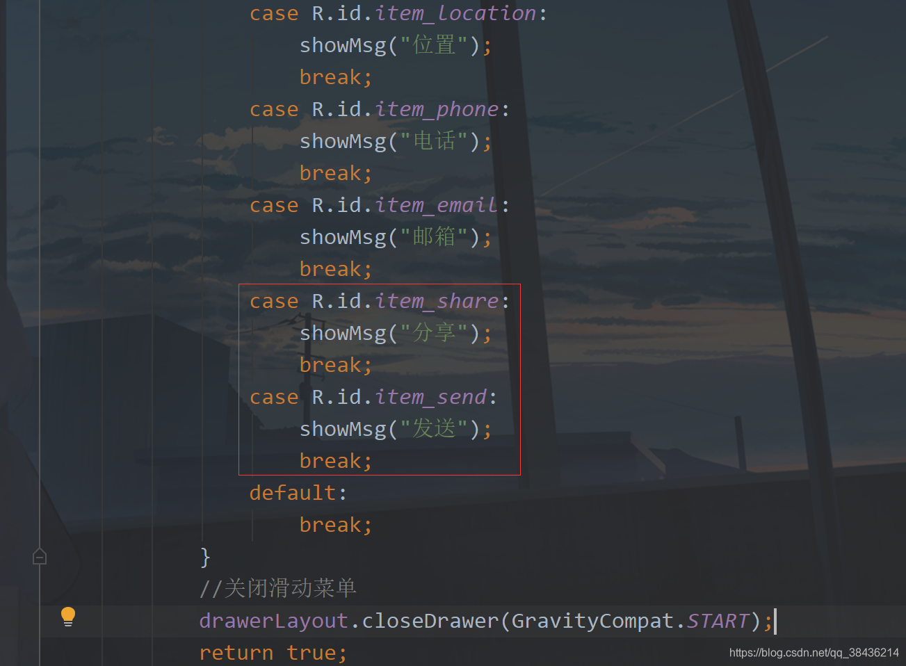
假如上面的五个菜单是基础功能,那么下面再添加一个扩展菜单。
当然还是要先添加这个菜单图标
icon_share.xml
<?xml version="1.0" encoding="UTF-8"?><vector xmlns:android=“http://schemas.android.com/apk/res/android”
android:width=“24dp”
android:height=“24dp”
android:tint=“#000000”
android:viewportWidth=“24.0”
android:viewportHeight=“24.0”>
<path
android:fillColor=“@android:color/white”
android:pathData=“M18,16c-0.79,0 -1.5,0.31 -2.03,0.81L8.91,12.7C8.96,12.47 9,12.24 9,12s-0.04,-0.47 -0.09,-0.7l7.05,-4.11C16.49,7.69 17.21,8 18,8c1.66,0 3,-1.34 3,-3s-1.34,-3 -3,-3s-3,1.34 -3,3c0,0.24 0.04,0.48 0.09,0.7L8.04,9.81C7.5,9.31 6.79,9 6,9c-1.66,0 -3,1.34 -3,3s1.34,3 3,3c0.79,0 1.5,-0.31 2.04,-0.81l7.05,4.12C15.04,18.53 15,18.76 15,19c0,1.66 1.34,3 3,3s3,-1.34 3,-3S19.66,16 18,16z” />
icon_send.xml
<?xml version="1.0" encoding="UTF-8"?><vector xmlns:android=“http://schemas.android.com/apk/res/android”
android:width=“24dp”
android:height=“24dp”
android:autoMirrored=“true”
android:tint=“#000000”
android:viewportWidth=“24.0”
android:viewportHeight=“24.0”>
<path
android:fillColor=“@android:color/white”
android:pathData=“M3,5.51v3.71c0,0.46 0.31,0.86 0.76,0.97L11,12l-7.24,1.81C3.31,13.92 3,14.32 3,14.78v3.71c0,0.72 0.73,1.2 1.39,0.92l15.42,-6.49c0.82,-0.34 0.82,-1.5 0,-1.84L4.39,4.58C3.73,4.31 3,4.79 3,5.51z” />
然后修改nav_menu.xml添加如下代码:
<item
android:id=“@+id/item_share”
android:icon=“@drawable/icon_share”
android:title=“分享” />
<item
android:id=“@+id/item_send”
android:icon=“@drawable/icon_send”
android:title=“发送” />
放在group的i下面,然后进入到MainActivity中,添加两个菜单的点击事件
运行

你可以看到这里还有分隔线。
像这种导航菜单一般都是定好的,静态的。但是保不齐就有需要动态的菜单,需要去动态改变一些数据。而动态的菜单就不能再去使用刚才的这种方式添加item了,我们可以用列表来解决。
说到列表你会想到ListView,不过现在都使用RecyclerView了。而为了简化RecyclerView的使用,我打算引入帮助的库,而为了模拟真实的接口返回数据,也会使用一个Json解析库。
下面首先在工程的下build.gradle的添加如下
//添加jitpack仓库
maven { url “https://jitpack.io” }
添加位置如下图:

为什么要这么做的呢?这里你就要分清楚Android依赖库的由来,Google自己的库和第三方库。Google自己的库在你创建项目时就已经添加了,如
google()
jcenter()
而第三方库要想使用有些是需要添加jitpack仓库的,也就是我上面添加的代码。
下面进入app的build.gradle,在dependencies闭包{}中添加如下依赖库:
//RecyclerView最好的适配器,让你的适配器一目了然,告别代码冗余
implementation ‘com.github.CymChad:BaseRecyclerViewAdapterHelper:2.9.30’
//Gson库
implementation ‘com.google.code.gson:gson:2.8.5’
然后再点击Sync Now 进行同步,同步没有报错,则我们先来构建这个返回的数据。
{
“code”:200,
“data”:[
{
“id”:0,
“name”:“朋友”
},
{
“id”:1,
“name”:“钱包”
},
{
“id”:2,
“name”:“位置”
},
{
“id”:3,
“name”:“电话”
},
{
“id”:4,
“name”:“邮箱”
},
{
“id”:5,
“name”:“分享”
},
{
“id”:6,
“name”:“发送”
}
],
“msg”:“Success”
}
实际开发中的返回数据和这个差不多,仅供参考。这一段JSON字符串,里面有三个主体内容,code用来检测你返回的是否合格,通常200表示正常返回,msg则表示描述,对于这个code的描述。data则是返回的数据组数。下面通过这个返回数据,我们可以写出这样的一个实体类。
在com.llw.drawerdemo中新建一个MenuResponse.java类,里面的代码如下:
package com.llw.drawerdemo;
import java.util.List;
/**
-
菜单返回数据
-
@author lonel
*/
public class MenuResponse {
/**
-
code : 200
-
data : [{“id”:0,“name”:“朋友”},{“id”:1,“name”:“钱包”},{“id”:2,“name”:“位置”},{“id”:3,“name”:“电话”},{“id”:4,“name”:“邮箱”},{“id”:5,“name”:“分享”},{“id”:6,“name”:“发送”}]
-
msg : Success
*/
private int code;
private String msg;
private List data;
public int getCode() {
return code;
}
public void setCode(int code) {
this.code = code;
}
public String getMsg() {
return msg;
}
public void setMsg(String msg) {
this.msg = msg;
}
public List getData() {
return data;
}
public void setData(List data) {
this.data = data;
}
public static class DataBean {
/**
-
id : 0
-
name : 朋友
*/
private int id;
private String name;
public int getId() {
return id;
}
public void setId(int id) {
this.id = id;
}
public String getName() {
return name;
}
public void setName(String name) {
this.name = name;
}
}
}
然后再创建一个常量类Contanst.java,里面的代码如下:
package com.llw.drawerdemo;
/**
-
常量
-
@author lonel
*/
public class Contanst {
public static final int SUCCESS = 200;
public static final String JSON = “{\n” +
" “code”:200,\n" +
" “data”:[\n" +
" {\n" +
" “id”:0,\n" +
" “name”:“朋友”\n" +
" },\n" +
" {\n" +
" “id”:1,\n" +
" “name”:“钱包”\n" +
" },\n" +
" {\n" +
" “id”:2,\n" +
" “name”:“位置”\n" +
" },\n" +
" {\n" +
" “id”:3,\n" +
" “name”:“电话”\n" +
" },\n" +
" {\n" +
" “id”:4,\n" +
" “name”:“邮箱”\n" +
" },\n" +
" {\n" +
" “id”:5,\n" +
" “name”:“分享”\n" +
" },\n" +
" {\n" +
" “id”:6,\n" +
" “name”:“发送”\n" +
" }\n" +
" \n" +
" ],\n" +
" “msg”:“Success”\n" +
“}”;
}
里面是我们返回的数据JSON字符串,用这种方式来模拟真实返回数据。还有一点就是这个成功码用一个全局的常量来表示,尽量不要再代码中直接使用200来做为成功的返回判定。用常量的好处就是改起来快,假如今天你是200为成功,明天变成100,那么我只需要改这个常量的值即可,而不需要你去每一个用200判定的地方都去手动改成100,效率上就提高很多。
下面来写这个item的布局,在layout下新建一个item_menu.xml文件,里面的代码如下:
<?xml version="1.0" encoding="utf-8"?><TextView xmlns:android=“http://schemas.android.com/apk/res/android”
android:id=“@+id/tv_menu_name”
android:layout_width=“match_parent”
android:layout_height=“wrap_content”
android:foreground=“?attr/selectableItemBackground”
android:padding=“16dp”
android:textColor=“#000”
android:textSize=“16sp” />
这里的
android:foreground=“?attr/selectableItemBackground”
就是点击item的效果,体验感更强一些。
然后去写适配器,在com.llw.drawerdemo下新建一个MenuAdapter类,里面的代码如下:
package com.llw.drawerdemo;
import androidx.annotation.Nullable;
import com.chad.library.adapter.base.BaseQuickAdapter;
import com.chad.library.adapter.base.BaseViewHolder;
import java.util.List;
/**
-
菜单列表适配器
-
@author lonel
*/
public class MenuAdapter extends BaseQuickAdapter<MenuResponse.DataBean, BaseViewHolder> {
public MenuAdapter(int layoutResId, @Nullable List<MenuResponse.DataBean> data) {
super(layoutResId, data);
}
@Override
protected void convert(BaseViewHolder helper, MenuResponse.DataBean item) {
helper.setText(R.id.tv_menu_name,item.getName());
//添加点击事件
helper.addOnClickListener(R.id.tv_menu_name);
}
}
相比于传统的适配器,这样写就简洁很多了,然后是修改布局,首先是activity_main.xml中,我们去掉nav_menu
保留这个headerLayout,然后去修改这个nav_header布局代码:修改后如下:
<?xml version="1.0" encoding="utf-8"?><androidx.core.widget.NestedScrollView xmlns:android=“http://schemas.android.com/apk/res/android”
xmlns:app=“http://schemas.android.com/apk/res-auto”
android:layout_width=“match_parent”
android:layout_height=“match_parent”
android:fitsSystemWindows=“true”
android:overScrollMode=“never”
android:orientation=“vertical”>
<LinearLayout
android:orientation=“vertical”
android:layout_width=“match_parent”
android:layout_height=“wrap_content”>
<RelativeLayout
android:background=“#1391F8”
android:layout_width=“match_parent”
android:layout_height=“160dp”>
<com.google.android.material.imageview.ShapeableImageView
android:id=“@+id/iv_avatar”
android:layout_width=“80dp”
android:layout_height=“80dp”
android:layout_alignParentBottom=“true”
android:layout_marginStart=“24dp”
android:layout_marginEnd=“24dp”
android:layout_marginBottom=“30dp”
android:padding=“1dp”
android:src=“@mipmap/icon_default_avatar”
app:shapeAppearanceOverlay=“@style/circleImageStyle”
app:strokeColor=“#FFF”
app:strokeWidth=“2dp” />
<TextView
android:id=“@+id/tv_name”
android:layout_width=“wrap_content”
android:layout_height=“wrap_content”
android:layout_alignTop=“@+id/iv_avatar”
android:layout_marginTop=“16dp”
android:layout_toEndOf=“@+id/iv_avatar”
android:text=“初学者-Study”
android:textColor=“#FFF”
android:textSize=“16sp” />
<TextView
android:id=“@+id/tv_tip”
android:layout_width=“wrap_content”
android:layout_height=“wrap_content”
android:layout_below=“@+id/tv_name”
android:layout_marginTop=“8dp”
android:layout_toEndOf=“@+id/iv_avatar”
android:text=“Android | Java”
android:textColor=“#FFF”
android:textSize=“14sp” />
<androidx.recyclerview.widget.RecyclerView
android:id=“@+id/rv_menu”
android:layout_width=“match_parent”
android:layout_height=“wrap_content”/>
</androidx.core.widget.NestedScrollView>
NestedScrollView表示一个滚动视图,它里面只能放一个布局,当这个布局的高度超过屏幕时,则可以上下滚动显示,而这个布局里面又可以嵌套其他的布局。我在里面放置了之前的相对布局和新增的列表控件。下面我们进入到MainActivity。
先声明成员变量
private RecyclerView rvMenu;//列表
然后在onCreate中通过headerView去绑定布局中的id。
//绑定列表控件
rvMenu = headerView.findViewById(R.id.rv_menu);
自我介绍一下,小编13年上海交大毕业,曾经在小公司待过,也去过华为、OPPO等大厂,18年进入阿里一直到现在。
深知大多数初中级Android工程师,想要提升技能,往往是自己摸索成长或者是报班学习,但对于培训机构动则近万的学费,着实压力不小。自己不成体系的自学效果低效又漫长,而且极易碰到天花板技术停滞不前!
因此收集整理了一份《2024年Android移动开发全套学习资料》,初衷也很简单,就是希望能够帮助到想自学提升又不知道该从何学起的朋友,同时减轻大家的负担。


既有适合小白学习的零基础资料,也有适合3年以上经验的小伙伴深入学习提升的进阶课程,基本涵盖了95%以上Android开发知识点,真正体系化!
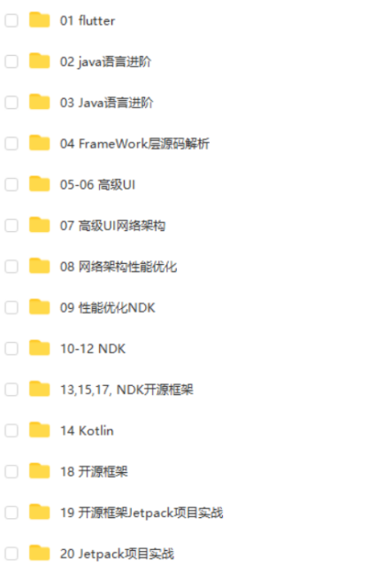
由于文件比较大,这里只是将部分目录截图出来,每个节点里面都包含大厂面经、学习笔记、源码讲义、实战项目、讲解视频,并且会持续更新!
如果你觉得这些内容对你有帮助,可以扫码获取!!(备注:Android)

最后
总之啊,家里没矿的同学们,如果你们想以后的日子过得好一些,多想想你们的业余时间怎么安排吧;
技术方面的提升肯定是重中之重,但是技术外的一些“软实力”也不能完全忽视,很多时候升职确实是因为你的技术足够强,但也与你的“软实力”密切相关
在这我也分享一份大佬自己收录整理的 Android学习PDF+架构视频+面试文档+源码笔记 ,还有高级架构技术进阶脑图、Android开发面试专题资料,高级进阶架构资料这些都是我闲暇还会反复翻阅并给下属员工学习的精品资料。在脑图中,每个知识点专题都配有相对应的实战项目,可以有效的帮助大家掌握知识点。
总之也是在这里帮助大家学习提升进阶,也节省大家在网上搜索资料的时间来学习,也可以分享给身边好友一起学习


相信自己,没有做不到的,只有想不到的
《Android学习笔记总结+移动架构视频+大厂面试真题+项目实战源码》,点击传送门即可获取!
View>
NestedScrollView表示一个滚动视图,它里面只能放一个布局,当这个布局的高度超过屏幕时,则可以上下滚动显示,而这个布局里面又可以嵌套其他的布局。我在里面放置了之前的相对布局和新增的列表控件。下面我们进入到MainActivity。
先声明成员变量
private RecyclerView rvMenu;//列表
然后在onCreate中通过headerView去绑定布局中的id。
//绑定列表控件
rvMenu = headerView.findViewById(R.id.rv_menu);
自我介绍一下,小编13年上海交大毕业,曾经在小公司待过,也去过华为、OPPO等大厂,18年进入阿里一直到现在。
深知大多数初中级Android工程师,想要提升技能,往往是自己摸索成长或者是报班学习,但对于培训机构动则近万的学费,着实压力不小。自己不成体系的自学效果低效又漫长,而且极易碰到天花板技术停滞不前!
因此收集整理了一份《2024年Android移动开发全套学习资料》,初衷也很简单,就是希望能够帮助到想自学提升又不知道该从何学起的朋友,同时减轻大家的负担。
[外链图片转存中…(img-gnp8XR90-1712152261830)]
[外链图片转存中…(img-ItwLRhU7-1712152261830)]
[外链图片转存中…(img-uHwFgMGk-1712152261831)]
[外链图片转存中…(img-AvYj3FEb-1712152261831)]
[外链图片转存中…(img-z47AWDbM-1712152261831)]
既有适合小白学习的零基础资料,也有适合3年以上经验的小伙伴深入学习提升的进阶课程,基本涵盖了95%以上Android开发知识点,真正体系化!
由于文件比较大,这里只是将部分目录截图出来,每个节点里面都包含大厂面经、学习笔记、源码讲义、实战项目、讲解视频,并且会持续更新!
如果你觉得这些内容对你有帮助,可以扫码获取!!(备注:Android)
最后
总之啊,家里没矿的同学们,如果你们想以后的日子过得好一些,多想想你们的业余时间怎么安排吧;
技术方面的提升肯定是重中之重,但是技术外的一些“软实力”也不能完全忽视,很多时候升职确实是因为你的技术足够强,但也与你的“软实力”密切相关
在这我也分享一份大佬自己收录整理的 Android学习PDF+架构视频+面试文档+源码笔记 ,还有高级架构技术进阶脑图、Android开发面试专题资料,高级进阶架构资料这些都是我闲暇还会反复翻阅并给下属员工学习的精品资料。在脑图中,每个知识点专题都配有相对应的实战项目,可以有效的帮助大家掌握知识点。
总之也是在这里帮助大家学习提升进阶,也节省大家在网上搜索资料的时间来学习,也可以分享给身边好友一起学习
[外链图片转存中…(img-5VFkcbm3-1712152261832)]
[外链图片转存中…(img-1lteHgpy-1712152261832)]
相信自己,没有做不到的,只有想不到的


 被折叠的 条评论
为什么被折叠?
被折叠的 条评论
为什么被折叠?
 到【灌水乐园】发言


