import pandas as pd
import matplotlib.pyplot as plt
import seaborn as sns
import statsmodels.api as sm
sns.set_theme()# 设置风格
%config InlineBackend.figure_format = 'retina' # 让图片更清晰
df = pd.read_excel('D:/data/HOUSTNSA.xlsx')# 导入数据
print(df)
data = df['HOUSTNSA'].values
year = pd.date_range("1/1/1959", periods=770, freq="M")
ts = pd.DataFrame(data, index=year,columns=['HOUSTNSA'])
print(ts)
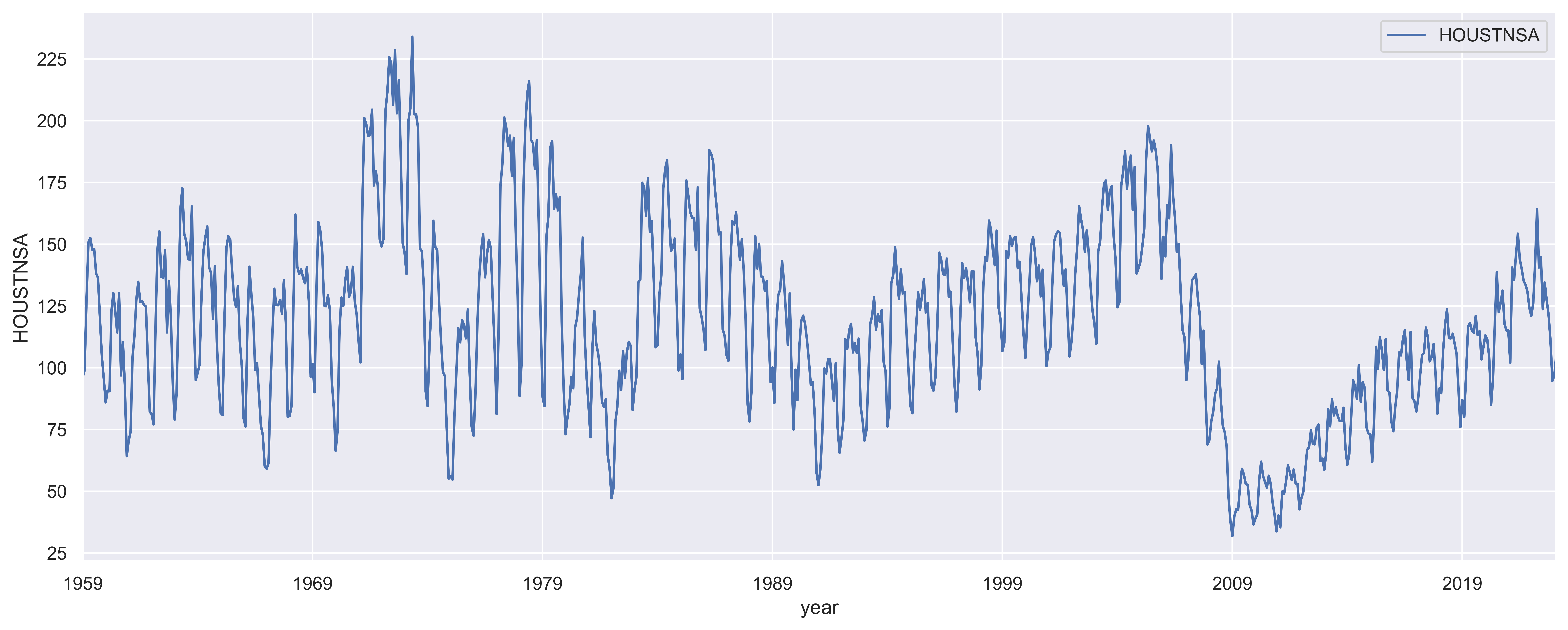
fig, ax = plt.subplots( figsize=(16, 6))
plt.xlabel('year')
plt.ylabel('HOUSTNSA')
ax = ts.plot(ax=ax)
plt.savefig("tsplot.png", dpi = 600, bbox_inches = 'tight')
plt.show()
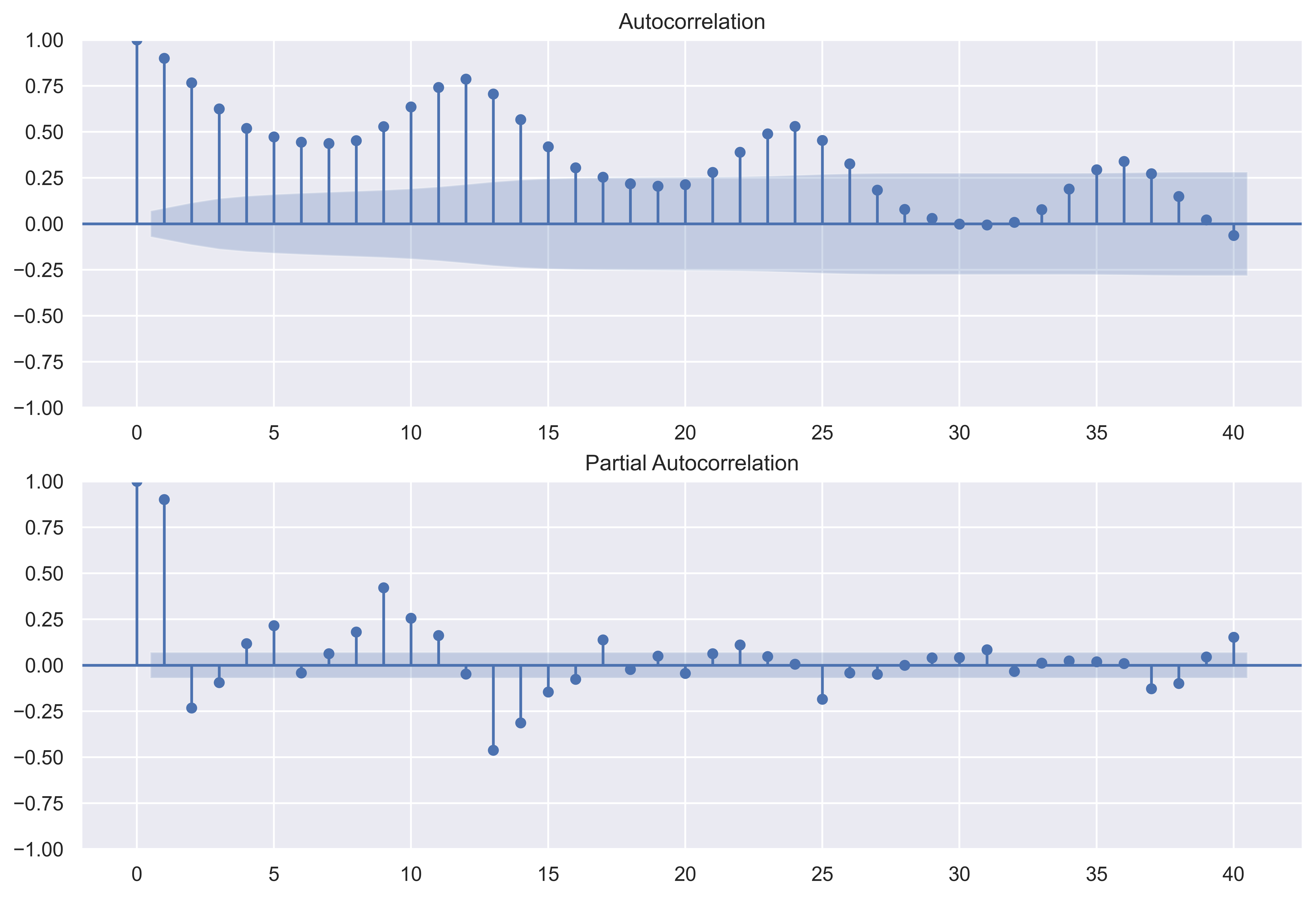
fig = plt.figure(figsize=(12, 8))
ax1 = fig.add_subplot(211)
fig = sm.graphics.tsa.plot_acf(ts.values.squeeze(), lags=40, ax=ax1)
ax2 = fig.add_subplot(212)
fig = sm.graphics.tsa.plot_pacf(ts, lags=40, ax=ax2)
plt.savefig("tsplot1.png", dpi = 600, bbox_inches = 'tight')
plt.show()


 被折叠的 条评论
为什么被折叠?
被折叠的 条评论
为什么被折叠?
 到【灌水乐园】发言


