


数据可视化是数据分析的重要环节,本文将通过Python的Matplotlib和Seaborn库,演示4种常见图表绘制方法,并提供可直接运行的代码示例。
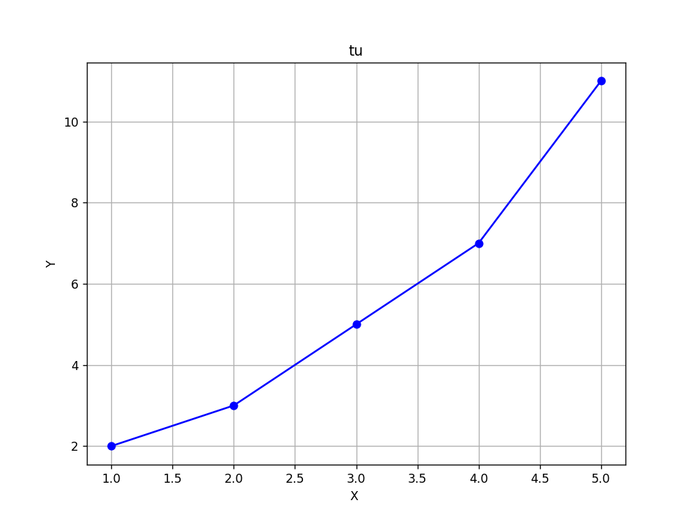
一、基础折线图(Matplotlib)
代码实现
import matplotlib.pyplot as plt

# 数据准备
x = [1, 2, 3, 4, 5]
y = [2, 3, 5, 7, 11]

# 创建图形和轴对象
plt.figure(figsize=(8, 6))
plt.plot(x, y, marker='o', linestyle='-', color='b')

# 添加标题和标签
plt.title('tu')
plt.xlabel('X ')
plt.ylabel('Y')

# 显示网格
plt.grid(True)
结果呈现
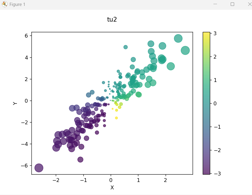
二、散点图与样式美化
代码实现
# 生成随机数据
np.random.seed(42)
x = np.random.randn(200)
y = x * 2 + np.random.randn(200)
# 创建子图
fig, ax = plt.subplots(figsize=(7, 5))
# 绘制散点图
scatter = ax.scatter(x, y,
c=np.arctan2(x, y), # 颜色映射
s=100*np.abs(x), # 点大小
alpha=0.7,
cmap='viridis')
# 添加颜色条
plt.colorbar(scatter)
ax.set_title("多维特征散点图", pad=20)
ax.set_xlabel("特征X")
ax.set_ylabel("特征Y")
plt.show()
结果呈现
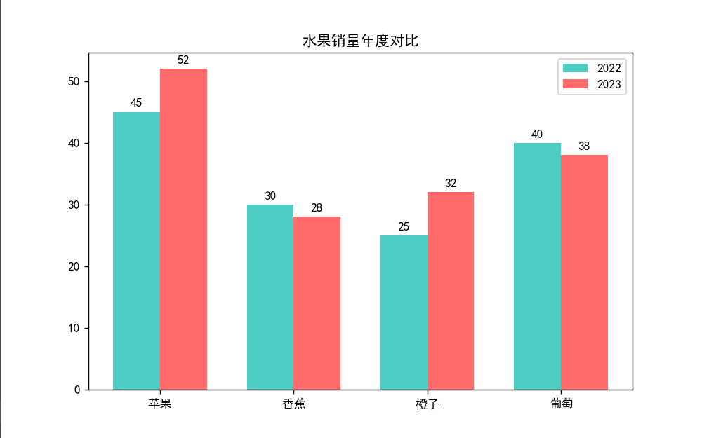
三、柱状图与数据对比
代码实现
# 准备数据
categories = ['苹果', '香蕉', '橙子', '葡萄']
sales_2022 = [45, 30, 25, 40]
sales_2023 = [52, 28, 32, 38]
# 设置样式
plt.style.use('seaborn-darkgrid')
x = np.arange(len(categories))
width = 0.35
fig, ax = plt.subplots(figsize=(8,5))
rects1 = ax.bar(x - width/2, sales_2022, width,
label='2022', color='#4ECDC4')
rects2 = ax.bar(x + width/2, sales_2023, width,
label='2023', color='#FF6B6B')
ax.set_xticks(x)
ax.set_xticklabels(categories)
ax.legend()
# 添加数据标签
def autolabel(rects):
for rect in rects:
height = rect.get_height()
ax.annotate(f'{height}',
xy=(rect.get_x() + rect.get_width()/2, height),
xytext=(0, 3),
textcoords="offset points",
ha='center', va='bottom')
autolabel(rects1)
autolabel(rects2)
plt.title("水果销量年度对比")
plt.show()
结果呈现
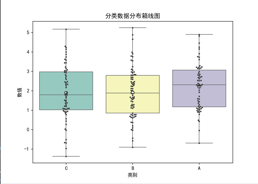
四、高级可视化(Seaborn箱线图)
代码实现
import seaborn as sns
import pandas as pd
# 创建示例DataFrame
data = pd.DataFrame({
'类别': np.random.choice(['A', 'B', 'C'], 200),
'数值': np.random.normal(0, 1, 200) +
np.repeat([1, 2, 3], [70, 70, 60])
})
plt.figure(figsize=(7,5))
sns.boxplot(x='类别', y='数值', data=data,
palette='Set3',
showmeans=True,
meanprops={"marker":"o",
"markerfacecolor":"white",
"markeredgecolor":"black"})
sns.swarmplot(x='类别', y='数值', data=data,
color='.25', size=3)
plt.title("分类数据分布箱线图")
plt.show()
结果呈现


 被折叠的 条评论
为什么被折叠?
被折叠的 条评论
为什么被折叠?
 到【灌水乐园】发言


