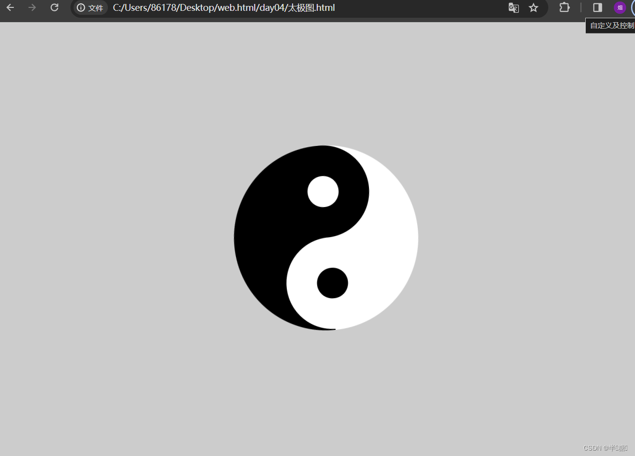
csst样式实现太极八卦图
<!DOCTYPE html>
<html lang="en">
<head>
    <meta charset="UTF-8">
    <meta name="viewport" content="width=device-width, initial-scale=1.0">
    <title>太极图</title>
    <style>
        * {
				margin: 0;
				padding: 0;
				background: #ccc;
			}
			.taiji {
				width: 0;
				height: 300px;
				border-left: 150px solid #000000;
				border-right: 150px solid #FFFFFF;
				border-radius: 50%;
				animation: myRotate 3s linear infinite;
                margin: auto;
				margin-top: 200px;
			}

			@keyframes myRotate{
				from{transform: rotate(0deg);}
				to{transform: rotate(360deg);}
			}

			.taiji::before {
				display: block;
				content: "";
				background: white;
				height: 50px;
				width: 50px;
				border-radius: 50%;
				border: 50px solid #000000;
				margin-left: -72px;
			}
			.taiji::after {
				display: block;
				content: "";
				background: black;
				height: 50px;
				width: 50px;
				border-radius: 50%;
				border: 50px solid white;
				margin-left: -72px;
			}
    </style>
</head>
<body>
    <div class="taiji"></div>
</body>
</html>
效果图
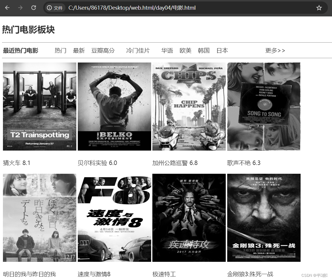
灰度化页面实例
<!DOCTYPE html>
<html lang="zh">
<head>
<meta charset="UTF-8">
<meta name="viewport" content="width=device-width, initial-scale=1.0">
<title>电影</title>
<style>
body {
font-family: "Microsoft YaHei UI", sans-serif;
color: rgb(42, 42, 172);
}
html{
filter: grayscale(1);
}
</style>
</head>
<body>
<h2>热门电影板块</h2>
<hr>
<table width="800">
<tr>
<td><b>最近热门电影</b></td>
<td>热门</td>
<td>最新</td>
<td>豆瓣高分</td>
<td>冷门佳片</td>
<td>华语</td>
<td>欧美</td>
<td>韩国</td>
<td>日本</td>
<td width="80"></td>
<td>更多>></td>
</tr>
<table>
<hr>
<table>
<tr>
<td><img src="../img/movie1.jpg" width="200" height="240"></td>
<td><img src="../img/movie2.jpg" width="200" height="240"></td>
<td><img src="../img/movie3.jpg" width="200" height="240"></td>
<td><img src="../img/movie4.jpg" width="200" height="240"></td>
</tr>
<tr>
<td><p>猜火车 8.1</p></td>
<td>贝尔科实验 6.0</td>
<td>加州公路巡警 6.8</td>
<td>歌声不绝 6.3</td>
</tr>
<tr>
<td><img src="../img/movie5.jpg" width="200" height="240"></td>
<td><img src="../img/movie6.jpg" width="200" height="240"></td>
<td><img src="../img/movie7.jpg" width="200" height="240"></td>
<td><img src="../img/movie8.jpg" width="200" height="240"></td>
</tr>
<tr>
<td><p>明日的我与昨日的我</p ></td>
<td>速度与激情8</td>
<td>极速特工</td>
<td>金刚狼3:殊死一战</td>
</tr>
</table>
</body>
</html>
效果图
发光按钮
<!DOCTYPE html>
<html lang="en">
<head>
    <meta charset="UTF-8">
    <meta http-equiv="X-UA-Compatible" content="IE=edge">
    <meta name="viewport" content="width=device-width, initial-scale=1.0">
    <title>发光按钮</title>
    <style>
    body {
        display: flex;
        justify-content: center;
        background-color: #202020;
    }

    button {
        position: relative;
        margin-top: 300px;
        padding: 20px 60px;
        cursor: pointer;
        transition: 0.5s all;
        background-color: #202020;
    }

    button span {
        color: #5e07f5;
        font-size: 50px;
        font-family: '楷体';
        text-shadow: 5px 5px 5px rebeccapurple;
    }

    button:hover {
        box-shadow: inset 0px 0px 25px #ff7700;
    }

    button:active {
        margin-top: 305px;
        transition: 0.2s all;
        box-shadow: inset 0px 0px 25px #ffaf6a;
    }


    button div {
        transition: 0.5s all;
        position: absolute;
        background-color: #ff7700;
        box-shadow: 0 0 15px #ff7700, 0 0 30px #ff7700, 0 0 50px #ff7700;
    }

    button .top {
        width: 15px;
        height: 2px;
        top: 0;
        left: 0;
    }

    button .bottom {
        width: 15px;
        height: 2px;
        bottom: 0;
        right: 0;
    }

    button .left {
        width: 2px;
        height: 15px;
        top: 0;
        left: 0;
    }

    button .right {
        width: 2px;
        height: 15px;
        right: 0;
        bottom: 0;
    }

    button:hover .top,button:hover .bottom {
        width: 100%;
    }

    button:hover .left,button:hover .right {
        height: 100%;
    }
   </style>
</head>
<body>
    <button>
        <span>刘大帅哥</span>
        <div class="top"></div>
        <div class="bottom"></div>
        <div class="left"></div>
        <div class="right"></div>
    </button>
</body>
</html>
效果图
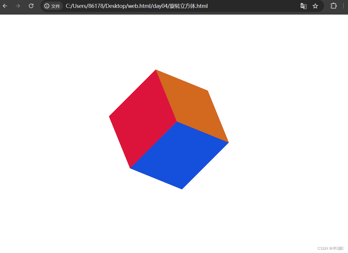
 旋转立方体
旋转立方体
<!DOCTYPE html>
<html lang="en">

<head>
    <meta charset="UTF-8">
    <meta http-equiv="X-UA-Compatible" content="IE=edge">
    <meta name="viewport" content="width=device-width, initial-scale=1.0">
    <title>3D Box 1_bit</title>
    <style>
        .container {
            width: 100%;
            margin: 150px auto;
            text-align: center;
        }

        .box {
            display: inline-block;
            width: 200px;
            height: 200px;
            position: relative;
            transform-style: preserve-3d;
            background-color: brown;
            transform: rotate3d(1, 1, 0, 65deg);
            transition: transform 1.6s;
        }

        .box:hover {
            transform: rotate3d(1, 1, 0, 265deg);
        }

        .plane {
            width: 200px;
            height: 200px;
            position: absolute;
        }

        .plane-before {
            background-color: chocolate;
        }

        .plane-left {
            background-color: crimson;
            transform-origin: 0% 0%;
            transform: rotate3d(0, 1, 0, 90deg);
        }

        .plane-right {
            background-color: rgb(220, 20, 203);
            transform-origin: 100% 100%;
            transform: rotate3d(0, 1, 0, -90deg);
        }

        .plane-bottom {
            background-color: rgb(20, 80, 220);
            transform-origin: 100% 100%;
            transform: rotate3d(1, 0, 0, 90deg);
        }

        .plane-top {
            background-color: rgb(240, 113, 45);
            transform-origin: 0% 0%;
            transform: rotate3d(1, 0, 0, -90deg);
        }

        .plane-after {
            background-color: rgb(220, 20, 20);
            transform: translateZ(-200px)
        }
    </style>
</head>

<body>
    <div class="container">
        <div class="box">
            <div class="plane plane-before">

            </div>
            <div class="plane plane-left">

            </div>
            <div class="plane plane-right">

            </div>
            <div class="plane plane-after">

            </div>
            <div class="plane plane-bottom">

            </div>
            <div class="plane plane-top">

            </div>
        </div>
    </div>
</body>

</html>
效果图
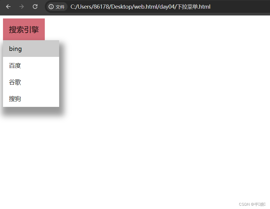
下拉菜单栏
<!DOCTYPE html>
<html lang="en">
    <head>
        <meta charset="utf-8">
        <title>HTML</title>
        <style>
            .dropdown-btn {
                background-color: #d36c78;
                color: black;
                padding: 16px;
                font-size: 20px;
                border: none;
            }
            .dropdown {
                position: relative;
                display: inline-block;
            }
            .dropdown-menu {
                display: none;
                position: absolute;
                background-color: white;
                min-width: 150px;
                box-shadow: 5px 16px 16px 8px rgba(0,0,0,0.4);
                z-index: 1;
            }
            .dropdown-menu a {
                color: black;
                padding: 12px 16px;
                text-decoration: none;
                display: block;
            }
            .dropdown-menu a:hover {
                background-color: #cccccc;
            }
            .dropdown:hover .dropdown-menu {
                display: block;
            }
        </style>
    </head>
    <body>

        <div class="dropdown">
            <button class="dropdown-btn">搜索引擎</button>
            <div class="dropdown-menu">
                <a href="#">bing</a>
                <a href="#">百度</a>
                <a href="#">谷歌</a>
                <a href="#">搜狗</a>
            </div>
        </div>
    </body>
</html>
效果图


 1243
1243

 被折叠的 条评论
为什么被折叠?
被折叠的 条评论
为什么被折叠?
 到【灌水乐园】发言


