


目录
一、整体思路
这是一个基于 Vue 3 + Vite 构建的情人节主题网站。整体采用单页面应用(SPA)架构,通过组件化的方式构建各个模块。主要包含以下几个核心部分:
  <div class="app">
    <CoverView />
    <LetterView />
    <GalleryView />
    <WishView />
    <EndingView />
    <FooterSection />
  </div>
</template>
整个应用采用自上而下的垂直布局,每个模块都是一个独立的视图组件。通过 CSS 的 min-height: 100vh 确保每个模块都能占满一屏。
二、封面模块

封面模块是整个应用的第一屏,主要包含两个部分:
- 花瓣动画背景
- 标题与滚动提示
其中最引人注目的是花瓣飘落效果,这是通过 Canvas 实现的。花瓣的运动轨迹使用了贝塞尔曲线来实现自然的飘落效果:
class Petal {
    constructor(canvas) {
        this.canvas = canvas
        this.reset()
    }

    reset() {
        const isMobile = window.innerWidth <= 768

        // 随机初始位置(包括两侧区域,使花瓣分布更自然)
        this.x = Math.random() * (this.canvas.width + 300) - 150
        this.y = Math.random() * -150 - 50 // 在画布上方随机位置

        // 移动端下花瓣更大一些
        this.size = isMobile ?
            Math.random() * 18 + 15 : // 15-33px
            Math.random() * 18 + 12   // 12-30px

        // 移动端下速度稍慢一些
        this.speedX = (Math.random() * 2.5 - 0.8) * (isMobile ? 0.8 : 1)
        this.speedY = (Math.random() * 2 + 0.8) * (isMobile ? 0.9 : 1)

        // 旋转相关
        this.rotation = Math.random() * 360
        this.rotationSpeed = (Math.random() * 2.5 - 1.2) * (isMobile ? 0.4 : 0.6)

        // 移动端下透明度稍高一些
        this.opacity = isMobile ?
            Math.random() * 0.6 + 0.5 :
            Math.random() * 0.5 + 0.4

        // 更丰富的颜色变化
        this.color = [
            '#ff99cc', '#ff8ac4', '#ff7eb8',
            '#ff6666', '#ff7777', '#ff8888',
            '#ffb7dc', '#ff9eb7', '#ffcce6',
            '#ff85a2', '#ff739e', '#ff91b8'
        ][Math.floor(Math.random() * 12)]

        // 花瓣大小的缩放因子(移动端稍大)
        this.scale = isMobile ?
            Math.random() * 0.4 + 0.9 : // 0.9-1.3
            Math.random() * 0.4 + 0.8   // 0.8-1.2

        // 添加摆动幅度
        this.swingFactor = Math.random() * 3 + 1.5
        this.swingOffset = Math.random() * Math.PI * 2
    }
花瓣的渲染采用了 Canvas 的 bezierCurveTo 方法绘制花瓣形状,并通过 RadialGradient 实现了渐变效果:
    draw(ctx) {
        ctx.save()
        ctx.translate(this.x, this.y)
        ctx.rotate((this.rotation * Math.PI) / 180)
        ctx.scale(this.scale, this.scale)

        // 绘制花瓣
        ctx.beginPath()
        ctx.moveTo(0, 0)
        ctx.bezierCurveTo(
            this.size / 2, -this.size / 2,
            this.size, 0,
            this.size / 2, this.size / 2
        )

        // 添加渐变效果
        const gradient = ctx.createRadialGradient(
            this.size / 2, 0, 0,
            this.size / 2, 0, this.size
        )
        gradient.addColorStop(0, this.color)
        gradient.addColorStop(1, this.color + '88') // 半透明效果

        ctx.fillStyle = gradient
        ctx.globalAlpha = this.opacity
        ctx.fill()
        ctx.restore()
    }
三、爱的告白模块
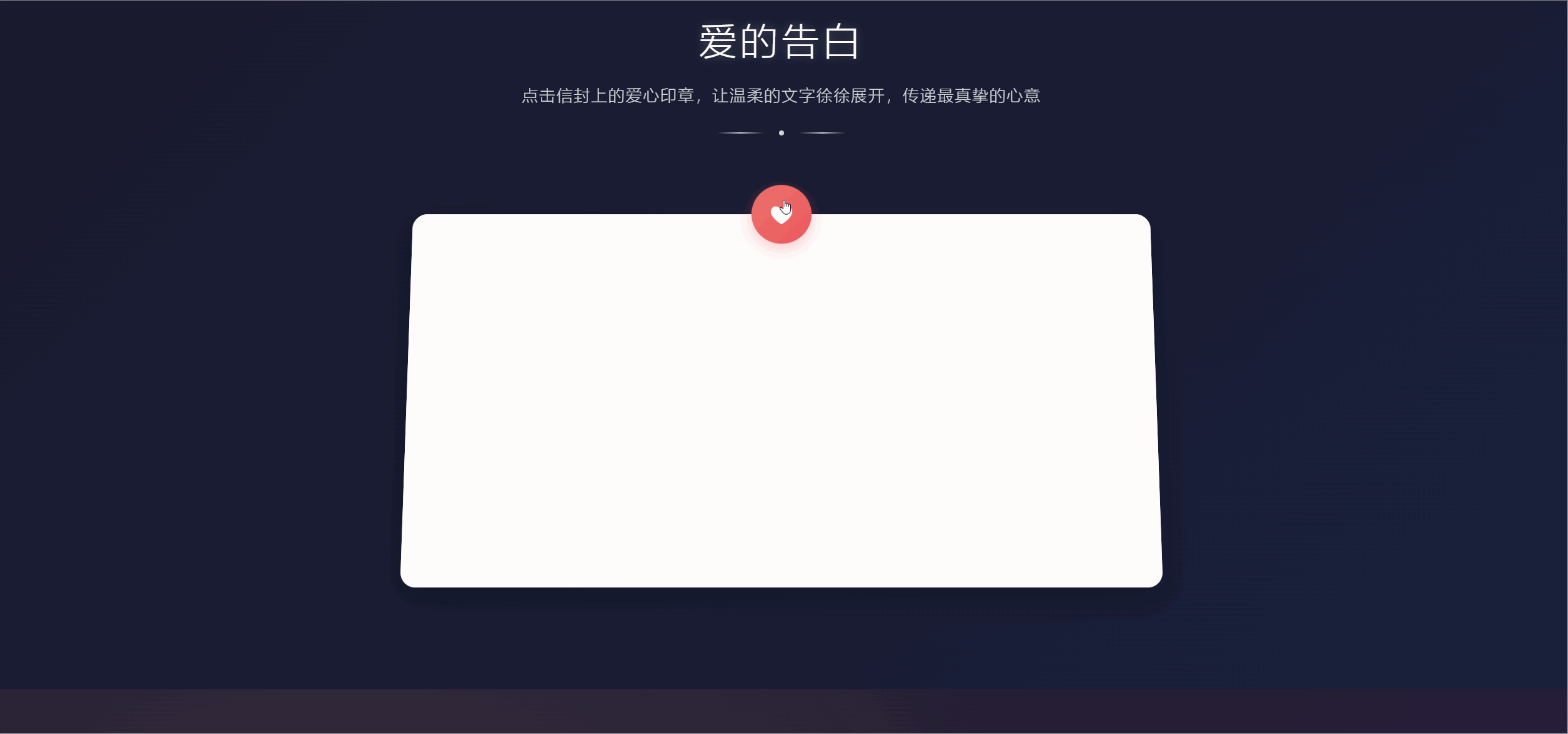
这个模块采用了信封展开的交互效果,主要通过 CSS transform 和过渡动画实现。核心是使用了自定义的打字机效果组件来展现文字:
const startTyping = () => {
    if (currentIndex < props.text.length) {
        // 处理换行符
        if (props.text[currentIndex] === '\n') {
            displayText.value += '<br>'
        } else {
            displayText.value += props.text[currentIndex]
        }
        currentIndex++
        setTimeout(startTyping, props.speed)
    } else {
        isDone.value = true
        emit('done')
    }
}
四、甜蜜时光模块
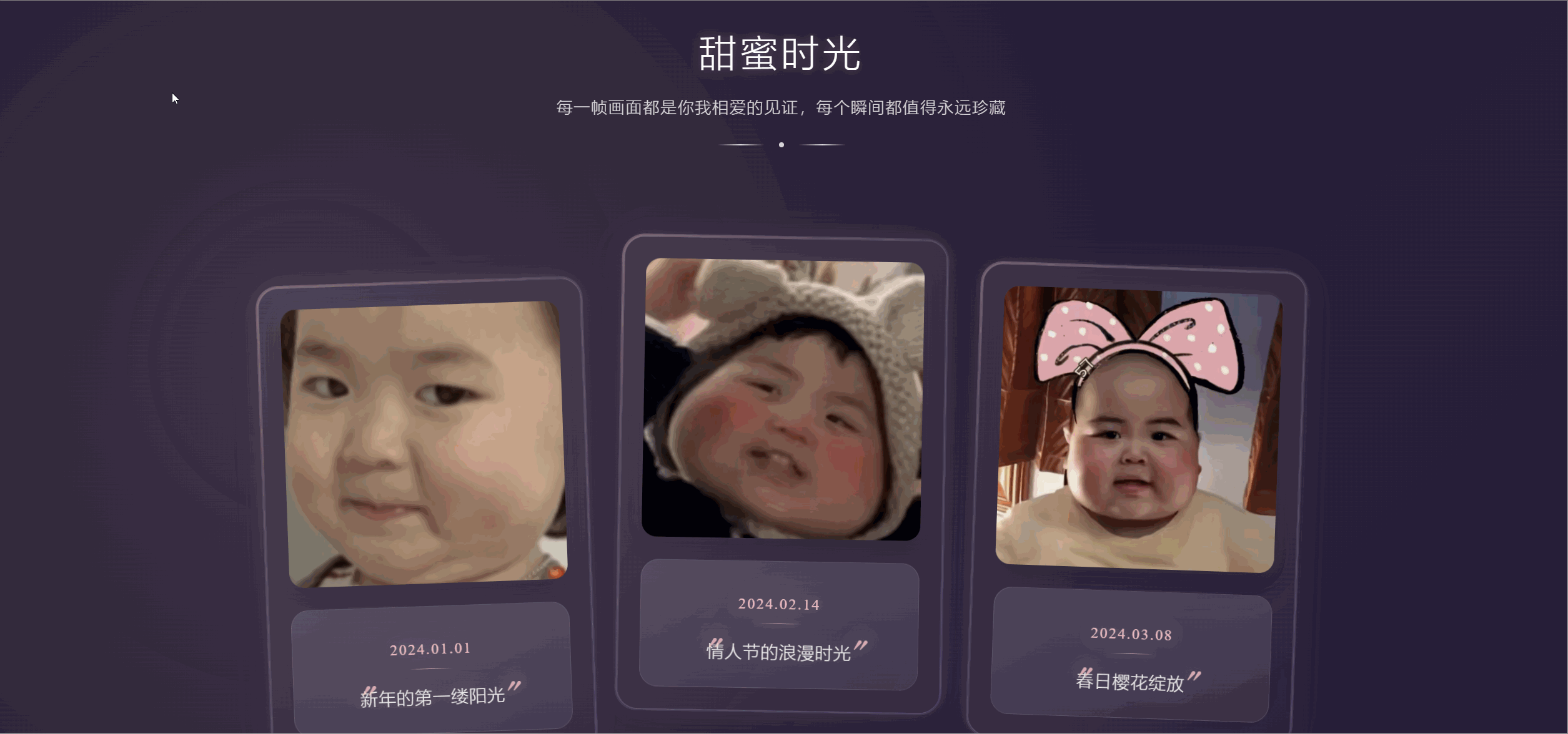
相册模块采用了网格布局展示照片,并结合了 Intersection Observer API 实现了照片的渐入动画效果:
onMounted(() => {
    const observer = new IntersectionObserver(
        (entries) => {
            entries.forEach(entry => {
                if (entry.isIntersecting) {
                    isVisible.value = true
                    observer.disconnect()
                }
            })
        },
        {
            threshold: 0.1,
            rootMargin: '500px 0px'
        }
    )

    if (galleryContainer.value) {
        observer.observe(galleryContainer.value)
    }

    return () => observer.disconnect()
})
五、爱的誓言模块
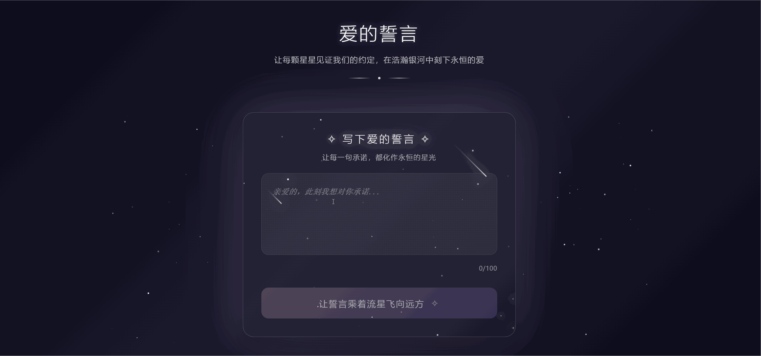
这个模块的亮点是星空背景效果,通过 Canvas 绘制了闪烁的星星和流星效果:
class Star {
    constructor(canvas) {
        this.canvas = canvas
        this.reset()
    }

    reset() {
        this.x = Math.random() * this.canvas.width
        this.y = Math.random() * this.canvas.height
        this.size = Math.random() * 2
        this.blinkSpeed = Math.random() * 0.02
        this.brightness = Math.random()
        this.maxBrightness = 0.5 + Math.random() * 0.5
    }

    update() {
        this.brightness += this.blinkSpeed
        if (this.brightness <= 0 || this.brightness >= this.maxBrightness) {
            this.blinkSpeed = -this.blinkSpeed
        }
    }

    draw(ctx) {
        ctx.beginPath()
        ctx.arc(this.x, this.y, this.size, 0, Math.PI * 2)
        ctx.fillStyle = `rgba(255, 255, 255, ${this.brightness})`
        ctx.fill()
    }
}

// 创建流星类
class ShootingStar {
    constructor(canvas) {
        this.canvas = canvas
        this.reset()
    }

    reset() {
        this.x = Math.random() * this.canvas.width
        this.y = 0
        this.length = Math.random() * 80 + 50
        this.speed = Math.random() * 10 + 10
        this.angle = Math.PI / 4
        this.opacity = 1
    }

    update() {
        this.x += Math.cos(this.angle) * this.speed
        this.y += Math.sin(this.angle) * this.speed
        this.opacity -= 0.01

        if (this.opacity <= 0 || this.x > this.canvas.width || this.y > this.canvas.height) {
            this.reset()
        }
    }

    draw(ctx) {
        ctx.beginPath()
        ctx.moveTo(this.x, this.y)
        const tailX = this.x - Math.cos(this.angle) * this.length
        const tailY = this.y - Math.sin(this.angle) * this.length

        const gradient = ctx.createLinearGradient(this.x, this.y, tailX, tailY)
        gradient.addColorStop(0, `rgba(255, 255, 255, ${this.opacity})`)
        gradient.addColorStop(1, 'transparent')

        ctx.strokeStyle = gradient
        ctx.lineTo(tailX, tailY)
        ctx.lineWidth = 2
        ctx.stroke()
    }
}
六、结尾模块
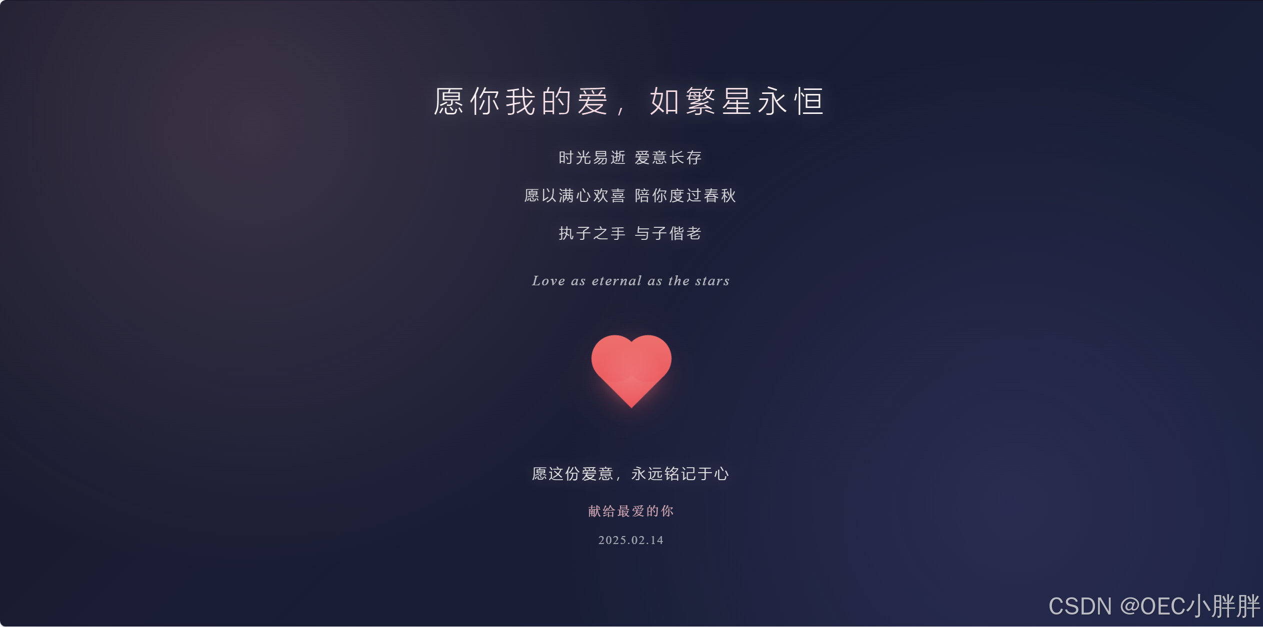
结尾模块采用了优雅的渐变背景和星空装饰效果,通过 CSS 动画实现了文字的淡入效果:
<template>
    <div class="ending-container" ref="endingContainer">
        <div class="ending-content" :class="{ 'ending-appear': isVisible }">
            <div class="ending-text">
                <div class="ending-title">愿你我的爱,如繁星永恒</div>
                <div class="ending-poem">
                    <div class="poem-line">时光易逝 爱意长存</div>
                    <div class="poem-line">愿以满心欢喜 陪你度过春秋</div>
                    <div class="poem-line">执子之手 与子偕老</div>
                </div>
                <div class="ending-subtitle">Love as eternal as the stars</div>
            </div>
            <div class="ending-decoration">
                <div class="star-field">
                    <div class="stars stars-1"></div>
                    <div class="stars stars-2"></div>
                    <div class="stars stars-3"></div>
                </div>
                <div class="heart-container">
                    <div class="heart"></div>
                    <div class="heart-glow"></div>
                </div>
            </div>
            <div class="ending-credits">
                <div class="credit-line">愿这份爱意,永远铭记于心</div>
                <div class="credit-signature">献给最爱的你</div>
                <div class="credit-date">2025.02.14</div>
            </div>
        </div>
    </div>
</template>
七、页脚模块
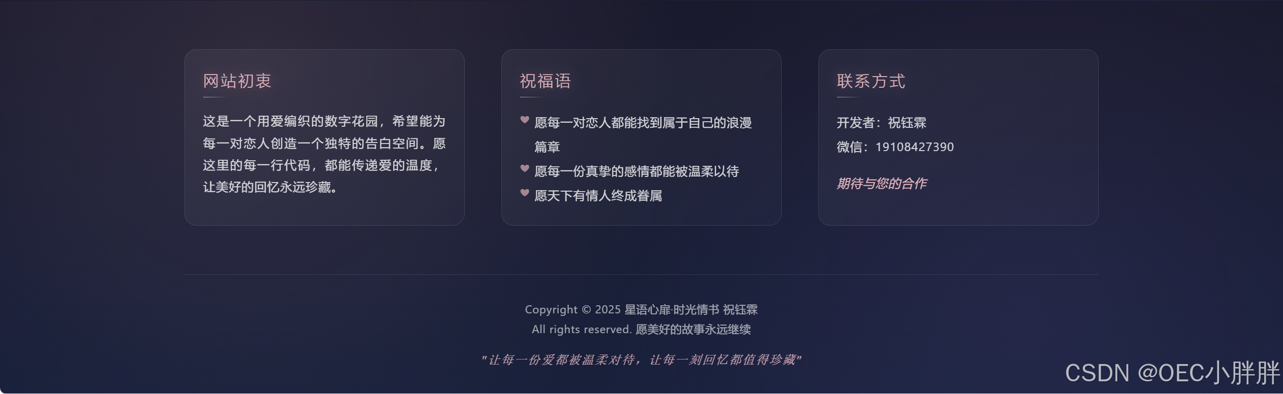
页脚模块包含了网站信息、联系方式和版权声明等内容,采用了网格布局和精美的渐变效果:
<template>
    <footer class="footer-container">
        <div class="footer-content">
            <div class="footer-section purpose">
                <h3>网站初衷</h3>
                <p>这是一个用爱编织的数字花园,希望能为每一对恋人创造一个独特的告白空间。愿这里的每一行代码,都能传递爱的温度,让美好的回忆永远珍藏。</p>
            </div>
            <div class="footer-section blessings">
                <h3>祝福语</h3>
                <div class="blessing-text">
                    <p>愿每一对恋人都能找到属于自己的浪漫篇章</p>
                    <p>愿每一份真挚的感情都能被温柔以待</p>
                    <p>愿天下有情人终成眷属</p>
                </div>
            </div>
            <div class="footer-section contact">
                <h3>联系方式</h3>
                <div class="contact-info">
                    <p>开发者:祝钰霖</p>
                    <p>微信:19108427390</p>
                    <p class="cooperation">期待与您的合作</p>
                </div>
            </div>
        </div>
        <div class="footer-bottom">
            <div class="copyright">
                <p>Copyright © {{ currentYear }} 星语心扉·时光情书 祝钰霖</p>
                <p>All rights reserved. 愿美好的故事永远继续</p>
            </div>
            <div class="love-quote">
                "让每一份爱都被温柔对待,让每一刻回忆都值得珍藏"
            </div>
        </div>
    </footer>
八、性能优化
项目在性能方面做了以下优化:
- 使用
devicePixelRatio适配高清屏幕 - Canvas 动画采用
requestAnimationFrame - 组件懒加载
- 图片资源按需加载
九、响应式设计
1. 基础配置
项目采用移动优先(Mobile First)的响应式设计理念,通过媒体查询来适配不同设备。主要通过检测设备宽度来判断:
@media (max-width: 768px) {
  html {
    font-size: 14px;
  }
}
2. 花瓣动画响应式
在封面的花瓣动画中,针对移动端做了专门的优化:
    reset() {
        const isMobile = window.innerWidth <= 768

        // 随机初始位置(包括两侧区域,使花瓣分布更自然)
        this.x = Math.random() * (this.canvas.width + 300) - 150
        this.y = Math.random() * -150 - 50 // 在画布上方随机位置

        // 移动端下花瓣更大一些
        this.size = isMobile ?
            Math.random() * 18 + 15 : // 15-33px
            Math.random() * 18 + 12   // 12-30px
主要调整了:
- 花瓣数量: 移动端180片,桌面端150片
- 花瓣大小: 移动端15-33px,桌面端12-30px
- 飘落速度: 移动端速度降低到桌面端的0.8-0.9倍
3. 布局响应式
各个主要区域都采用了弹性布局:
- 内容区域最大宽度限制:
.content {
  width: 100%;
  max-width: 1200px;
  padding: 0 1rem;
  margin: 0 auto;
}
- 照片墙自适应:
<div class="gallery-content" :class="{ 'gallery-appear': isVisible }">
  <div class="gallery-grid">
      <div v-for="(photo, index) in photos" :key="index" class="photo-item"
          :class="{ 'photo-appear': isVisible }" :style="{ animationDelay: index * 0.1 + 's' }"
          @click="openPhoto(photo)">
          <div class="photo-card">
              <div class="photo-frame">
                  <img :src="photo.url" :alt="photo.description" loading="lazy">
              </div>
              <div class="photo-info">
                  <p class="photo-date">{{ photo.date }}</p>
                  <p class="photo-description">{{ photo.description }}</p>
              </div>
          </div>
      </div>
  </div>
</div>
- 桌面端: 四列网格布局
- 平板端: 三列网格布局
- 移动端: 双列网格布局
4. 字体响应式
使用相对单位实现文字大小的自适应:
- 标题采用 vw 单位配合 min() 函数:
.cover-title {
    font-size: min(8vw, 4.5rem);
    color: #fff;
    text-shadow: 0 0 10px rgba(255, 255, 255, 0.5);
    animation: titleBreath 2s infinite ease-in-out;
    text-align: center;
    margin: 0;
    padding: 0;
    line-height: 1.2;
}
- 内容文字使用 rem 单位,基于根字体大小:
- 桌面端: 16px(1rem)
- 移动端: 14px(1rem)
5. 交互响应式
针对不同设备的交互方式做了优化:
- 移动端优化触摸体验:
@media (max-width: 768px) {
  .interactive-element {
    min-height: 44px; /* 触摸友好的最小点击区域 */
    cursor: pointer;
  }
}
- 悬浮效果处理:
@media (hover: hover) {
  .photo-card:hover {
    transform: scale(1.05);
  }
}
6. 图片响应式
采用现代的响应式图片技术:
- 使用 loading=“lazy” 实现懒加载:
  <div class="photo-frame">
    <img :src="photo.url" :alt="photo.description" loading="lazy">
  </div>
- 使用 CSS 的 object-fit 确保图片比例:
.photo-frame img {
  width: 100%;
  height: 100%;
  object-fit: cover;
}
通过以上这些响应式设计的实现,确保了网站在各种设备上都能提供良好的用户体验。特别是在移动端,通过调整元素大小、间距和交互方式,让用户体验更加流畅自然。
十、在线体验与合作
体验地址
合作方式
页脚处有合作方式,支持个性化定制
用数字情书镌刻永恒爱意
在飘落的花瓣与闪烁星空间
开启属于我们的时光密语
🌹愿有情人终成眷属
如果,您觉得这篇文章不错的话,那请多多点赞、收藏,加关注。


 扫一扫
扫一扫


 8179
8179

 被折叠的 条评论
为什么被折叠?
被折叠的 条评论
为什么被折叠?
 到【灌水乐园】发言


