


成品代码已经全部打包,需要参考或期末大作业的请自取
https://pan.quark.cn/s/143f750f04c4 https://pan.quark.cn/s/143f750f04c4
1. 准备工作
1.1 项目目录结构
-
study/:网站根目录,包含所有素材。-
images/:存放固定使用的图片,如logo。 -
uploads/:存放非固定使用的图片,如商品图。 -
css/:存放CSS文件。-
base.css:基础公共样式,清除默认样式,设置网页基本样式。 -
index.css:首页CSS样式。
-
-
index.html:首页HTML文件。
-
1.2 默认样式代码
/*
  这个CSS的作用是用来对浏览器的默认样式进行重置。
  例如 body的默认margin ulol的默认padding和margin已经列表样式
  a标签的下划线等
*/

body {
  margin: 0;
  line-height: 1;
}

p {
  margin: 0;
}

ul, ol {
  margin: 0;
  padding: 0;
  list-style: none;
}

a {
  text-decoration: none;
  color: inherit;
}

html {
  box-sizing: border-box;
}

*, *::after, *::before {
  box-sizing: inherit;
}

input {
  outline: none;
  margin: 0;
}
2. 网页制作思路
2.1 布局思路
- 先整体再局部,从外到内,从上到下,从左到右。
-
使用Flexbox(弹性盒子布局)进行内容布局的优势有很多,以下是一些主要的优点:
1. 灵活性:Flexbox提供了一种更加灵活的方式来对齐和分配容器内项目的空间,无论是在水平方向还是垂直方向。
2. 响应式设计:Flexbox非常适合响应式设计,因为它可以轻松地调整项目的大小以适应不同的屏幕尺寸和方向。
3. 简化布局:Flexbox可以简化复杂的布局模式,如圣杯布局或双飞翼布局,只需几行代码即可实现。
4. 对齐和分布:Flexbox提供了强大的对齐和分布选项,可以轻松地将项目对齐到容器的开始、结束、中心或任意位置。
15. 多轴布局:Flexbox允许你在一个声明周期内处理两个轴上的布局,这意味着你可以同时处理主轴(水平)和交叉轴(垂直)的布局。
6. 容器内对齐:Flexbox提供了`align-items`和`justify-content`属性,使得在容器内对齐项目变得更加简单。
7. 自适应缩放:Flexbox中的项目可以根据容器的大小自动缩放,这使得布局更加灵活和自适应。
2.2 CSS实现思路
-
画盒子,调整盒子范围(宽高背景色)。
-
调整盒子位置(flex布局,内外边距)。
-
控制图片、文字内容样式。
3. - 头部(Header)布局示例:

<div class="top-nav">
    <div class="top-box">
        <img  src="./img/asset-logoIco.png" alt="">
        <a class="nav" href="01.html">首页</a>
        <a class="nav" href="02.html">课程</a>
        <a class="nav" href="">职业规划</a>
        <input class="search" type="search" name="" placeholder="输入关键词" id="sc">
        <label for="sc"></label>
        <button class="sub"></button>
        <a class="denglu" href="login.html">登录</a>|
        <a class="denglu" href="reg.html">注册</a>
        <a class="geren" href="person.html">个人中心</a>
        <a href="person.html"><img src="./img/asset-personalIco.png" alt=""></a>
        <a href="person.html"><img style="border-radius: 50%;margin-left: 20px" id="touxiang" src="./img/weixin.jpg" alt=""></a>
        <a class="geren" href="person.html">海阔天空</a>
    </div>
</div>
.top-nav{
display: flex;
justify-content: center;
align-items: center;
width: 100%;
height: 140px;
}
.top-nav .top-box{
width: 1200px;
height: 47px;
display: flex;
align-items: center;
}
#touxiang{
width: 36px;
}
.nav{
margin-left: 40px;
padding: 10px;
}
.search{
outline: none;
padding: 10px;
width: 300px;
margin-left: 40px;
border: #00b4ff 1px solid;
border-right: 0;
}
.sub{
width: 50px;
height: 37px;
cursor: pointer;
border: #00b4ff 1px solid;
border-left: 0;
background: #00a2fc url("../img/search.jpg") center no-repeat;
background-size: 28px;
}
.nav:hover{
color: #00b4ff;
border-bottom: #00b4ff 2px solid;
}
.nav:after{
color: #00b4ff;
border-bottom: #00b4ff 2px solid;
}
.denglu{
padding: 10px;
font-size: 14px;
}
.geren{
font-size: 14px;
padding: 6px;
color: gray;
}4. banner
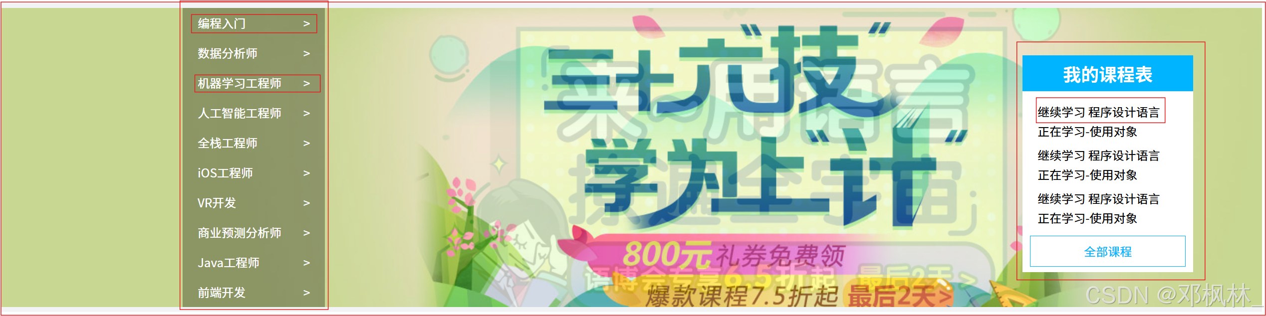
<div class="banner">
    <div class="banner-con">
        <div class="box-banner">
        <ul class="left">
            <li><a href="">编程入门<span>> </span></a></li>
            <li><a href="">数据分析师<span>> </span></a></li>
            <li><a href="">机器学习工程师<span>> </span></a></li>
            <li><a href="">人工智能工程师<span>> </span></a></li>
            <li><a href="">全栈工程师<span>> </span></a></li>
            <li><a href="">iOS工程师<span>> </span></a></li>
            <li><a href="">VR开发<span>> </span></a></li>
            <li><a href="">商业预测分析师<span>> </span></a></li>
            <li><a href="">Java工程师<span>> </span></a></li>
            <li><a href="">前端开发<span>> </span></a></li>
        </ul>
        <div class="right">
				<h2>我的课程表</h2>
				<div class="content">
					<dl>
						<dt>继续学习 程序设计语言</dt>
						<dd>正在学习-使用对象</dd>
					</dl>
					<dl>
						<dt>继续学习 程序设计语言</dt>
						<dd>正在学习-使用对象</dd>
					</dl>
					<dl>
						<dt>继续学习 程序设计语言</dt>
						<dd>正在学习-使用对象</dd>
					</dl>
				</div>
				<a href="" class="more">全部课程</a>
			</div>
    </div>
    </div>
</div>
@keyframes move {
0%{
background: url("../img/widget-bannerA.jpg");
}
50%{
background: url("../img/widget-bannerB.jpg");
}
100%{
background: url("../img/widget-bannerA.jpg");
}
}
.banner{
width: 100%;
height: 400px;
display: flex;
justify-content: center;
animation: move 5s infinite;
}
.banner .banner-con{
height: 420px;
width: 1200px;
position: relative;
}
.left li{
width: 190px;
height: 40px;
line-height: 40px;
color: #fff;
padding-left: 20px;
background-color: rgba(0, 0, 0, 0.3);
}
.left li:hover{
color: #00b4ff;
}
.left li:hover span{
color: #00b4ff;
}
.left li span{
float: right;
margin-right: 20px;
}
.right h2{
text-align: center;
line-height: 48px;
margin-top: 0;
color: white;
background-color: #00b4ff;
}
.right{
width: 228px;
height: 290px;
background-color: white;
position: absolute;
right: -150px;
top: 15%;
}
.right dt,dd{
margin-left: 20px;
margin-bottom: 10px;
}
.more{
display: inline-block;
width: 208px;
margin: 0 10px;
color: #00b4ff;
line-height: 40px;
text-align: center;
border: #00b4ff 1px solid;
}
.more:hover{
background-color: #00b4ff;
color: white;
}5,课程
<div class="course">

    <div class="course-box">
        <div class="small">
            <a href="detail.html">
                <img src="./img/widget-demo1.png" alt="">
                <p>Think PHP 5.0 博客系统实战项目演练 </p>
                <p > 高级  1125人在学习</p>
            </a>
        </div>
    </div>
</div>
.course{
    width: 100%;
    height: 700px;
    display: flex;
    justify-content: center;
    align-items: center;
    position: relative;
    bottom: 280px;
}
.course-box{
    width: 1200px;
    height: 700px;

}
.course-box .small{
    display: inline-block;
    width: 228px;
    height: 300px;
    background-color: white;
    box-shadow: gray 1px 2px 5px;
    margin-right: 8px;
    margin-bottom: 20px;
}
.course-box .small p{
    margin: 20px 20px;
    font-size: 15px;
}
.course-box .small p:last-child{
    margin-top: 50px;
    color: orange;
}
六,footer
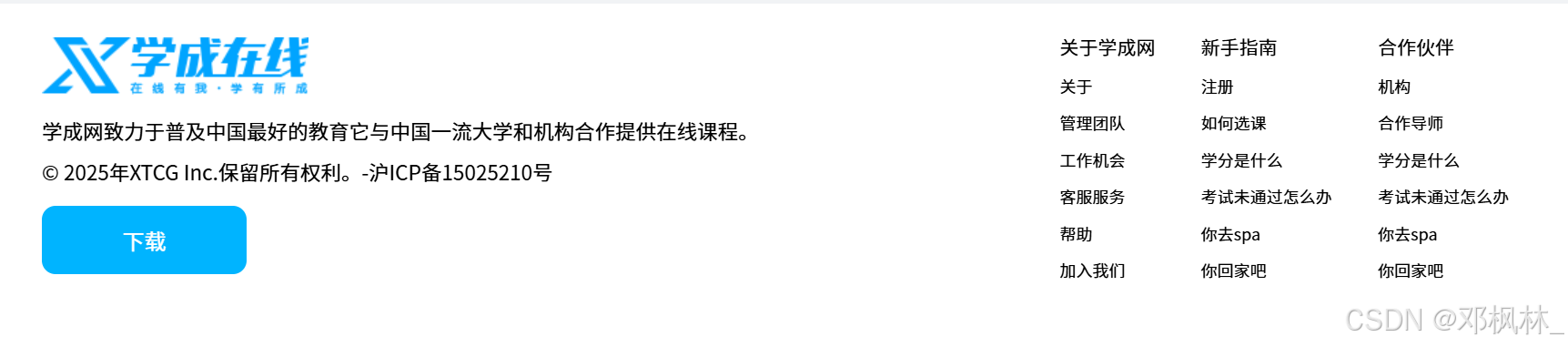
<div class="footer">
    <div class="footer-box">
        <div class="left">
            <img src="./img/asset-logoIco.png" alt="">
            <p>学成网致力于普及中国最好的教育它与中国一流大学和机构合作提供在线课程。</p>
            <p>© 2025年XTCG Inc.保留所有权利。-沪ICP备15025210号</p>
            <a href="">下载</a>
        </div>
        <div class="footer-right">
        <ul>
            <li>关于学成网</li>
            <li>关于</li>
            <li>管理团队</li>
            <li>工作机会</li>
            <li>客服服务</li>
            <li>帮助</li>
            <li>加入我们</li>
        </ul>
        <ul>
            <li>新手指南</li>
            <li>注册</li>
            <li>如何选课</li>
            <li>学分是什么</li>
            <li>考试未通过怎么办</li>
            <li>你去spa</li>
            <li>你回家吧</li>
        </ul>
        <ul>
            <li>合作伙伴</li>
            <li>机构</li>
            <li>合作导师</li>
            <li>学分是什么</li>
            <li>考试未通过怎么办</li>
            <li>你去spa</li>
            <li>你回家吧</li>
        </ul>
        </div>
    </div>
</div>
.footer{
width: 100%;
height: 300px;
display: flex;
background-color: white;
justify-content: center;
align-items: center;
}
.footer .footer-box{
width: 1200px;
height: 300px;
display: flex;
margin-top: 50px;
}
.footer .footer-box p{
line-height: 10px;
margin: 20px 0;
font-size: 15px;
}
.footer .footer-box a{
width: 150px;
height: 50px;
line-height: 50px;
text-align: center;
display: inline-block;
background-color: #00b4ff;
color: white;
border-radius: 10px;
}
.footer-box .left{
width: 600px;
}
.footer .footer-box a:hover{
background-color: cornflowerblue;
}
.footer-right{
float: right;
width: 500px;
margin-left: 200px;
}
.footer-right ul{
display: inline-block;
margin-right: 30px;
font-size: 12px;
}
.footer-right ul li:first-child{
font-size: 14px;
}
.footer-right ul li{
margin-bottom: 15px;
}


 扫一扫
扫一扫


 被折叠的 条评论
为什么被折叠?
被折叠的 条评论
为什么被折叠?
 到【灌水乐园】发言


