


文章目录
Swiper滑块视图容器
滑块容器视图(Swiper)和滚动容器视图(Scroll-View)的区别,滚动容器仅有一个内容区域,可自由滚动选择要显示的内容;滑块容器有多个区域,Swiper下的每个swiper-item是一个滑块切换区域,只能一屏一屏的切换,不能停留在2个滑块区域之间。
滑块视图容器(Swiper)
Swiper是父元素,内包含多个子元素Swiper-item,先写上一个Swiper,并设置样式,代码如下:
<template>
	<view>
		<swiper>
			<swiper-item>我是第一区域</swiper-item>
			<swiper-item >我是第二区域</swiper-item>
			<swiper-item>我是第三区域</swiper-item>
			<swiper-item> 我是第四区域</swiper-item>
		</swiper>
	</view>
</template>

<script	setup>

</script>

<style lang="scss">
	swiper{
		width:100vw ;
		height: 200px;
		border: 1px solid green;
		swiper-item{
			width: 100%;
			height:100%;
			background: pink;
		}
	}
</style>
效果如下:

在这里,可以加上CSS选择器:swiper-item:nth-child(2n),选择2倍数页,并为其设置珊瑚色背景,代码如下:
<template>
	<view>
		<swiper>
			<swiper-item>我是第一区域</swiper-item>
			<swiper-item >我是第二区域</swiper-item>
			<swiper-item>我是第三区域</swiper-item>
			<swiper-item> 我是第四区域</swiper-item>
		</swiper>
	</view>
</template>

<script	setup>

</script>

<style lang="scss">
	swiper{
		width:100vw ;
		height: 200px;
		border: 1px solid green;
		swiper-item{
			width: 100%;
			height:100%;
			background: pink;
		}
		swiper-item:nth-child(2n){
			background: coral;
		}
	}
</style>
效果如下:

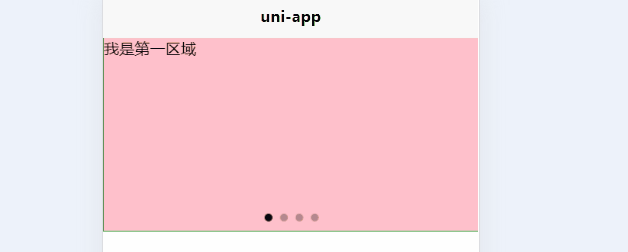
显示面板指示点(indicator-dots)
有了指示点,可以很清楚的知道区域的总数,也可以直接点击指示点快速切换到不同区域,添加指示点属性,代码如下:
<template>
	<view>
		<swiper indicator-dots>
			<swiper-item>我是第一区域</swiper-item>
			<swiper-item >我是第二区域</swiper-item>
			<swiper-item>我是第三区域</swiper-item>
			<swiper-item> 我是第四区域</swiper-item>
		</swiper>
	</view>
</template>

<script	setup>

</script>

<style lang="scss">
	swiper{
		width:100vw ;
		height: 200px;
		border: 1px solid green;
		swiper-item{
			width: 100%;
			height:100%;
			background: pink;
		}
		swiper-item:nth-child(2n){
			background: coral;
		}
	}
</style>
效果如下:
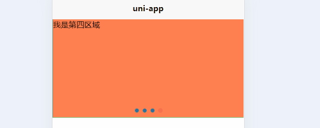
指示点颜色(indicator-color)、当前选中指示点颜色(indicator-active-color)
这里的指示点,默认是灰色,被选中后为黑色,继续添加属性,尝试改变指示点的颜色,代码如下:
<template>
	<view>
		<swiper indicator-dots indicator-color ="#126bae" indicator-active-color = "#ee3f4d">
			<swiper-item>我是第一区域</swiper-item>
			<swiper-item >我是第二区域</swiper-item>
			<swiper-item>我是第三区域</swiper-item>
			<swiper-item> 我是第四区域</swiper-item>
		</swiper>
	</view>
</template>

<script	setup>

</script>

<style lang="scss">
	swiper{
		width:100vw ;
		height: 200px;
		border: 1px solid green;
		swiper-item{
			width: 100%;
			height:100%;
			background: pink;
		}
		swiper-item:nth-child(2n){
			background: coral;
		}
	}
</style>
效果如下:

衔接滑动(circular)
即滑动到末尾后是否返回到开头,默认是不能返回到开头的,加入衔接滑动属性,代码如下:
<template>
	<view>
		<swiper indicator-dots indicator-color ="#126bae" indicator-active-color = "#ee3f4d" circular>
			<swiper-item>我是第一区域</swiper-item>
			<swiper-item >我是第二区域</swiper-item>
			<swiper-item>我是第三区域</swiper-item>
			<swiper-item> 我是第四区域</swiper-item>
		</swiper>
	</view>
</template>

<script	setup>

</script>

<style lang="scss">
	swiper{
		width:100vw ;
		height: 200px;
		border: 1px solid green;
		swiper-item{
			width: 100%;
			height:100%;
			background: pink;
		}
		swiper-item:nth-child(2n){
			background: coral;
		}
	}
</style>
效果如下:
自动切换(autoplay)、自动切换时间间隔(interval)
默认自动切换时间为5000毫秒,有点慢,直接设置2000毫秒试试,代码如下:
<template>
	<view>
		<swiper indicator-dots indicator-color ="#126bae" indicator-active-color = "#ee3f4d" circular autoplay interval = "2000">
			<swiper-item>我是第一区域</swiper-item>
			<swiper-item >我是第二区域</swiper-item>
			<swiper-item>我是第三区域</swiper-item>
			<swiper-item> 我是第四区域</swiper-item>
		</swiper>
	</view>
</template>

<script	setup>

</script>

<style lang="scss">
	swiper{
		width:100vw ;
		height: 200px;
		border: 1px solid green;
		swiper-item{
			width: 100%;
			height:100%;
			background: pink;
		}
		swiper-item:nth-child(2n){
			background: coral;
		}
	}
</style>
效果如下:

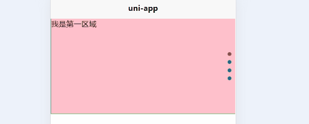
纵向滑动(vertical)
代码如下:
<template>
	<view>
		<swiper indicator-dots indicator-color ="#126bae" indicator-active-color = "#ee3f4d" circular autoplay interval = "2000" vertical>
			<swiper-item>我是第一区域</swiper-item>
			<swiper-item >我是第二区域</swiper-item>
			<swiper-item>我是第三区域</swiper-item>
			<swiper-item> 我是第四区域</swiper-item>
		</swiper>
	</view>
</template>

<script	setup>

</script>

<style lang="scss">
	swiper{
		width:100vw ;
		height: 200px;
		border: 1px solid green;
		swiper-item{
			width: 100%;
			height:100%;
			background: pink;
		}
		swiper-item:nth-child(2n){
			background: coral;
		}
	}
</style>
效果如下:


 4631
4631


 被折叠的 条评论
为什么被折叠?
被折叠的 条评论
为什么被折叠?
 到【灌水乐园】发言


