


做了一个气温序列的折线图,自己做了一个日期序列(03年到22年的月频率)
#一些参数
a=0.01
b=1
c=0.12
t=0
tt=[]
#绘制时间序列
for i in range(1,len(t_data)+1):
    decimal_part = t - int(t)
    if decimal_part <0.12:
        t=round(t+a,2)
    else:
        t=round(t-c+b+a,2)
    tt.append(t)
print(tt)
print(len(tt))
结果长这个样子,我将用它作为横坐标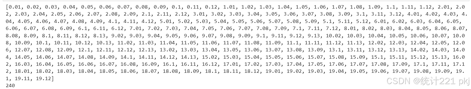
plt.figure(facecolor='white')
plt.plot(tt,t_data,label='数据趋势')
# 添加标题和标签
plt.title('折线图示例')
plt.xlabel('日期')
# 旋转日期标签以便阅读
plt.gcf().autofmt_xdate()
plt.xticks(rotation=45)
plt.ylabel('数据值')
plt.legend()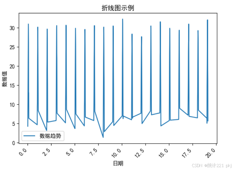
看来横坐标还是按照原始十进制排序,导致数据看起来不是那么的平滑,将尝试将横坐标转换日期格式(matplotlib.dates)
from datetime import datetime, timedelta

# 开始日期和结束日期
start_date = datetime(2003, 1, 1)
end_date = datetime(2022, 12, 31)

# 初始化时间列表
date_list = []

# 添加月份,直到达到结束日期
current_date = start_date
while current_date <= end_date:
    # 添加当前日期到列表
    date_list.append(current_date.strftime('%Y-%m'))
    # 更新到下一个月的第一天
    if current_date.month == 12:
        current_date = current_date.replace(year=current_date.year + 1, month=1)
    else:
        current_date = current_date.replace(month=current_date.month + 1)

# 输出结果
for date1 in date_list:
    print(date1)
print(type(date1))

import matplotlib.dates as mdates
# 将字符串日期转换为datetime对象
custom_x = [mdates.date2num(datetime.strptime(date, '%Y-%m')) for date in date_list]

# 绘制折线图
plt.plot(custom_x, t_data)

# 设置x轴的日期格式和定位器
plt.gca().xaxis.set_major_formatter(mdates.DateFormatter('%Y-%m'))
plt.gca().xaxis.set_major_locator(mdates.MonthLocator())

# 旋转日期标签以便阅读
plt.gcf().autofmt_xdate()

# 显示图表
plt.show()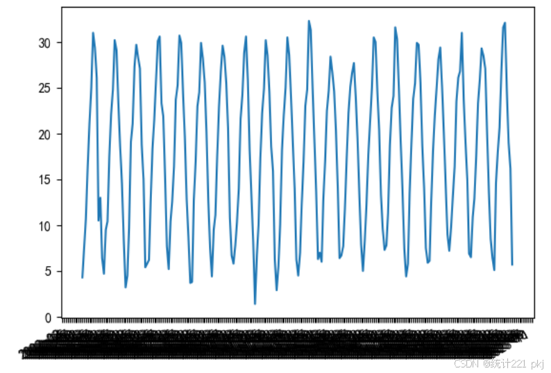
看来20年的数据日期横坐标太长了,不能正常显示。老实了,还是用普通np序列作横坐标吧。
tt2=np.arange(1,241)
tt2

plt.figure(figsize=(10, 6))
plt.plot(tt2,t_data, marker='o')
plt.xlabel('时间(月)')
plt.ylabel('月均气温(℃)')
plt.title('月均气温时序图')
plt.grid(True)
plt.show()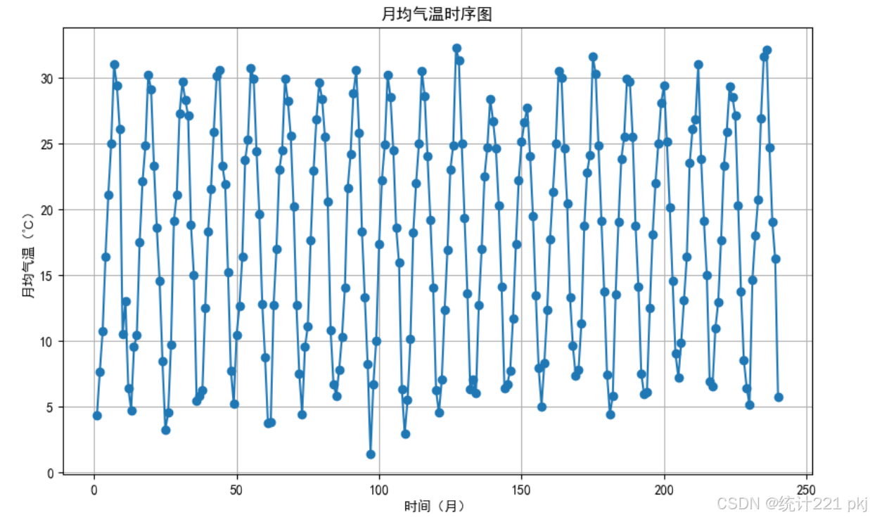


 被折叠的 条评论
为什么被折叠?
被折叠的 条评论
为什么被折叠?
 到【灌水乐园】发言


